Table of contents
Brown and cream living room. gray and white bedroom. black and white kitchen, so you can't go wrong. wicker furniture on the balcony. all of these combinations are sure to work, but there is nothing new in any of them. to give a different tone to your home, or to a specific room, bet on colorful furniture!
With the variety of MDF and MDP furniture on the market, in addition to lacquer and the thousands of finishing options, there is no shortage of ideas to get out of the commonplace when decorating. Sometimes it is worth investing in more basic color combinations as a base in a room, and investing in just one piece of furniture, or some decorative objects that draw attention because of the color.
You can buy a piece of furniture in the color you like best, or you can customize a piece of furniture that has been left aside and needs a new look. Anything goes to make your home more beautiful and attractive. This way, you will feel more and more proud of your place, and your guests won't stop praising it! Follow our tips on how to use color in the bathroom, bedroom, living room, kitchen, and evenon the balcony, and get inspired to add a touch of color around.
Tips to choose the right color furniture
The urban architect and interior designer Sandra Pompermayer explains that the color of the furniture depends a lot on the sensation you want to cause in an environment or in a visitor. The best part? There are no rules! The chosen color needs to be according to the personal taste of the house dweller. If you opt for two colors, use the stronger one sparingly, in small objects or in prints.influence the choice of color, such as mood, weather, and state of mind," says the professional.
Besides there being no rules for the choice of colors, the same applies for the style of the furniture. Colors can be applied to more modern furniture, with an industrial look, or to vintage style furniture. This bet makes the environment cool and charming. If possible, combine new furniture with old, and with a touch of color, of course. The combination looks amazing!
Colorful furniture for the bedroom
According to the architect, it is necessary to be very careful when inserting colorful furniture in bedrooms, in order not to cause visual fatigue. one idea is to avoid many objects in the same tone, too big and in strong tones. "When you have a study area in bedrooms, bet on colors that influence, stimulate, that generate renewable sensations and at the same time balanced, such as shades of green," explains Sandra.
Specifically in the case of bedrooms for children or teenagers who are very active, the architect advises to use the color blue, which transmits a neutralizing and calming sensation, since the shades of blue refer to deep emotions and dreams.composition."
Check out 30 colorful furniture inspirations for use in bedrooms below:
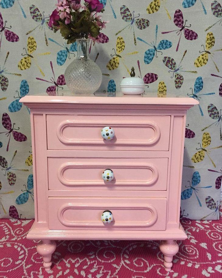
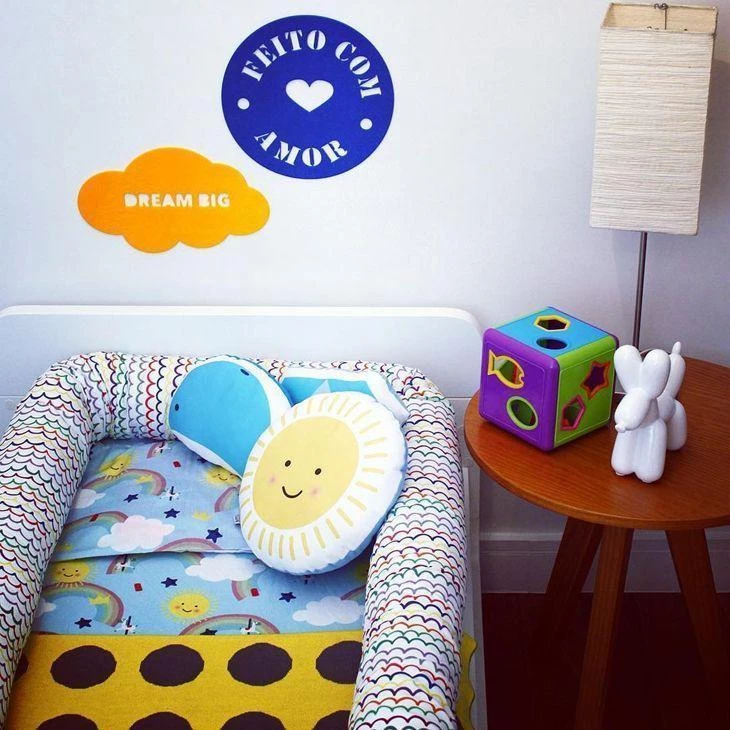
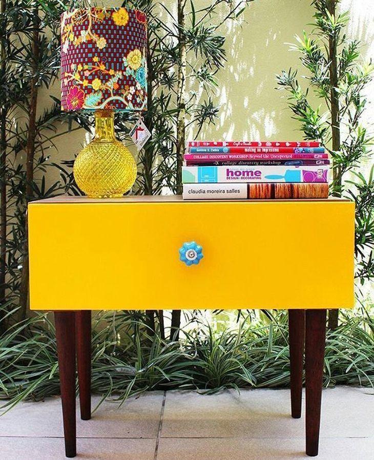
1. next to you

The bedside table is indispensable in the bedroom! It is the one that supports the lamp, the alarm clock, the bedside book, and the cell phone. Give the piece of furniture a cheerful touch, with your favorite color.
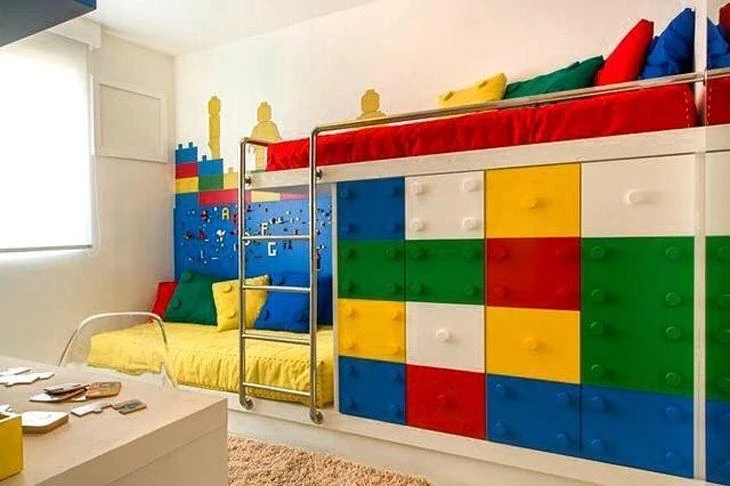
2. almost a rainbow
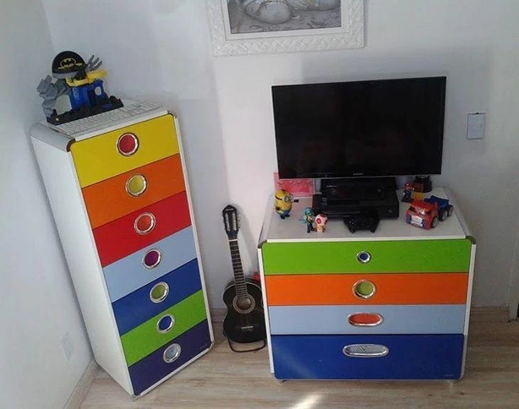
For a child's room, you can vary the colors. If you have a drawer or chest of drawers, for example, paint each drawer a different color. You can paint the knobs as well, and invert the colors - and even use them to teach the colors to the room's owner!
3. modern vintage

The bombé style dressing table, chubby, full of curves and boasting an equally charming mirror, is reminiscent of olden times. Yellow appears to give the piece a modern face.
4. design on the bedside table

The bedside table, even if it has a neutral color, doesn't need to be dull. You can paint or apply a sticker on it, with your preferences of images or colors. Want to innovate? Bet on pop art images.
5. bet on the classic
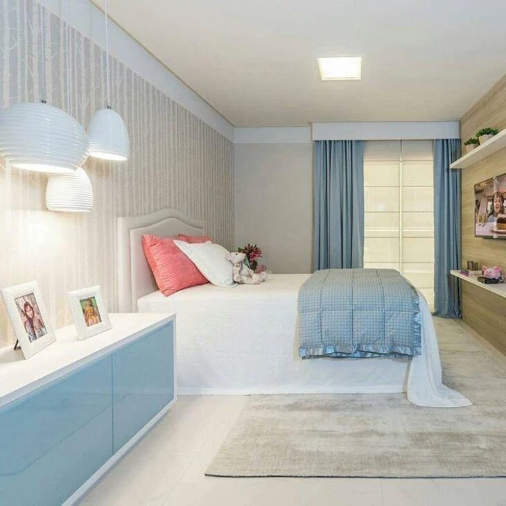
If you are afraid of colors, have no doubts: choose a color palette that you like, and add to it one object or another in a more accentuated color. This room is based on white, cream, and baby blue, and the pink pillows are what make it different.
6. colors for girls
The little princess's room doesn't need to be exclusively pink. Bet on wooden furniture, for balance, and use colors in the accessories and decoration objects, such as picture frames.
7. fashion style
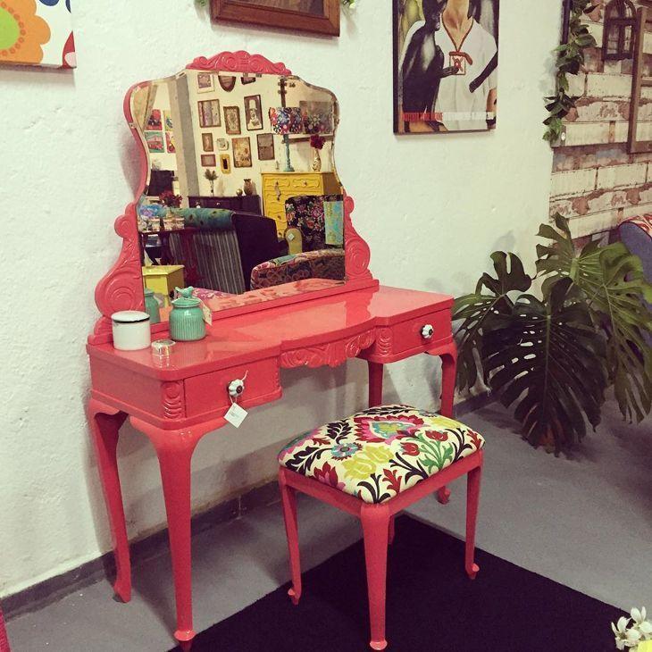
The red dressing table draws attention from afar, and will be the center of attention in the room. The stool displays a very colorful cushion, perfect for a young woman who is super active and fashionable.
8. color in the organization

Colors can appear in any type of furniture. Proof of this is this panel, exclusive for storing and displaying the cap collection of the owner of the room. The same color appears in the desk drawer. Organization and a modern touch to the environment at the same time.
9. choose a base color
Choose a neutral color to be the base of the room - here, the color white. Then, add elements of two or three colors to decorate and get a beautiful result (shades of blue, yellow and black).
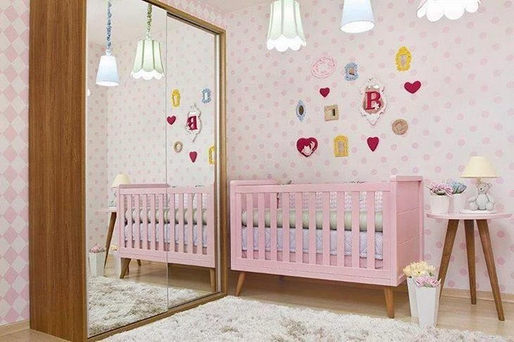
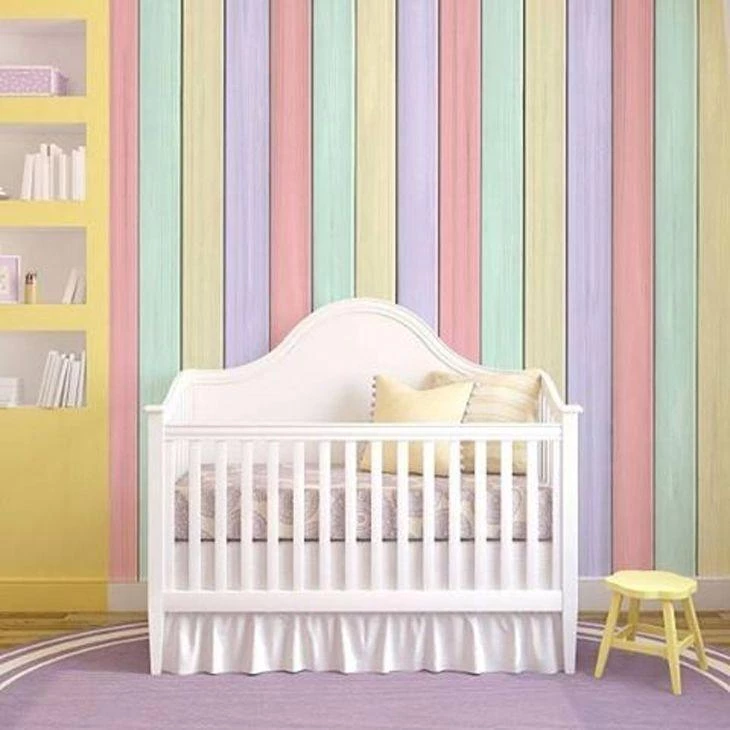
10. montessorian bedroom
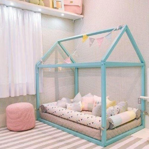
Baby shades of pink and light blue are featured in this gray and white room, while subtle details in other colors, such as brown and yellow, appear to break the monotony and brighten up the room.
11. candy color
Soft colors, such as candy colors, look very charming when applied to older furniture. The combination results in a beautiful vintage effect! And the colors remind you of cotton candy clouds that permeate your thoughts and take you back to childhood.
12. drips of color
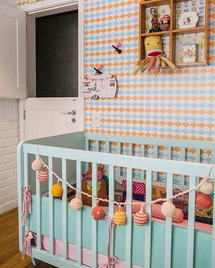
The baby's room doesn't need to be only in tone on tone. Here the wallpaper brings irreverence to the decoration, with drawings in blue and orange. The other colors appear in the toys and in the light wire that serves as decoration for the crib.
13. what is your favorite color?

If the answer to this question is "several", don't be afraid. Choose one color to be the predominant color in the room, then use the others to appear in details and cute decorations.
14. one color is not enough
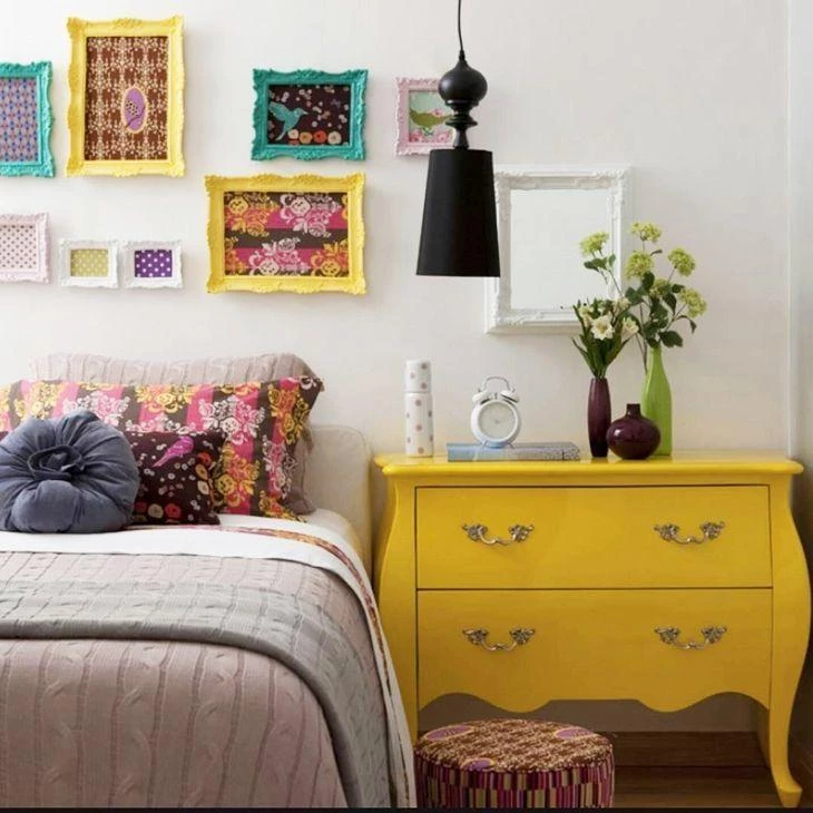
For a cheerful and relaxed environment, use yellow! The color naturally illuminates and combines very well with other colors, light or stronger. Here, cyan appears in the picture frames, as well as white, pink, and black in the details.
15. all blue!
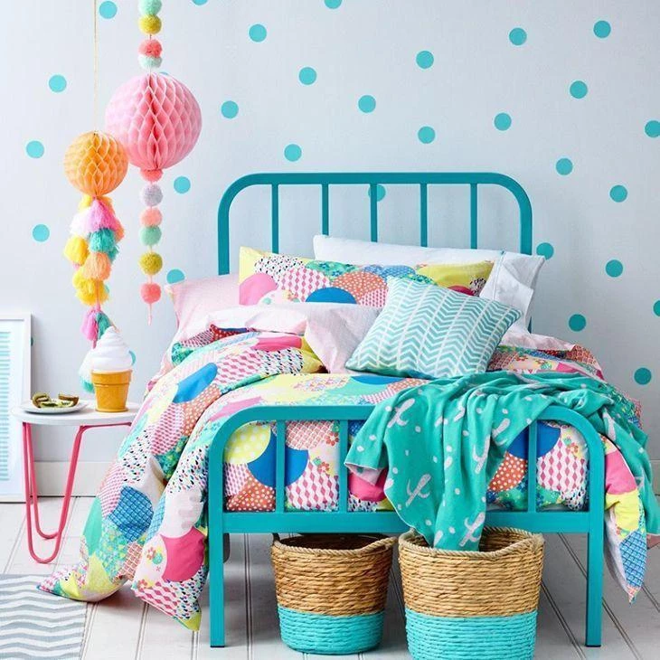
A blue world, full of polka dots, to enchant a young girl! The combination of the petit poá wall with the colored balloons, used only for decoration purposes, is just charming, and even the bedding gets into the mood of relaxed colors.
16. white is also color!

It's a mistake to think that white furniture doesn't give the room personality. This room has a yellow wall, and all the furniture is white. To compensate, colorful bedding, pillows, shelves and accessories, for no one to fault!
17. candy stripes
A beautiful bet for baby rooms, for both boys and girls, is to invest in candy colors, from the floor to the ceiling, from the furniture to the accessories.
18. pink rose

It is said that women from 1 to 100 like pink, not necessarily pink, but some shade of pink! If this statement is true, what is important is to find out what is your favorite shade, and invest in some furniture with the desired color.
19. lots of colors for baby
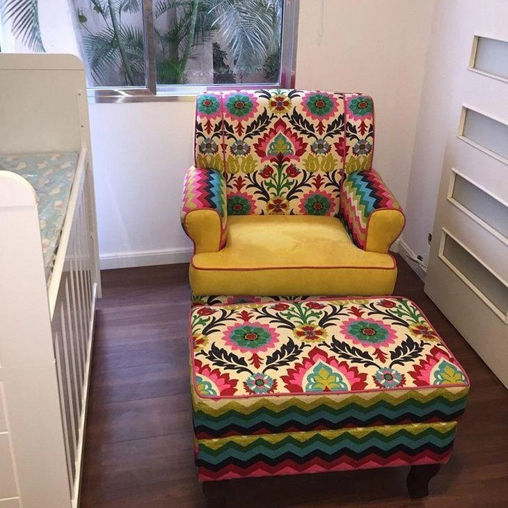
If you want a change in this idea, invest in a super colorful nursing armchair, with cushions and a loose pouf, full of drawings and colors.
20. dividing the room
When parents and baby share a room, no white everything! The idea is to share the decoration as well. Invest in furniture and accessories that are functional for the adults and supportive for the newest member of the family. Use colors that match each other for greater harmony.
Princess Bedroom
Some little girls make a point of having their room all pink. To please the little ones and not make it look heavy, use light shades, always balanced with white, cream, or nude. You can satisfy the princess's desires and not make a mess of the look.
22. blue and yellow

Blue and yellow are close cousins. Any shades of the two colors always match each other. Whenever using two strong colors, fill in the rest of the space with white - or raw tones, such as the wood of the feet of the desk and lampshade - to balance the look.
23. colorful Pitacos
In the baby's room, you can use color without fear. Invest in a bedding set full of cheerful and fun prints. If possible, have colorful educational toys nearby as well, to attract the little ones' attention.
24. girl's room
Now the teenager is in a phase where baby things don't appeal anymore, and adult things seem boring, so mix the furniture, and leave the decoration with more serious items and other cutesy ones, like the stuffed animals and the desk chair.
25. a little bit of each color
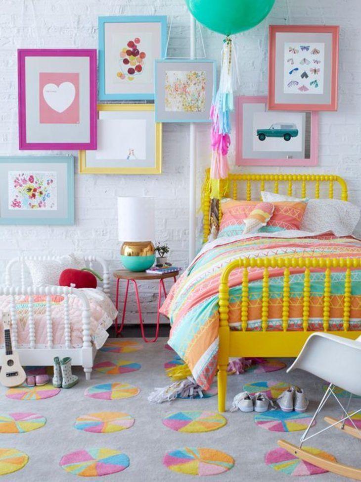
Children's rooms allow you to play with colors, without fear of getting extremely colorful and heavy. In this option, with a light wall and carpet with prints that match the other colors of the room, the beds of the two little partners come to crown the beautiful decor, basic and, at the same time, full of details.
26. adults can do it too!

Colors can be applied in any environment, even in double rooms. To do this, choose colors that match each other, not necessarily tone on tone, but combinations that will give a visual lift.
27. colors and flavors
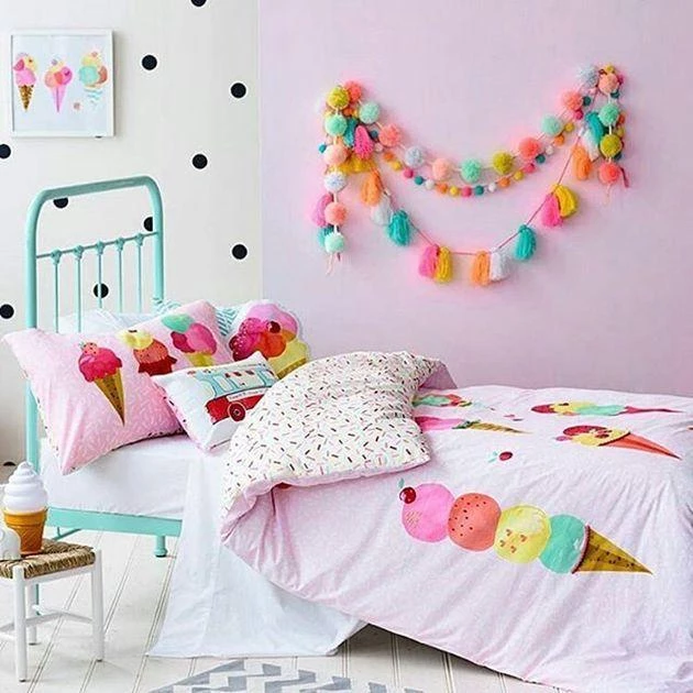
When you look at this picture, can you imagine the ice cream cart, with its animated music, that used to play in the streets in the 1980's? That's right! This entire room was inspired by the colors of one of children's favorite candies.
28. pink lemonade

Yellow and green are close colors, and any shade of these colors match each other. To give a "warmth" to the clear look, the bedside table was painted pink. On the wall, plates adorn it, with white details.
29. two universes in one room

Two universes fit inside this room, which houses a sibling couple. The different personalities can be perceived by the design, colors, and decoration of each sibling's corner, from the wall to the desk.
30. tuned baby
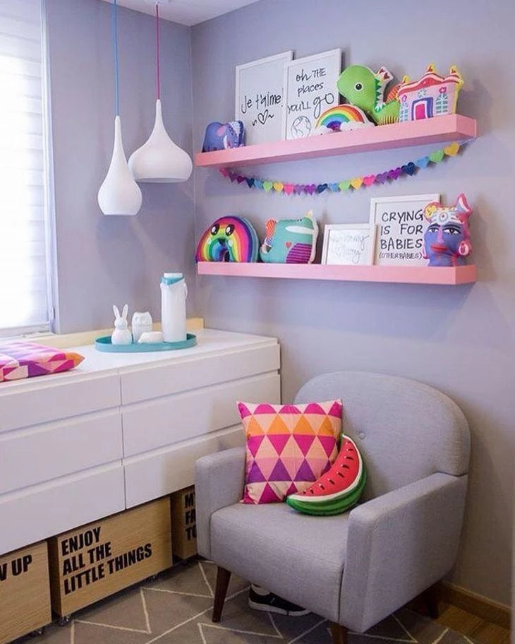
Baby rooms can be cheerful and irreverent too. Invest in colorful accessories and toys. Here, the floor, walls, furniture, and carpet are basic, without flashy colors. The details that call attention, such as the watermelon pillow.
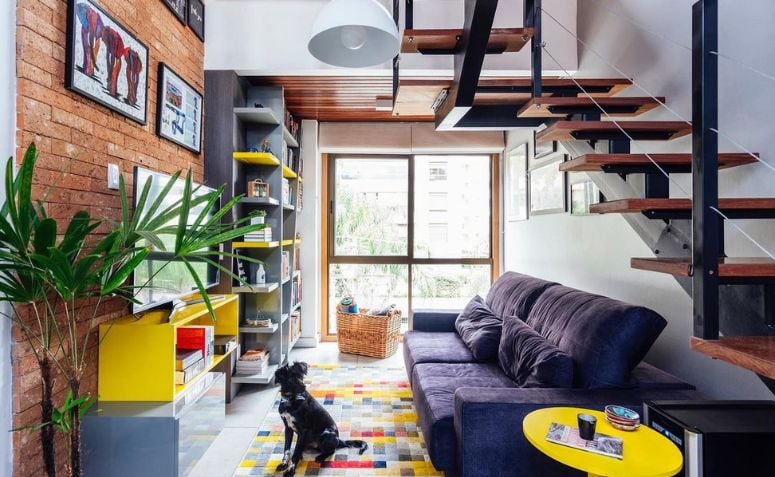
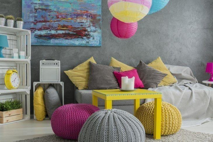
Colorful furniture for the living room
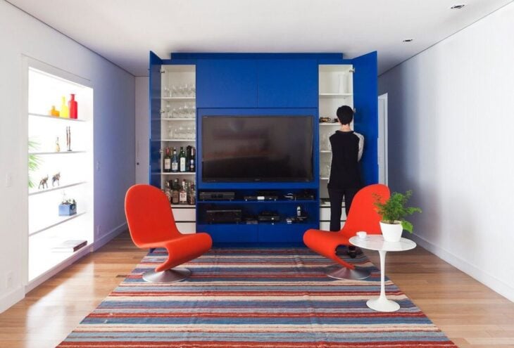
The architect explains that for large environments, such as living rooms, it is possible to use the color of preference, without fear: "Bet on the tone that matches the personality of the dweller or the family, without fear, and don't forget to mix it with neutral tones - such as gray, beige, and shades of brown - to give it a balance", says Sandra.
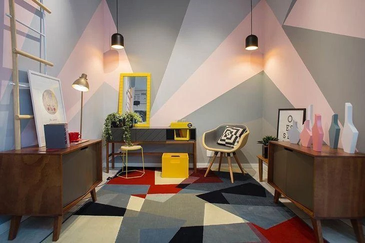
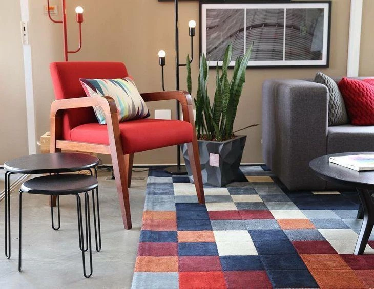
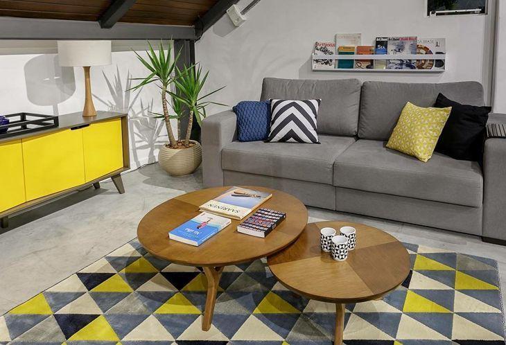
31. colors in geometry

A colorful room needs to have some neutral or classic color items, to balance the look. In this option, the colors appear in the geometric rug, pillows, pouf, and armchair. The other colors are basic and do not clash with the items mentioned.
32. basic gold
No, gold is not basic, but here it almost becomes commonplace. Since the room is all white, with furniture in neutral colors, the difference is in the details, such as the little plants, which give a touch of green to the environment. The golden armchair reigns absolute!
33. black and white

The geometric effect on the wall looks amazing, and you hardly notice that the decoration is based on the classic black and white. The mixture of the two colors results in gray, which appears in various shades.
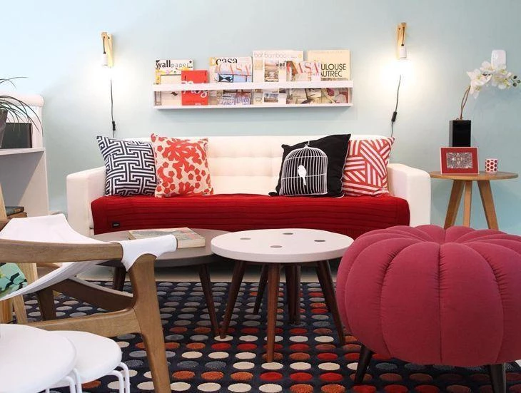
34. white sofa
Even though this room has several colorful items, the one that really deserves to be highlighted is the white sofa, which allows the use of several colors of cushions and textures, expanding the range of options for those who will decorate the room.
35. modern style

Gray and purple are colors that are always present in environments with more modern decoration. Give your room a touch of modernity, abusing both colors and their various shades.
36. under the stairs

The space under the stairs can and should be used! Take advantage of the sloping design and bet on low furniture. You can make a small bar or place a buffet with your finest dishes. Use the surface to place decorative objects.
37. balance with wood
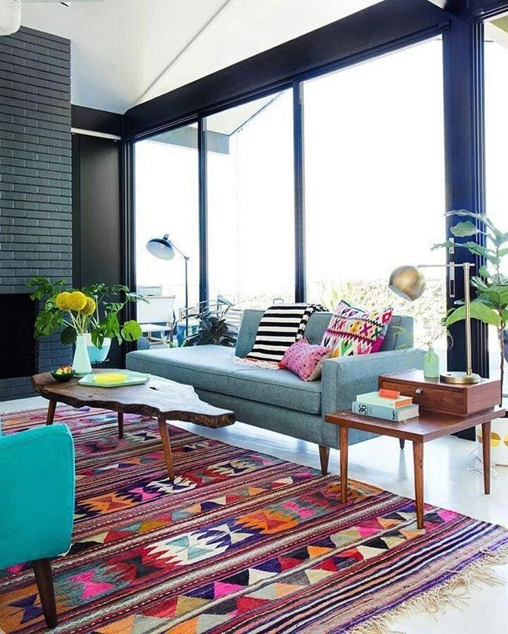
If you have a generous amount of space, use a rug in the living room, and invest in a very colorful piece. The sofa, armchairs, and cushions can follow the super colorful style. To balance the environment, use wooden pieces.
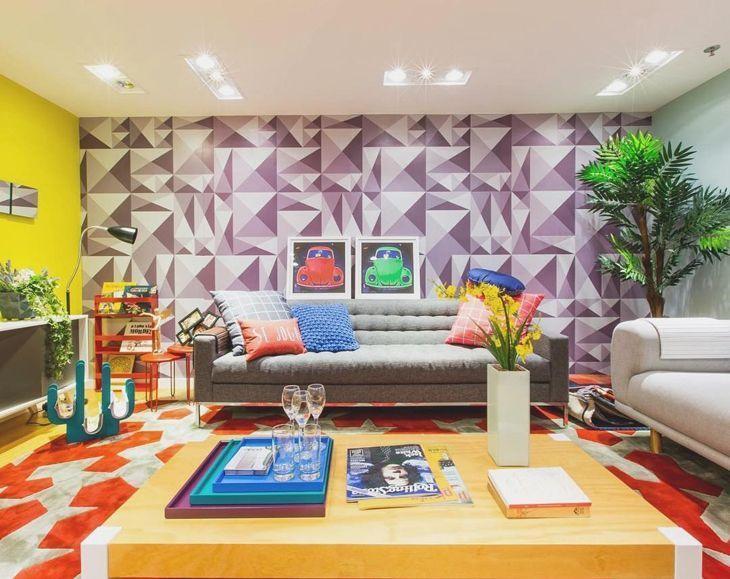
38. colored geometry
The perfect idea for an art enthusiast, since the geometry appears in the drawings on the wall and on the carpet.
39. colors of spring

They say that light colors welcome and celebrate the arrival of spring, since the season fills the beds and gardens with flowers of various shades. If you can't change a piece of furniture, use covers to give it a new look and change the face of the room.
40. all the colors!
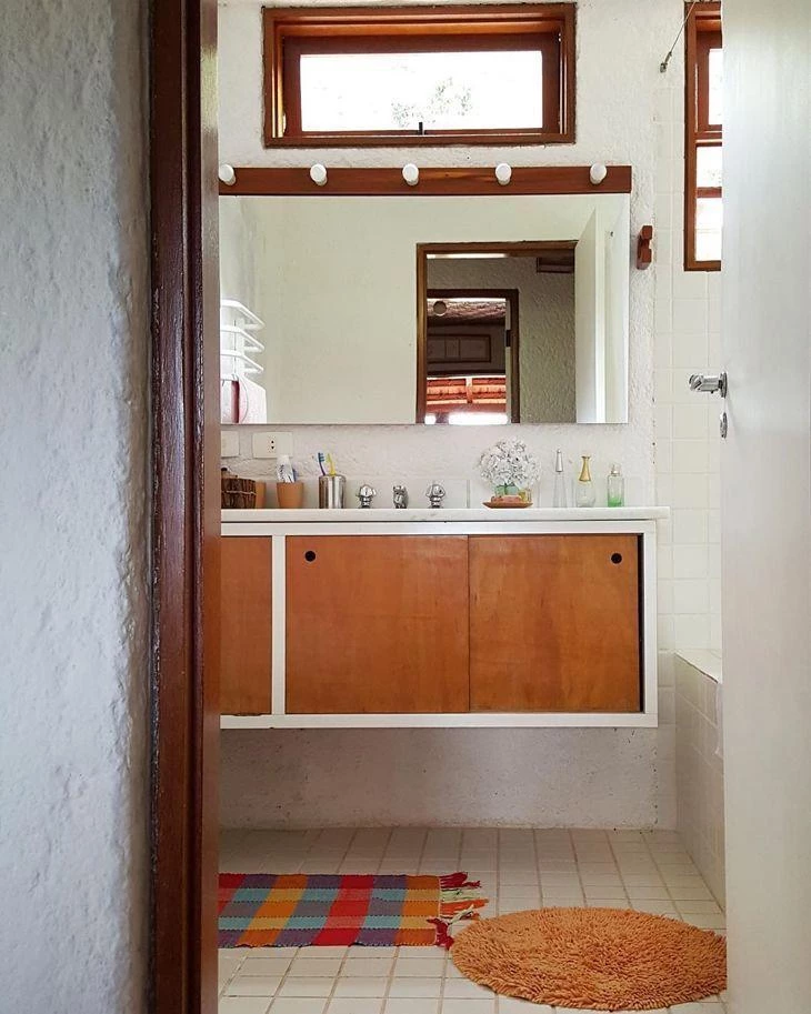
If a room is large, you can bet on the use of many colors. To do this, balance the overall scenario with the use of white and objects in neutral tones, such as gray and nude. Use colors on the floor, walls, and furniture.
41. yellow without fear
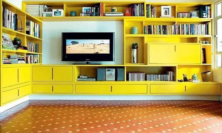
Yellow represents modernity in decoration, and usually appears in contemporary projects. This room has two walls lined with the same piece of furniture, a kind of bookcase, which serves as a rack and also houses the books.
42. color on them!

Besides using color in the furniture, innovate and also use a wall with a very prominent color, such as orange - no one expects to "face" a wall in this shade, and this is the best part, the innovation in your décor.
43. female environment
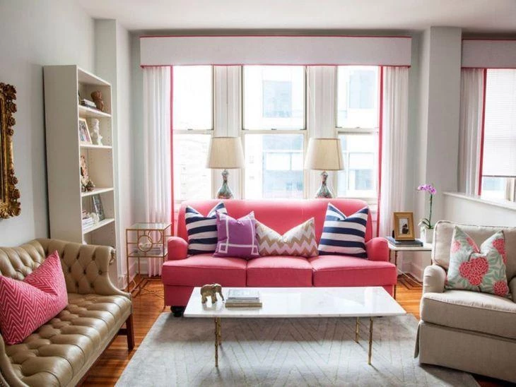
To set up a very feminine environment, the color pink is always a sure bet. Here, it appears on the sofa, in details on the pillows, and on the curtain. To not make the environment too heavy, furniture and objects in neutral and light tones.
44. colorful corner
If your house is all in classic, neutral tones, use only one piece of colored furniture, in some corner, to make a difference.
45. sitting in color
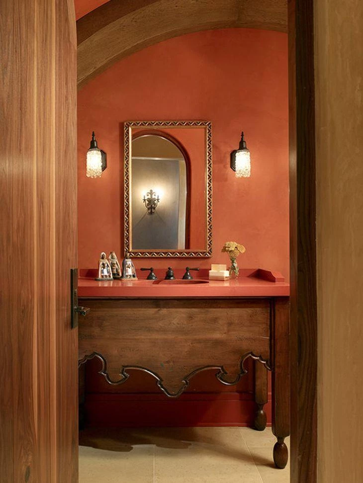
In environments full of wood, on the floor and on the furniture, it is worth investing in color at isolated points, as in the chairs above, which have their structure painted and backrests and cushions covered in super colorful fabric.
46. colors that match
To get the colors right, bet on those that always work - think, for example, of the color combinations of winter clothes, with a neutral and a strong color, for example: gray with red, navy blue with wine, among others.
47. color and tone
What is your favorite color? You can use not the color, but the tone. If you say "blue" to several people, each of them will think of a different tone, so go for this idea, and use several shades in your decoration.
48. black also counts

When we say neutral colors, black is almost always forgotten, but it is a great base for unleashing the imagination and using colors in the environment in which it appears. If possible, use it on some wall, even if it is small.
49. red without cloying
Your lipstick is red, your nail polish, scarpin, and favorite dress, too, so bring red into the decoration as well, in its various shades, from the most open, to the most closed, almost wine.
50. working environment
To set up the furniture for a work environment, use colors to liven up the mood and lift the mood of everyone who shows up there, employees and customers alike.
51. pink and blue

The combination of pink and blue doesn't necessarily mean a childish environment. Use strong shades that break away from the classics to create a more contemporary look. Gray is a good ally to compose it.
52. mosaic in the environment

The environment gets colors in every corner. On the floor, a stylized carpet with drawings, walls with different colors and colorful geometry, and a large sofa full of personality, with accessories to help the composition: lampshades, cushions, and pictures.
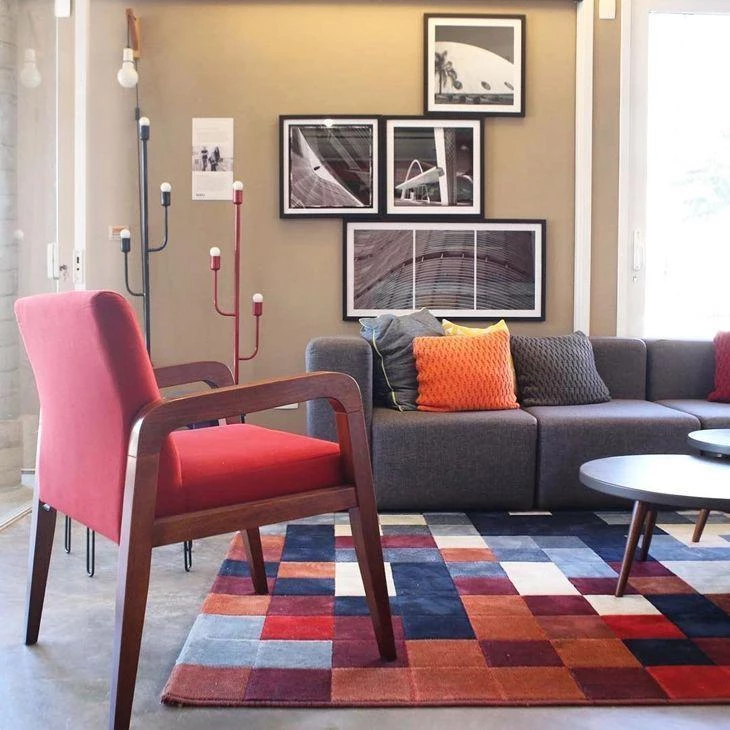
53. checkered friend
The black and white checkered is a super ally of the decoration. It makes the environment, automatically, "cool". Bet on furniture that is entirely in one color. Here, for example, it is as if they were blocks of colors: gray on the wall, wine on the armchair and mustard on the sofa.
54. cooperative carpet
It was forgotten and is slowly taking its place at the center of decoration again, literally, and is reigning over the rooms. Choose a good quality one, so that it does not wear out easily.
55. blue palette
In this suggestion for use, it appears on one wall, and the idea is to combine it with items that are a little lighter, such as the pool blue.
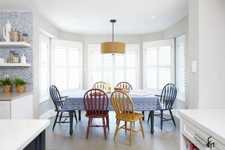
56. dining room
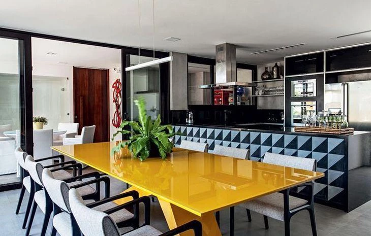
The dining room can be given a major highlight, which is the table. If it is in a color different from the classic ones, bet on materials with a finer finish, such as lacquer, to give the piece more shine and magnificence.
57. double darling
Gray and yellow is the favorite pair of this time. It's worth it on the wall, on the floor, on the rug, on the furniture and upholstery, in lighter or stronger shades. For accessories, invest in black and white pieces.
58. notable small

A small, buffet-style cabinet, to store those family items, or a sideboard, to have a place to dump keys and mail: a multi-purpose, charming piece, highlighted by color.
59. wood that saves
Wood, in its natural tone, saves any decoration. In this environment, with gray and yellow, it brings more balance to the room, which has the color duo used in every corner.
60. colorful sumptuousness
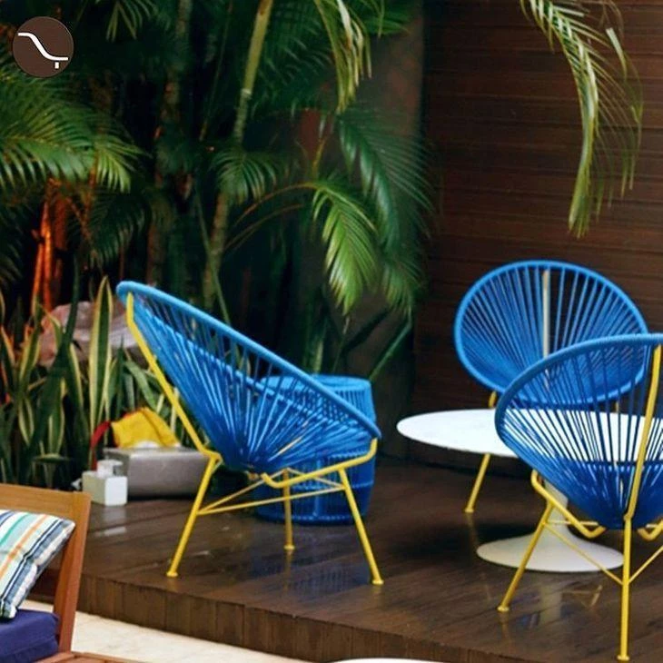
Of course, it depends a lot on personal taste to compose the decoration, but it is possible to combine pieces that are considered sumptuous with color to brighten it up.
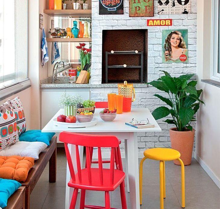
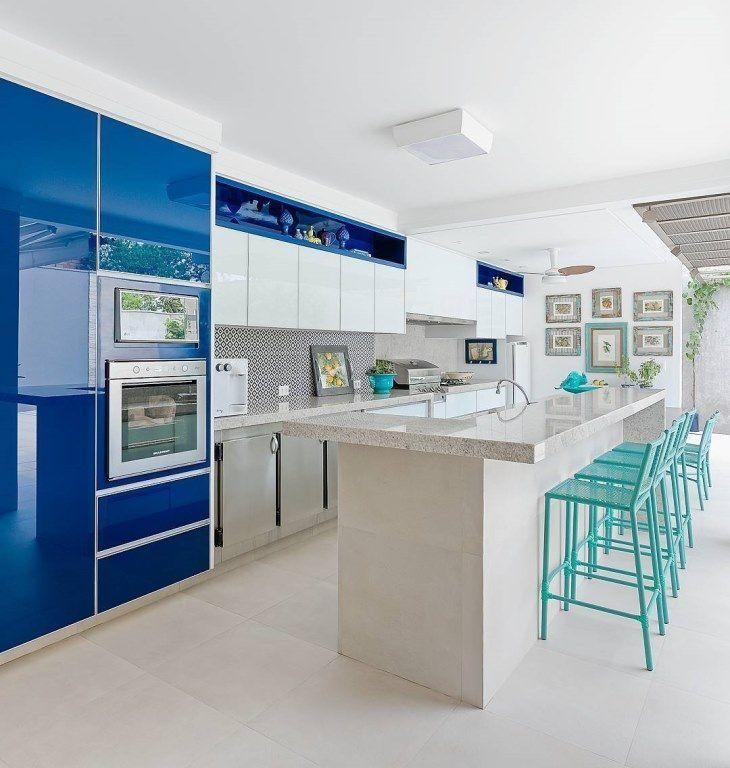
Colorful furniture for the kitchen
According to Sandra, the right bet is on warm colors (red, yellow, and orange) and their variations: "But you can also bet on a mix of warm colors with white and wood. Very light tones leave the kitchen with a clean look, even with the colors".
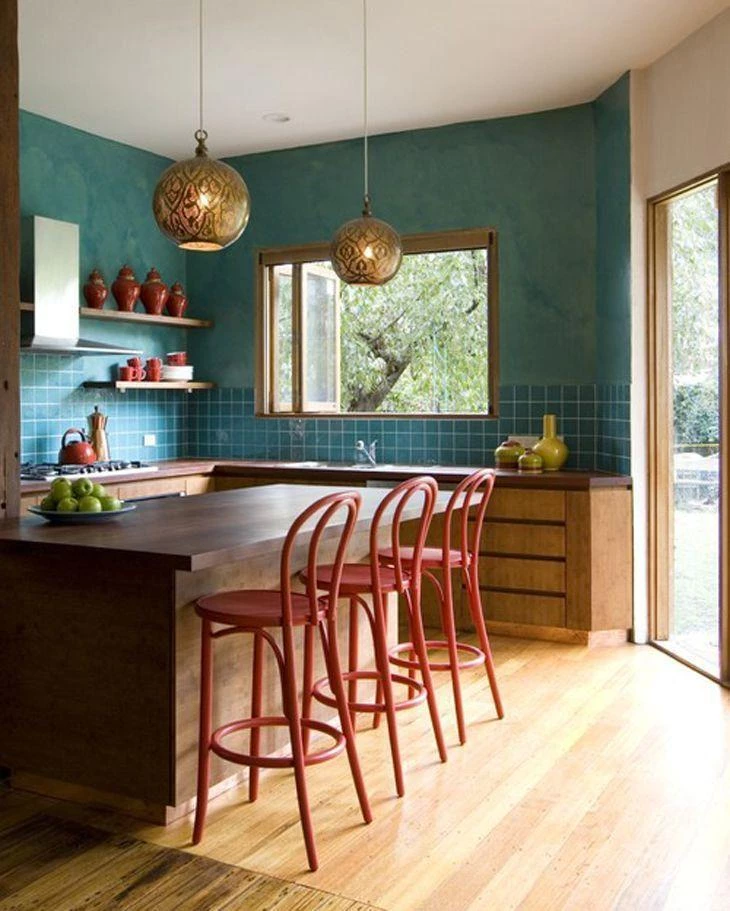
61. a touch of red

The red sink pairs with the small countertop. The highlight is the small points of brightness in the piece. The other cabinets, in white and wood, not to compete visually.
62. highlight piece
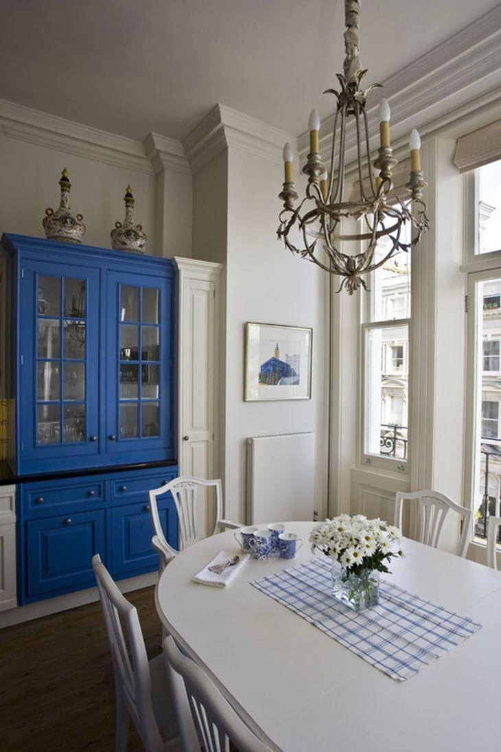
The kitchen with classic airs gained prominence in a piece in the corner, a beautiful crystal cabinet, in a vivid and very strong blue. To compose the rest of the decoration, the colors white and cream. Small details in shades of blue still appear.
63 - Colors that complement each other
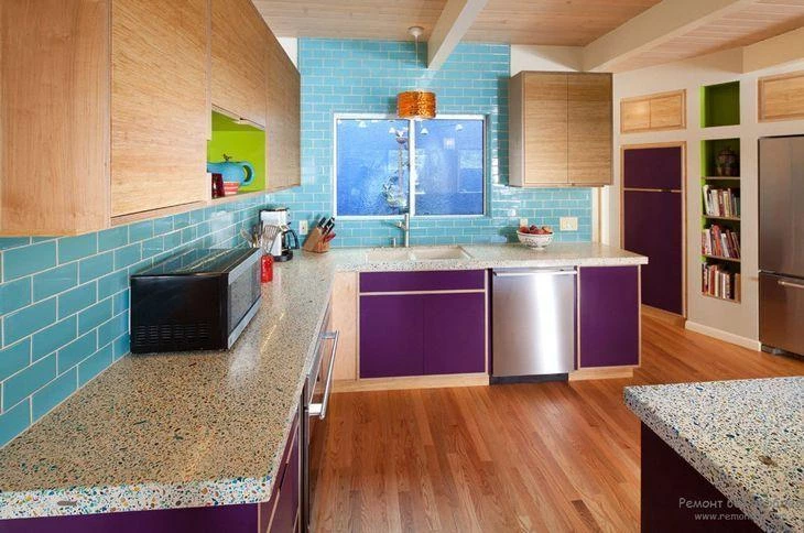
Wooden floors and furniture, for the basic of colors. A wall with water-green tessellations to lift the mood of the room, which also has stools and decorative objects in red.
64. sobriety in the kitchen

A small room calls for lighter colors to create a feeling of spaciousness. In this case, the idea was to create a more sober environment, hence the choice of a closed blue. White and light wood tones are perfect for not visually diminishing the space.
65. retro touch
Some brands are betting heavily with the launch of retro appliances, those that you look at and remember that you had one just like it at your grandmother's house.
66. yellow-white light
Yellow lamps have fallen into disuse for a list of reasons. In their place, white lamps reign supreme. Use yellow chandeliers with white lamps, preferably in large rooms, the result is impressive.
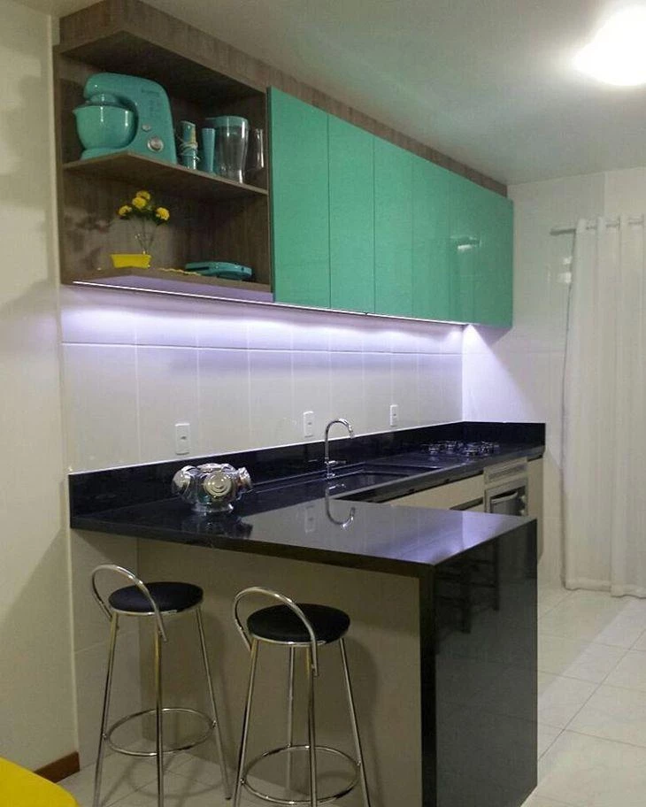
67. mint Combo
A colorful piece of furniture is not enough, you must also have an extra item in the same color, and very charming, to draw attention. In this case, the same color as the cabinet appears in the mixer and utensils.
68. soft red
Of the many shades of red, opt for a softer shade if you want to use it abundantly in the kitchen, especially if the room is small or narrow. Use black or stainless steel appliances to create an interesting color combination.
69. yellow kitchen

A soft yellow environment can become even more interesting when combined with small details in very different colors, such as bright red and a more delicate blue. Use stainless steel appliances.
70 A detail makes the difference

Sometimes one (or two, three?) colored detail makes all the difference, like a colored appliance (or just a part of it), for example, like this built-in oven. Or a little garbage can, or a different part of the floor, like this tile idea.
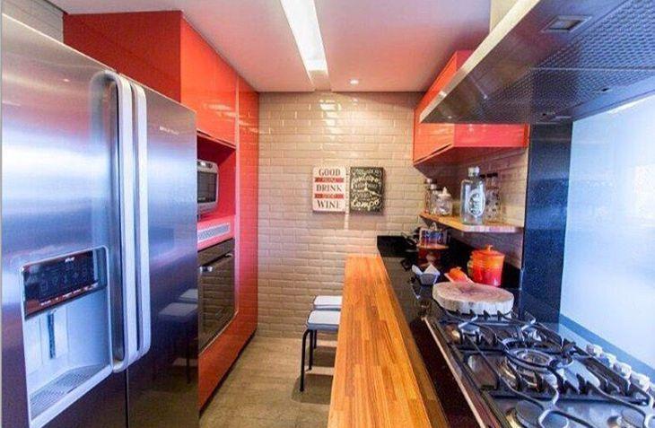
71. orange cabinets
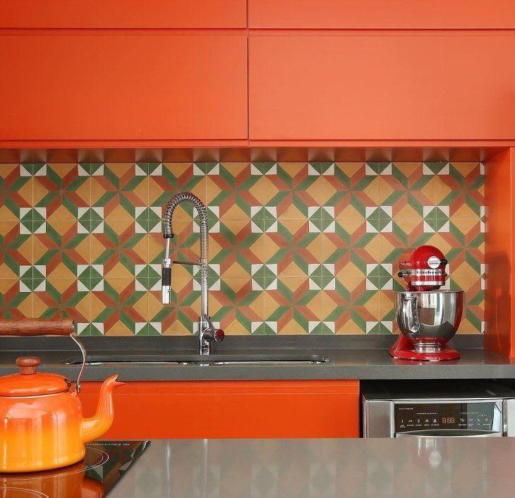
The orange with the geometric tiles made the environment modern in the right measure. Even the kettle follows the same color palette!
72. almost pool blue

The use of exposed brick on the walls and classic color furniture (such as the wood cabinet, the granite countertop, and the black stools) allows for a touch of relaxation in the cabinets. The chosen color was a light blue, almost in the pool version.
73. prime colors
You know the order of the box of colored pencils? from white to black? If you are afraid of making a mistake with close colors, or cousins, just follow this tip! Colors that are close together always match when used together in decoration.
74. color mixing
The definition of white is, in fact, "absence of color". Black, on the other hand, is the combination of all colors. But if you mix white with black, the result is gray. So, use this trio to decorate your kitchen. The combination is, without a doubt, perfect.
75. candy combo

Candy colors are light colors, just like the ones on cotton candy skewers (rescue your childhood memory). The furniture appears in a very light greenish gray, leaving a clean environment, and the high chairs in candy yellow.
76. sure bets

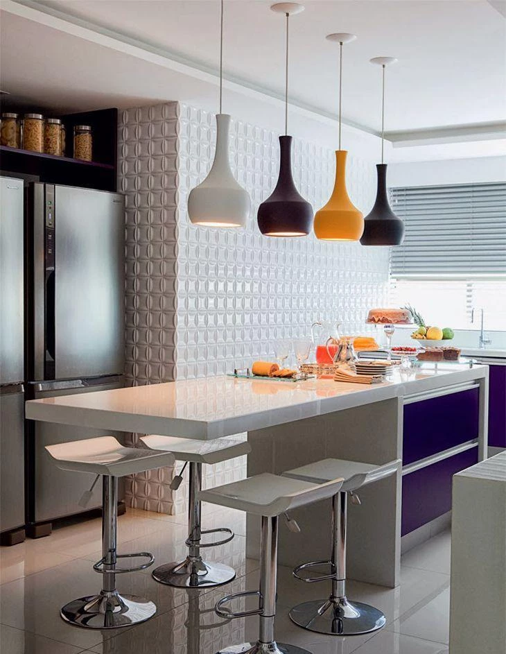
The central island has a black base, and the white countertop makes everything more balanced. To close with a golden key, stainless steel countertops.
77. fifty shades of blue

Tall cabinets in navy blue, cabinets under the sink, in the famous "panty blue" tone. On the countertop, the light blue utensil kit and the pair of spice grinders in a dégradé of the tone. On the shelf, aqua blue cocotes, and over the sink, more objects in shades of blue. Perfect for those who are in love with this color!
78. a little red dot

No, this isn't one of those "What is it, what is it?" ones, but it could be. The little red dot in question here is a set of chairs that appear in the background of the kitchen, which gains even more prominence in a completely neutral room.
79. fear of colors
If the fear of risking colors speaks louder and forbids you to dare, opt for using color in a small piece of furniture. Here, the chairs of the small bench, which serves as a side table and for quick meals, were the ones chosen to gain a touch of color.
80. flag green

The use of the wall and the cabinets in this shade of green looks amazing in this super spacious kitchen full of wood from floor to ceiling. The combination is made even more interesting by not having a single color of wood. The use of natural wood is nature's contribution to a differentiated decor.
81 - Abuse of nuances
To avoid leaving the kitchen with just one color, you can choose a color and use other shades of it in some details. Besides making the cabinet with more than one color, the utensils can follow the same palette.
82. basic room

This kitchen does not have many details in its structure, it is very basic, but it was well decorated, with the sink cabinet in mint green, tiled adhesive wall, colored window and a few utensils, each one in a different color.
83. total black
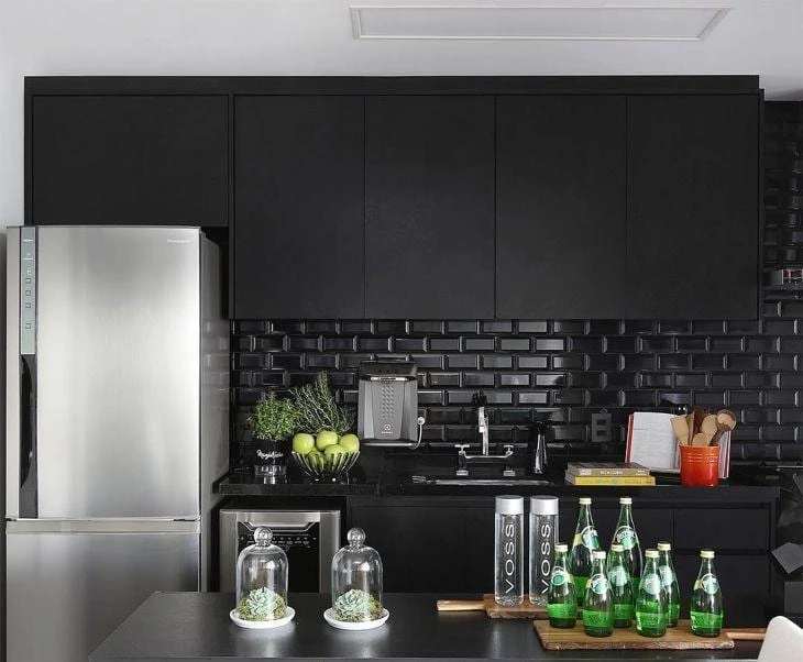
The total black look is not only requested on the fashion runways. The kitchen got black subway tile, cabinets and countertops also in the same tone. The stainless steel appliances make the look more sophisticated.
84. peace of mind
Chromotherapy is a therapeutic method that uses colors to regulate the balance between body, mind, and emotions. According to the technique, the color blue brings patience and serenity, sensations that you can certainly feel while resting on this balcony.
85. gray and pink

An unusual, but very successful color combination: pink and gray. You can use it on furniture and upholstery, and on details such as chandeliers and utensils.
86. break the white
If you love a completely white kitchen, this is an idea that might appeal to you. Instead of leaving it 100% white, give it a light touch of color with pendants of different colors. If possible, use an ensemble.
87. Is white a color?

If we take into consideration that white is the sum of all colors, then it can indeed be considered a color! This rectangular kitchen seems to be even larger with white cabinets covering its entire length.
88. support bench
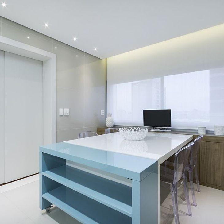
The idea of a continuous surface is great in small rooms. Note that attached to the window, a buffet takes the entire length of the wall. Next to it, a white table. To finish the space a baby blue countertop, which also has shelves, being another option of cabinet for the small room.
89. inspiration from the arts

You can tell that whoever decorated this kitchen is an art enthusiast and loves Romero Britto's work, since the cabinets have well-defined, geometric edges, and each little piece has strong colors, like the artist's works.
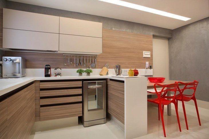
90. table as a highlight
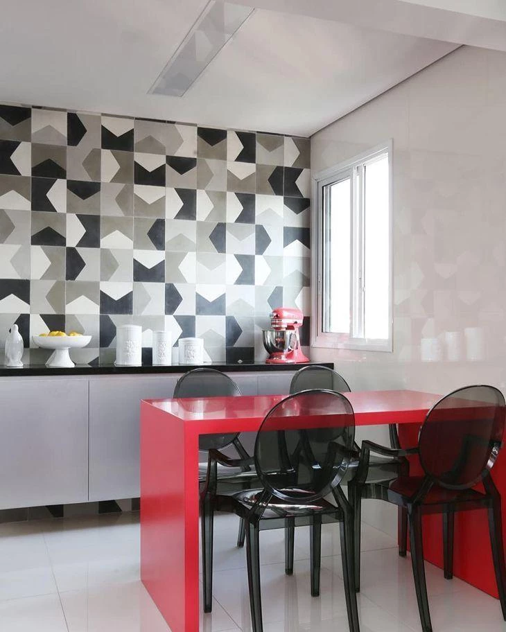
From the floor to the ceiling, the kitchen was completely decorated in black, white, and gray, colors that complement each other and are perfect for any room. To break up the trio, two red spots: the small dining table (with beautiful acrylic chairs) and the dreamy mixer behind the counter.
Colorful Bathroom Furniture

Usually, bathrooms are forgotten when it comes to color, and almost always the bet is on more basic, light colors or monochromatic combinations. Innovation is on account, at most, of a mosaic of tiles.
If you are part of this group of people, instead of using a strong color in predominance, the architect's advice is to bet on significant points to receive color: "The bathroom is a small environment and used many times a day. It is possible to use colors, there is no fixed rule. The important thing is to follow the style and personality of the client in decorating this room as well", which is, many times,almost forgotten.
91. leafy green
If you want to add a touch of color to the en suite bathroom, but which does not clash with the rest of the room's decor, the option is leaf green and its variations. The color has a calming effect, perfect for creating a relaxing atmosphere in the bathroom after a tiring day.
92. blue the color of the sea
It looks like this bathroom has several colors, but it is actually a few shades of gray: the lightest one in the toilet, a darker tone in the tile, another tone above in the mirror's frame and the darkest one on the floor. Because of that, the blue wood (used as covering for the whirlpool, sink wall and cabinet) stands out.
93 Copper and lead

The environment mixes clean and sober, with light colors on the floor, wall and countertop, and the sober shade of lead blue on the cabinet under the sink and mirror frame. The differential is the tub, coppery and with silver details.
94. rococo black

Black is always a good choice, whether in decoration or on the catwalks. And here, once again it proves that it can be called "basic black", and that it changes any environment. This bathroom has a refined air thanks to the combination of the color with rococo elements.
95 In the bathroom you can also
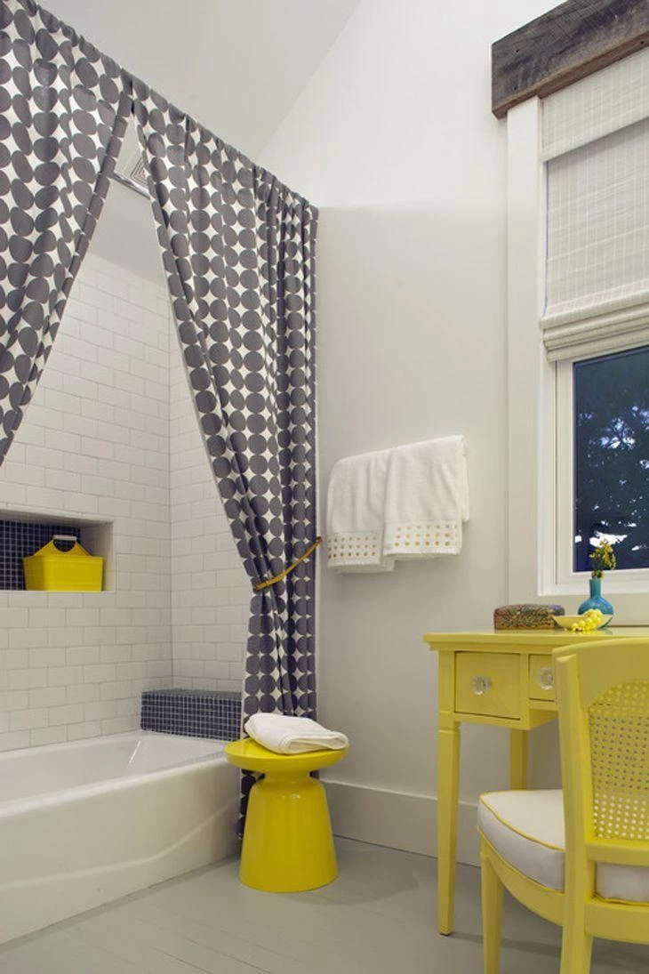
The duo gray and yellow is increasingly present in the decoration of various rooms of the house, and can appear in the bathroom as well, either on the shower curtain, a stool for the bathtub or other auxiliary furniture and details in bath items.
96. inspiration from the Indies
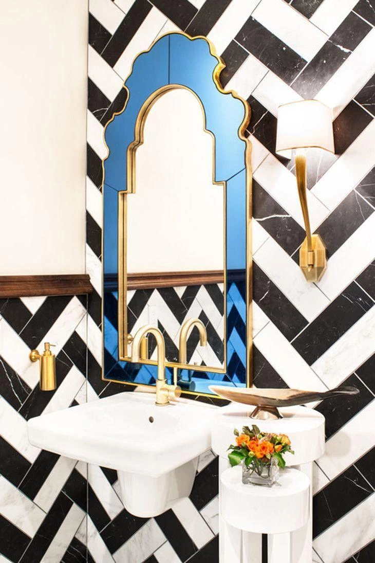
The use of the black and white diagonal tiling is already different in itself, so it is already possible to identify that the resident has very refined tastes and is bold. And it is the boldness that speaks louder also in the mirror, with a colored mirror frame with an Indian touch design and golden details scattered throughout the room.
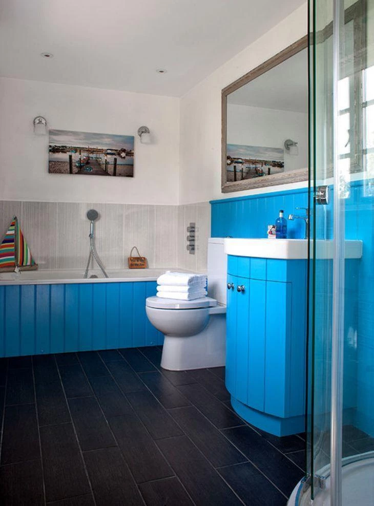
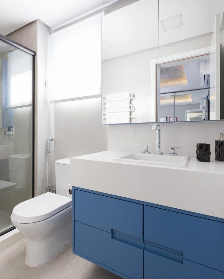
97. blue bench
The small bathroom received a strong blue countertop. The use of strong colors diminishes the environment, so the entire wall was covered with a mirror, which helps to enlarge (and in this case, balance) the bathroom.
98. retro haberdashery
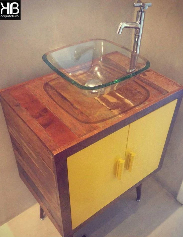
The toilet was given a charm by the retro cabinet, which serves as a base for the sink, transparent, to completely show the piece of furniture. The doors were given a new color, to give a touch of modernity to the piece.
99. wallpaper in the same tone
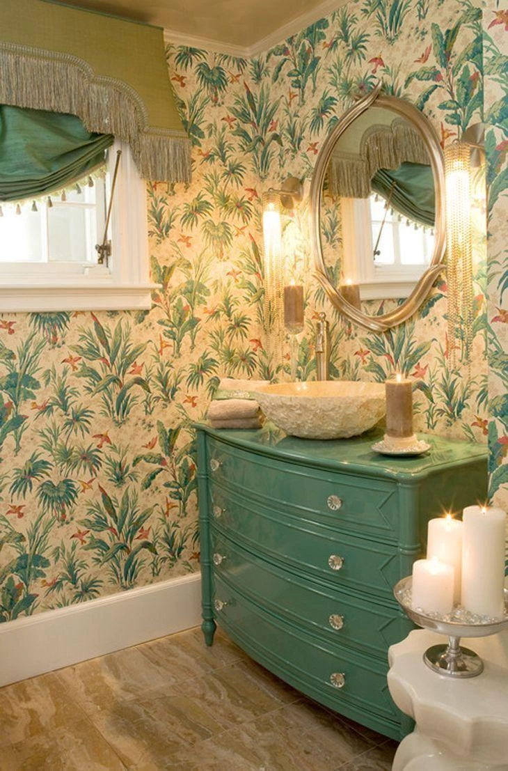
If you are not afraid to dare, envelope your entire washroom with a wallpaper that has details in the same shade as the furniture. The green appears in the old dresser, which served as the base for the sink, and changes a little in the curtain, but continues in the same palette.
100. light Candy
A very light green, lighter than candy green, lighter than the so-called baby green. It is like a splash of green paint in a bucket of white paint. Even though it is so subtle, it gives the room another face.
101. featured frames

The touch of color comes in yellow, which appears in the mirror's frame, on the mini shelf, and on the pendant.
102. soothing blue
According to chromotherapy, blue is a calming color, so it's perfect for the en-suite bathroom. On the wall, a very light shade. The dark closet doesn't deviate from the palette, and is perfect to house those fluffy towels and the stock of toiletries.
103. earthy tones
An environment with earthy tones doesn't need to be dull. Here, wood appears in abundance in its natural tone (in the door, the arched beam, and the side table for the sink). The color of the wall, in the color of clay, also appears in the sink. And a detail that may go unnoticed: the side table is actually the headboard of a bed, turned upside down.
104 Closet in the bathroom
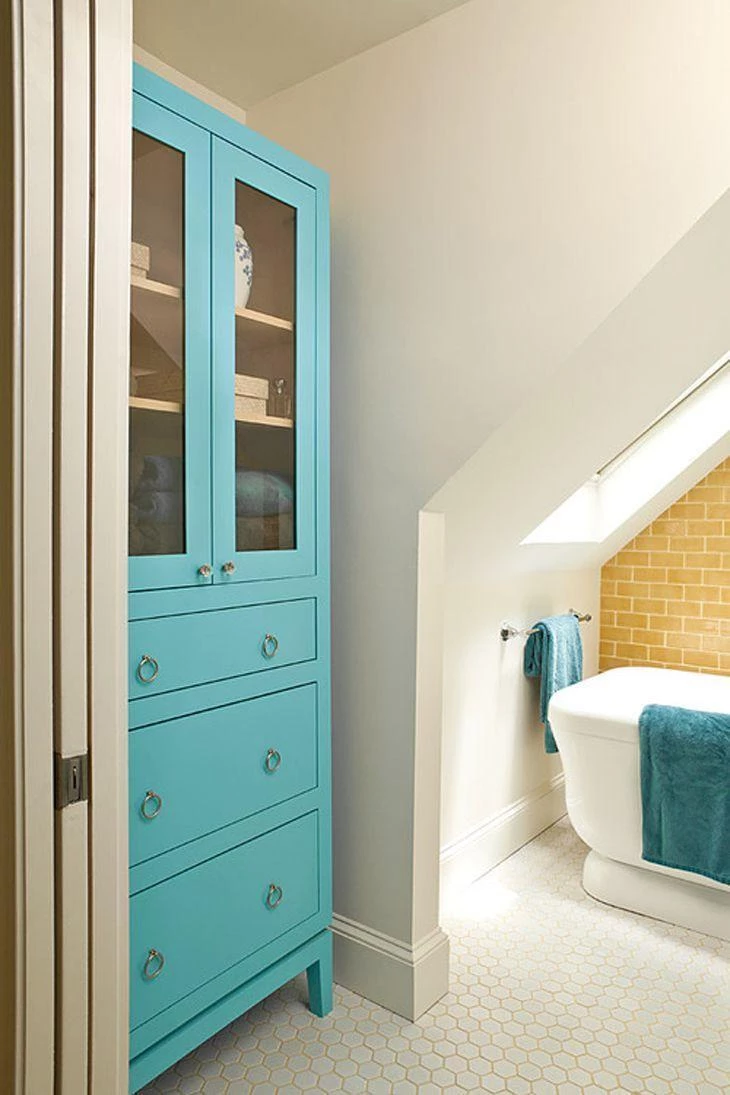
If you have a spacious bathroom, it is worth investing in a nice cabinet to store towels, bathrobes, and toiletries. The suggestion is to use a light color.
105. children and youth
If siblings share a bathroom, it is possible to please Greeks and Trojans as well, or rather, children and teenagers.
106. home spa
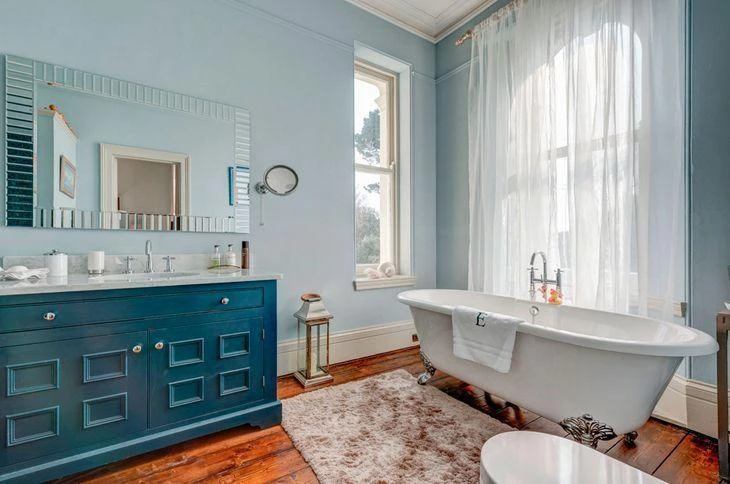
The huge bathroom gets a spa-like feel with the combination of the elements: the colors (white, blue, and white), the furniture (framed mirror, cabinet under the sink, and classic bathtub), and the decorative items (curtain with slight transparency, floor lamp, and rug).
107. cabinet in the bathroom

And what about moving the furniture from one room to another? Homes that have large bathrooms allow the use of larger pieces of furniture. Here, a brown and mirrored cabinet stands out, housing the hygiene products. The wood is exactly the same tone as the detail on the floor.
108. resting corner

A holiday in the afternoon calls for a rest, to regain energy for the next school day, so make sure you choose the furniture in your resting corner. Use cheerful colors to leave you full of energy and excitement for the next day.
See_also: Types and models of outdoor fireplace to enjoy the cold days109. White on it!
Just like the color black, white is often unnoticed because it is so neutral that it is not considered a colorful piece of furniture when found in this color.
110. cotton candy color
The bathroom gets a retro look with the set of items used. The highlight is the duo of blue and pink, very light, in the colors of cotton candy. The antique cabinet combines its charm with the tile, picture, mirror and decorative items.
111. camouflage color

Sometimes the color is so "neutral" that it seems to be camouflaged. This bathroom, in earthy tones, has the mirror's frame and the base of the sink in brown. The pink wall and the sconces with yellow lights help to create an intimate atmosphere.
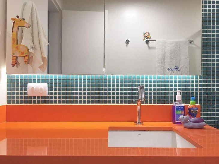
112. color point
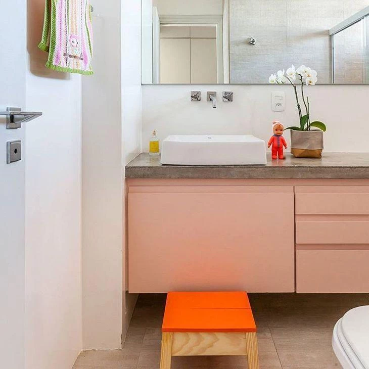
The bathroom sink cabinet appears in a candy color, a beautiful light pink. A flower vase on the countertop gives a touch of femininity to the environment, and the point of color comes with the stool.
113. reused ton
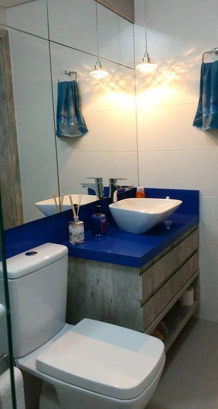
A more sophisticated decoration welcomes reused items. This bathroom, all worked in sober colors and fine coatings, got a navy blue vat, which serves as a base for the tub.
114. nude bathroom

Nude was the choice for the en suite bathroom. The old chest of drawers under the sink was given a facelift with a coat of gray paint. The sconces with yellow bulbs create a cozy atmosphere in the bathroom.
115. delicate salmon

The only reason the bathroom is not completely white is the grayish color of the floor, which is very similar to the color of the slate.
116. white and blue

In this idea, the same tone of wood appears in the highlighted strip of tiles, and one wall gets a touch of color from the same palette.
117. color cabinet
Light bathroom with a blue cabinet to break the ice.
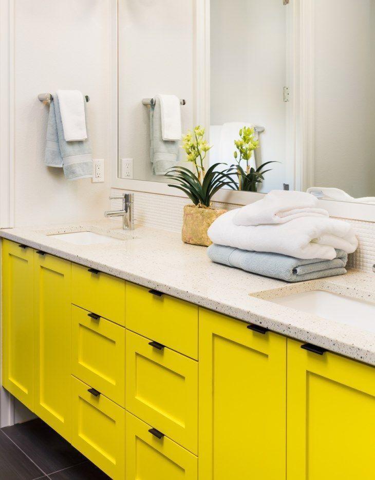
118. spacious and colorful

The spacious bathroom has a marble partition, which serves as a support for the sink and mirror and divides the wet area. The large cabinet, below the countertop with two sinks, receives the opaque yellow tone, which looks great in large environments.
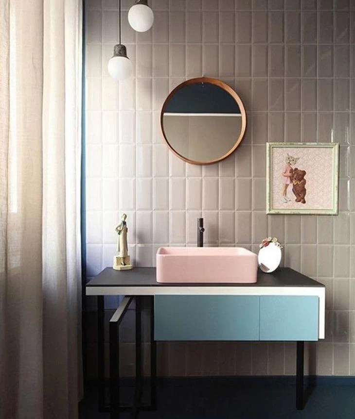
119. gray and magenta

The white of the bathroom is broken by the countertop area, which also gets an outline in the mirror in gray. The bottom of the cabinet, in magenta, leaves the bathroom with an amazing combination, delicate and feminine.
120. luxury in the right measure
The antique design of the piece is responsible for creating the atmosphere of elegance, and the size of the cabinet and countertop give the air of luxury is just the right measure. The yellow color leaves the environment with a touch of modernity.
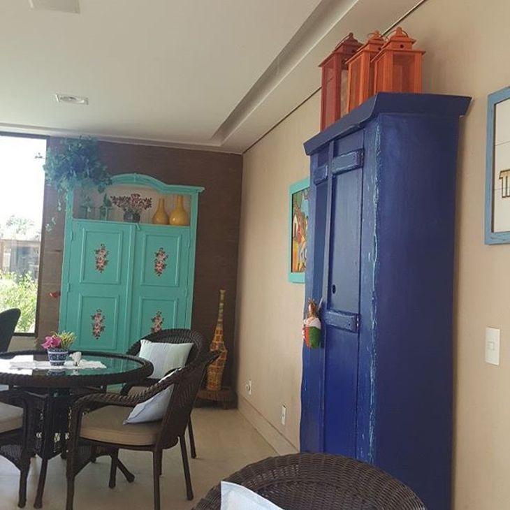
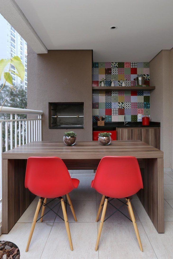
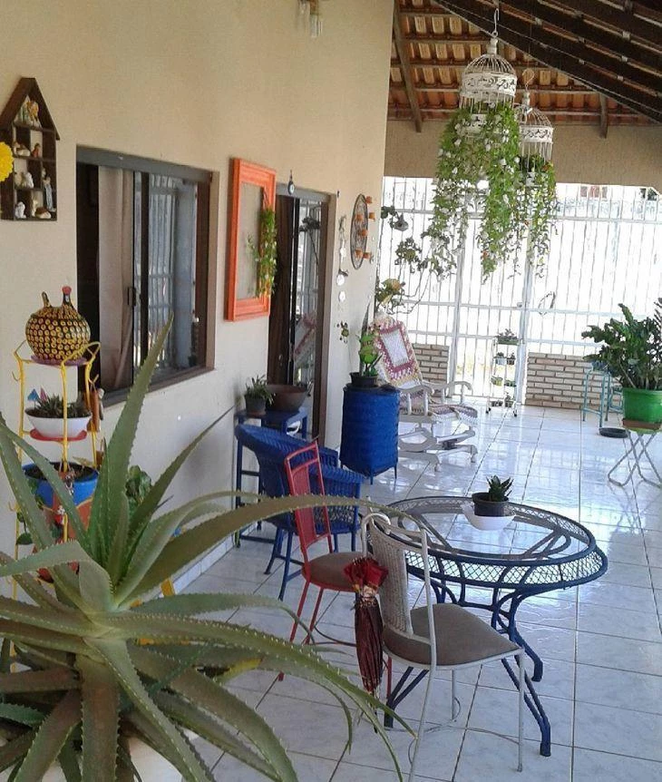
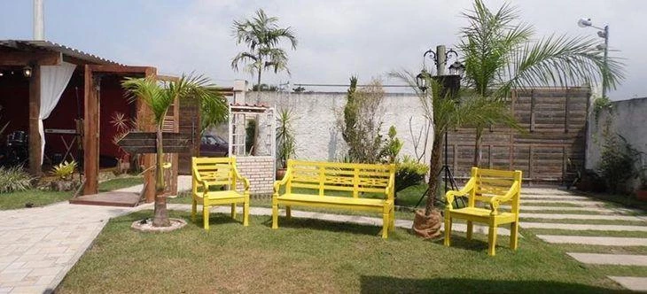
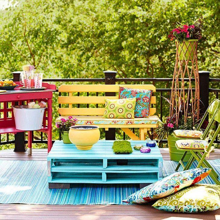
Colorful furniture for balconies and terraces
The balcony can be considered a blank canvas. Whether it is a small apartment balcony, or huge balconies, with gardens full of plants and flowers: colors are always very welcome. From dark blue to yellowish and brownish tones, or tone on tone of green, together with red. Or even several shades of the same color. Options abound!
"The combination of contrasting colors is beautiful in these rooms. If you are afraid to dare in the colors of the furniture, use specific fabrics for outdoors, in various colors", explains Sandra.It is recommended that the upholstery fabric be neutral", warns the professional.
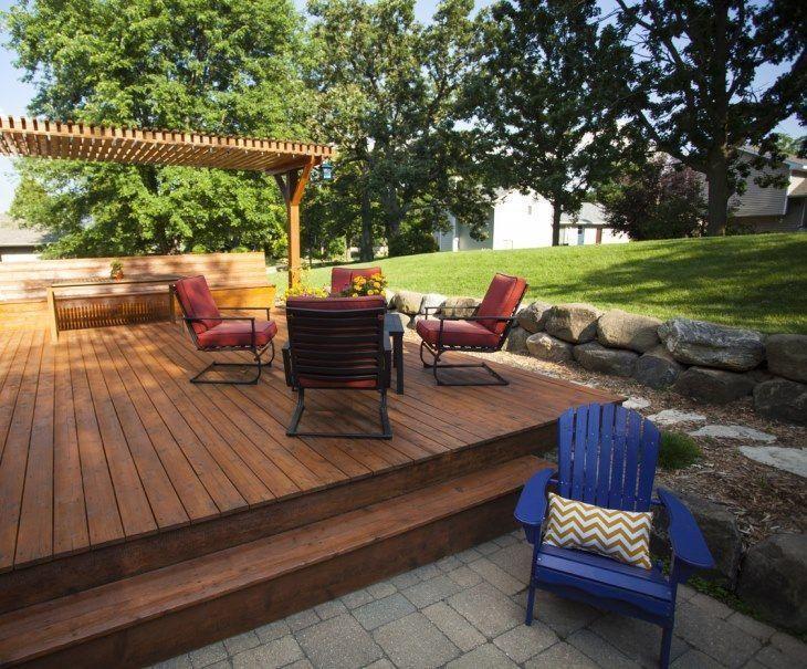
121. space to relax

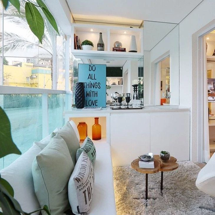
The semi-open veranda is an invitation to relax. If it's hot, open the windows and let the breeze in to cool off. On a cold gray day, nestle into the armchair with a cup of tea and the book of the moment. The colorful sideboard adds a relaxed touch to the space.
122. dark blue in the cabinets
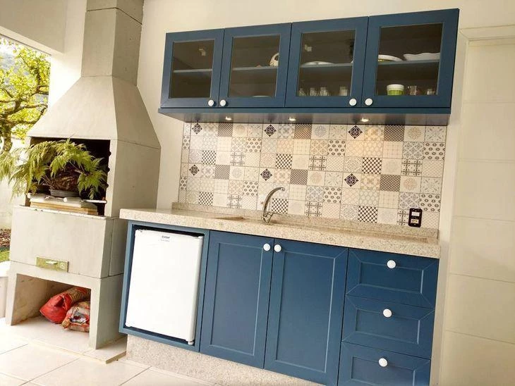
The barbecue area got a set of dark blue cabinets, under the sink and high up. As this space has a high circulation of people, it usually gets dirty easily, and the dark color helps not to leave the wood with grimy stains.
123. beach air
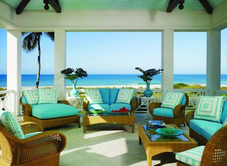
This beach house balcony is fantastic, perfect for a nice chat, smelling the sea and that late afternoon breeze. The shades of blue, framed by the white structure, makes the scene look like a movie set.
124. wicker wine
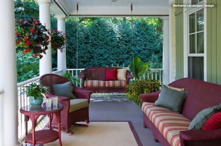
The veranda has a classic air with the appropriate furniture for the space. The wicker has a wine tone and upholstery with stripes, with colors in the same palette. The pillows, in three colors (red, gray, and cream), give softness to the environment.
125. glass gazebo
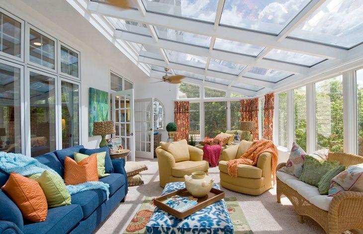
The veranda was just an extension of the house, like a backyard, but it was completely glazed, becoming a gazebo. The furniture has several colors, but they match each other.
126. summer talk
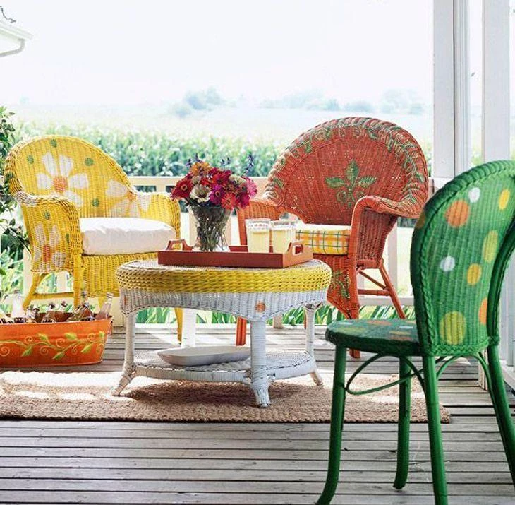
Do you know that hot day that calls for a nice cold lemonade, preferably accompanied by a good conversation? For this idea, the perfect scenario is a balcony with furniture in warm, summer colors.
127. clear glass
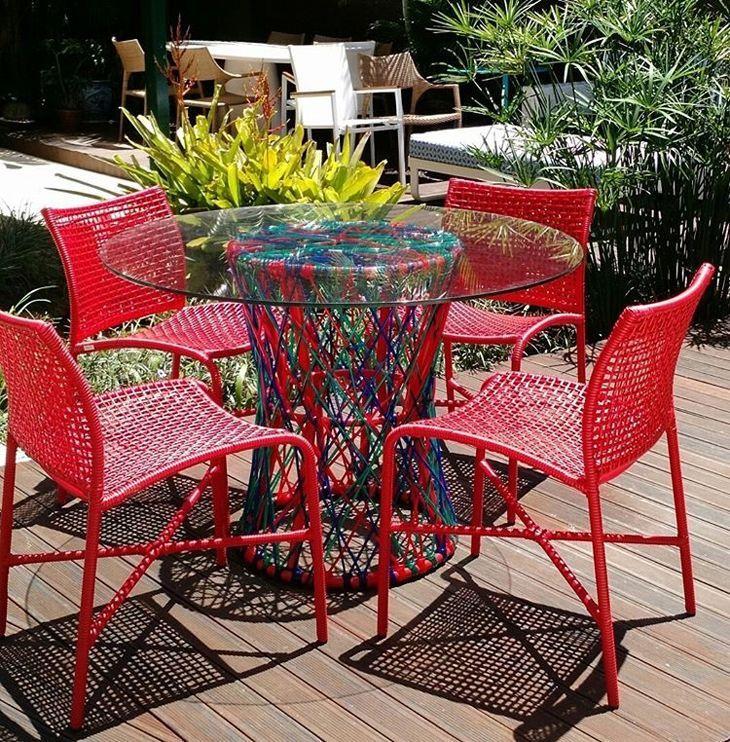
The chairs are blood red, very bright, and the decoration is completed with the table's base, made of colorful trellis (also highlighting the red). The transparent glass top allows the whole set to be seen.
128. zen corner
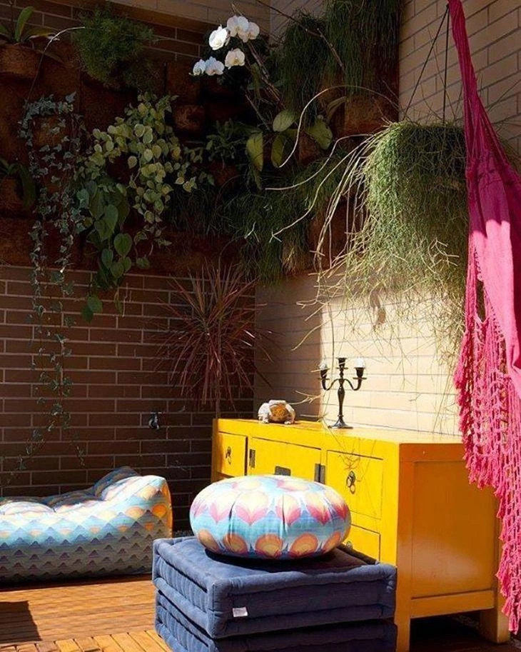
The veranda was decorated in such a way that it would become the zen corner of the house, perfect for resting, reading or meditation. For this, colorful pouffes and futons on the floor, a pink hammock for an afternoon nap, and a very cheerful buffet.
129. double dynamics
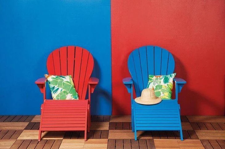
It looks like a painting! This super creative decoration proves that with few resources it is possible to create a beautiful corner. The simplicity makes the scene even more charming. Two colors, only, on the wall, with the same colors on the loungers, inverted.
130. miniature balcony

There are balconies that are huge enough to fit even sofa sets, but if this is not your case, don't be discouraged.
131. colors in the details
This balcony has glass all around it, so it can be closed - ideal for places with a lot of wind or cold. The fuzzy rug gives the feeling of hospitality, and the colors appear in the details of the decoration.
132. primary chairs
The primary colors, those that are pure (cannot be created from other colors) are always a sure choice for a cheerful decoration. The blue and yellow of the chairs can also receive a red cushion or garden seat, to complete the trio of colors.
133. cheerful environment

Balconies are basically places where people spend a little time to relax, so use cheerful colors to lift the mood of the place. Here, the use of two small coffee tables.
134. friends meeting

This type of decoration can be either for a leisure area in a hotel or for the veranda at home. The chairs of the same color and the stools of another make a visually pleasing ensemble, perfect for friends to sit while enjoying nature.
135. colorful veranda
The small gourmet veranda is full of colorful details. You could say that the base of it is neutral, with the white brick grill wall, light gray floor, white cabinet and wooden bench. The colors appear in the seating, cushions, futons, table utensils, and decorative pictures and objects.
136. special balcony
The veranda is the perfect space to relax with your loved ones or have a nice barbecue. The colorful chairs harmonize with the tiles and the brown tone of the wood, which brings a cozy feeling to the gourmet veranda.
137. indoor house
It is very difficult (almost impossible) to find one-story houses with large verandas in any capital city, but in the countryside it is common to find these spaces, so nice to spend hours catching up on things. Usually very large, these verandas are perfect for unleashing creativity when it comes to decorating.
138. once upon a time... A bed

Antique beds bring the charm of all the curves and designs with rococo inspiration. If the headboards are reused, they can form incredible stools!
139. happy hour

The end of the year is always the same question: where will the farewell party be, with happy hour and Secret Santa? This would be the perfect scenario! Hot weather, furniture suitable for relaxation, an umbrella to avoid the sun at the end of the workday, and lots of color to liven up the mood!
140. small detail
Think of a versatile piece of furniture.... It's that old bedside table! It used to belong to grandma, passed to auntie, and now it's yours. Give the little guy a new face and change its place. It doesn't necessarily have to be in the bedroom. It can serve as a book sideboard in the garden and make a charming place there.
141. lead is also color

Lead gray is that shade of gray that is closer to black. Besides the fantastic benefit of getting very little dirty (for the joy of housewives), it also allows very cheerful color combinations, such as red, wine, copper, and gold.
142. reusable material
Wood: a material that can always be reused, in many different ways, and to manufacture infinite projects.
143. passionate gourmet balcony
Royal blue cabinets, tiffany blue chairs, and white on all sides: it is impossible for such a charming combination to go wrong.
144. pastel shades
Before the term candy color, there was a lot of talk about pastel shades, and they are what appear in this gourmet micro balcony. The most intense colors are the leaves of the cacti and succulents, and a single red chair.
145. gourmet balcony

The construction companies are increasingly investing in buildings with large balconies and gourmet verandas. Unleash your imagination when decorating, and use striking colors to make this corner of the apartment very cheerful to receive your guests.
146. black and white

Black and white is to decoration what rice is to beans in cooking (both in taste and color). The combination is right on, and the colors give the feeling of good taste!
147. one day of vacation
Summer vacation, kids excited about the trip... And what do you imagine? Beach, pool, fruits, popsicles, beach umbrellas... A profusion of colors!
149. handicrafts in the décor
If you master the needle arts and understand crochet and knitting, make colorful pouffes, and combine the color used in them with other details in the same room, such as decorative objects and pillow covers.
How to paint the furniture at home

Most of the furniture used today is made of MDF or plywood, with a Formica or laminate finish. Some basic steps are the same for solid wood furniture. Check out the step-by-step:
Step 1 - Sanding: The first task, to start the painting process, is to sand the wood vigorously all over the piece, even in the corners - you can take advantage of this moment to remove burrs and corners that can hurt. Leave the surface very smooth. You can't see it with the naked eye, but the wood will be more porous, perfect to receive the paint.
Step 2 - Repair: If the piece of furniture has been dropped or has dents in it, use wood filler. Use a spatula to fill the desired space, wait until it dries, and then sand again to leave a completely uniform surface.
Step 3 - Base: the idea is the same as for the nail base: it is not a mandatory item, but it helps and facilitates the coverage and durability of the paint. preferably, opt for a base of the same brand as the paint that will be used.
Step 4 - Paint: Don't forget that there are specific paints for some areas. If you are going to paint a piece of furniture that will be exposed to the weather, prefer oil-based synthetic enamel. If the furniture is going to fill a corner of the house, there are more options: acrylic, spray, and synthetic enamel.
Step 5 - Drying and covering: Now it is already possible to see the change in the furniture. wait for the first coat of paint to dry and apply two more coats of paint, respecting the drying intervals between one application and the next. after the painting is finished, it is time to cover it. to do this, apply a layer of matte spray varnish over the entire surface. the product helps to maintain the shine and protect the furniture.
What is the best bet?

20 colorful furniture to buy online
Colorful furniture always adds a different touch to any environment. Here are some ideas of products that can give your home a new look:
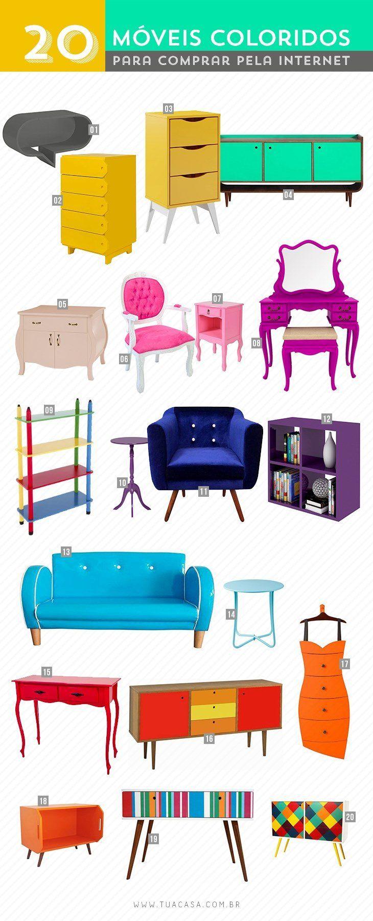
- Product 1: Cartoon Oval Shelf - Buy at Aiup
- Product 2: Drawer Drawer Tag Canary Yellow, Buy at Meu Móvel de Madeira
- Product 3: Nightstand Pop 3 Drawers - Buy at Muma
- Product 4: Buffet 3 Doors Dylan Maxima, Buy at Extra
- Product 5: Dresser Doors, Buy at Aiup
- Product 6: Medalhão II Provencal Carved Chair Buy at Cidade dos Móveis
- Product 7: English bedside table, buy at Objetos de Madeira
- Product 8: Vintage Dresser. Buy at Shoptime
- Product 9: Colorful Bookshelf In Wood and Mdf. Buy at Submarino
- Product 10: Triky side table - Buy at Tok Stok
- Product 11: Decorative Armchair Suede Acetinado - Buy at Americanas
- Product 12: Nicho Adapte Grape. Buy at KD Stores
- Product 13: 2-seat Sofa Rock My Child Synthetic Leather - Buy at WMB Store
- Product 14: Azalea Side Table - Buy at Mobly
- Product 15: Louis XV Sideboard with Two Drawers - Buy at Cidade dos Móveis
- Product 16: Buffet 3 Drawers 2 Doors Vintage. Buy at Madeira Madeira
- Product 17: Dress Dresser. Buy at Aiup
- Product 18: Vegetable Box Bedside Table. Buy at Trekos and Cacarekos
- Product 19: Sideboard Home. Buy at KD Stores
- Product 20: Losangulo Cabinet. Buy at KD Stores
Colorful furniture is a sure bet to give your decoration a face-lift! Invest in a colorful piece, either bought ready-made, or an old piece of furniture that can be given a new face! What matters is to make your home increasingly beautiful.
See_also: 70 Thor cake ideas for a party worthy of the gods