Table of contents
Decorating a bedroom can be a simple task, but it requires a bit of attention when the idea is to get away from the more of the same. Especially in a small bedroom, you can't get away from these essential items, but by choosing the right colors it is possible to make the room more stylish and personalized.
And when we think of a couple's bedroom, we have a mission to accomplish: the style should be as unisex as possible, so that the space does not look like only one of them.
See_also: 80 incredible wall covering ideas to renew your spaceWhen it comes to colors especially, the more neutral it is, the better, regardless of whether the style is rustic, contemporary, industrial, classic, or Scandinavian.
Colors also have a strong influence on the transmission of sensations and, for the bedroom, shades that evoke tranquility, relaxation and peace can and should be adopted. On the other hand, options that attract attention should be avoided. To guide your composition and choice of colors, you can use the chromatic circle and, also see below, inspirations of creative palettes used by professionalsBrazilians to leave the couple's room full of harmony and originality.
1. blue amidst the rustic
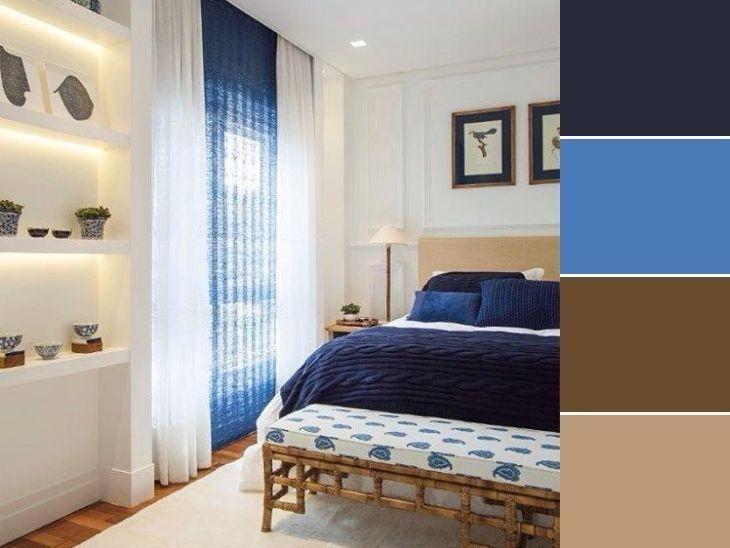
The neutrality of white gave lightness to the room, whose highlight color is dark blue married to straw. The tone on tone, here in blue, is always a good combination to take the monotony out of an environment.
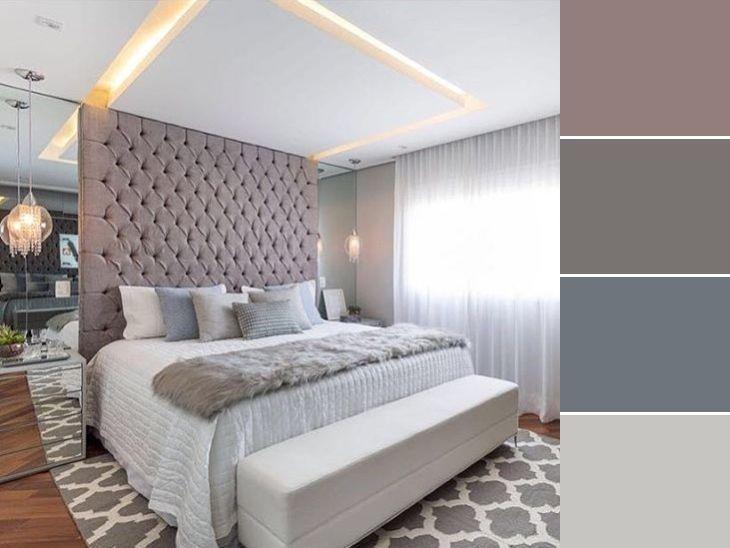
2. sobriety for the serious couple
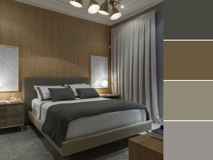
Several shades of gray were used in this room, one tending towards green and the other towards graphite. The wall was responsible for warming up the room, with its wood tone pulled towards a very cozy brown.
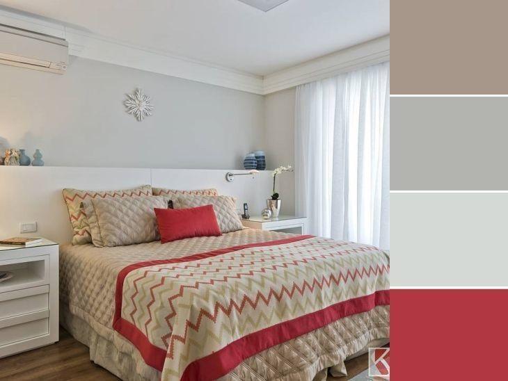
3. an environment full of comfort and joy
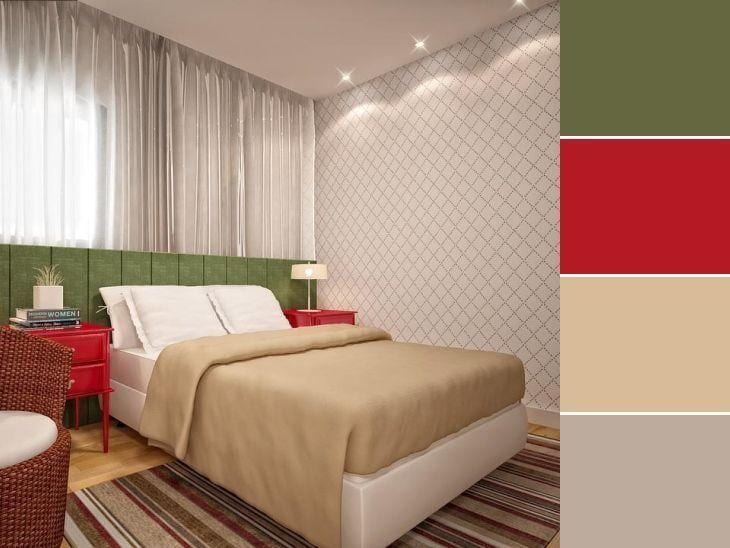
Warm colors can be adopted in rooms, when used with caution. In this option, red was included with subtlety in the palette, and transformed the neutrality of the main colors into something very cheerful and harmonious, without aggressiveness, appearing in the bedside tables and in details of the carpet.
4. is it a room or a dream?
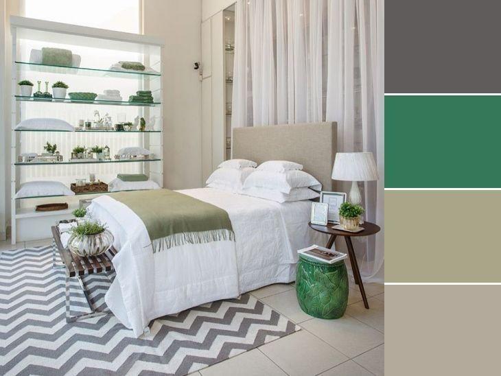
Here the green gave all the grace to the environment, used in small objects and in the simple detail of the blanket. All this combined with the much desired chevron rug guarantees a romantic and delicate decoration to the space.
5. an industrial option full of personality
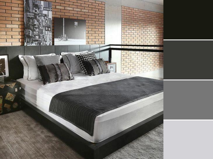
The cushions, especially the Pied-de-poule, gave a break from the masculinity of the industrial bedroom. The vintage style employed in the paintings and in the trunk also helped in this counterpoint.
6. a classic full of refinement
Once again, gray shows that it reigns supreme in the choice of sober colors for the bedroom. With white and gold, there is no way it can't be sophisticated and chic. You could say that this is a wildcard palette.
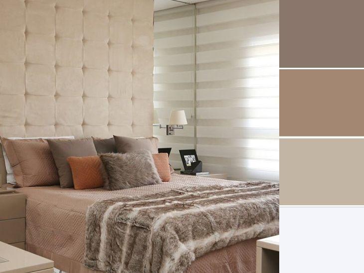
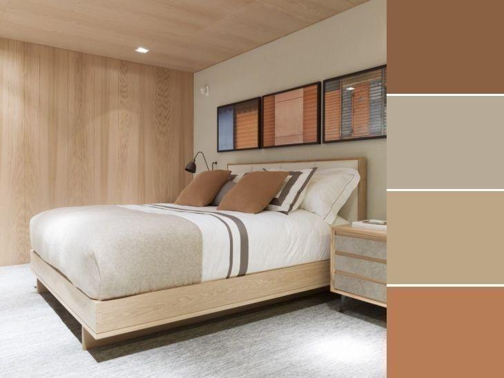
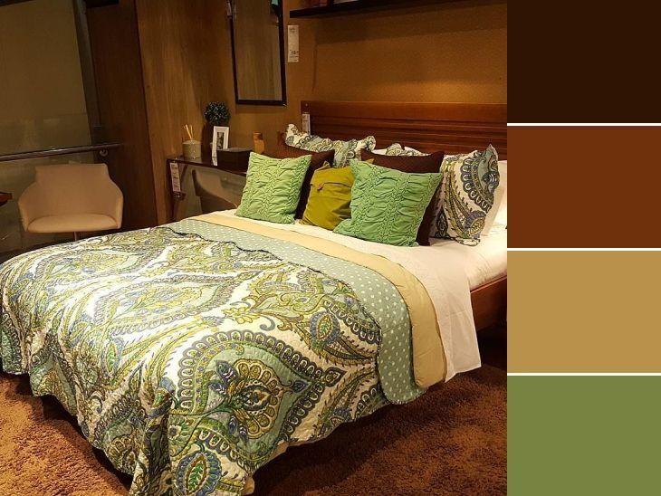
7. earthy + off-white tones
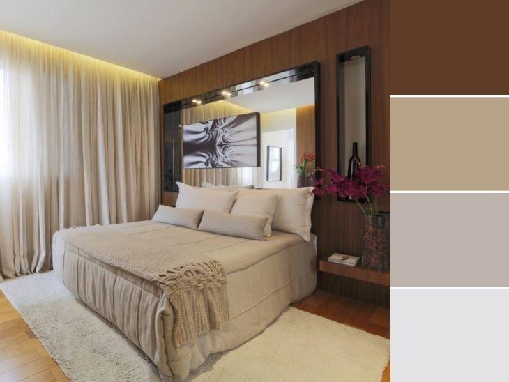
It is inevitable not to feel the coziness of the environment with this marriage of brown with neutral colors. The environment was warmed not only by the rug, but also by the choices of this palette.
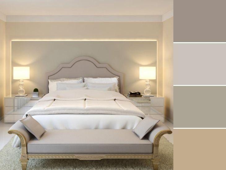
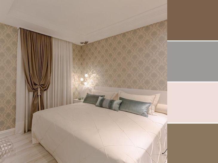
See_also: 70 apartment kitchen ideas to optimize your space8. cool colors are super comfortable
The high headboard and the bed's skin bring once again the classic gray to the bedroom. Of course, the white could not be missing to close the composition with a lot of refinement.
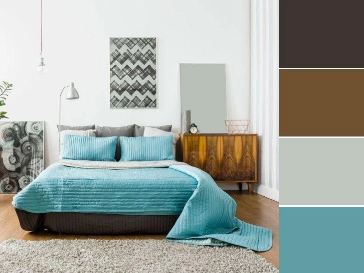
9 Who says that brown and blue don't go together?
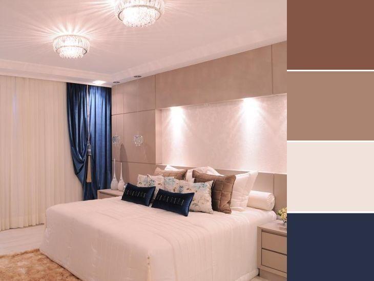
The navy blue was used in a balanced way, because it is a very striking color, and the idea here was to keep the softness of the tones as a highlight. And for this, the variations of brown were very well adapted to the style of the room, until it reached beige.
10. warm up the space with creativity
The colors don't need to be highlighted only on the walls; they can be included in the bedding, the pillows, and the decorative objects.
11. leave only one detail as highlight
In this inspiration, once again the bedding made all the difference in giving color to the room. It was the bedding that brought the earthy and warm tones, and kept the subtlety in the decoration even with a striking print.
12. when less is more
You can play with a single color and its range of tones to make the room minimalistic and balanced.
13. a true kings room
For those who don't want to be afraid of making a mistake, the choice of simple, neutral colors is a sure thing, and to break the neutrality, the patterned wallpaper added a touch of charm.
14. modern and stripped down couples
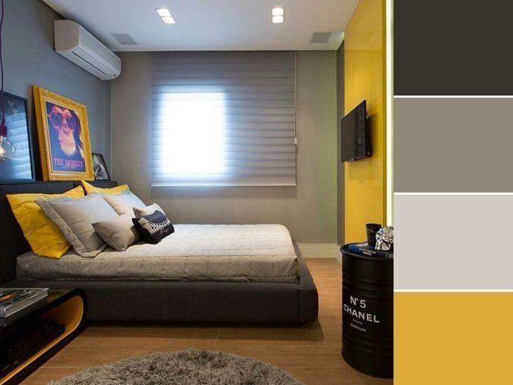
Yellow was applied in great style in this bedroom, even though it is not a color often used for this type of environment, but it was responsible for making the room modern and full of personality.
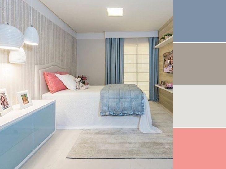
15. pink can also be unisex
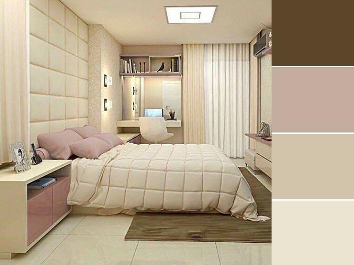
... used in the right measure. In this option, the tone chosen was quartz pink, a 2016 trend. The other colors chosen were in charge of taking any femininity out of the decoration.
16. ... and the blue one too!
How not to love this combination of candy colors with white and gray? The wood paneling made the choice more mature and versatile.
17. yellow + gray = love at sight
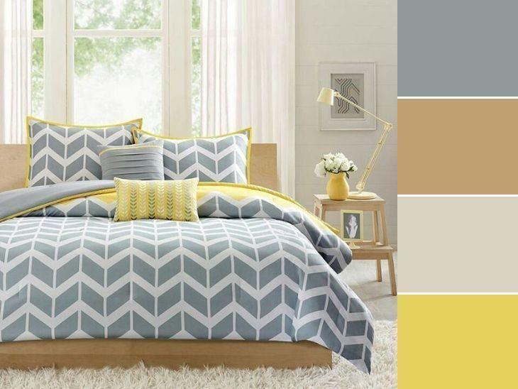
The couple's youthfulness was stamped in the room with this color palette. Delicate, fun, and cozy.
18. how about betting on grape?
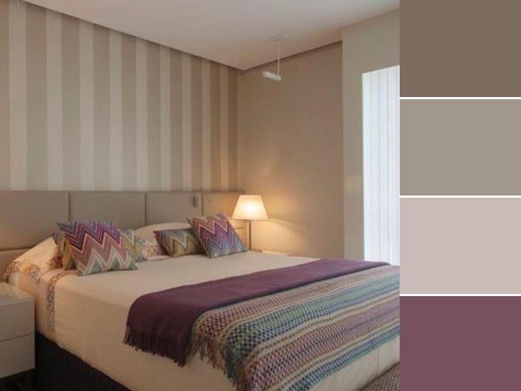
Although color is not the main feature of this decoration, it is what filled the room with joy. It is in the small details that the environment gains all the difference necessary for its personalization.
19. for those who like Scandinavian style
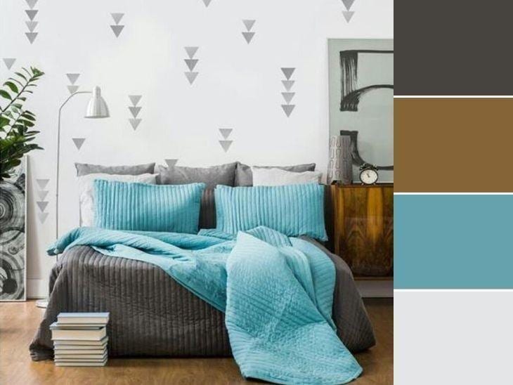
... but does not give up subtle touches of happiness in the environment. And in this case, turquoise played its role perfectly.
20. the important thing is to invest in your favorite colors
It is possible to create an environment with the so-called dry colors (those that cause less impact) and give all the comfort and tranquility that a bedroom requires. Besides, this is an environment that does not require much lighting, so even if your favorite color is dark, there is a way to favor it when decorating.
It is easier to understand the proposal when we transfer it from our head to a project, or when we see inspirations like the ones above. It is possible to give the impression we want for the environment just by choosing the right colors, and also to include personality in what apparently could be something very simple. Nothing like using creativity and good taste in our favor at these times. Take a look and seetips to get the color combination right.