Table of contents
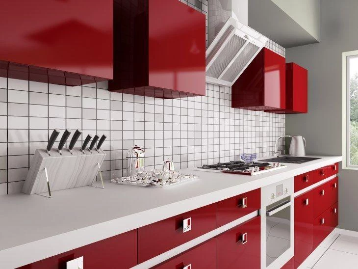
Every year we see how much people are trying to give personality to their homes, and it couldn't be different with the most enjoyable room in the house: the kitchen. And, if you want to be a little bold, how about a red kitchen?
Although it is more common to look for clean projects and neutral tones, with a few tips we see that it is possible to escape the conventional in an interesting and bold way, working well with the materials and colors. Red in its variations is one of the favorites for the kitchen, because it is a vibrant color, which brings energy and reminds us of power. However, the choice for this color in the decoration demands a certain confidence and power,When used wisely, it makes the environment more modern. The essential tip is:
- For the shy ones: It is worth coloring the kitchen only with objects and utensils, as isolated points.
- For the most daring: The focal point can be a countertop, cabinets, walls, the floor, or even the table.
For those who already see in this color the potential that we see, this post will inspire you.
1. cabinets in evidence in your red kitchen
Wine is a great shade for those who are afraid that the kitchen will be too bold. The tone is more discreet, but no less modern and was a great choice that predominates in the kitchen. The varnished finish looks very elegant with the clean decor, highlighting the cabinets.
See_also: The colors that go with gray and 50 ways to use them2. red on white
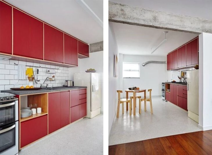
In this kitchen, even though the cabinet doors are red, the context between the white walls and the mixed wood floor dosed very well the kind of contrast they would like to have. The special detail is the wooden cabinet structure.
3. counter as the protagonist of the red kitchen
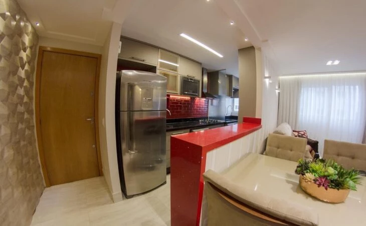
The focal point of this room that integrates dining room, living room, and kitchen is the counter. It is a super option for those who want to add a special touch without being too bold. The brick wall between the cabinets and the sink also brings a shade of red, which forms the composition of the room, but without taking the focus off the counter.
4. discretion and sobriety
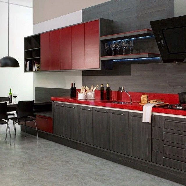
We can see that not every colored kitchen needs to be too bold. When mixed with other sober tones and materials, the burnt red brought color in the right measure and made the environment lighter.
5. all red
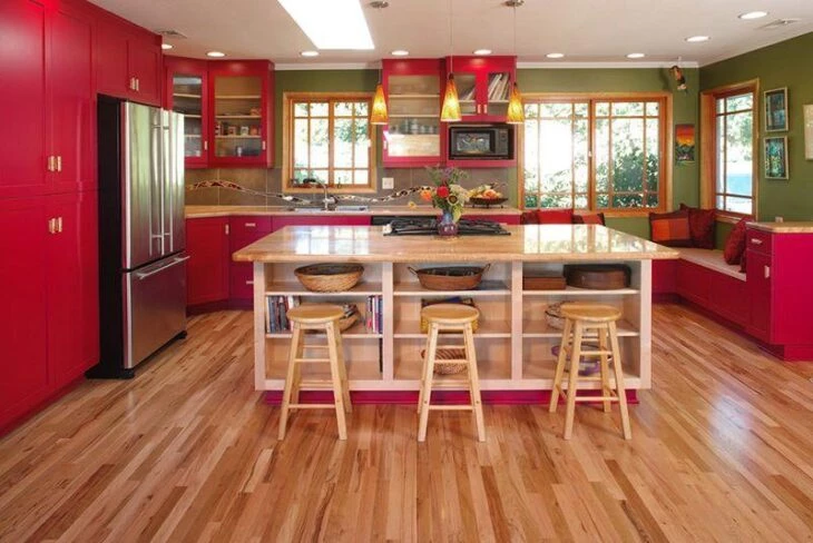
This is an example of inspiration for the more daring, who have a large kitchen. The predominant red left the environment cheerful, striking and very modern, without exaggeration due to the combination of the wooden floor.
6. reddish
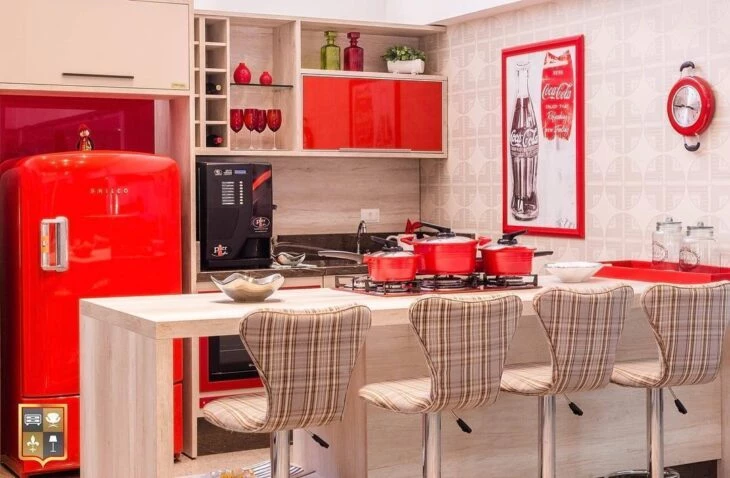
This project brings red in its brightest shade, but in details and equipment. Leaving the rest of the kitchen in a lighter tone is a trick for those who have a small kitchen but do not want to give up style.
7. red gourmet kitchen
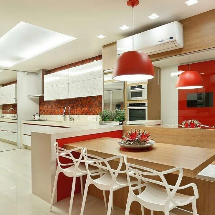
This kitchen is an example of a gourmet area, where those who are at the table are interacting with those who are preparing the meal. The red color brings life to the conviviality environment, besides being psychologically linked to the culinary. The elements such as the coating tiles, the pendant and the part of the counter call the attention composing the rest of the furniture, such as the super stylish Allegra chairs.
8. focal points
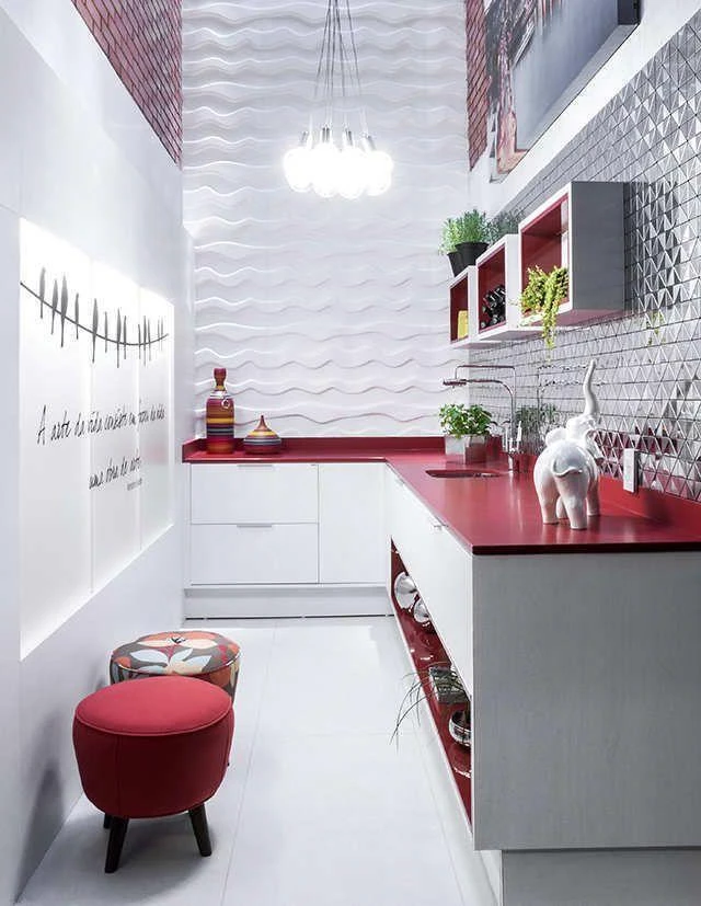
The mixture of elements, colors, materials and textures make this kitchen project unique. The highlight of the details is precisely because of all the surrounding in white. Without being too bold, the red brings balance to the environment.
9. multi-tone
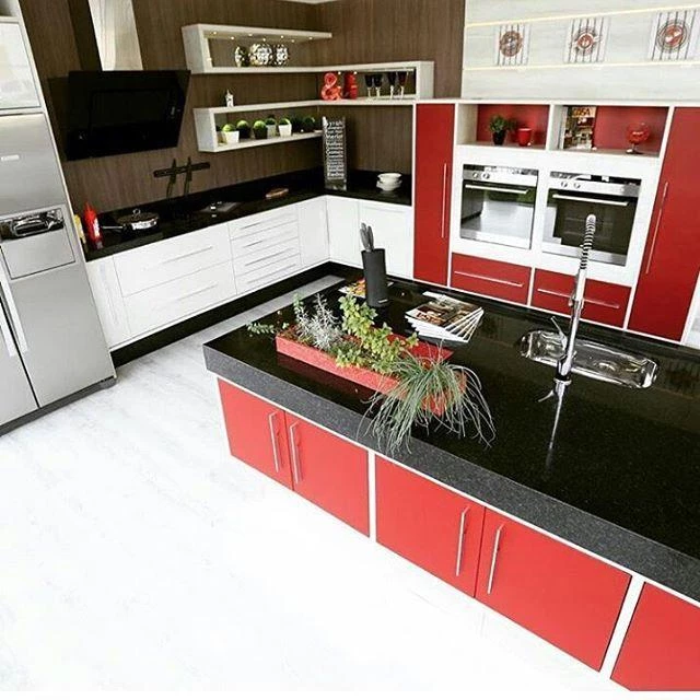
The secret to making the bright red stand out without overdoing it was again to use sober colors and materials for the composition of the environment. The harmony with the chrome made the environment more funky.
10. featured on the wall
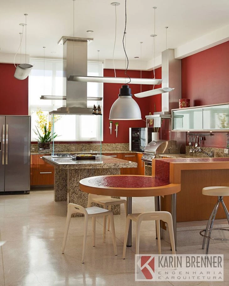
This project overwhelms the entire environment with its bold, elegant, red walls. Because of the focus on the sides, the composition of the rest of the room was more discreet, in the choice of floor, ceiling, and furniture.
11. small and colorful red kitchen
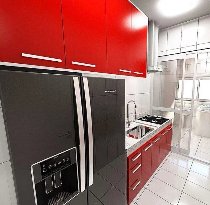
Once again we can see that the red on the lacquered cabinet doors takes on a much lighter face when combined with the white in the surroundings. The refrigerator brings the special detail, along with the observation that small kitchens can be colored, yes.
12. varnish
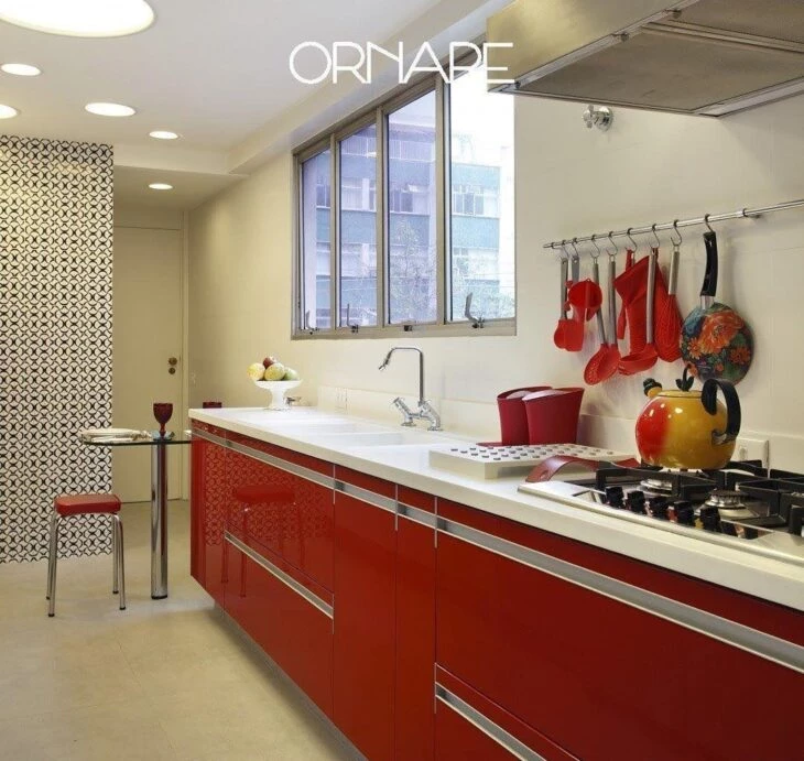
The varnished red appears again, this time on the countertop. The composition with the utensils and the contrast with the patterned wall make the environment much more cheerful and current.
13. simple and chic red kitchen
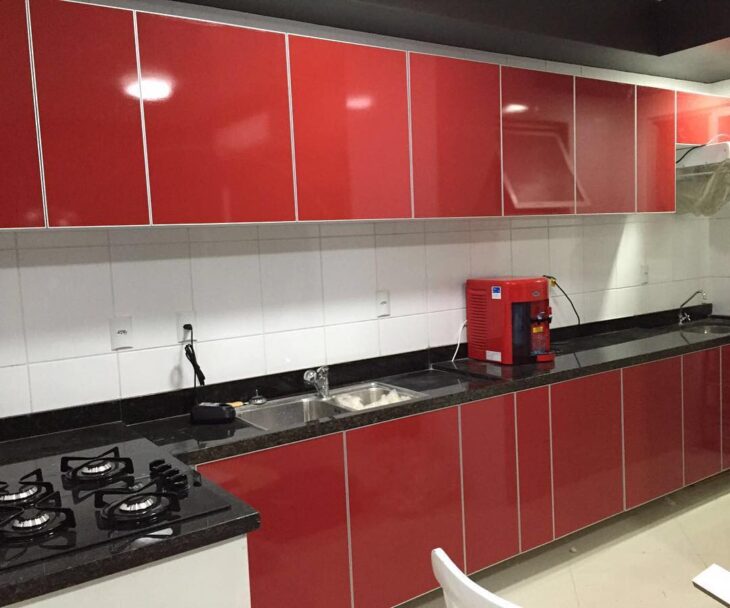
This kitchen shows the simplest way to bring personality to the decor, neutralizing all the elements and leaving the cabinets as the protagonists of the kitchen.
14. personality
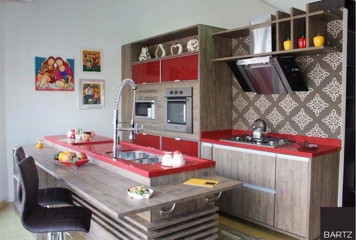
This project is one of the cutest things you will see today. The wallpaper matching the wood, the way they worked the textures and brought the red to add the finishing touch, represents the definition of a kitchen with personality.
15. shades of gray
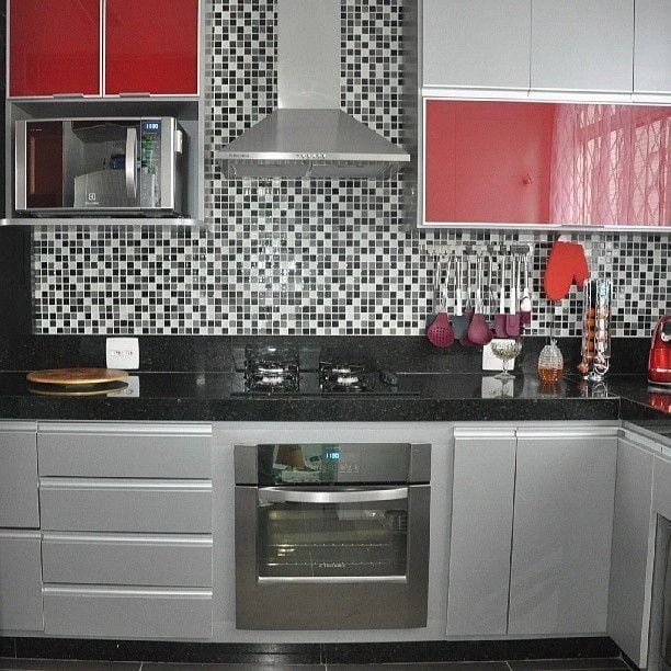
Gray also works very well in neutralizing, see? Red breaks the monotony of the environment, making it much more interesting.
16. luxurious
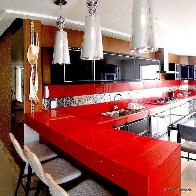
What could be more luxurious than this design? The all-red of this kitchen is made up of the stylish black lacquered cabinets, and the metallic details such as the pendants.
See_also: Tiles for bedrooms: 60 ideas to revamp your room17. industrial footprint
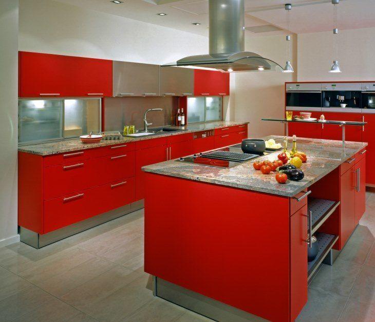
Once again we can notice the gray as the balance of the environment, with a very bold, industrial-looking red. This time the highlight goes to the silver.
18. marsala
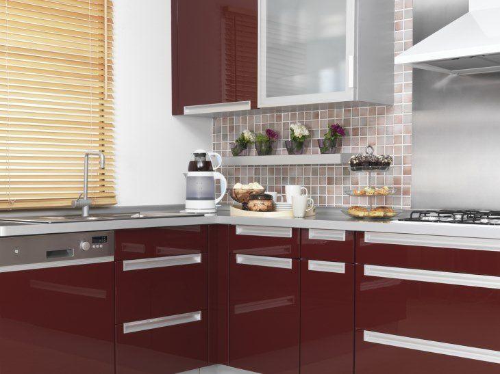
The marsala, present in the color of the cabinets and in variations of the covering, is contrasted with light tones making the environment more classic and elegant. The tessellations follow the same color palette.
19. contrast
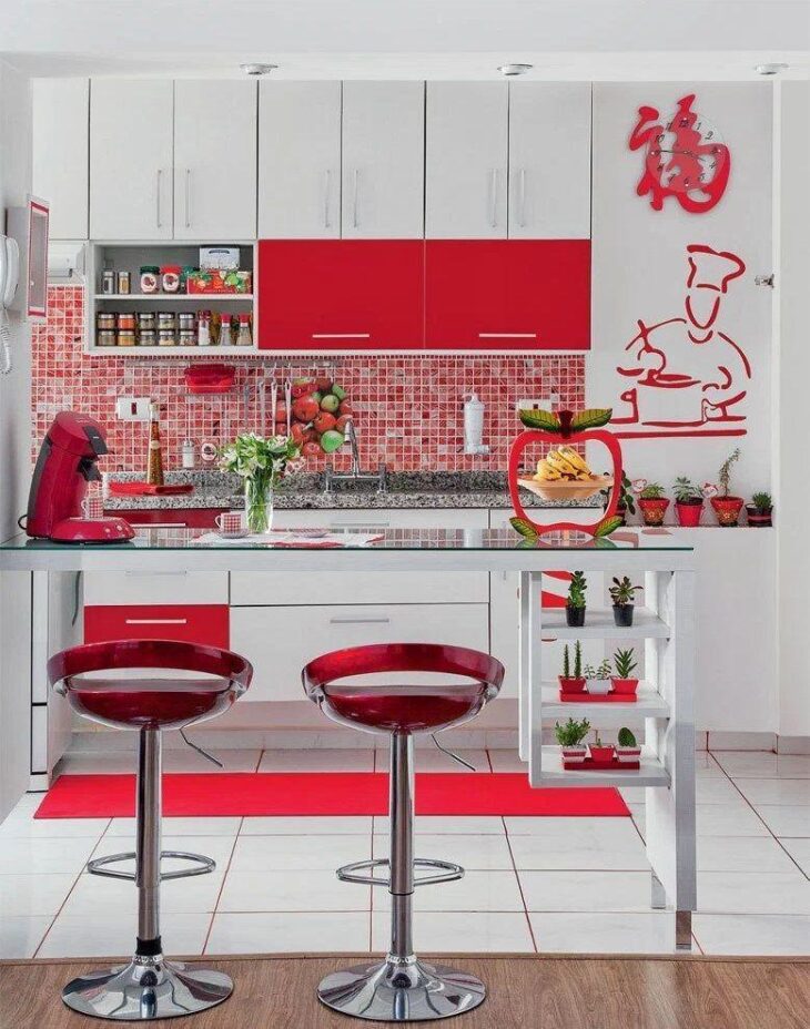
This kitchen is an elegant contrast of red and white, with the master chef sculpture and the red stools as highlights.
20. sober tones
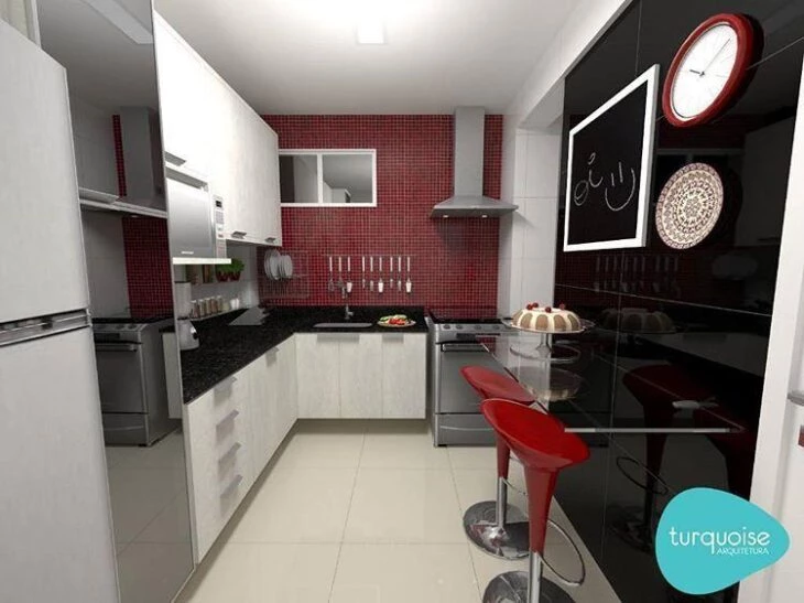
It seems that the black-white-grey combination forms the perfect combination with red, doesn't it? It is easy to identify that they are the favorite bets, because they combine elegance and modernity with mastery.
21. different shades
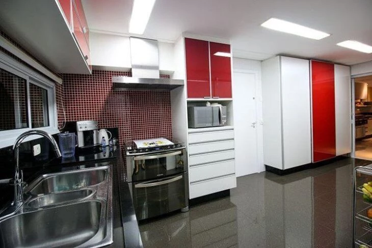
This kitchen contrasts the traditional black and white with the cheerful and elegant red in its shade variations, present in the tiles and in the cabinet doors.
22. organic
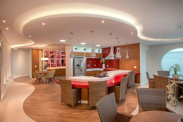
The detail of the organic shapes between the ceiling, floor, and furniture is incredible, and the crafted materials make the room worthy of many sighs.
23. modern and clean
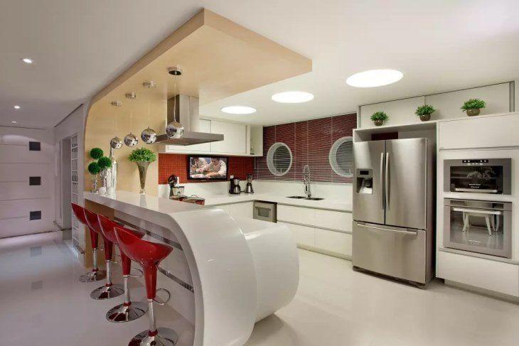
Iara Kílares, architect, is well known for her different forms, and for bringing an element as a focal point. In this project, she brings the surprisingly shaped counter composed with stools, red walls, and chrome pendants.
24. bench in the spotlight
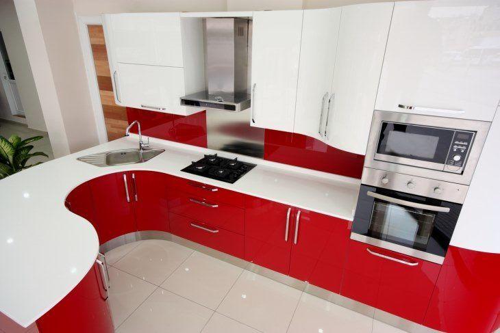
This kitchen preaches the concept that "more is more": more color in the cabinets, more color on the walls, and a countertop that no one can fault.
25. retro style
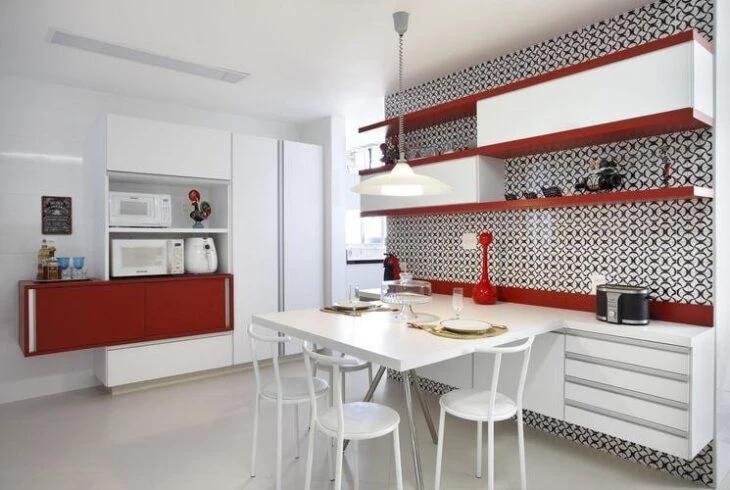
Despite the insertion of red, white prevails. The special detail is in the combination between these colors and the super retro wallpaper, full of personality.
26.luxury and elegance
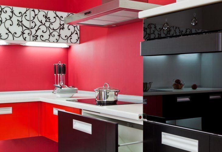
Once again black and red appear as bets for a luxurious and elegant environment. With a result like this, it is easy to understand why.
27. my heart is red
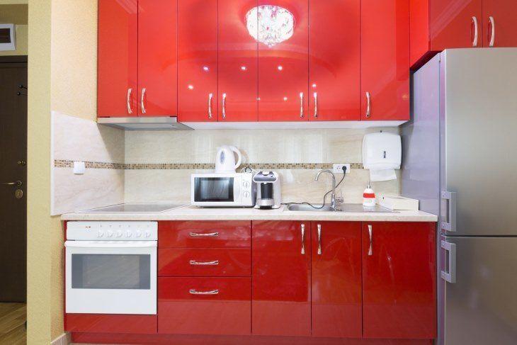
In its most practical and daring way to insert color in the kitchen: all red cabinets! In these cases, it is recommended to leave the neutral tones for the walls, so as not to visually overload the environment.
28. with blue
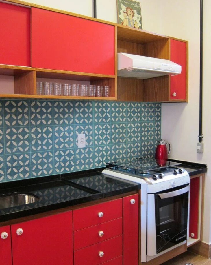
And who said that only neutral tones could make red survive? Look how the blue tiles gave this kitchen a lot of personality.
29. cabinets and counter
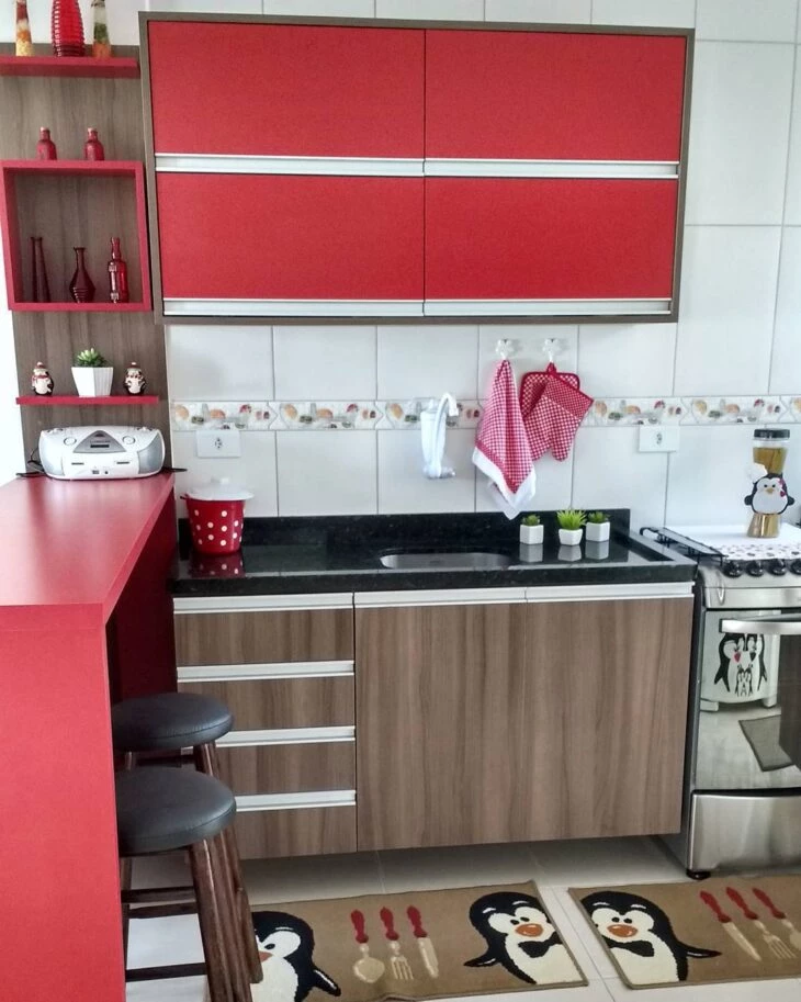
To bring a more relaxed look to the simple kitchen, the option was to bet on red cabinets and counter.
30. highlight for lighting
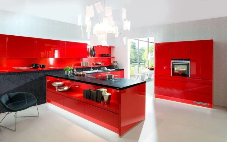
This kitchen works the varnish, the lighting and the colors in a luxurious way. Who wouldn't want such a kitchen?
31. vintage
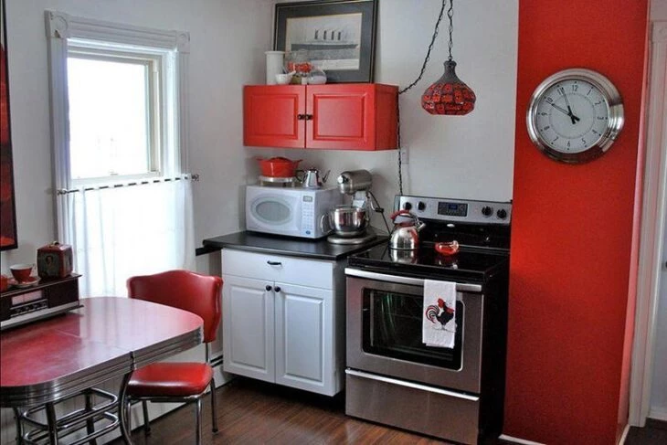
The combination between the antique furniture and the cheerful color makes this kitchen pure charm.
32. tiles and details
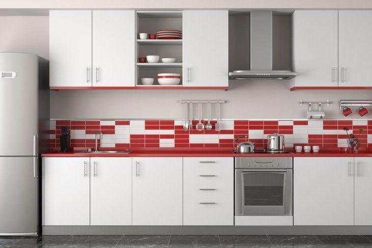
This is the typical decor for those who are still afraid of daring to dose up on red. The kitchen cabinets are all in light colors, a classic white. To bring out highlights, red subway tiles were used, asymmetrically, interspersed with white. The space gains color and beauty, but without drawing too much attention.
33. red and chrome
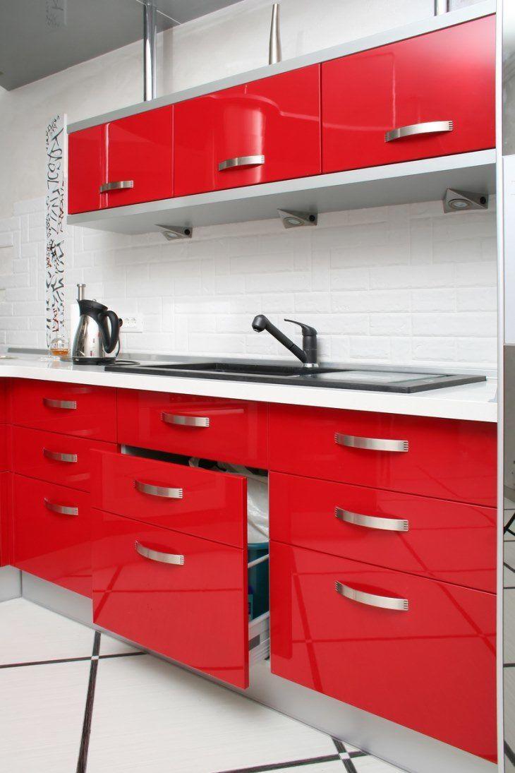
This room makes a good mix of neutral tones with a vivid color, as it combines the white of the walls, floor and the chrome accessories, and the red cabinets. The subway tiles are present, adding value to the project.
34. cabinets with different colors
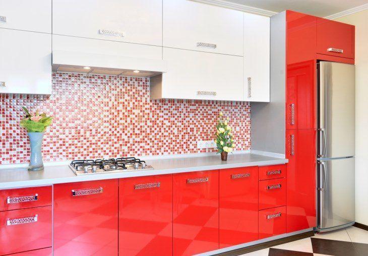
It is quite common to use different colors for the upper and lower cabinets in kitchens, to generate a nice visual contrast. Here, the choice was for white for the upper cabinets and red for the lower ones. This combination guarantees a classic combination that can't be wrong, so much so that it continued to be used in the wall tiles. It is so cute.
See more photos
Below, check out more photos of red kitchens:
35: When a person is bold, even the floor can be red.
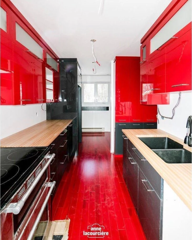
36. tiles making an amazing gradient on the kitchen wall
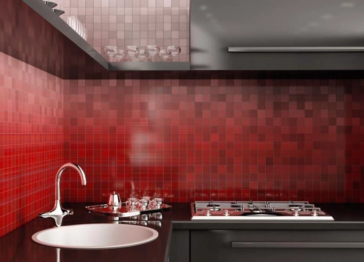
37. modern look with the color red only on the kitchen walls
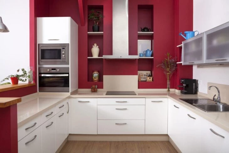
38. instead of paint, you can use a coating, such as tiles, to make the space charming
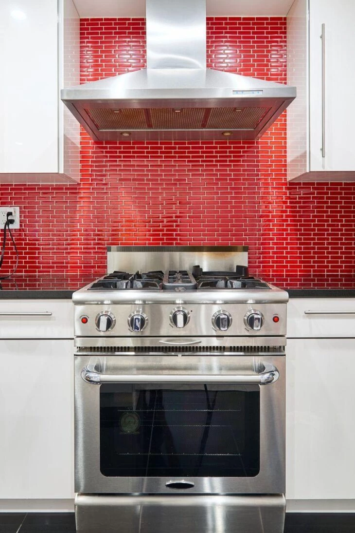
39. remember that the red and white duo is a guaranteed success for the kitchen decor
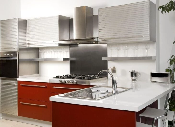
40. delicate wallpaper and red curved cabinets in the kitchen
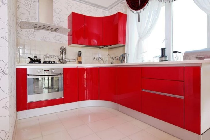
41 Another option that brings light-colored cabinets and only the red wall
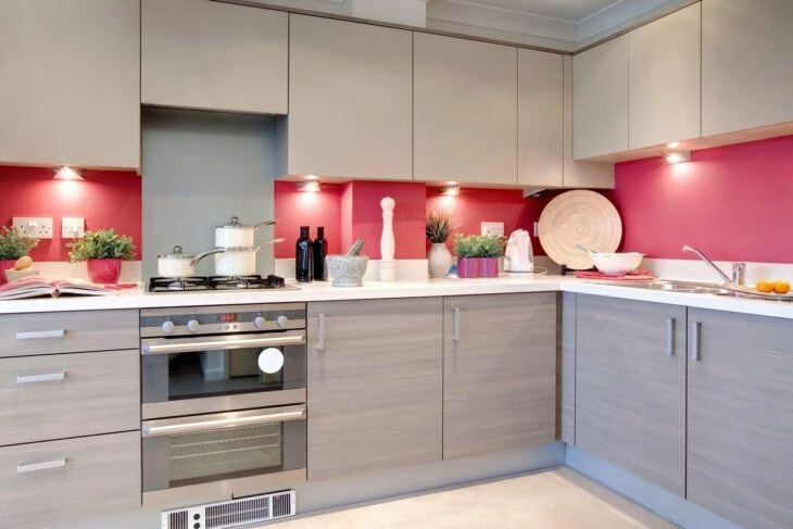
42. the red kitchen definitions were updated
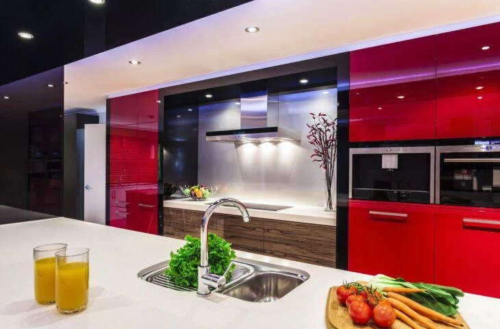
43 This project brings red to the kitchen wall and countertop
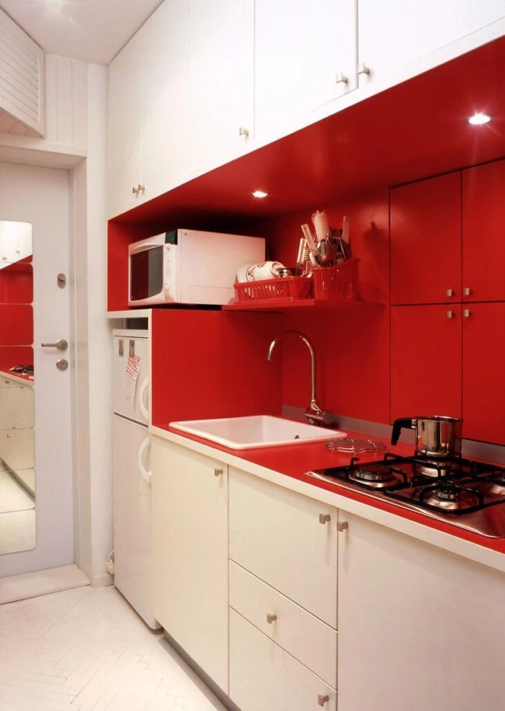
44. red kitchen with center island is so much love!
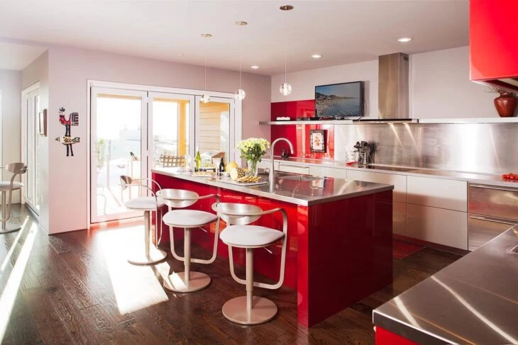
45. afraid to dare? bet on red appliances
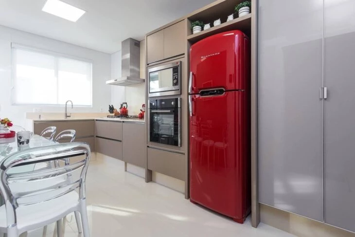
46. perfect contrast with white and brown
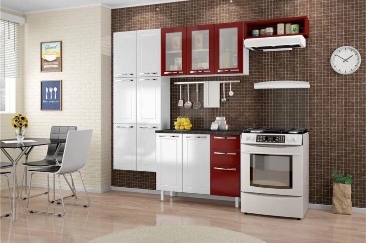
47. bright red applied to the upper cabinets and stools
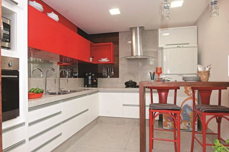
48. red Silestone Stellar on the countertop kicking ass!
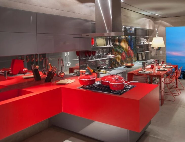
After so many inspirations it is almost impossible to be immune to the desire to color the most loved environment of the house. We already know that it is possible to leave the kitchen with more personality, making good combinations of materials, paint, texture, lighting and utensils so that the environment gains more life and becomes once and for all the most pleasant of your home. And, to be sure of the decoration, it is worth researchingLearn a lot about which colors go with red and plan your corner!


