Table of contents
It may sound like a paradox, but the color caramel has sober tones and is present in the earthy palette. Regardless of the style or decoration, the environment tends to be more elegant when this color is present. Below, learn more details about the subject and how to incorporate the color caramel in your project.
What is the caramel color?
The color caramel is between beige and brown. Its various shades meet various proposals, transmitting sobriety, sophistication, and solidity. In projects, caramel is widely used in decoration, marking presence in wall colors, objects, and even in tapestry.
Caramel tones
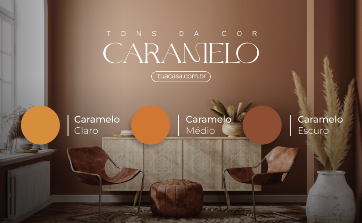
- Light caramel: a shade that pulls towards beige, ideal to include in minimalist environments and decorative proposals that call for sobriety and/or sophistication.
- Medium caramel: is close to burnt sugar, offering a warmer and cozier touch to the environment. Very present in leather furniture, used mainly in modern, industrial, and rustic decorations.
- Dark caramel: It has a brown background and reddish nuances, offering a unique elegance to the room. Its solidity is present in offices, home offices, and upholstery, as stool seats and armchair upholstery.
From the baby's room to the intimate living room, the color caramel can be used in all styles.
6 colors that go with caramel
Creating combinations with the color caramel is an easy task, since all you have to do is define the project's proposal and balance the colors to achieve the goal. To help you in this mission, check out the most popular shades:
Blue
Caramel with darker shades of blue usually make the decoration more mature, ideal for modern, industrial, and classic proposals, while in light shades, the decoration gains a new atmosphere, standing out especially in contemporary proposals.
Neutral tones
White, gray, and beige have an unquestionable sobriety, so adding caramel to this color palette will make the room warmer and more sophisticated. This combination is perfect in small rooms, where it is necessary to enhance natural lighting. But be careful with beige and caramel, as warm colors can create the feeling of small space.
Earthy tones
Caramel is already part of the earthy tones, so including it with its partner colors harmonizes the environment. These colors give a decoration with a boho and ethnic touch. If the proposal is to include plants in the environment, the result will be even more beautiful.
Black and graphite
Both black and graphite add sobriety to the decoration, but they are also fundamental pieces to create an intimate atmosphere. Besides this, it is possible to add other dark colors to this proposal, and caramel will include a unique coziness among the sober tones.
Rosa
The lightness of the pink will create a soft contrast with the caramel, ideal for environments with a feminine or even childish atmosphere. But for an elegant and sophisticated result, the metallic version - also known as rose gold - is ideal.
See_also: 80 neon party ideas for a colorful and very fun decorationGreen
Combining caramel with a shade of military green goes well with an industrial proposal. With light green, the contemporary decoration will have a light and relaxed aspect, while emerald green leaves a noble and refined atmosphere. Just align your personality with the project proposal and decide on your favorite shade of green.
In addition to the most popular combinations that were highlighted above, caramel also partners with other colors. To create a unique cartel, just look at the caramel tone in the chromatic circle and make complementary or analogous compositions.
55 photos of decoration with caramel color in different proposals
Get inspired by the following architectural projects, which have used the color caramel as a highlight or as a detail in the decoration. Either way, this tone leaves a unique mark on the environment:
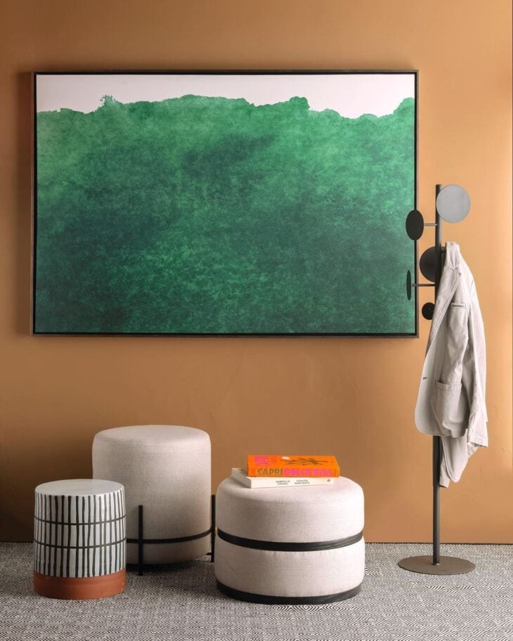
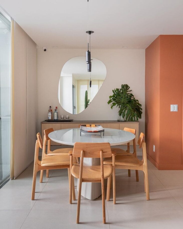
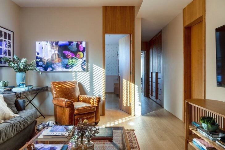
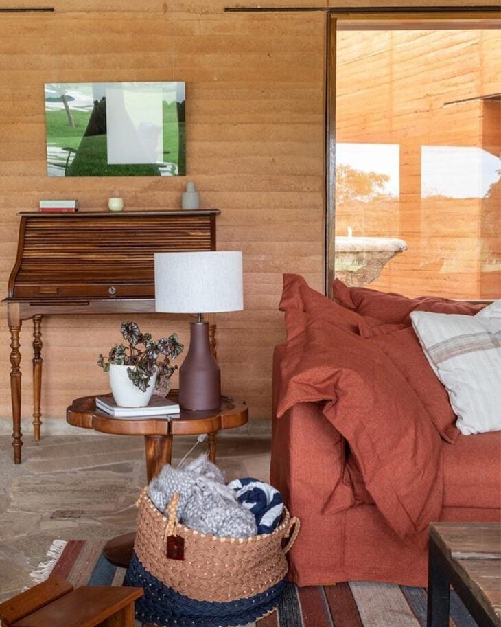
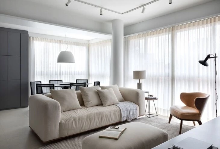
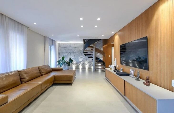
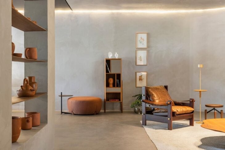
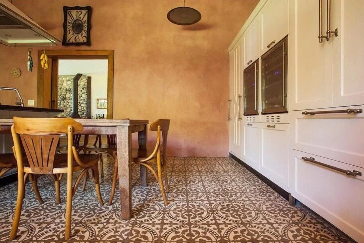
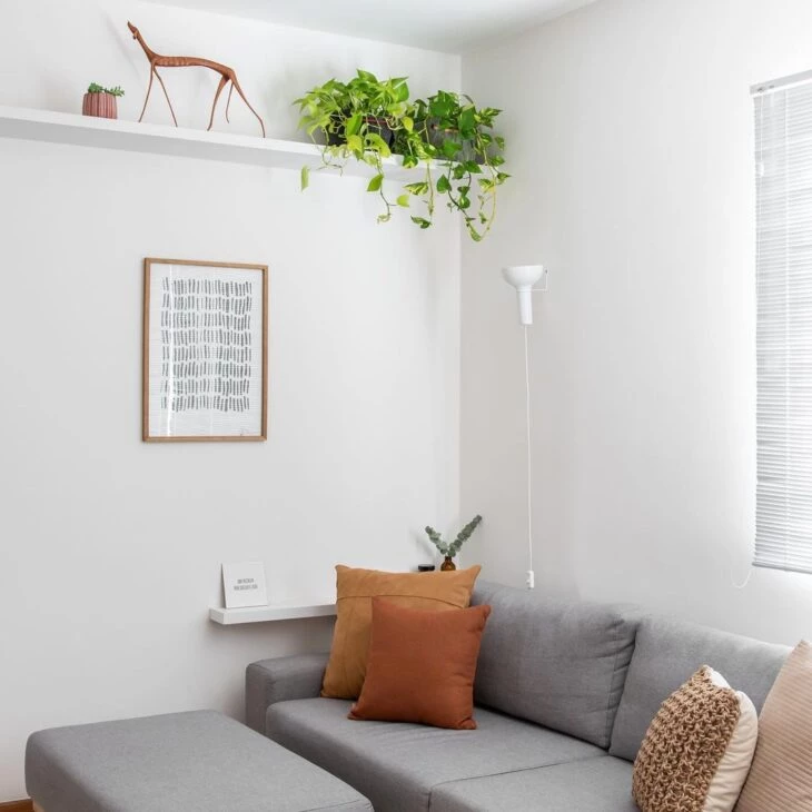
See_also: 70 ideas to decorate and make better use of the space behind the sofa1. the color caramel is highlighted from the walls to the furniture
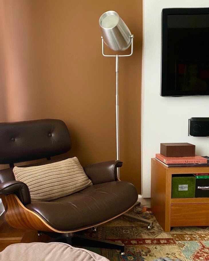
2. since its tone adds a warm touch to the decoration

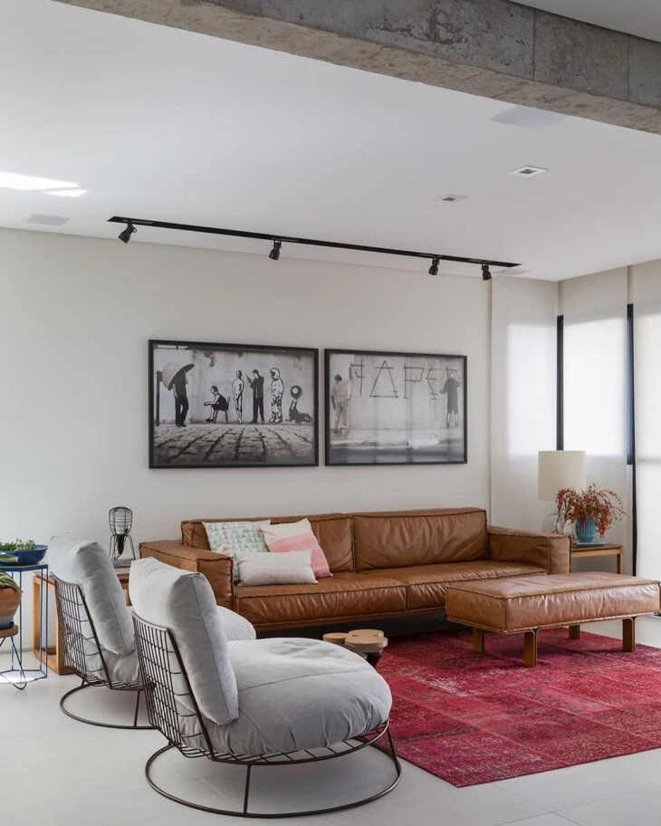
3. and heats up the color palette like no other
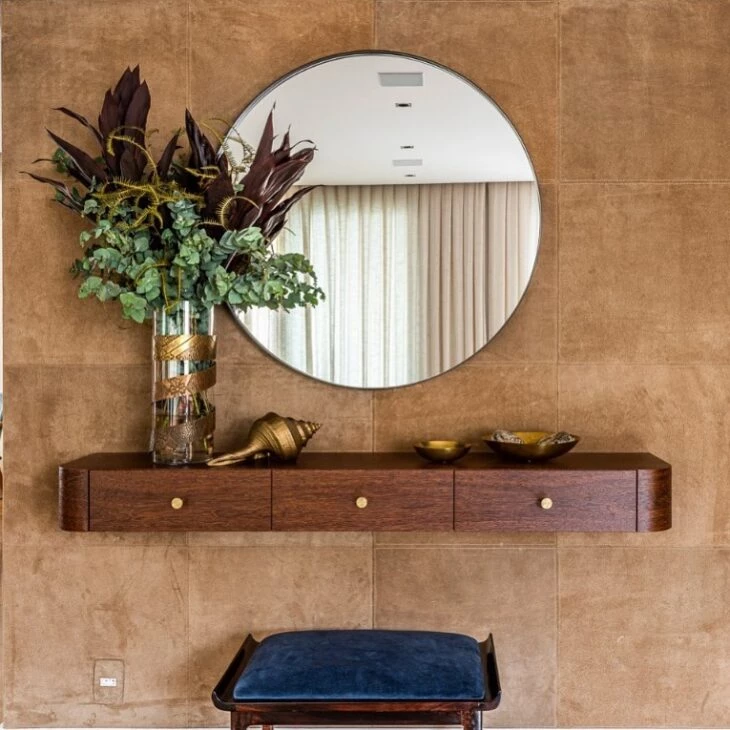
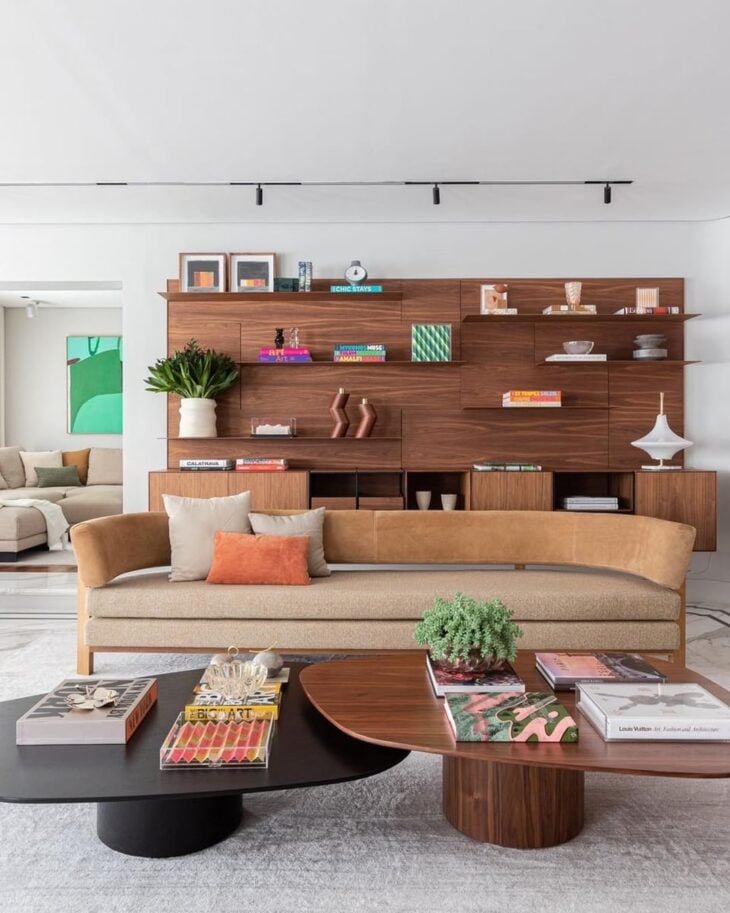
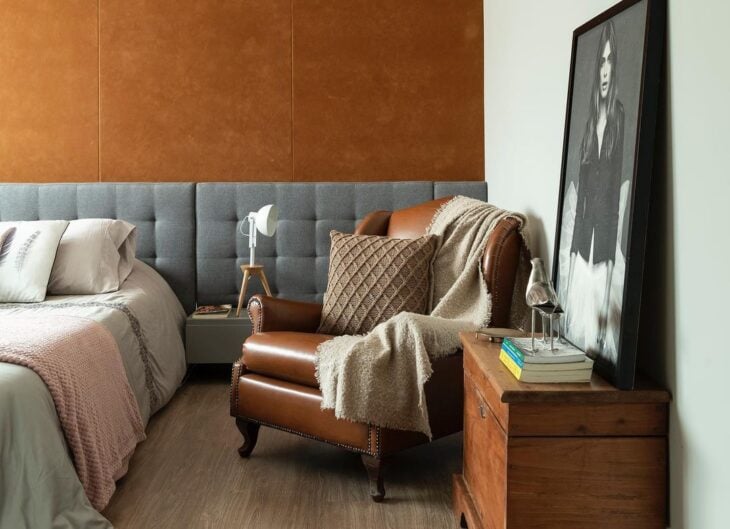
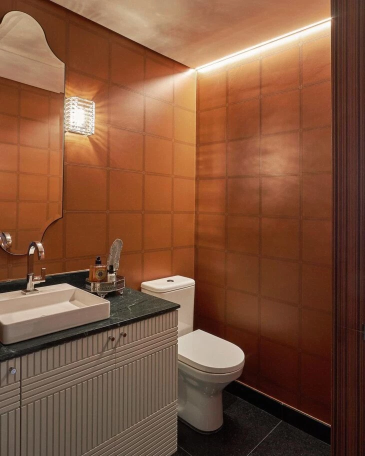
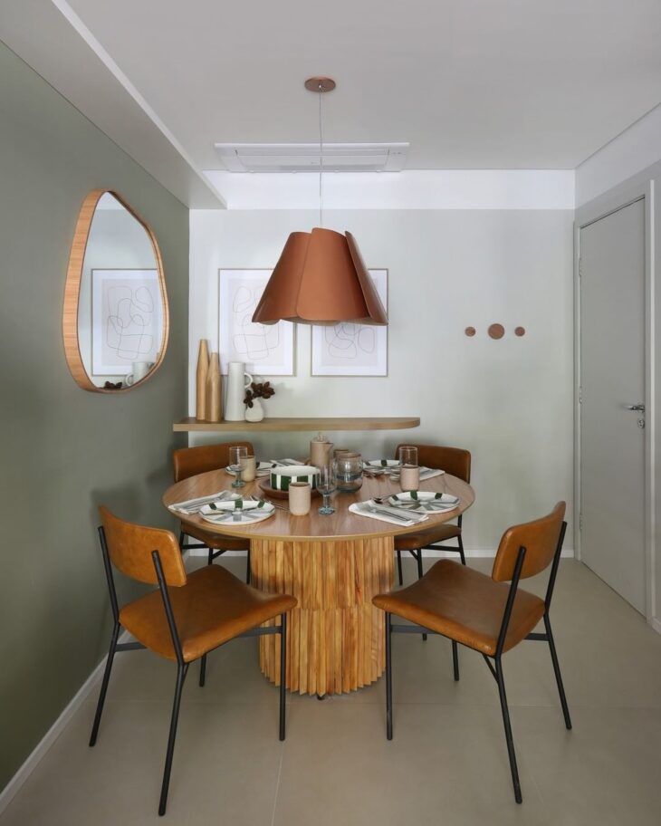
4 - In the covering, the caramel gives sophistication to the project
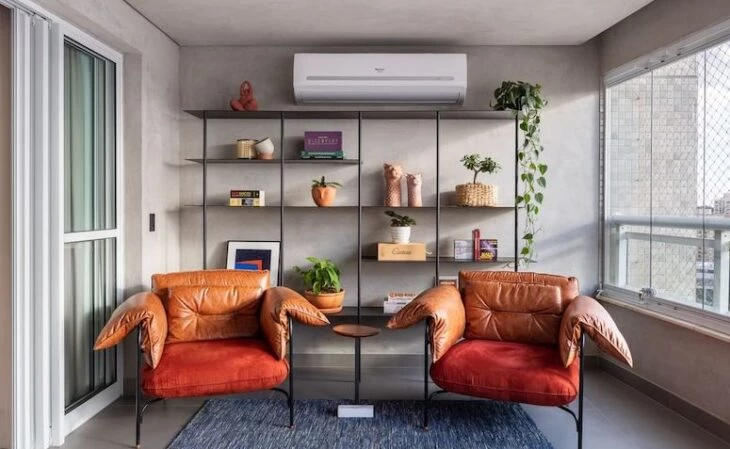
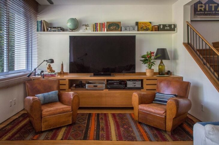
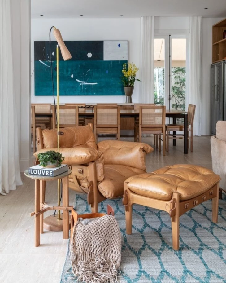
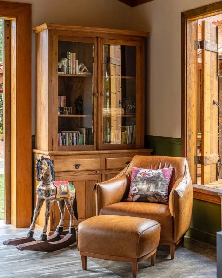
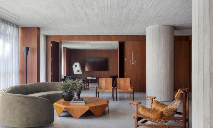
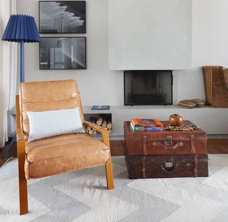
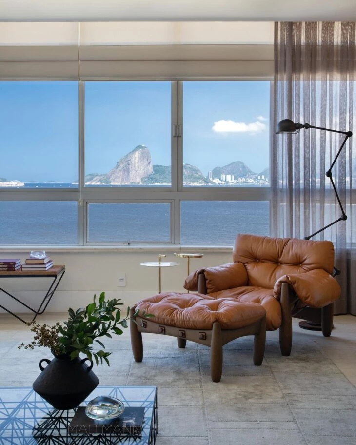
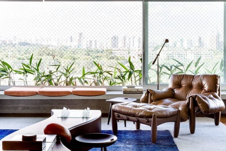
5. these armchairs create a tone on tone with the floor and woodwork
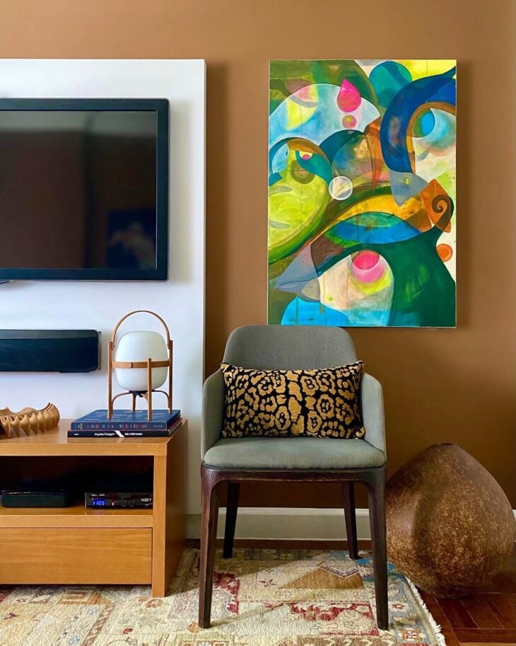
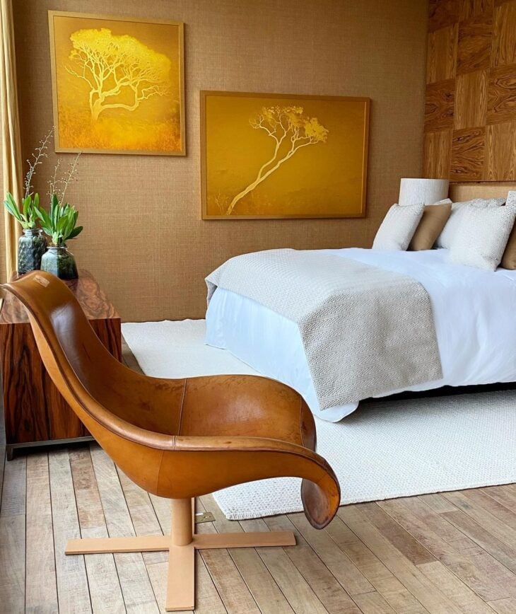
6. and in the painting, any picture will stand out on the wall
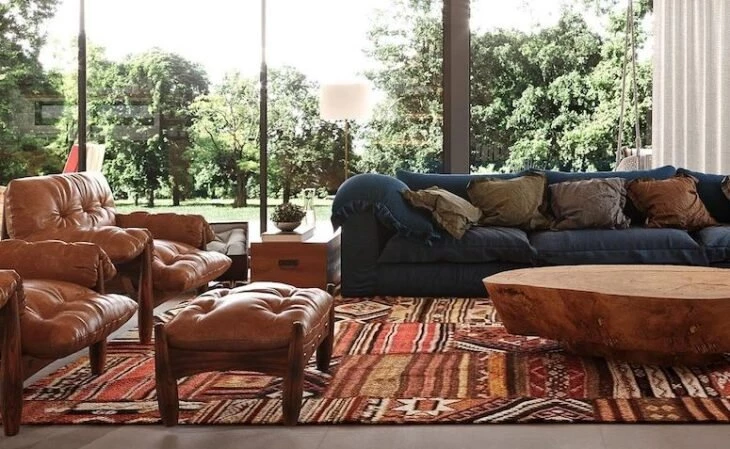
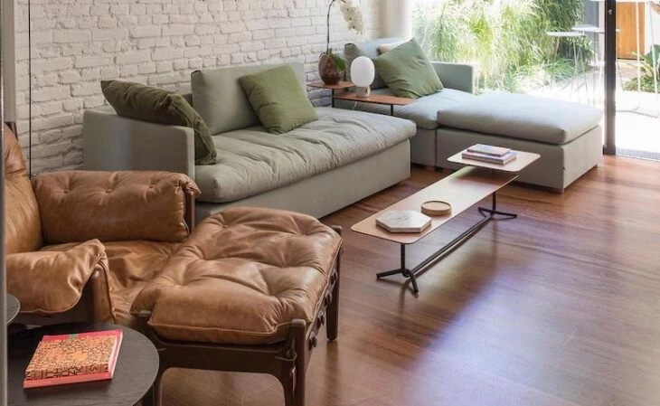
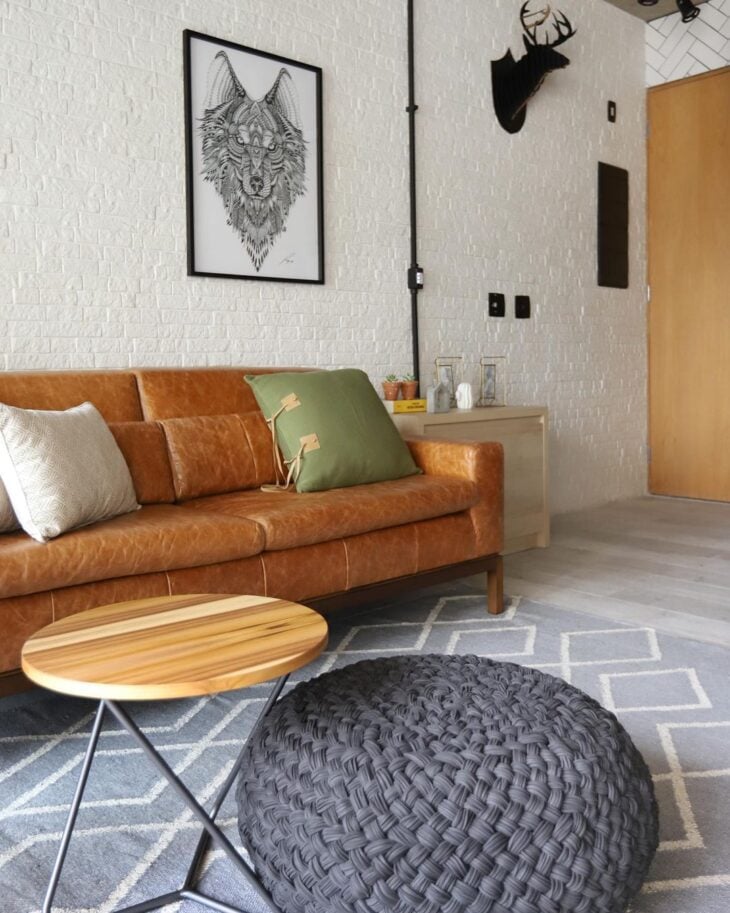
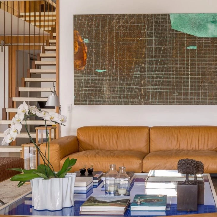
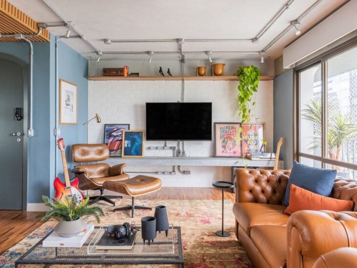
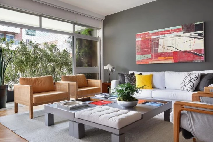
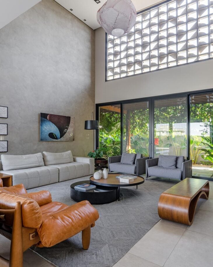
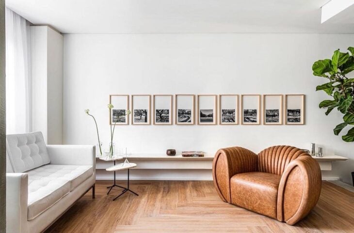
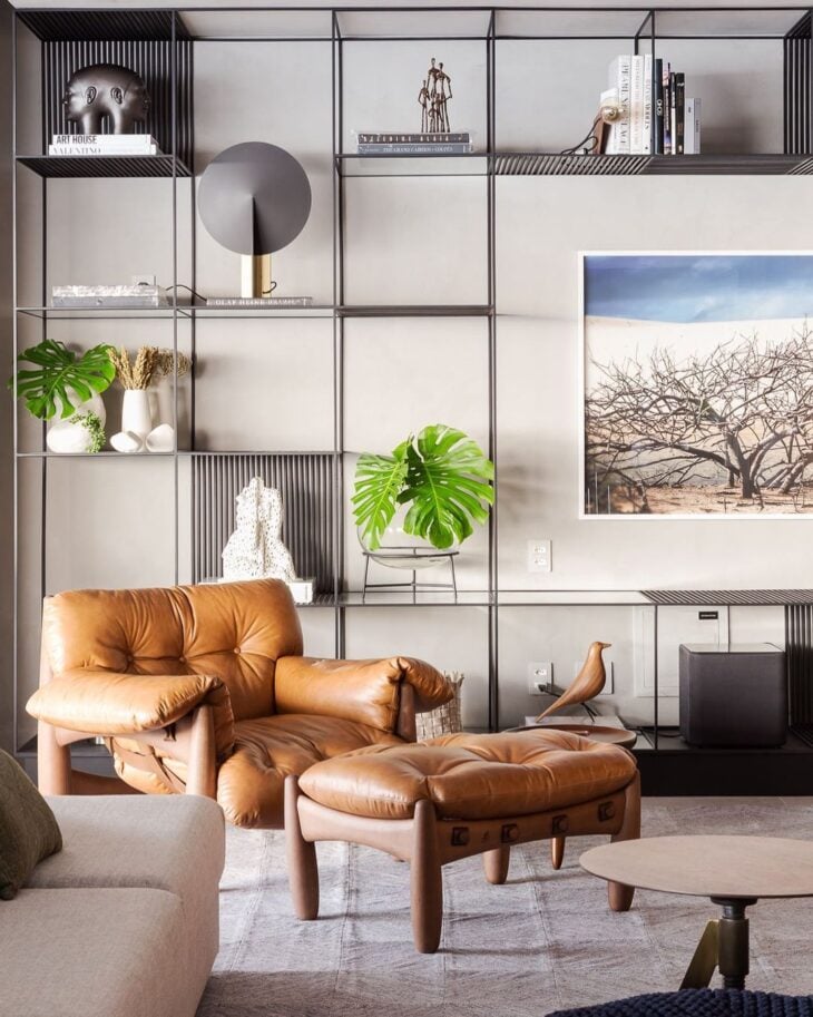
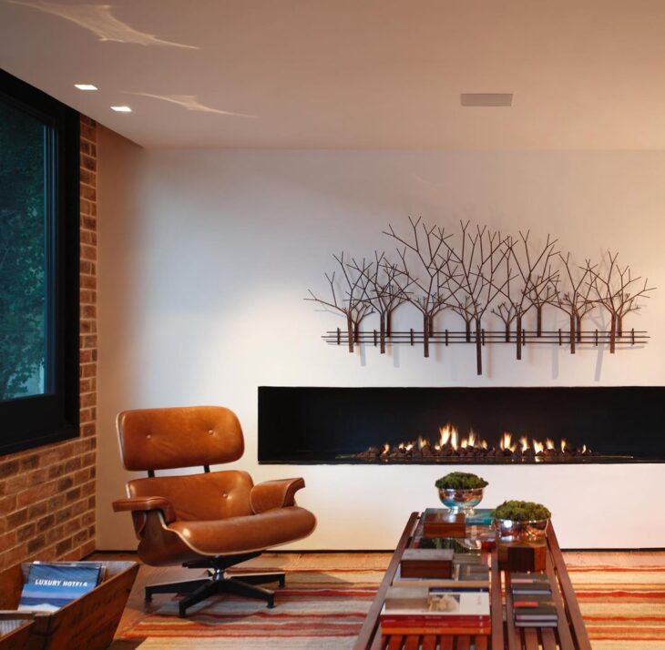
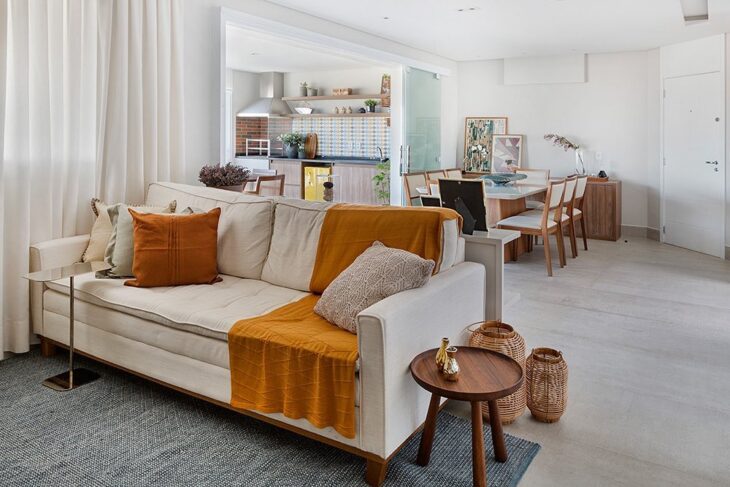
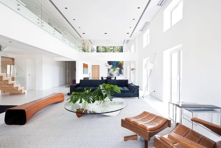
7. the caramel leather sofa is a classic
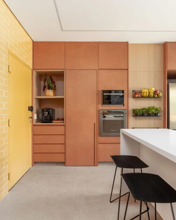
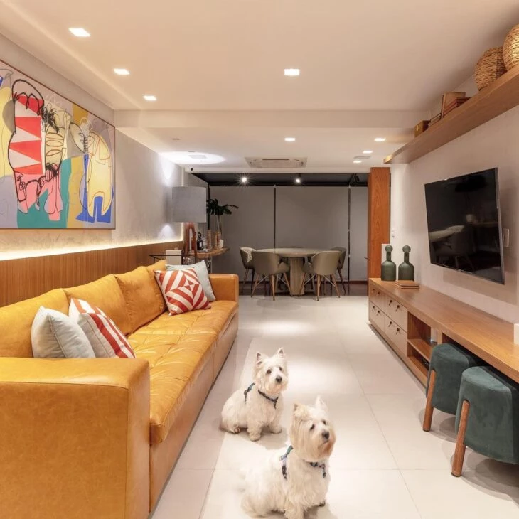
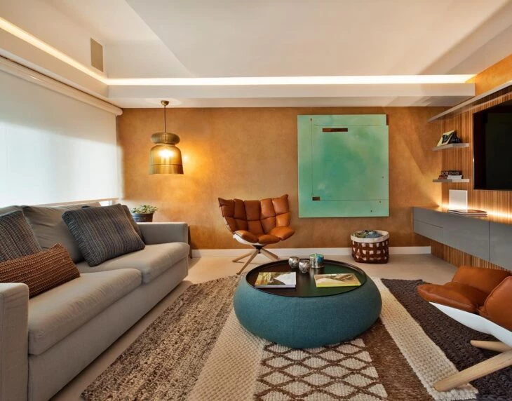
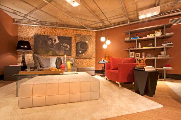
8. added to the yellow, the environment became uniform
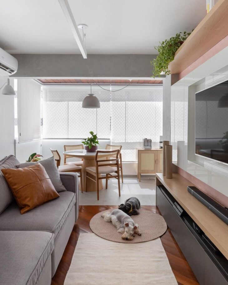
9. here the caramel was present in homeopathic doses
10. note how blue brought authenticity to the living room
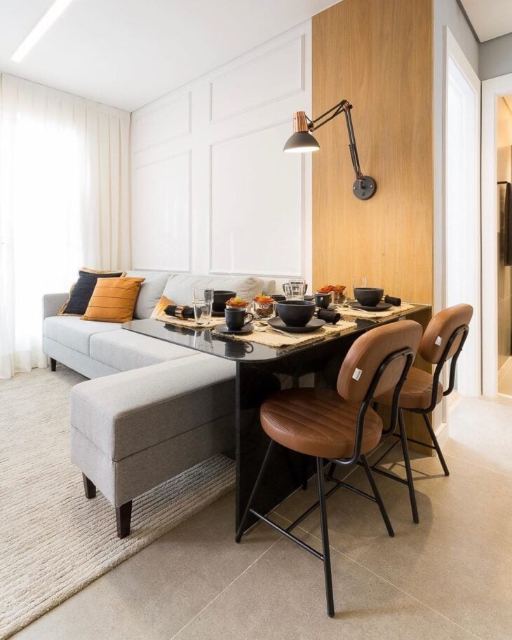
11. in the reading corner, the yellow color formed a beautiful composition
12. in the clean versions, the colorful point was in the details
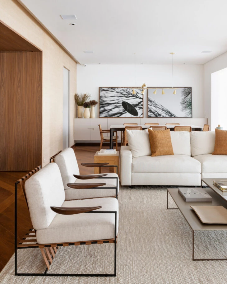
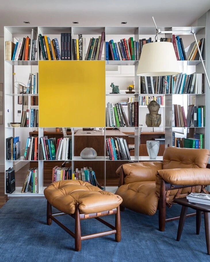
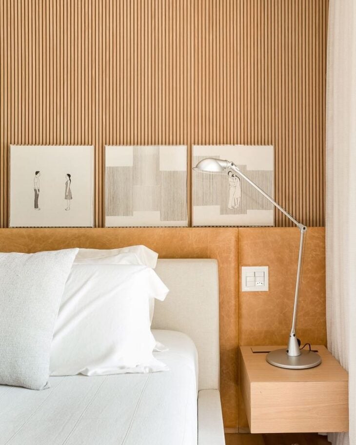
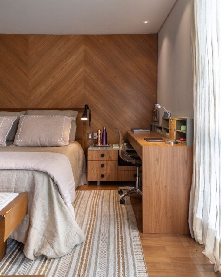
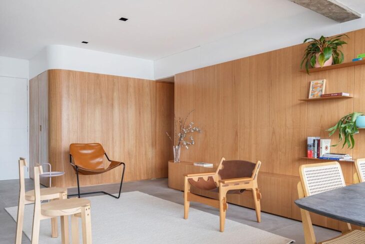
13. the different tones present in the leather and wood make everything more sophisticated
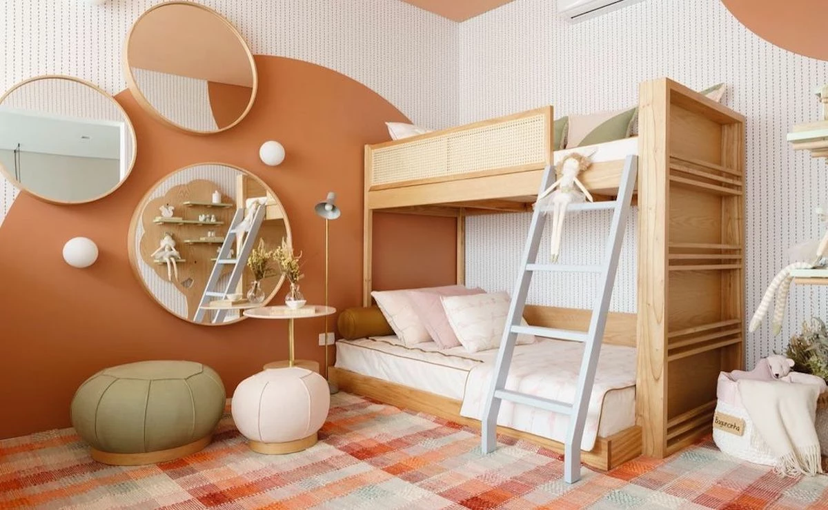
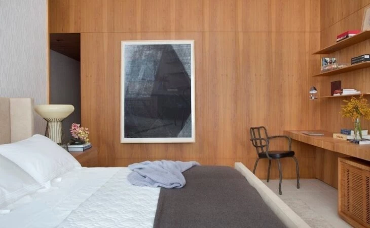
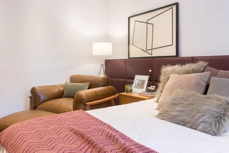
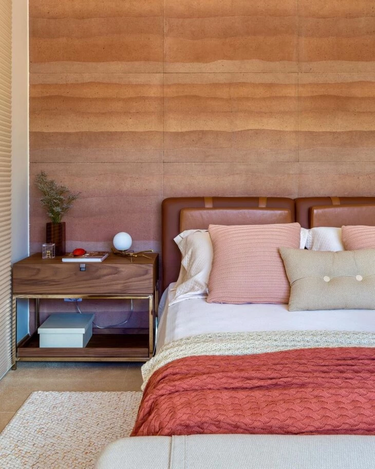
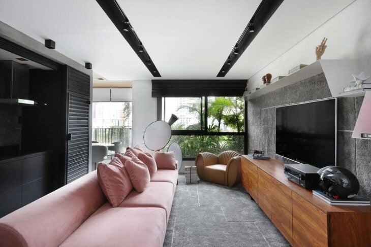
14. in the bedroom, pink and caramel were elegantly used
15. in this project, the caramel helped to balance the green and blue tones
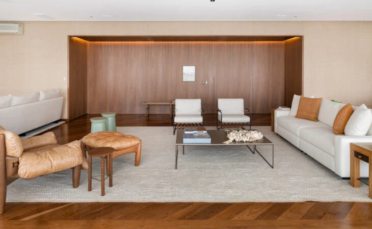
And who says that caramel can't be the highlight of the room?
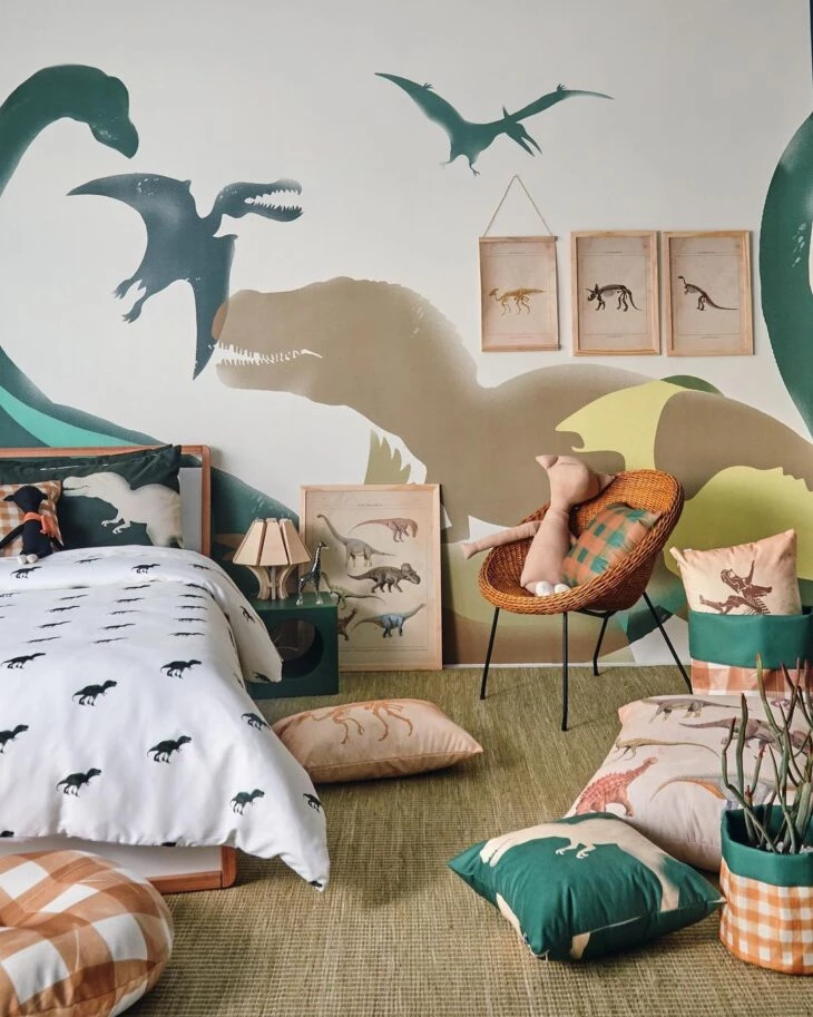
17. in the children's bedroom, the presence was guaranteed in the wicker chair
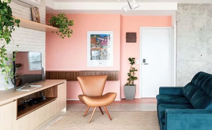
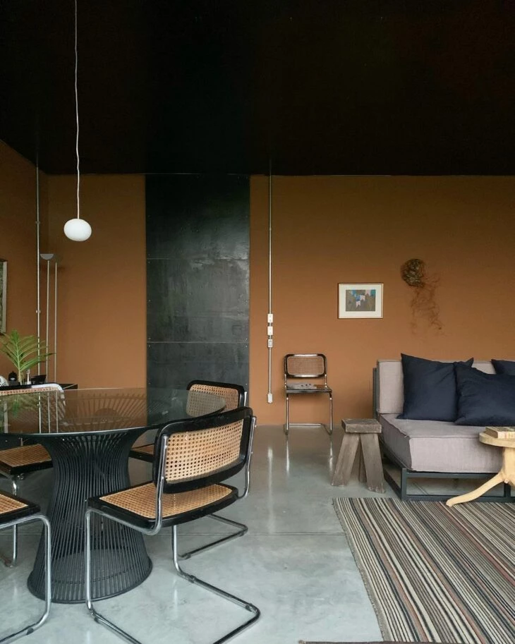
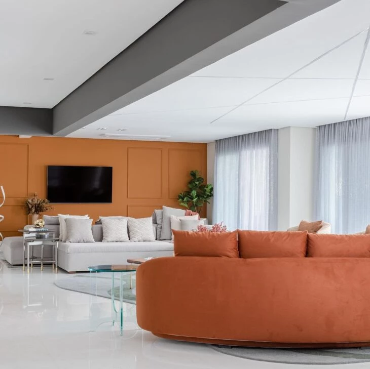
18. with orange, caramel makes the environment more sober
19. the detail between the sofa and the cushions made all the difference in this project
20. in the gray room, the caramel armchair was necessary
21. on the walls, the rustic and cozy touch is rewarding
22. notice how the atmosphere becomes more intimate
23. fall in love with this warm tone on tone
24. the duo formed with the gray never fails
25. colorful details break the sobriety of this room
26. in an environment with earthy tones, boho reigns
27. and a spot lighting adds even more value to the composition
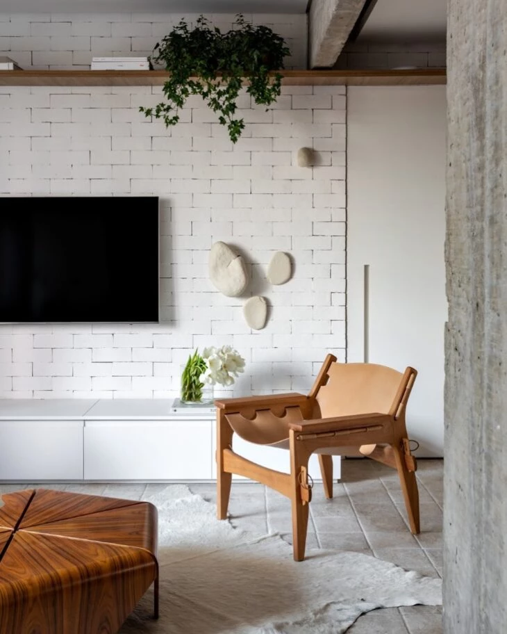
28. caramel leather is a distinguished presence in country decoration
29. in the bedroom, the caramel color adds elegance
30. and in any room, this bet will be timeless
31. after all, caramel never falls into disuse
32. for an intimate environment, it is worthwhile to bet on a higher dosage of color
33. or combine it with other dark, closed shades
34. dark caramel resembles the color of coffee with milk
35. while the medium caramel resembles the tone of freijó wood
36 The light caramel resembles nude or beige
37. depending on the shade, the combination with red is impeccable
38. this is why caramel is considered a democratic color
39. and is included from the modern design
40. even in a more casual proposal
41. in white, caramel is the main star
42 He also breaks that sober feeling
43 Here, the project relied on the boldness of graffiti, pink and caramel
44. being the ideal choice for those who do not give up comfort
45. regardless of whether lightness is the main idea
46. because it is a color that can adapt without effort
47. and contrasts dynamically with various colors
48 - Bringing balance to the palette of tones
49. and resulting in a unique decoration
50. the caramel color depends only on your planning
51. and, paradoxically or not, it will adapt to your idea
52. just choose how and how much caramel your decoration deserves
53 To create a perfect identity for your project
54. be it in the small details
55. caramel color will fit perfectly in your space
Did you see how the color caramel is the perfect balance point for several decorative styles? And since you've come this far, how about learning how to use the color brown to complement the colors of your project?