Table of contents
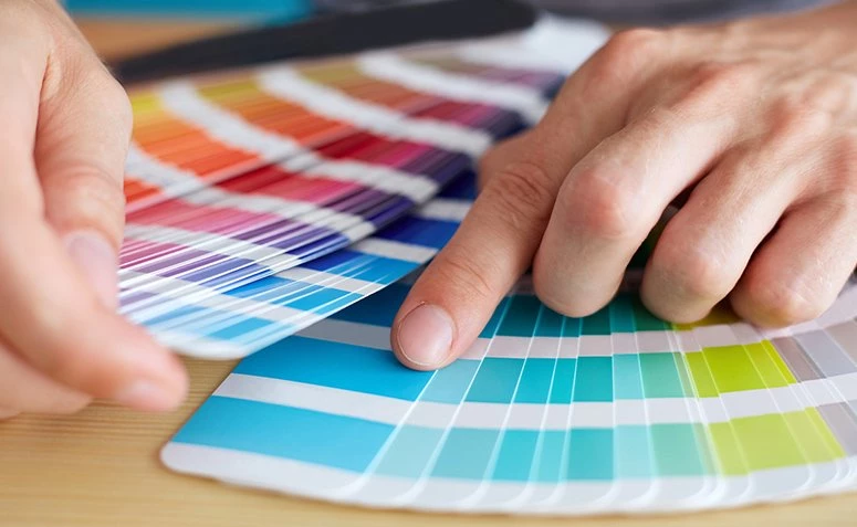
Choosing the shades that will go on the walls and in the home decor is a very complicated and, many times, frustrating task. Does yellow go with blue? Will green look good in the living room? And can I use a more vibrant color in the bedroom or should I just use a light palette? To help you solve this problem, we created some content about color combination that will answer your doubts!
We will begin by explaining how to combine colors with the chromatic circle. Then we will show you how the Feng Shui technique helps to create harmonious color compositions based on the emotions they convey. And finally, we have selected some ideas for you to copy! Shall we?
How to combine colors with the chromatic circle
Comprised of twelve colors, the color circle is a widely used tool when it comes to creating and harmonizing different colors:
Complementary Combinations
This combination consists of tones that are on opposite sides of the chromatic circle, for example, blue and orange or purple and yellow are complementary combinations. The effect of this combination results in an explosion of colors that provide liveliness and energy to the environment.
Three-color combination
As the name already suggests, this combination unites three different shades that are distant from each other within the circle, but at equal distances (on all fours). One of the schemes is blue, red, and yellow. Despite being colors that create a great contrast, the vibrant combination is quite harmonious.
Analogous Combinations
This scheme allows you to make combinations of two to five colors that are next to each other in the chromatic circle. The result creates a calming effect, as well as continuity, the famous gradient. Although you can combine up to five different shades, it is recommended to use only up to three colors so as not to lose focus.
See_also: Country house: 85 projects from rustic to modern to inspire youCombination in slit
The slit combination is somewhat reminiscent of the first scheme that combines colors from the opposite side of the circle. This combination consists of choosing one primary color and two complementary colors. The two shades must be opposite the primary color, for example, violet, yellow and green. Less intense than the three-color combination, this scheme relies on a slight contrast.
Four-color combination
The four colors of the chromatic circle can be connected by the edges of a rectangle, i.e. the scheme consists of one primary color, two complementary colors, and one more that provides greater emphasis among the other three. The result is a beautiful, colorful, and synchronous composition.
Four-color square combination
Using almost the same scheme as the previous combination, this composition consists of four colors connected by the tips of a square, thus, three in three shades following the chromatic circle (always leaving the same distance). The combination gives the space a lively atmosphere and a touch of relaxation through its colorful palette.
Now that you know how to use this tool to discover various compositions, here is another technique that helps you harmonize different colors through emotions.
How to combine colors with Feng Shui
This technique is based on the emotions and feelings that each color transmits in a place. According to Feng Shui, all shades have a different type of energy that is awakened when inserted into the decoration of an environment. For this reason, this method is also widely used when deciding which colors to use in each space of the residence, taking into account the function of each area.Check it out:
Black

This color is recommended for study and office spaces because it represents wisdom and intellectual depth. In addition, although this color provides an elegant look to the environment, it should be used with care, because in excess, the atmosphere becomes pessimistic and heavy. Therefore, it is recommended to use other neutral tones together with black to stabilize the energy.
White

Purity and innocence are words that can serve as synonyms for the tone white. Responsible for giving the feeling of amplitude in which it is inserted (thus, perfect for small environments), the color can compose any area of a house, as well as, together with other more vibrant tones, it gives balance between colors. White is often seen in living rooms, bedrooms and kitchens that seek a stylecleaner.
Gray
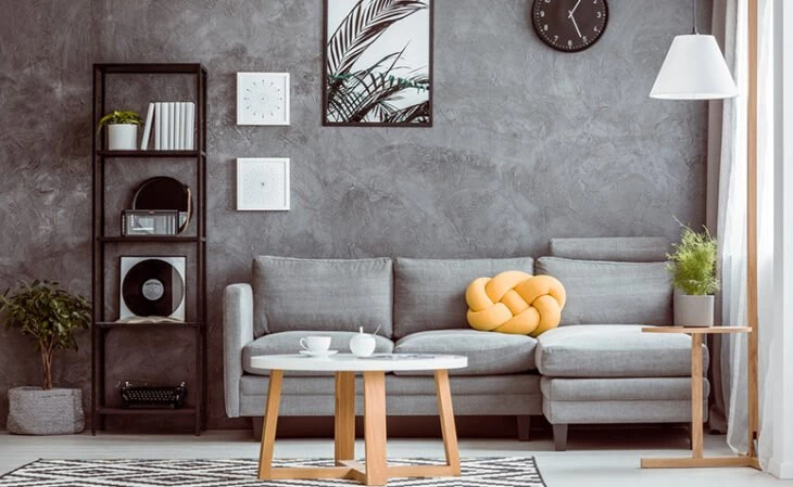
Being created from two opposites, gray, according to Feng Shui, transmits emotions such as stability, independence, and self-control. Connected to the earth element, the color is perfect on walls, as well as, in a harmonic way, it also combines with other colors. That said, it is worth inserting details in strong and vibrant tones in a decoration in which gray predominates.
See_also: Sand color offers a neutrality that escapes from the basicsRosa
Connected to femininity and unconditional love, pink is a symbol of sweetness, happiness, and delicacy - characteristics that represent a woman well.
Purple
It is the symbol of transmutation and luxury, it is the balance between reason and passion. The color also represents meditation and intuition and, therefore, it is a tone that helps stimulate spirituality. When present on the wall or on some decorative object, purple grants the feeling of respect and authority. Use the color with moderation so as not to bring feelings of anxiety or even depression.
Blue

The color of the water element is indicated for environments that seek to convey serenity and relaxation, and for this reason, many people end up choosing blue to compose the decoration or paint the walls of a room. Bringing calm, harmony, and tranquility to a space, the tone is ideal for those who are more agitated because, when used a lot, it ends up stimulating more sleep.
Green
It represents fertility and growth, and as such, is entirely connected to nature. Like blue, green also gives the feeling of calm and security, and is a good color to complement the decoration of a room. Other symbols such as health, prosperity, and new beginnings are also connected to green.
Yellow
Vibrant, the color provides optimism, inspiration, and a lot of good energy to the place where it is introduced. yellow is ideal for study and office spaces because it stimulates creativity, but use with moderation so as not to overdo it and create the opposite effect! the color is perfect for small details in spaces that need touches of vivacity that will make all the difference to the composition.
Red
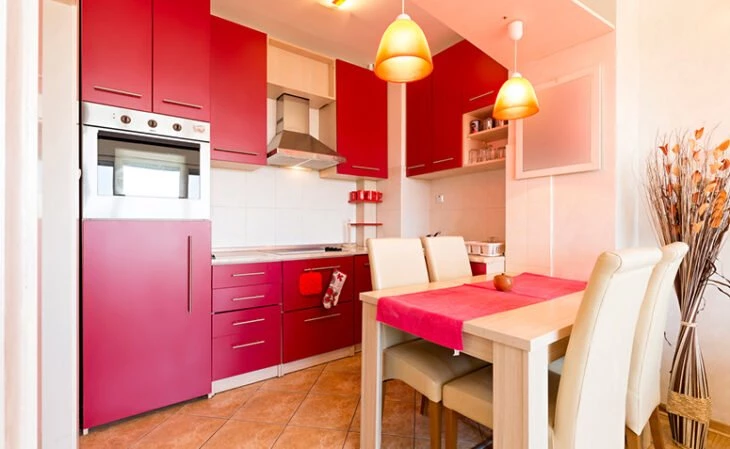
Finally, this tone is heat and passion, vigor and strength. Despite the good symbols that red represents, one must be careful not to overdo it and end up giving the environment a heavy aspect. Therefore, avoid using this tone on walls, but use it on furniture and other decorative items mixing it with other ornaments and materials in lighter shades that help to balance this strong energy.
It's amazing how one color can bring so many sensations and emotions into a room, living room, kitchen, or bathroom, isn't it? Here are some ideas of combinations to insert into your project!
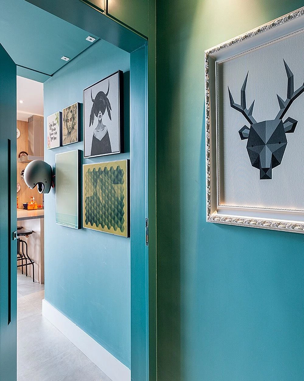
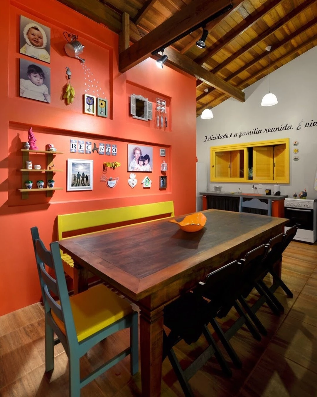
Color Combination for Walls
Here are twelve amazing and beautiful color combination ideas for the wall, whether for the intimate or social area, for discreet or more relaxed spaces, for you to get inspired and include in your remodeling project.
1. the colors for the wall will depend on the location

2. whether it is intimate or social
3. as well as the climate you seek to give to this space

4. as a lighter atmosphere
5. or something more relaxed

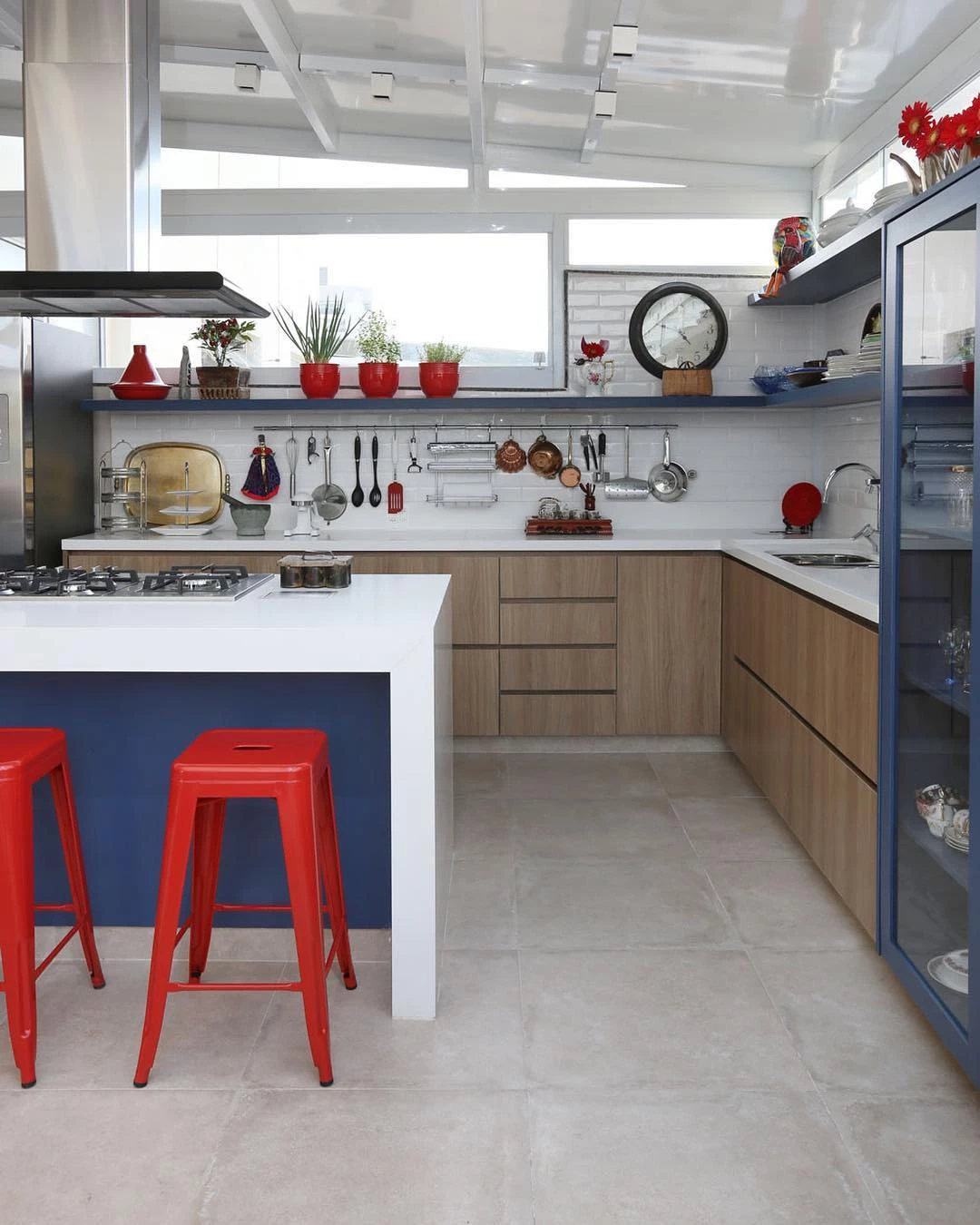
6. or even warm

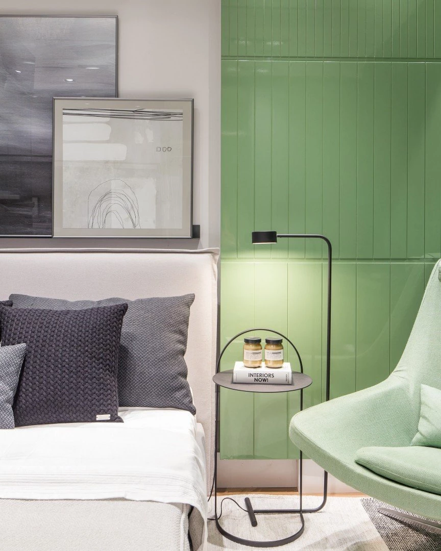
7. many choose to paint only half of the wall
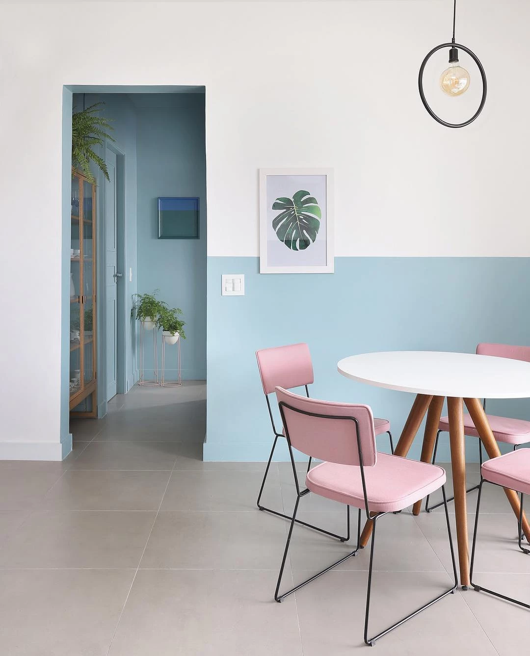
8. that gives the feeling that the wall is longer
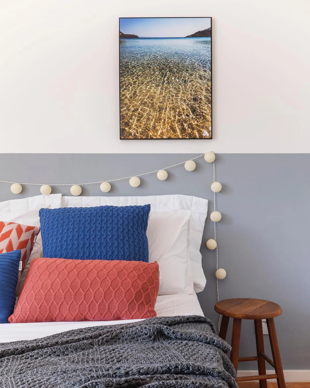
9. the dark tone enhances light materials
10. the color of the wall will guide the rest of the decoration

11. so choose wisely

12. for it will have the power to transform space
From the neutral tone to the most vivid tone, the color combinations for the wall can be diverse, all that is needed is a lot of creativity allied to the goal of harmonizing! Check out some ideas of palettes to use in the bedroom!
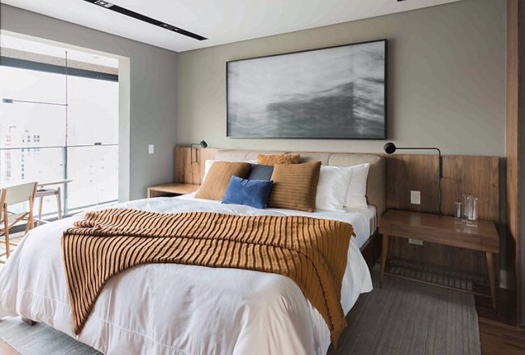
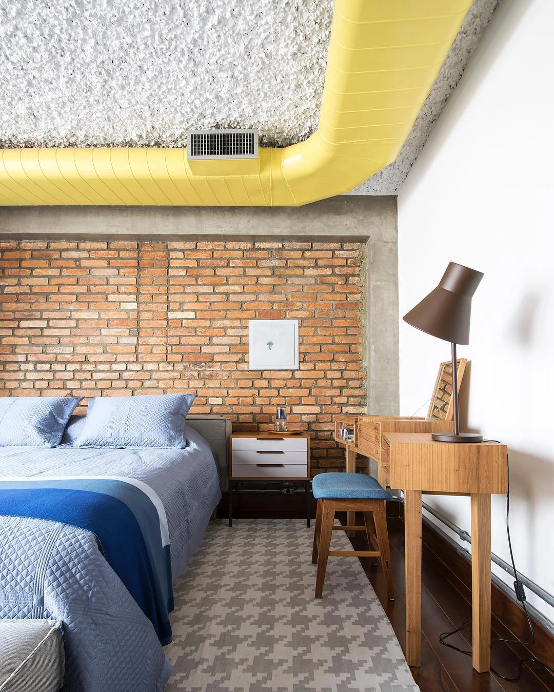
Color Combination for the Bedroom
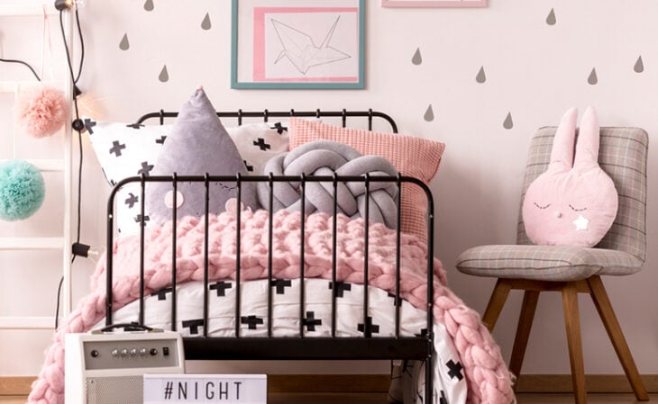
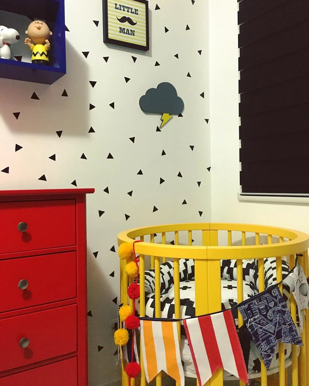
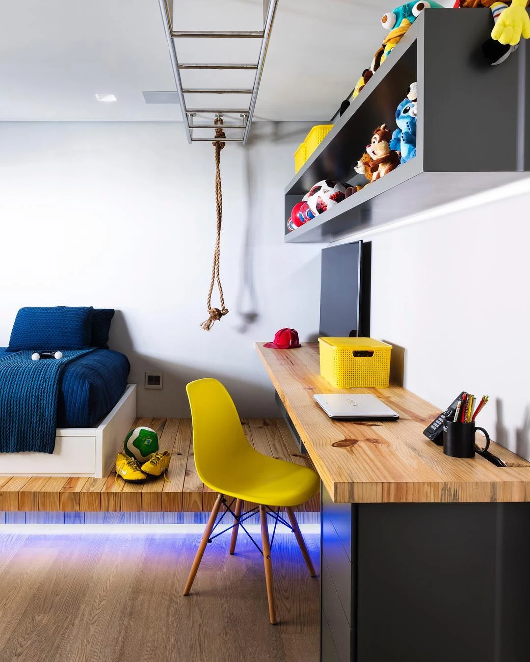
The bedroom is a private environment that requires a composition that transmits a sense of calm, but that doesn't mean you can't opt for more colorful tones, even more so in children's rooms:
13. according to Feng Shui, colors such as blue are ideal for this space

14. because it conveys a sense of tranquility

15. but you can also choose other colors
16. as the most vibrant
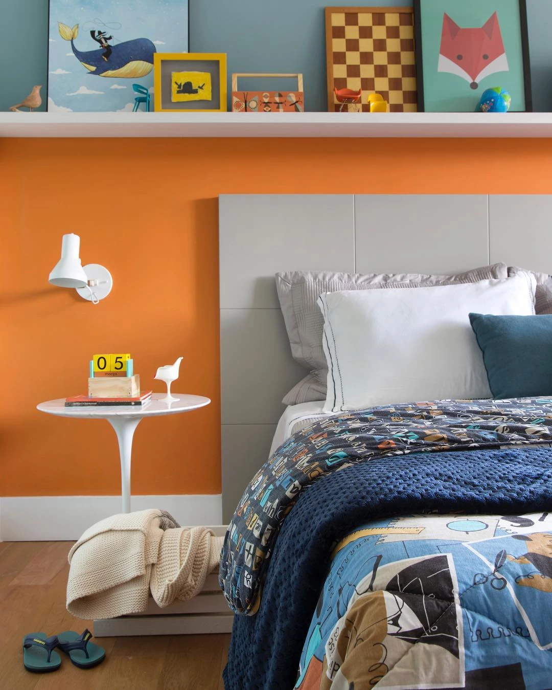
17. especially for children and youth environments
18. the gradient effect follows the analogous combination

19. consisting of two or more colors that are next to each other on the chromatic circle

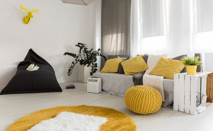
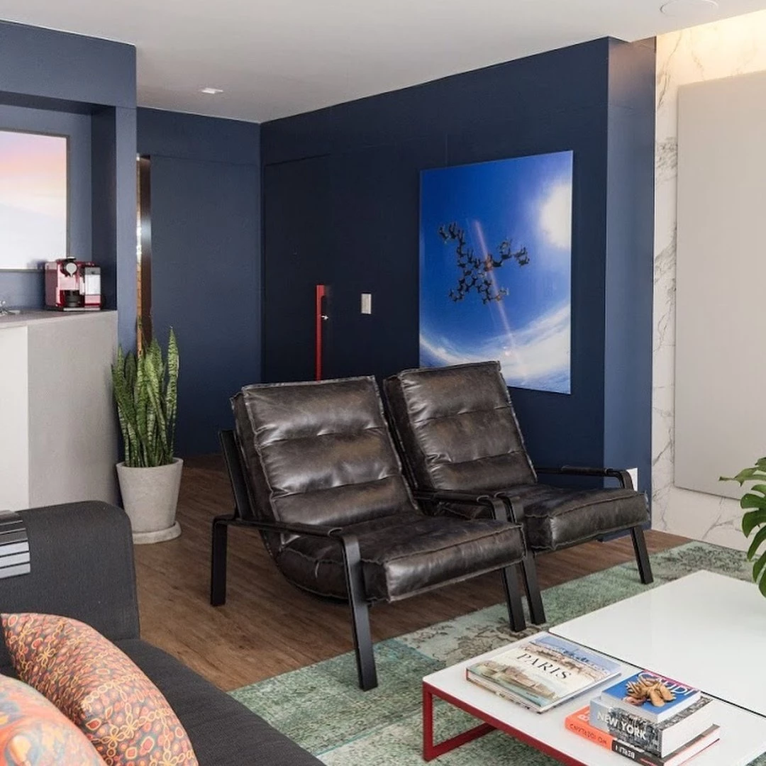
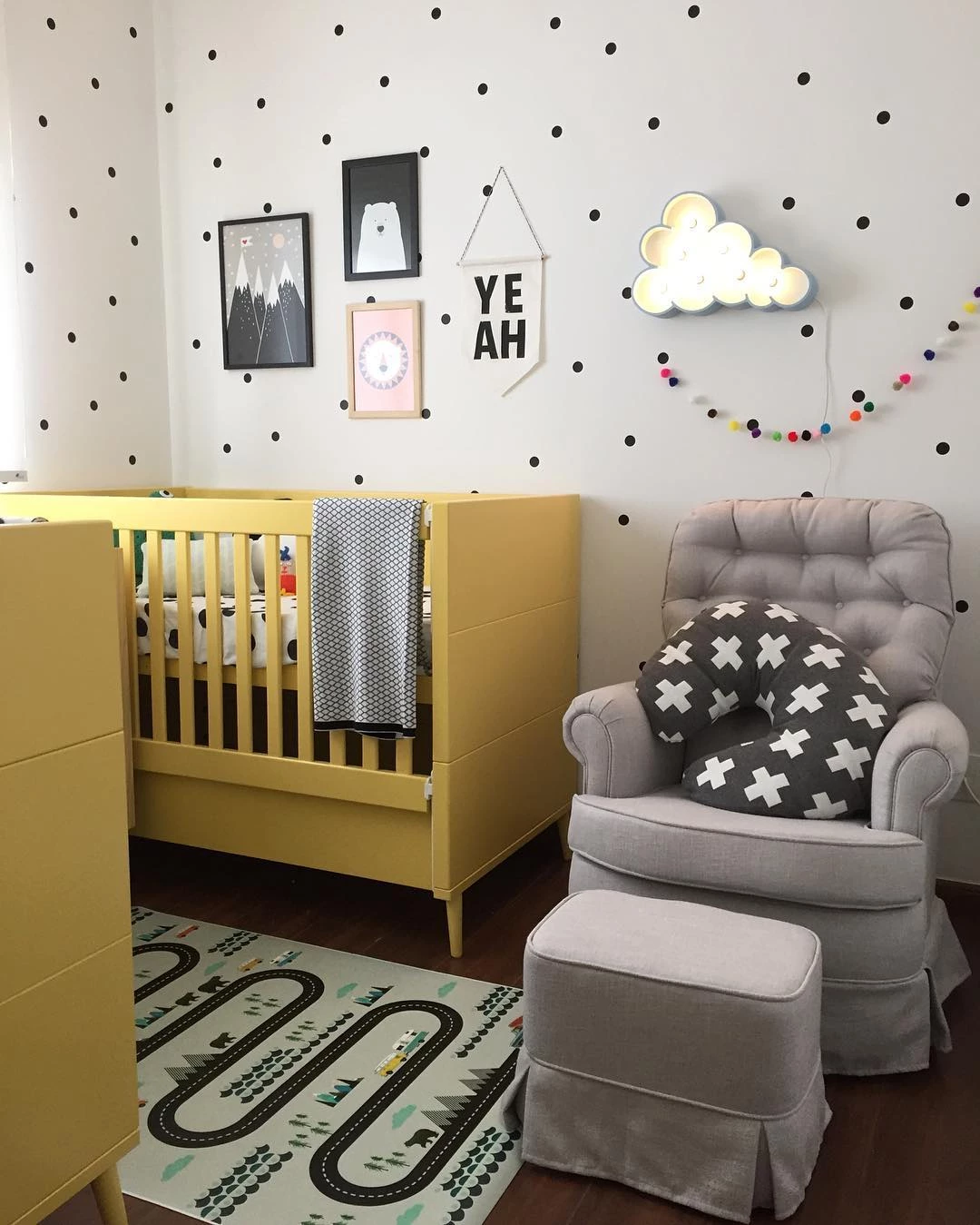
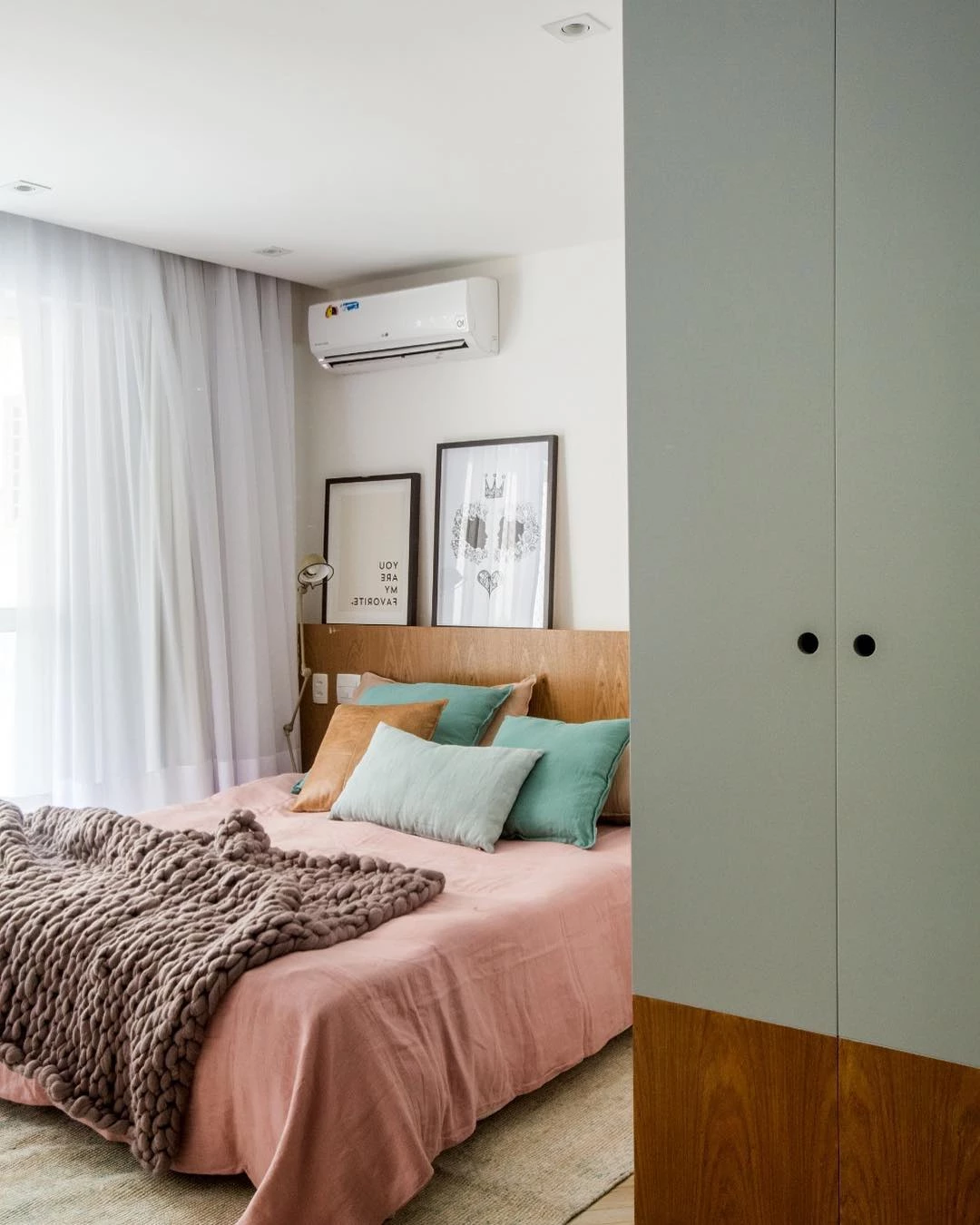
20. this space is a perfect example of complementary combination

21. the furniture and decorative objects are in harmony

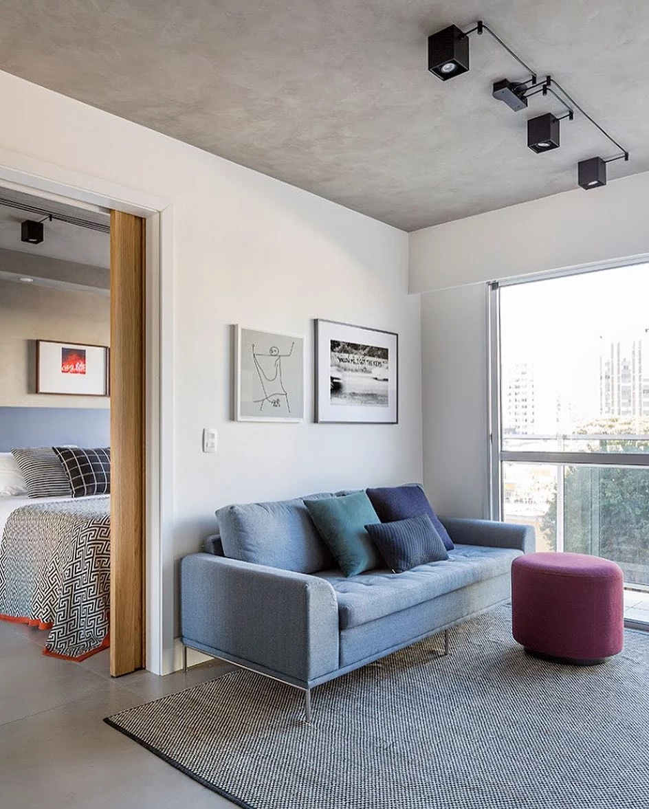
22. the white wall allows the use of more colors in decorations and items
23: Look how cute the colors are in this room!

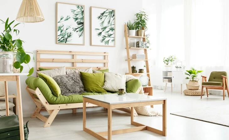
24. blue and green are practically best friends!

Now that you have seen the color combinations for the bedroom, get inspired with some creative palette ideas for the living room.
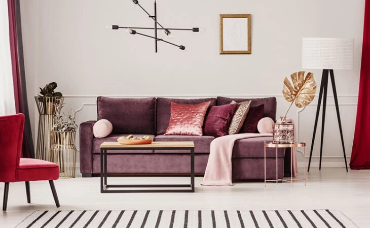
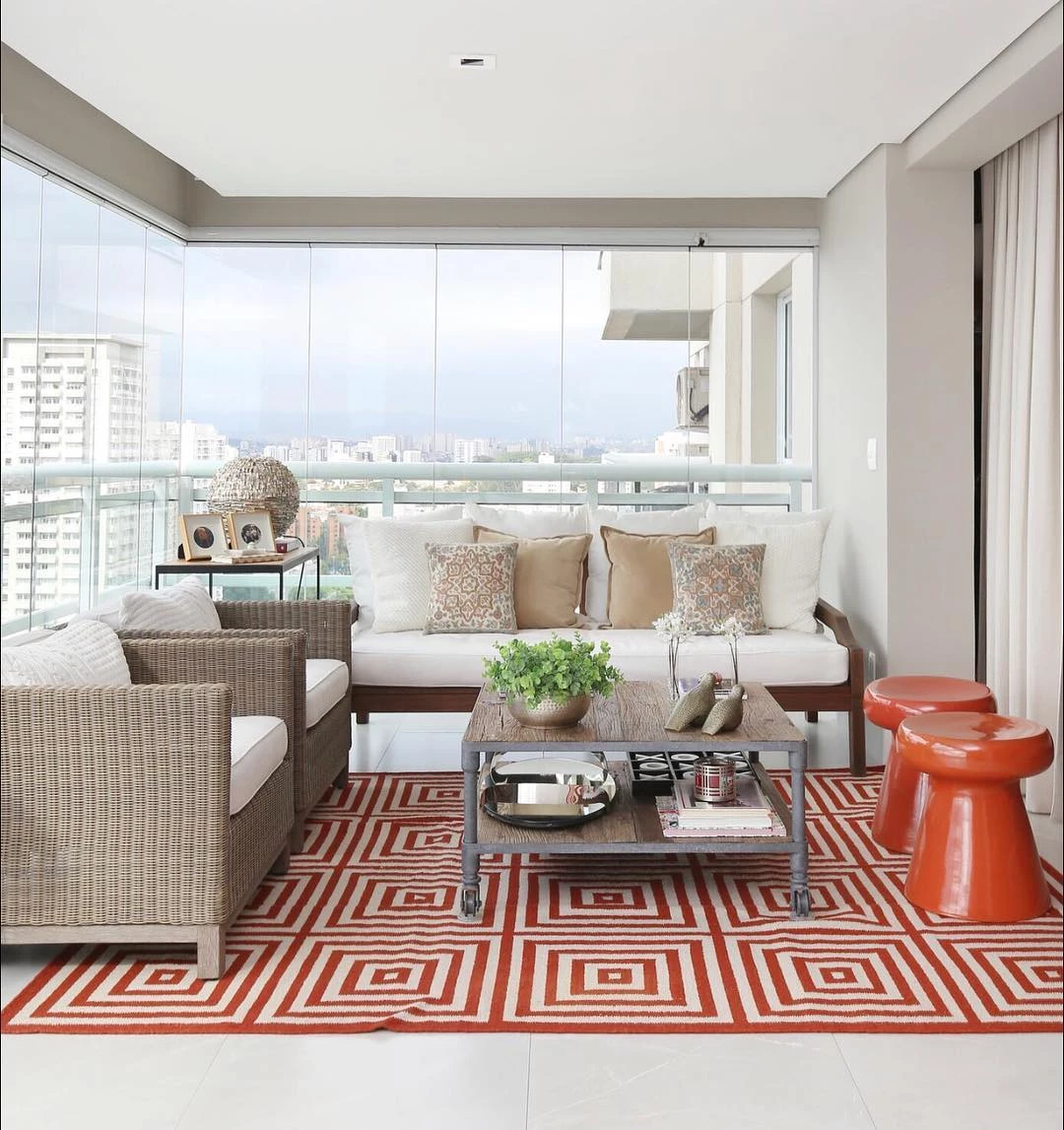
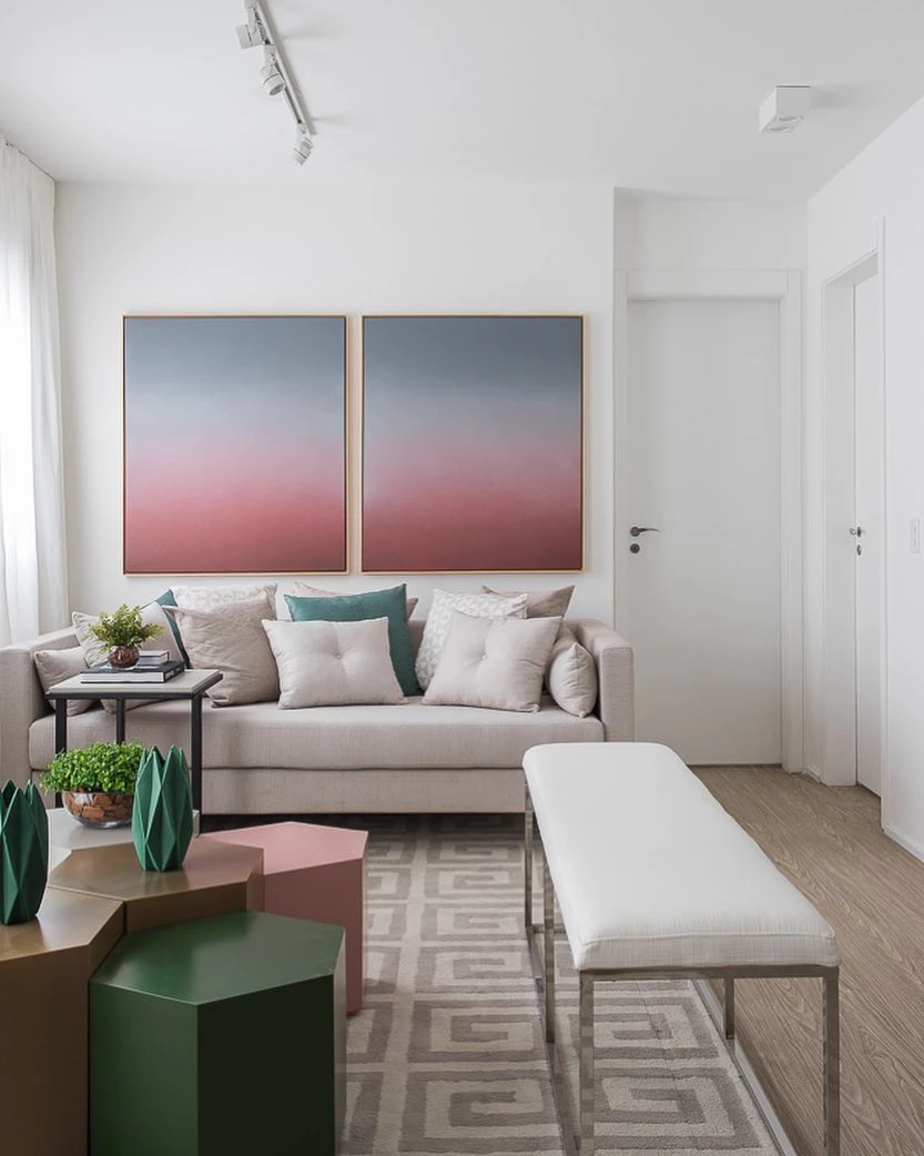
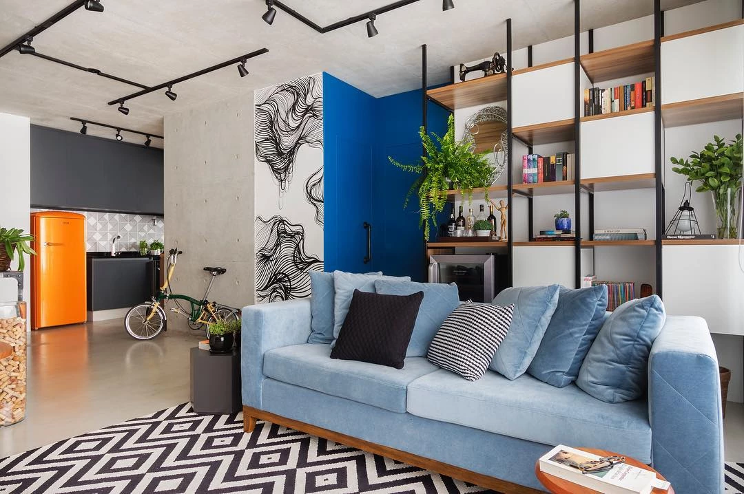
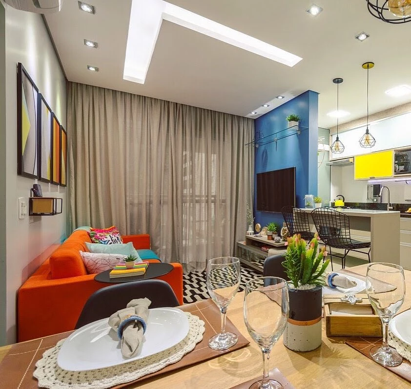
Color Combination for the Living Room
Remember to always follow the style of the space, be it discreet or uncluttered. Based on the characteristics of the place, you can resort to the methods we present and find out which is the perfect combination to bet on! Here are some ideas:
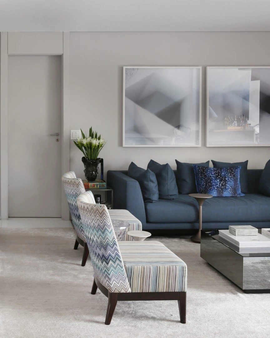
25. since white goes with all colors
26. choose a light wall in spaces with lots of furniture

27 In this way, the furniture is responsible for lending color to the space
28. try to create harmony among the decorative objects

29. so you will have a charming place
30. receive your friends in a comfortable space

31. and that transmits, through the colors, a sense of well-being

32. cushions and pictures provide liveliness to this decoration

33. bet on interesting contrasts
34. to promote personality in the composition of the room
35. the environment is marked by its clean look

36. this one is characterized by a more stripped-down style
As you can see, you can include from the most neutral tone to the most vibrant one, depending on the style and the atmosphere you want for this space. Finally, get inspired with some combinations with primary colors!
Primary Color Combination
The primary colors, which do not exist from the mixture of other tones, are responsible for creating new colors from their junctions, thus forming the secondary ones. Being "pure", as they are also called, the tones yellow, blue and red are also used in decorating a space. Check out some examples:
37. primary tones can also be combined with secondary ones
38. as well as all three colors can be found together
39. or in pairs

40. as blue and yellow

41. red and blue

42. or yellow and red
43 The primary colors can be used in any environment

44. whether intimate or convivial
45. as in the children's room
46. in the kitchen
47. in the living room
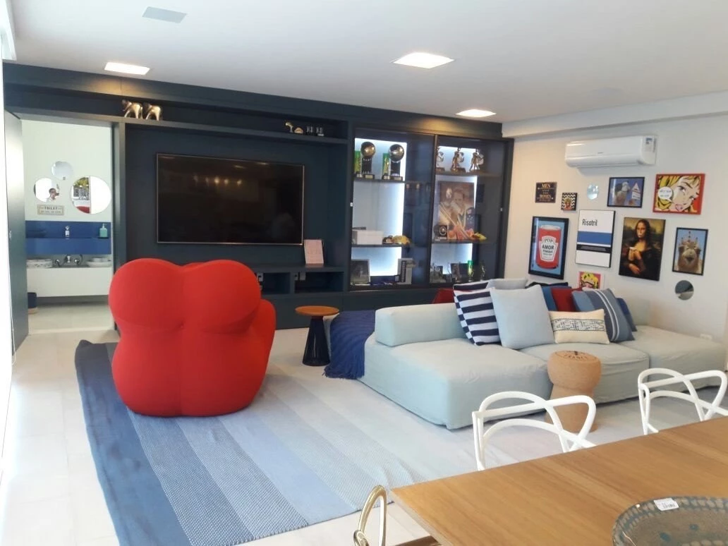
48. or in the gourmet area

Despite being more vibrant, the primary colors are incredible in these spaces, isn't it? It is worth remembering that the choice of palette for a space is in accordance with the style that it carries, as well as, according to the Feng Shui technique, the emotion that the environment represents, be it tranquility, creativity, optimism, vitality, among others.
And now, do you already know which shades to use to decorate your environments? Use one of the methods we present and find the perfect color combination to give your space a makeover. Remember that harmony is your main goal when choosing the schemes, so you can have a pleasant environment to be in. Take advantage and also see how to use primary colors.