Table of contents
The colors chosen for the house define not only the style of the building, but also of those who live in it. A generous coat of paint already makes a difference, but there are other resources that collaborate, such as installing natural stones or using wallpapers. Below, learn how to choose the colors for your house and get inspired in beautiful projects.
How to choose colors for your home?
The choice of colors for your home can generate doubts, especially because they will remain for a long time, so get acquainted with the main tips that can help you when making your choice:
Make a list of favorite colors
This is the first step in defining which color your home deserves. This does not mean that all of them will be used, as this is the basic step to start your selection process. From this, you can consider the other information.
Choose a preferred style
Searching for inspirations leads you to define a style you like the most, because your personal taste counts for a lot. Save all the possible references that appeal to you, and then see which of them form the majority in this group of images. Another point to consider is to understand which design has more to do with your lifestyle, as well as your routine.
Use and abuse the chromatic circle
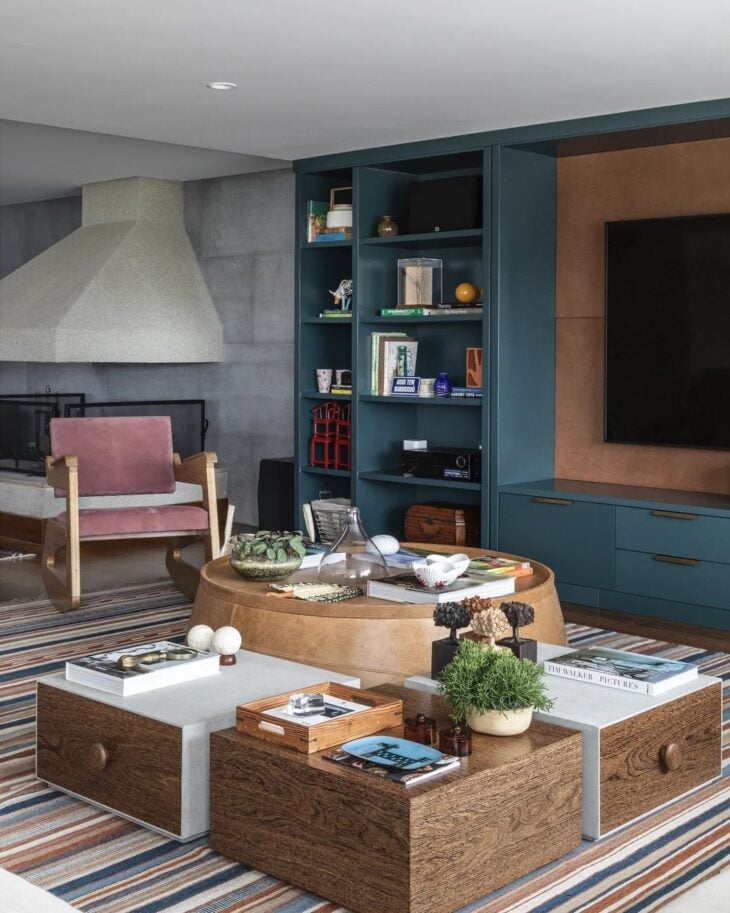
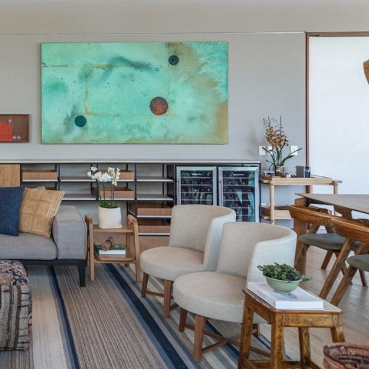
In interiors, the chromatic circle is infallible to define the decoration style, the harmonization and the sensations that these colors can transmit to the environment. Take that list of your favorite colors, check which ones are part of the tone chart and see how they can be included in your project with the help of the chromatic circle as a reference. Learn more about this tool for surewill help define the tones that will enhance the proposed design.
See_also: Closet models: 50 ideas that unite beauty and functionalityConsider the type of environment
Keeping in mind the size of each room can say a lot about the choice of colors. The options for spacious rooms are larger. However, small houses should avoid dark colors so as not to diminish the rooms. In this case, add light colors or include a stylized/sectored paint job to bounce lighting or give depth.
Pay attention to the surrounding structure
For example, does the house have a garden where the earth runs off on rainy days? Maybe it is better to discard the idea of a clear coat of paint and invest in coatings that are easy to wash. Is there a rule in the neighborhood or condominium about standardizing the facades? Or is the idea to stand out among the neighboring buildings? The answers to these questions arequestions are fundamental to define the possibilities.
Use simulator applications
The technology helps to visualize the chosen color without having to do the fateful application test.
Study the maintenance of each option
Think of your daily life as the decisive factor in the choice of colors for your home. A light paint job in a house where children and/or pets live will require a higher maintenance of cleaning and touch ups. Thus, a dark paint job on half a wall can be a way out. In other words, if your routine requires practicality, opt for practical solutions.
Besides choosing the perfect color for your home, remember to choose brands that offer quality to ensure durability and a quality result. In the end, the important thing is that your satisfaction of having a perfect home is guaranteed.
55 exterior home colors that are in evidence
Color trends are big influences when deciding on the palette for your facade. The projects on this list include many different styles, and many of them are very bold and creative. Check them out:
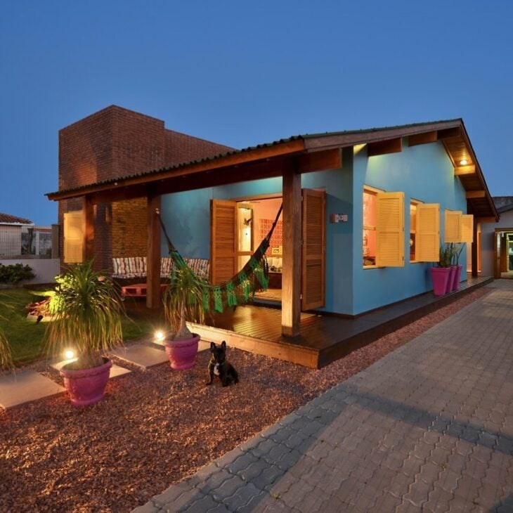
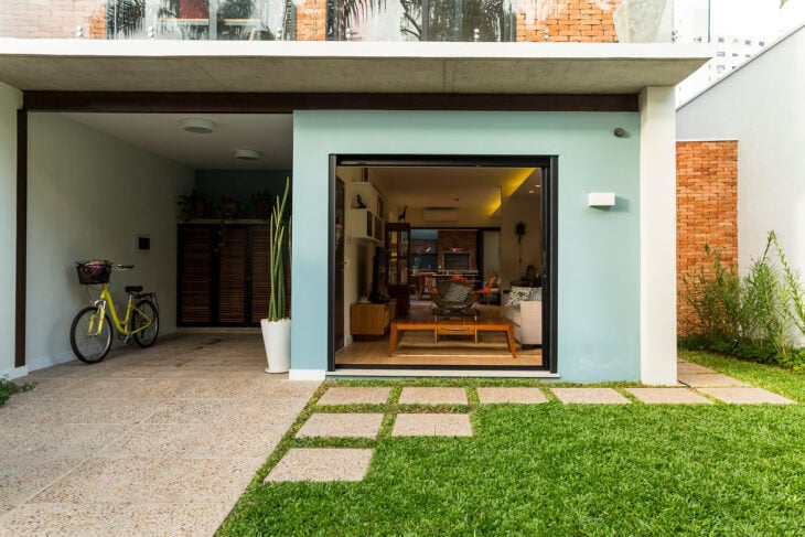
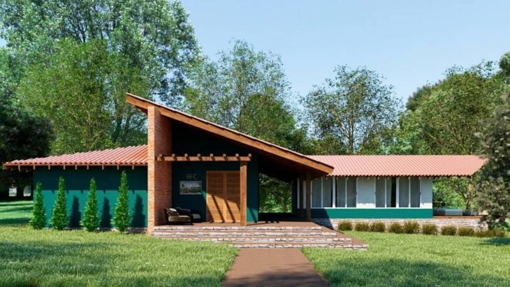
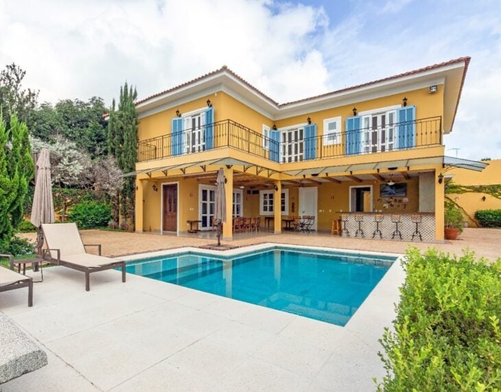
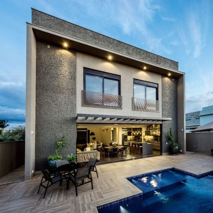
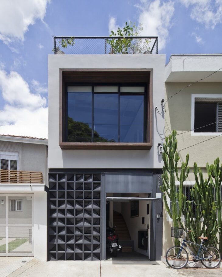
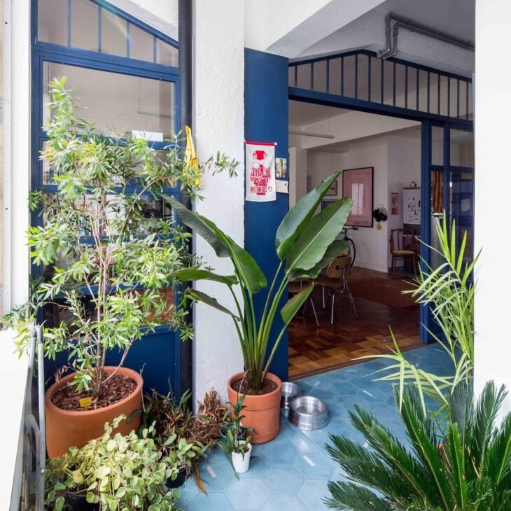
1. a tiffany blue house will stand out in the neighborhood
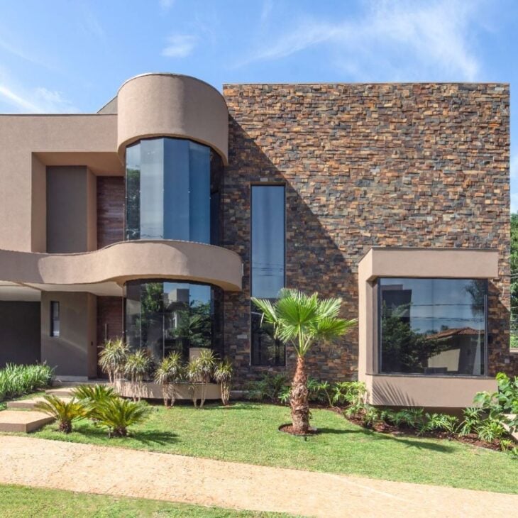
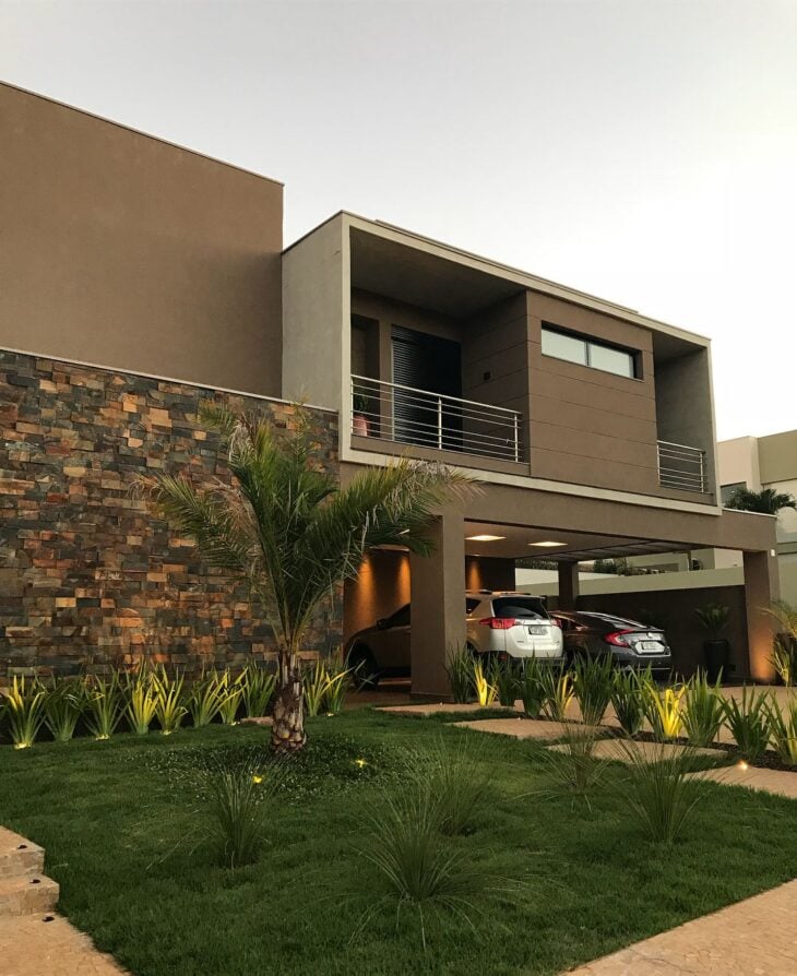
2. for those who are not afraid to dare, highlight the windows with yellow
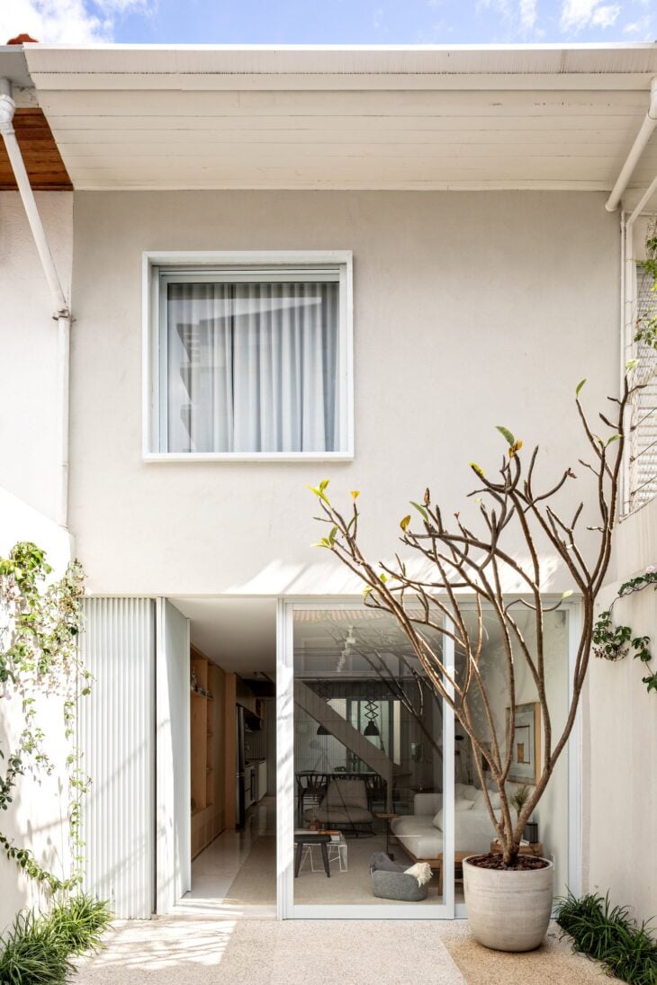
3. white in the outdoor area leaves the colorful squares as protagonists
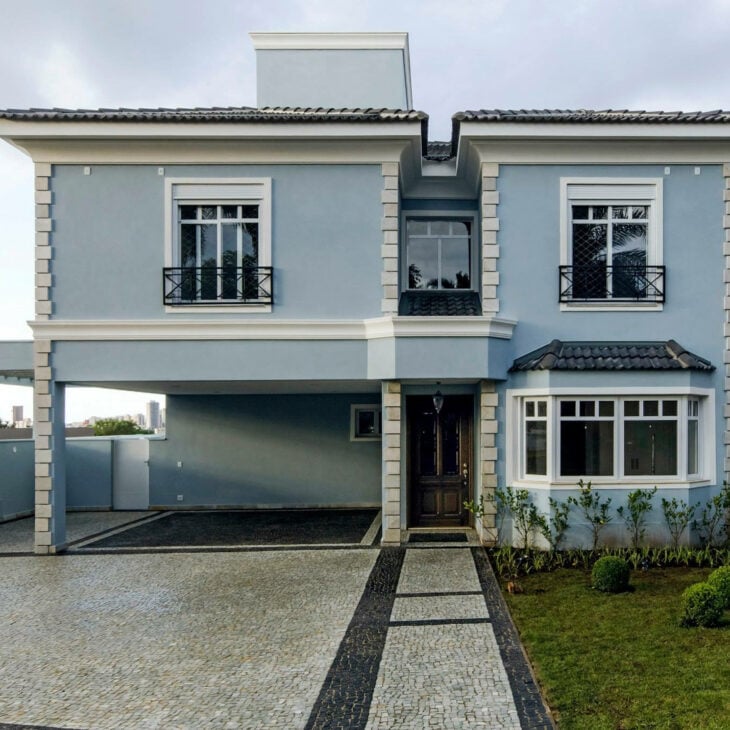
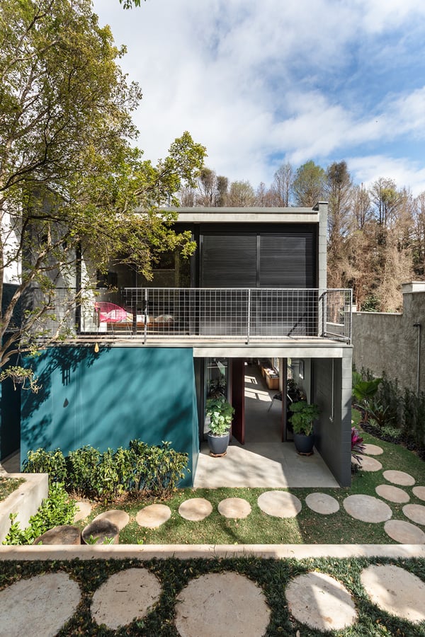
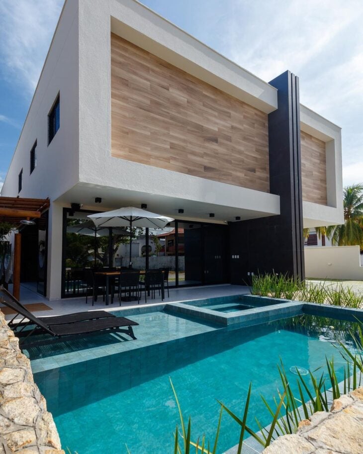
4. and mixing blue with gray gives a modern touch to the facade
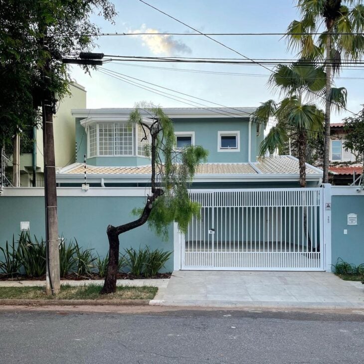
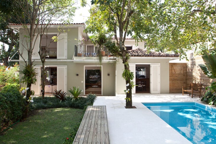
5. pastel shades are in fashion
6. and add a refined touch to the exterior painting
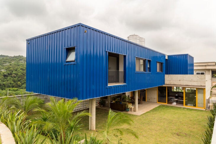
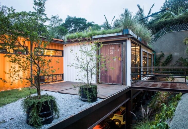
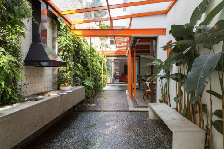
7. but for an industrial design, boldness can be the key word
8. you can opt for a soft tone
9. or more intense, depending on your proposal
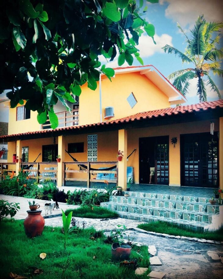
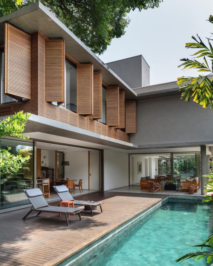
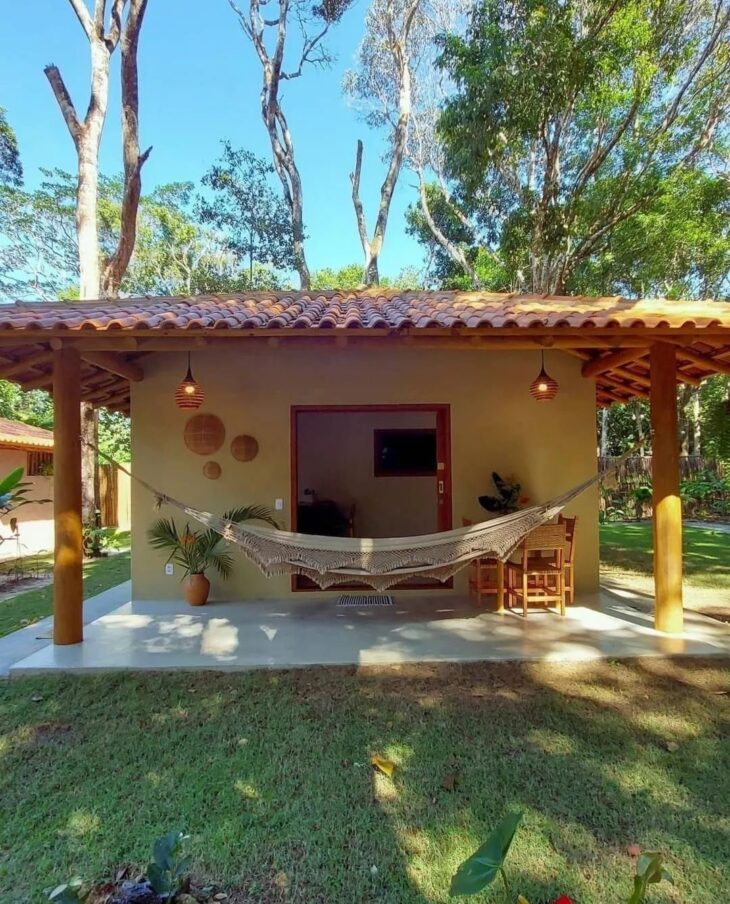
10. earthy tones are present in coatings
11. and harmonize well with moss green
12. you can bet on a sectorized external painting
13. and also mix painting with coatings
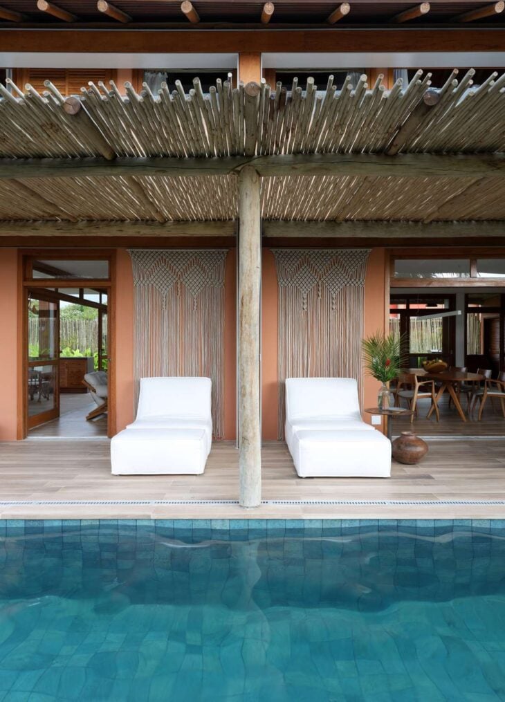
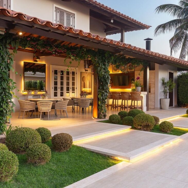
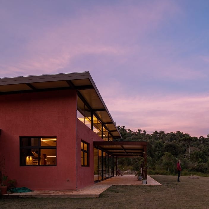
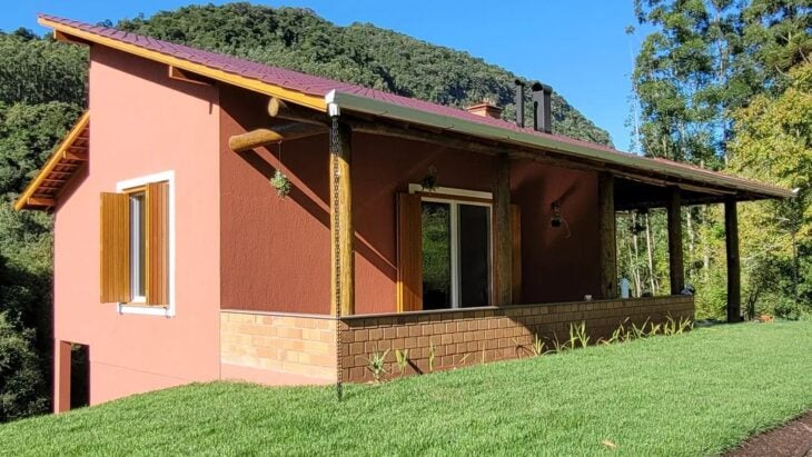
14. warm colors are present in timeless facades
15. in different shades, for different styles
16. notice how ochre brings the construction to life
17. and gain an honest balance combined with white
18. orange stands out even in the details
19. and also as the main color
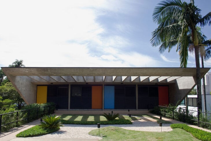
20. this modern structure was gifted with primary colors
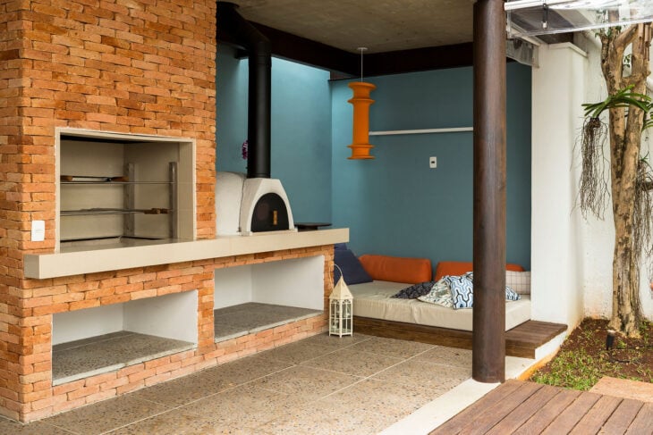
21. this gourmet area is exquisite with terracotta
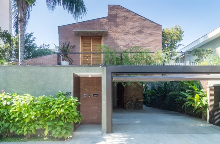
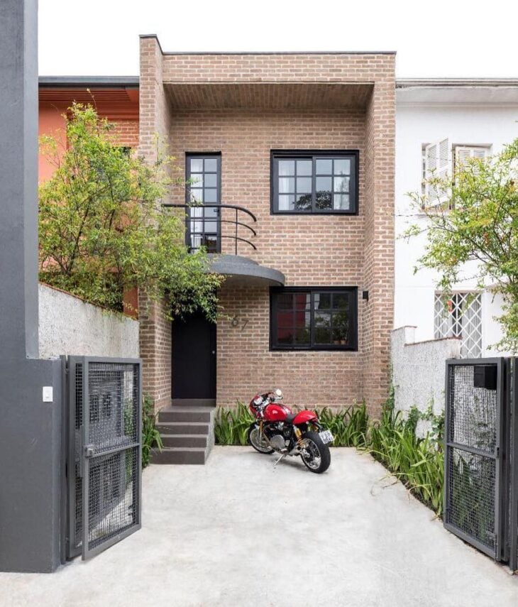
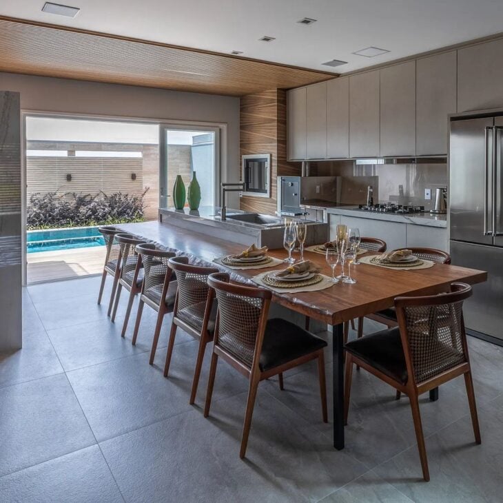
22. brown is traditional in modern house fronts
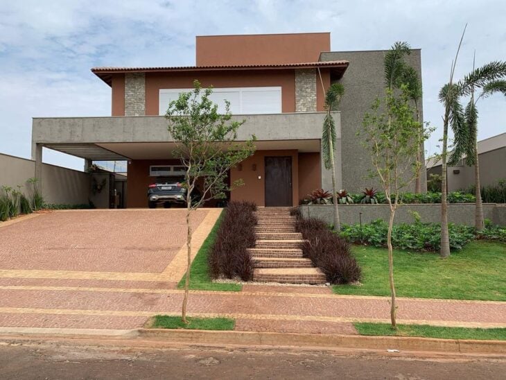
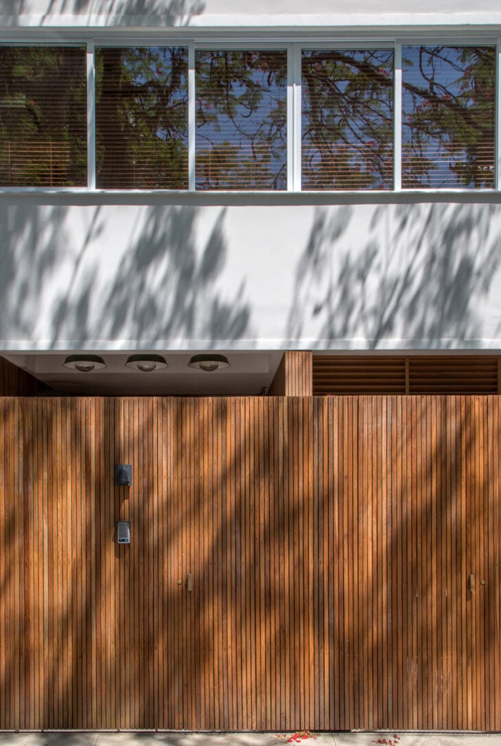
23. and makes its presence felt in natural materials, such as wood
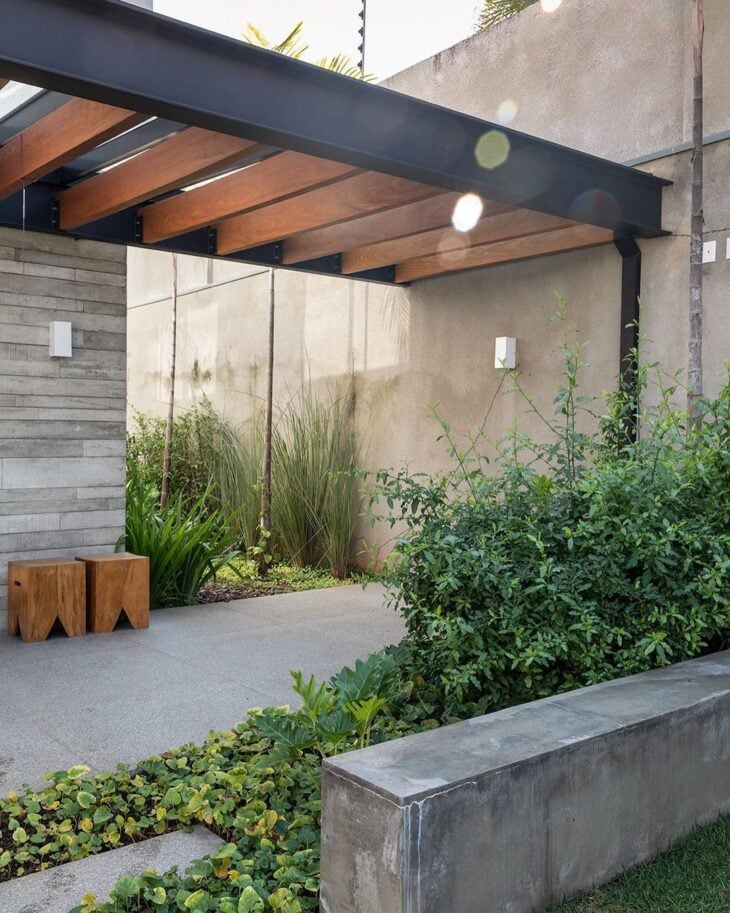
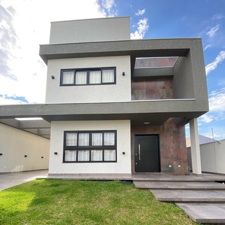
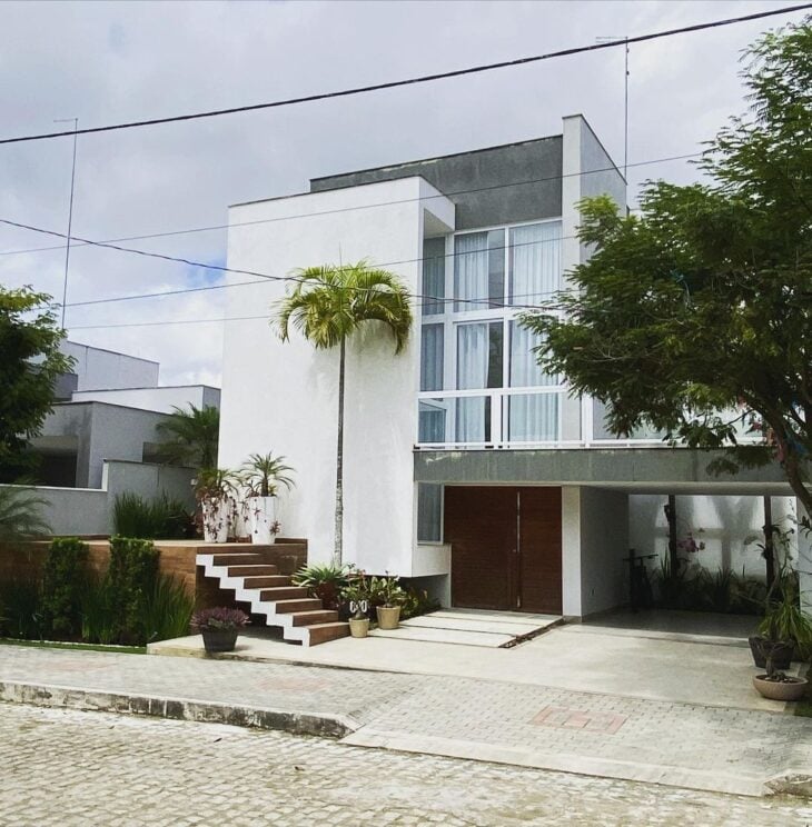
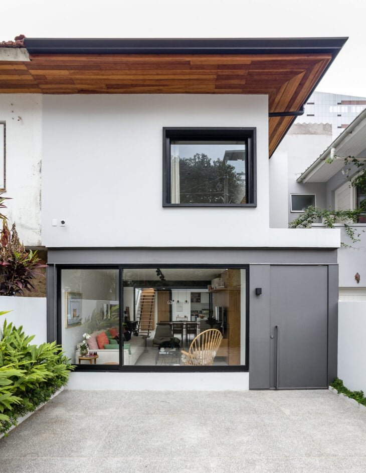
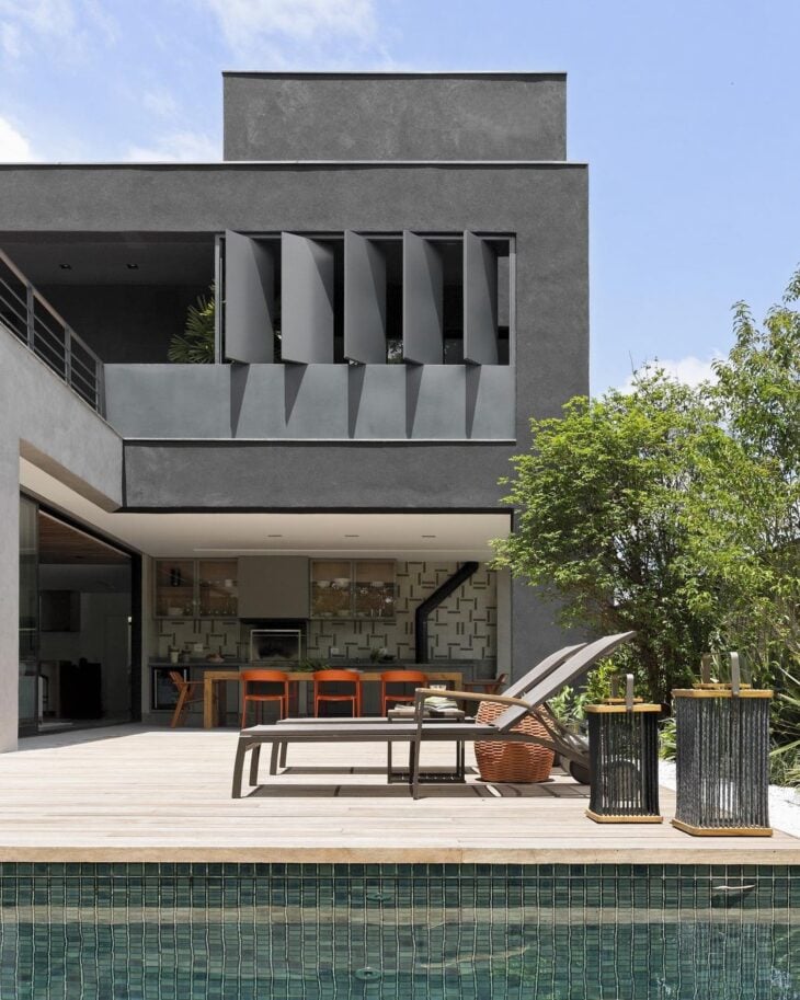
24. gray goes well with simple constructions
25. even the most sophisticated
26. the neutral color goes with everything
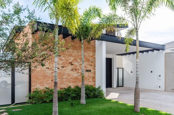
27. from a minimalist design
28. even contemporary proposals
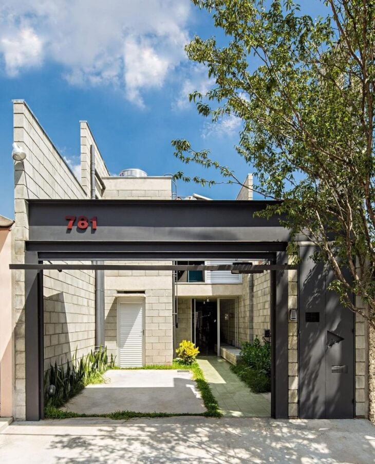
29. white harmonizes perfectly with the bricks
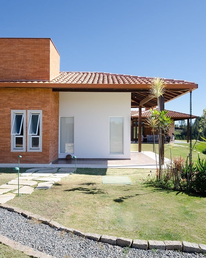
30. and is successful among facades for simple houses
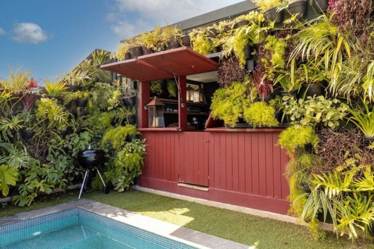
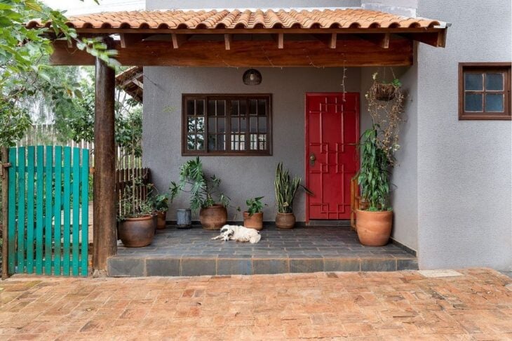
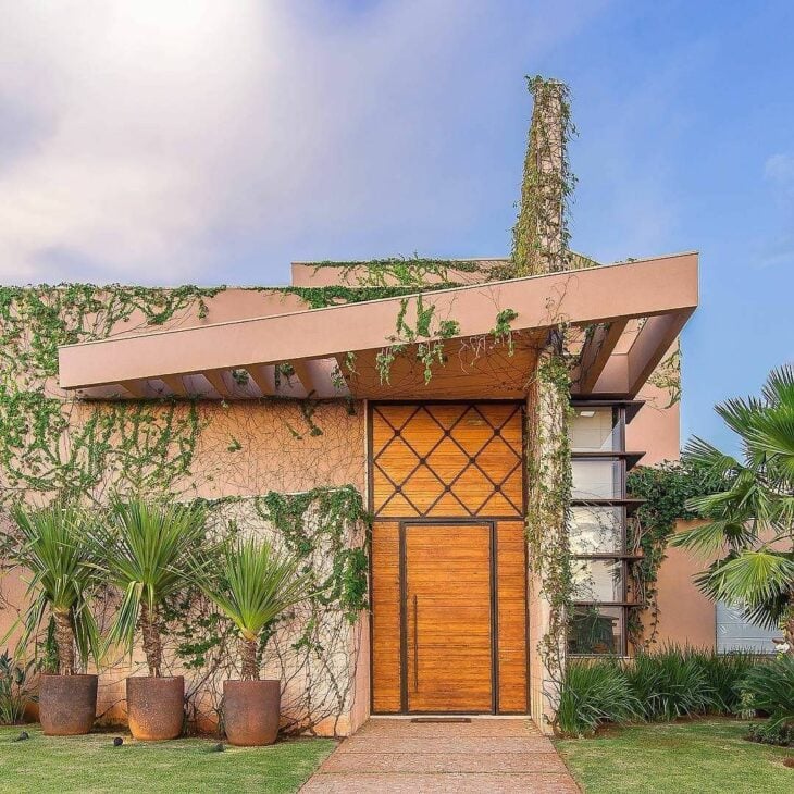
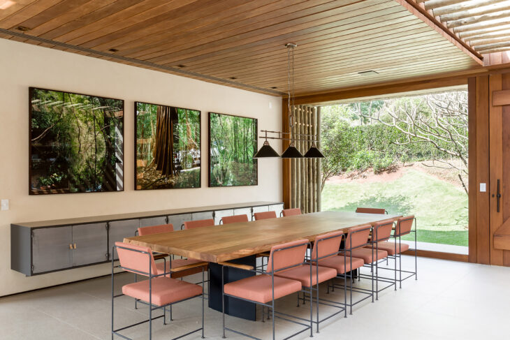
31. in constructions with basic lines
32. and even the most modern buildings
33. it is the perfect choice for more elaborate projects
34. and when mixed with black, are marked by sophistication
35 In fact, black can even be basic
36 But in architecture, they give that special touch to the design
37. giving the project a more current tone
38. both in contemporary proposals
39. as for more industrial styles
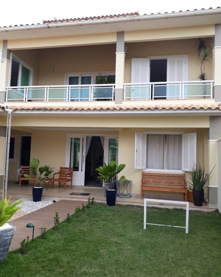
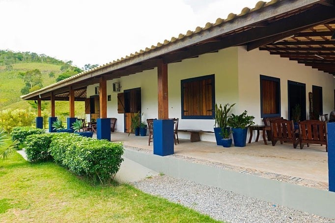
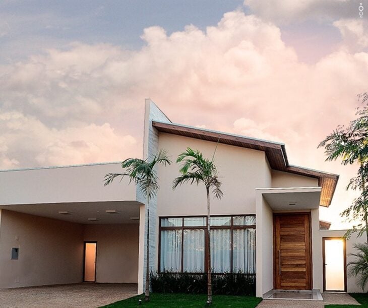
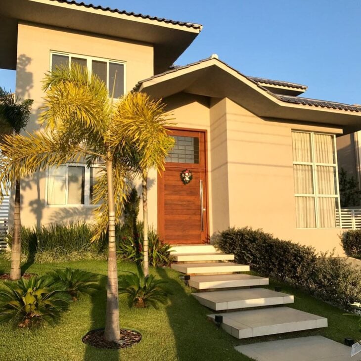
40. beige is the right choice for outdoor areas
41. because it imprints a simplistic identity
42. and also ensures a sophisticated atmosphere to the building
43. for colonial design, this is a great option
44 And if the idea is to let the landscaping stand out, even better
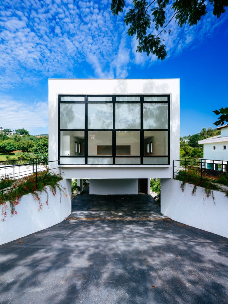
45. clean colors let the magnificence of the building speak for itself

46. and give a unique lightness to the design
47. brick brings brown and terracotta to the cartel
48. a perfect way to include practicality in outdoor maintenance
49 - The refinement was on account of the nude applied to the walls of this backyard
50. this is a perfect color for facades too
51. terracotta is an invitation to coziness
52. a very popular shade in country buildings
53 By the way, the whole earthy tones palette fits well in this style.
54. although they fit perfectly in urban constructions
55. that mix the best of both worlds
Because it is exposed to the weather, the painting in the external area of the house must be done with a special paint and receive a specific sealant for protection against humidity.
55 colors for the home that are perfect indoors
The colors are responsible for orchestrating the style of the decoration and also for providing distinct sensations with their shades and proportions:
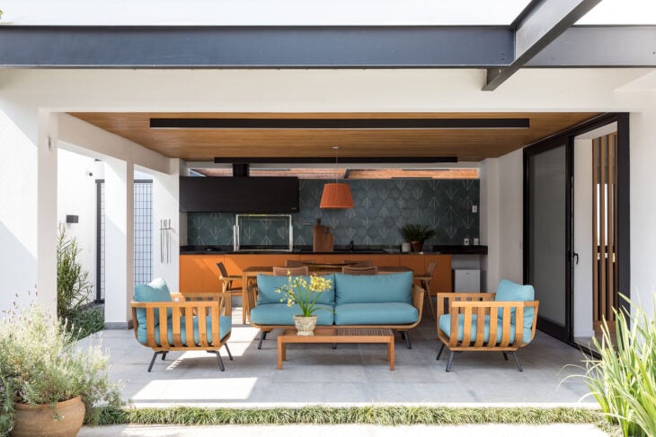
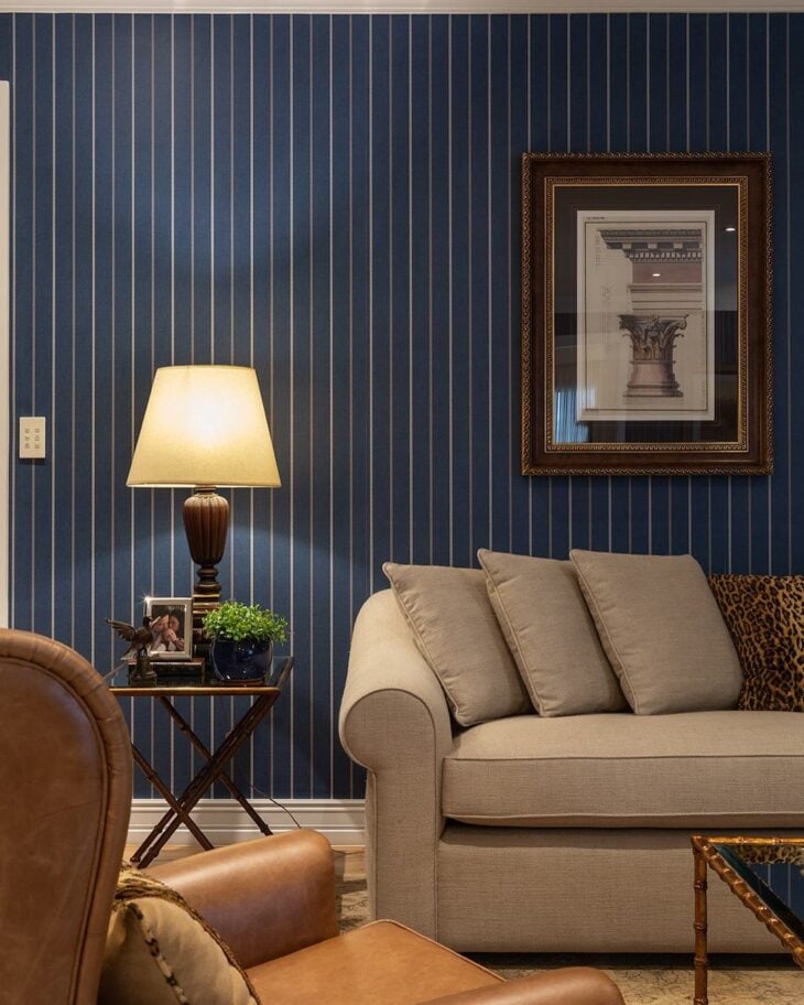
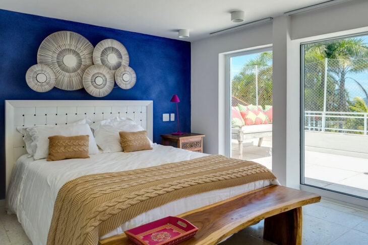
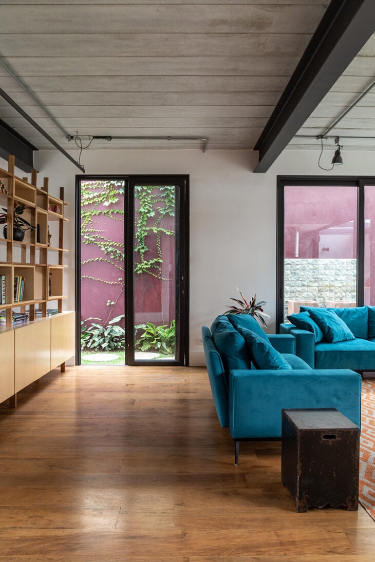
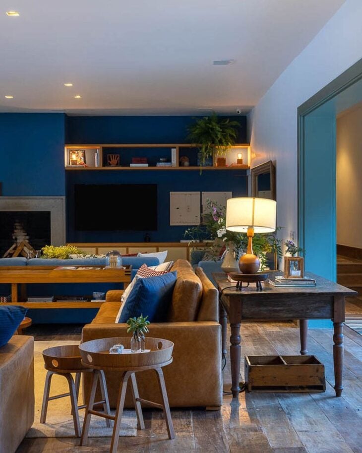
1. navy blue is a showstopper among earthy tones
2. and is of a unique elegance in classic design
3. you can't go wrong with a tone on tone between the doors and the floor
4. in minimalist design, the dark-colored washbasin is an exception
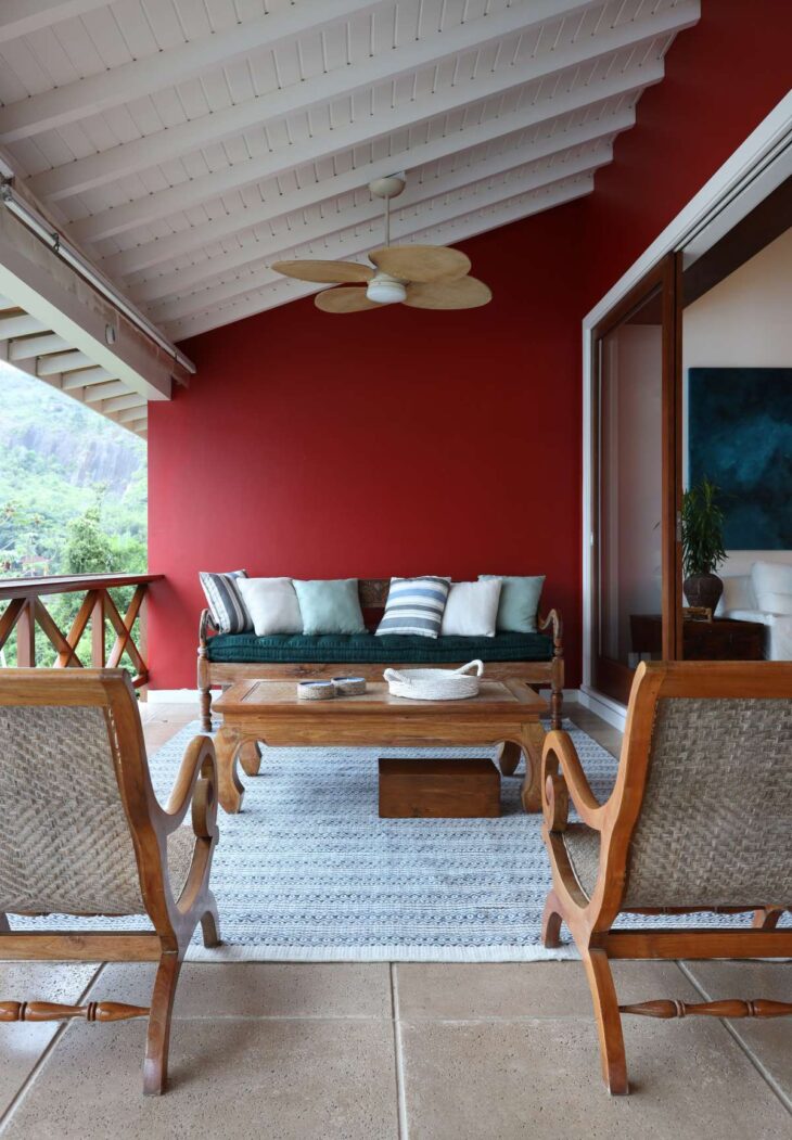
5. the veranda gained cozy airs with the red
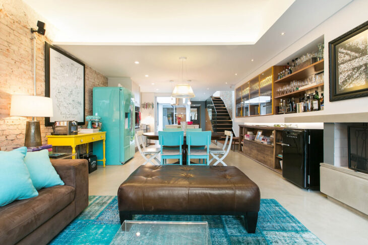
6. a feeling that is also introduced with blue
7. note how the tone of this cabinetry is one of pure elegance
8. but if you're looking for boldness, how about royal blue?
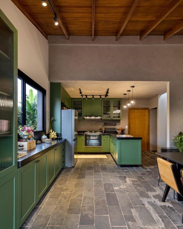
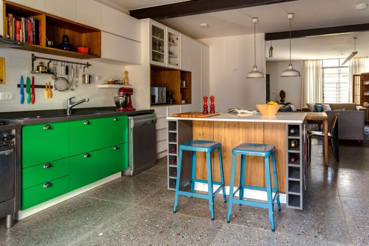
9. green shows grandeur in the vintage room
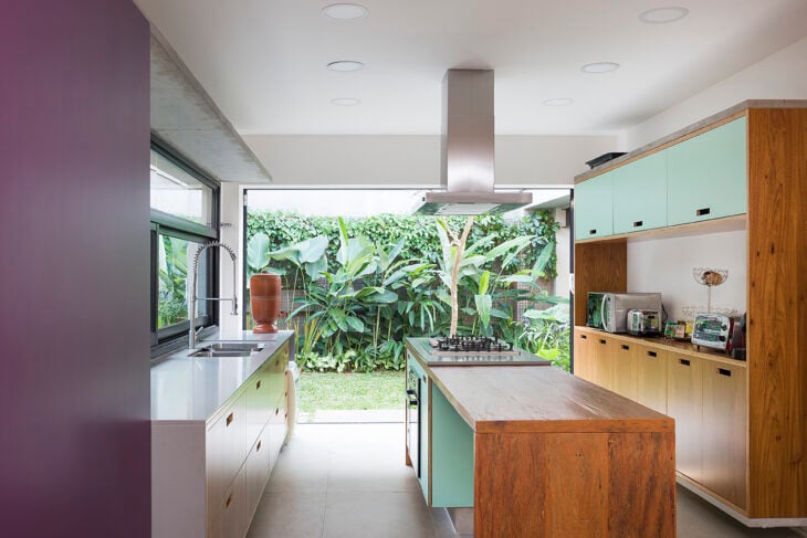
10. and serenity in contemporary cooking
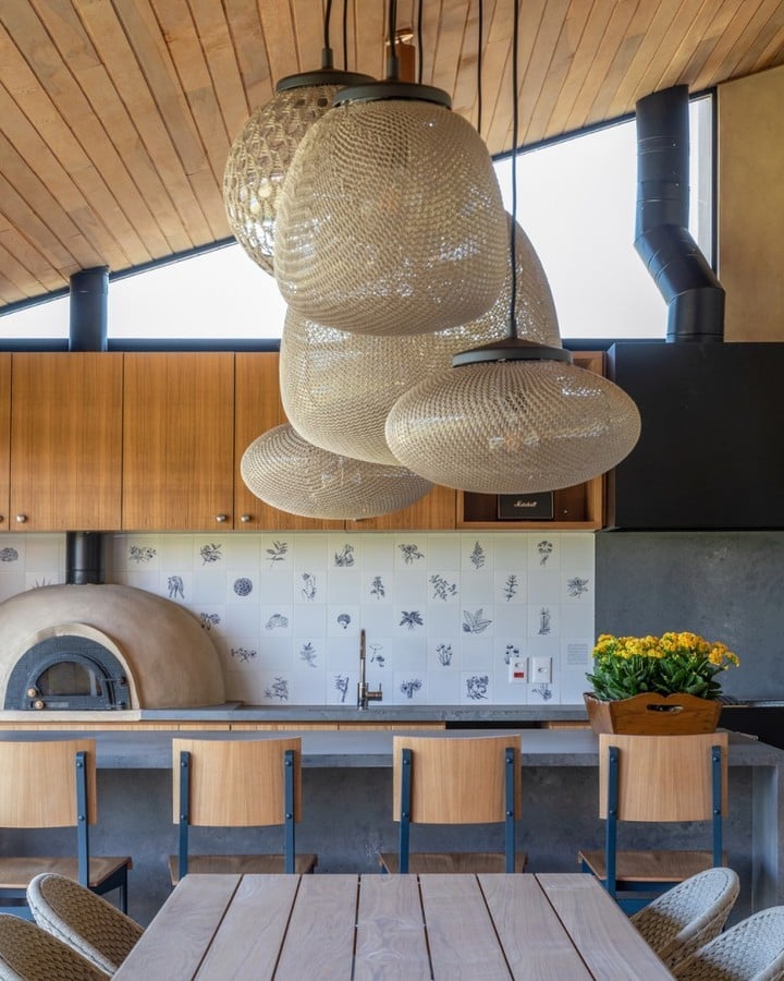
11. it is also present in the vegetation wallpaper
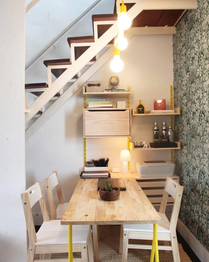
12. and on one side of the room in its darkest shade
13. you can add accent colors to the furniture in the house
14. or in just a few details of them
15. with the chromatic circle, many colors become harmonious

16. as long as they talk to each other
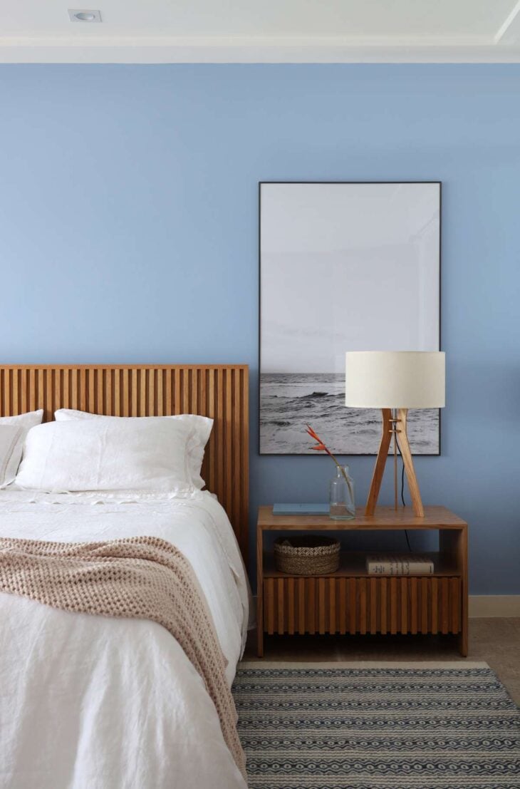
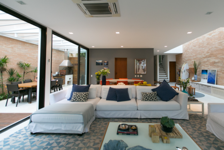
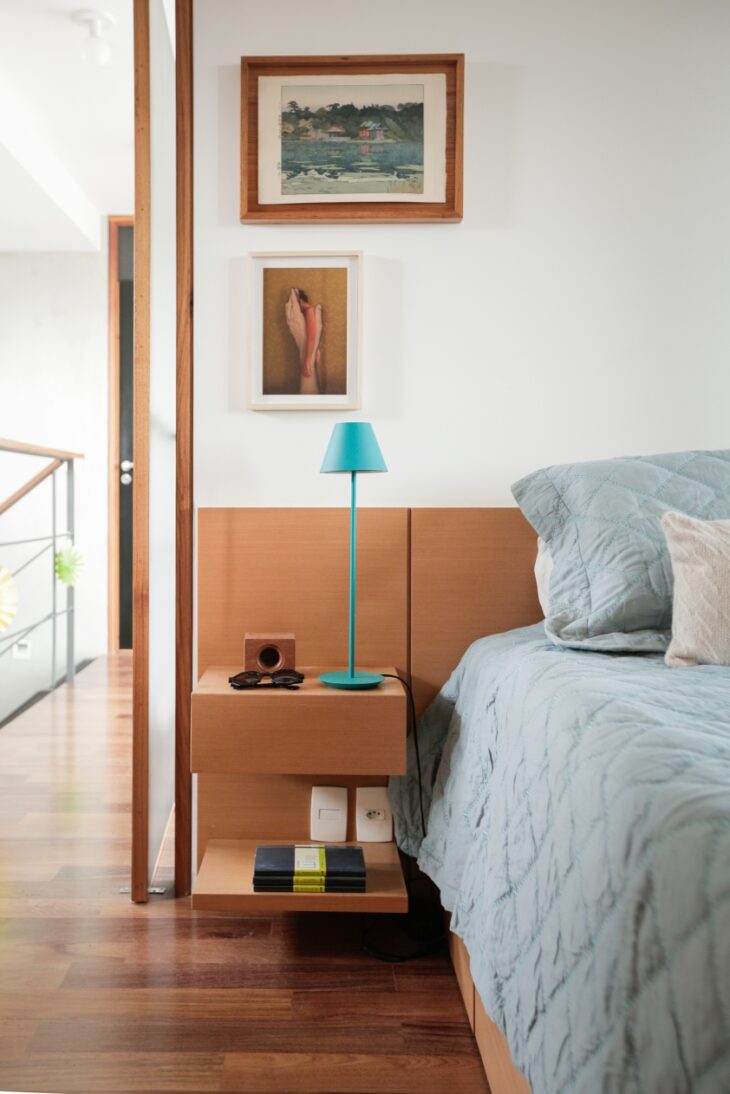
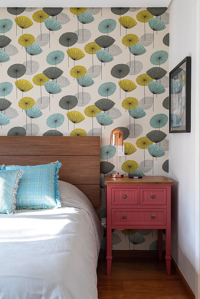
17. in the bedroom, light colors are welcome
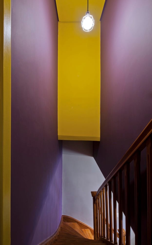
18. in the corridor, bold colors fit well
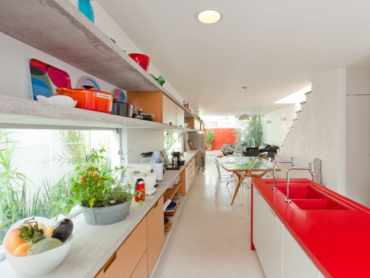
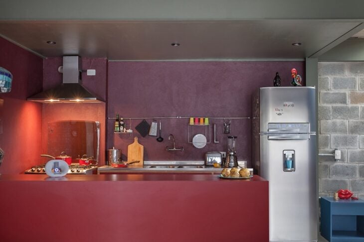
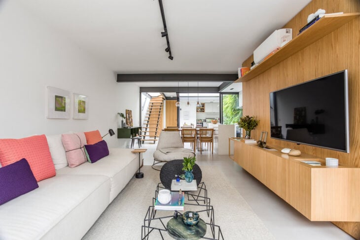
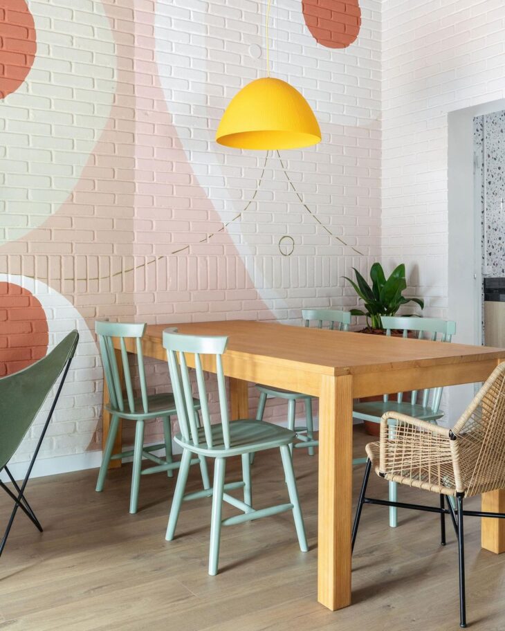
19. in this kitchen, the red goes perfectly with the purple
20. while on this one, it has become an interesting detail
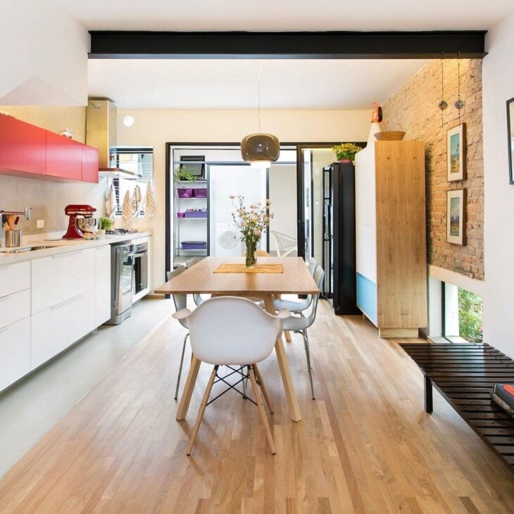
21. Can you imagine mint and purple forming such a perfect marriage?
22. but when in doubt, go gray
23. he is as democratic as white
24. and makes room for different combinations
25. with the most striking colors
26. and also the softest
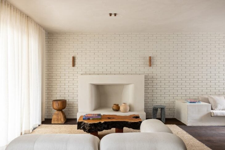
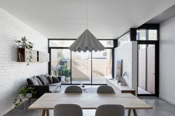
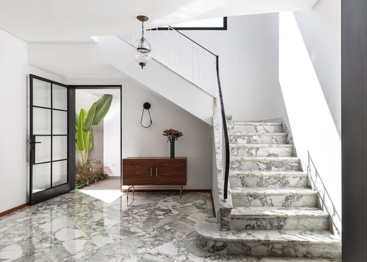
27. there is no way with white, since it is a classic
28. and is present in the balance with the burnt cement
29. whether in modern decoration
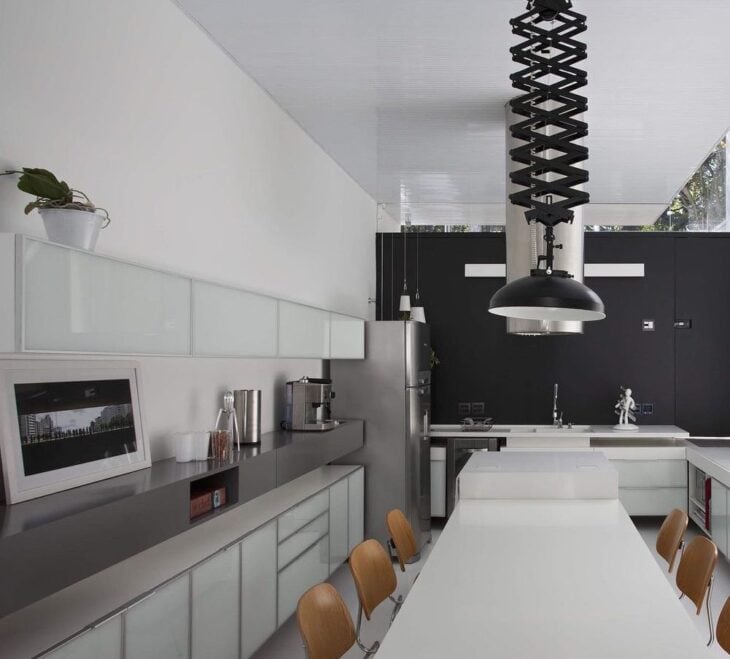
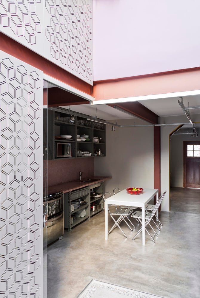
30. or in industrial
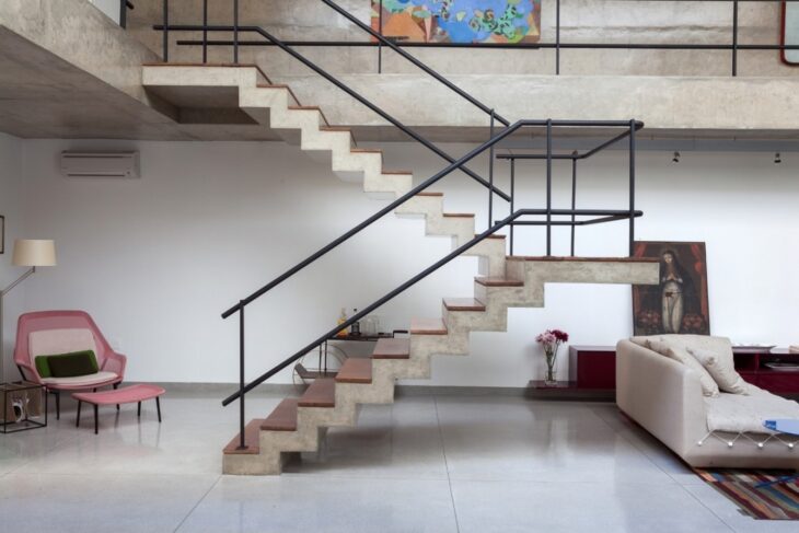
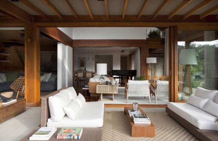
31 With the predominance of white, the floor becomes the highlight
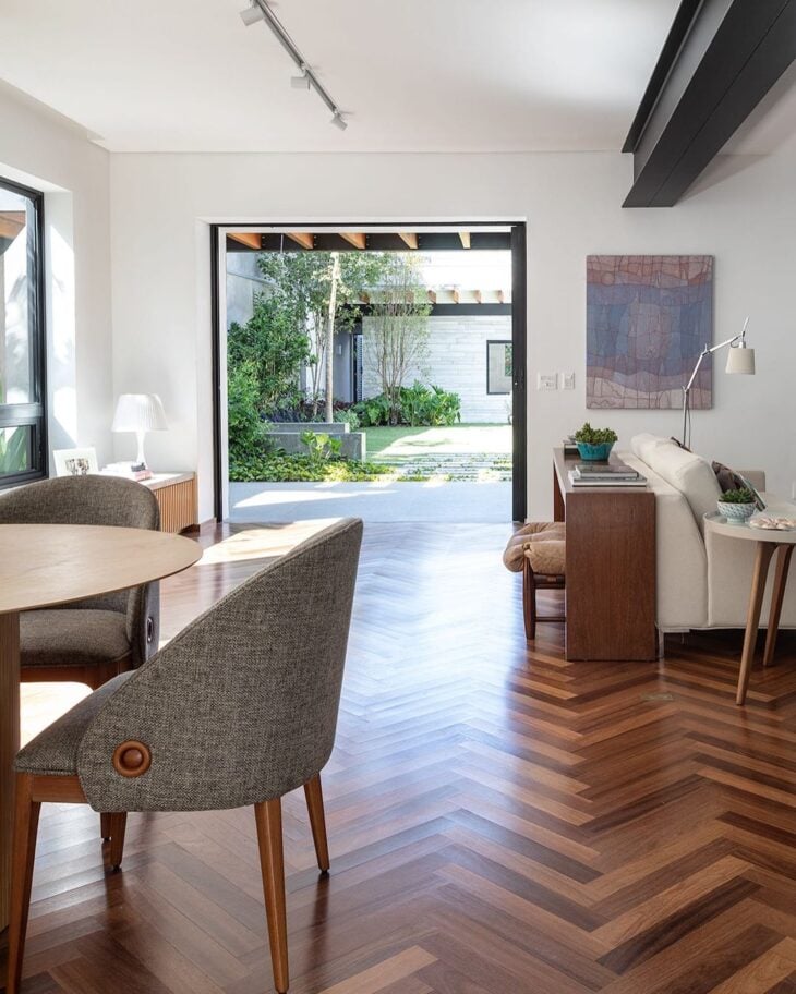
32. and makes a perfect balance with the wood
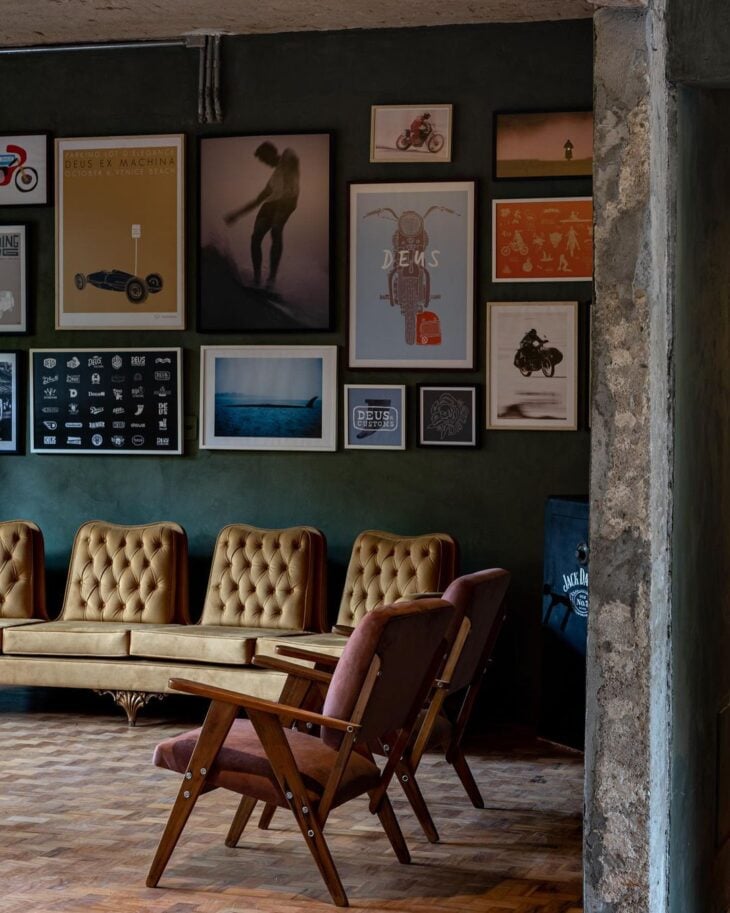
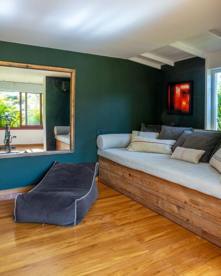
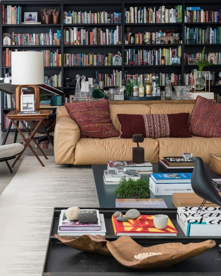
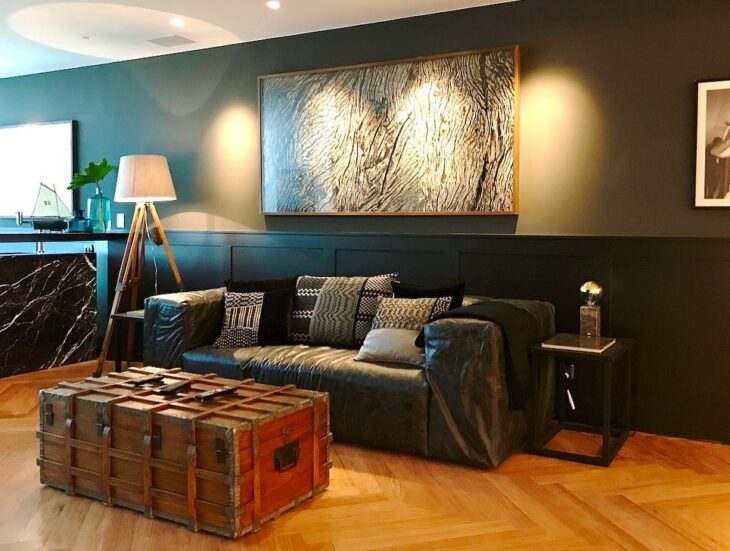
33. black brings that intimate atmosphere
34. remember to give sophistication in the details
35 The wall in the background made all the difference in this project
36. with the same elegance as the boiserie in this room
37. and also this stylish cabinetry
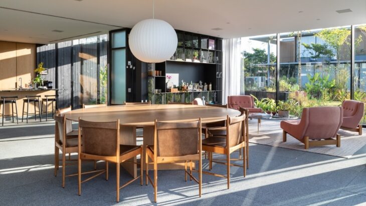
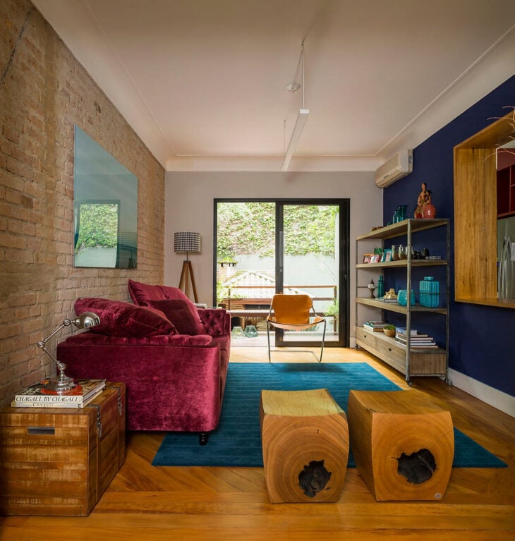
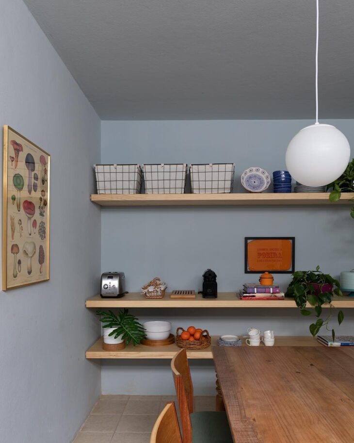
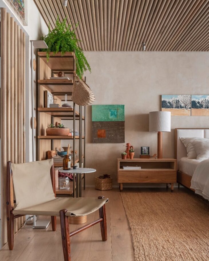
38 - In classic decoration, earthy tones are cozy
39. and beige maintains its maturity and sobriety
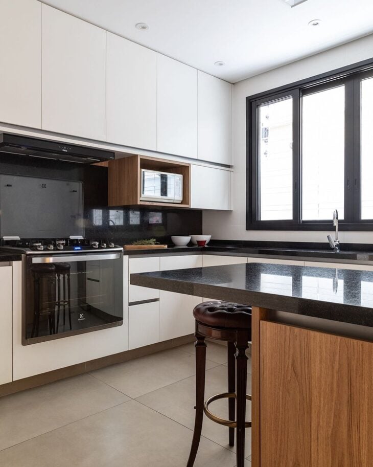
40. from wood to white, this palette is pure sophistication
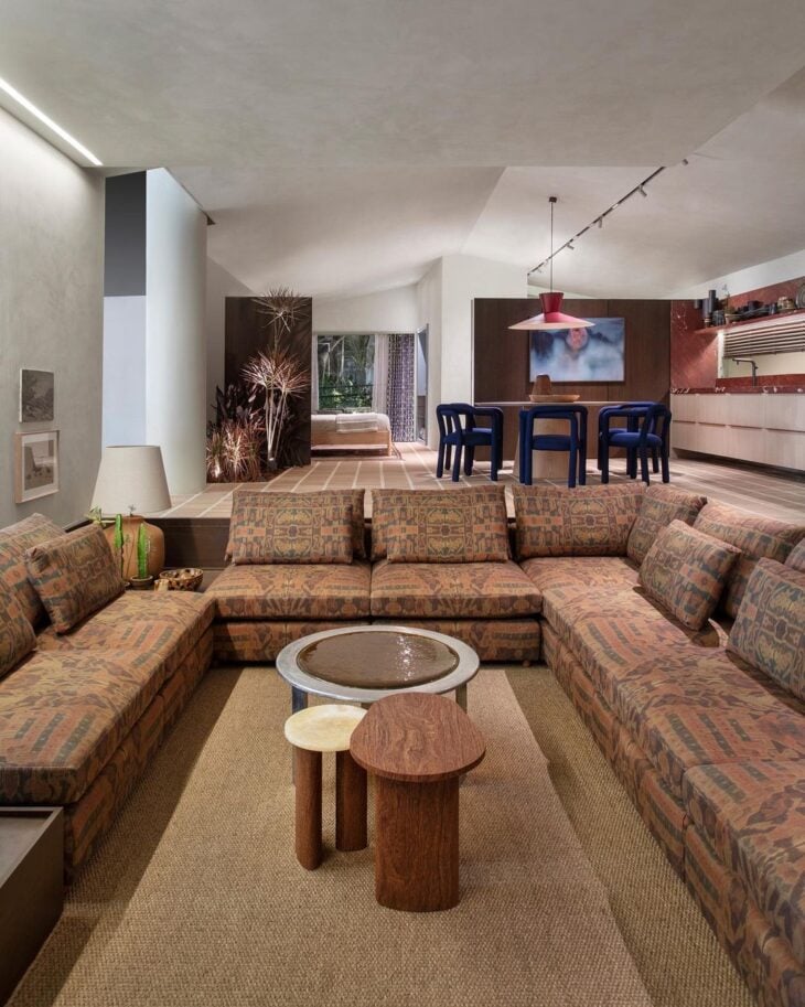
41. which fits both the comfort room and the bedroom
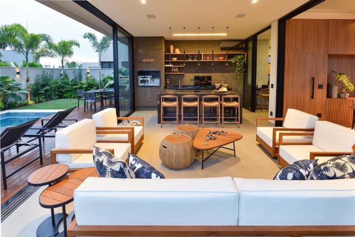
42. as in the inviting gourmet area
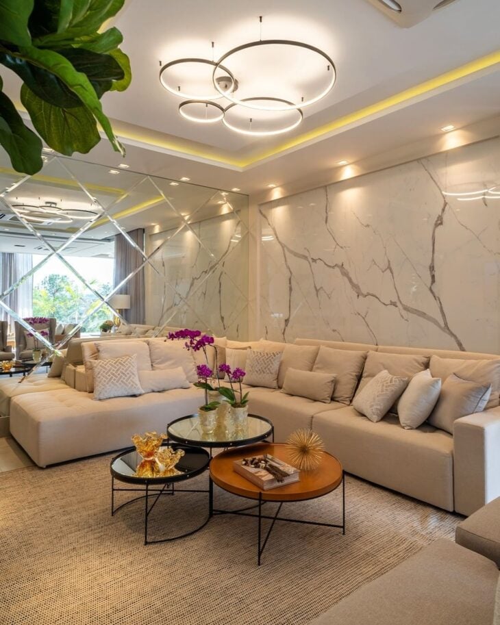
43. with clear walls, the furniture is responsible for the environment's identity
44 Among other details of the surroundings, such as a beautiful lining
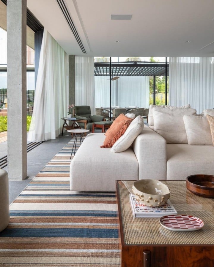
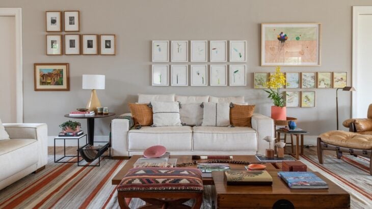
45 You can also colorize the sober environment with a nice rug
46. terracotta was chosen to give expressiveness
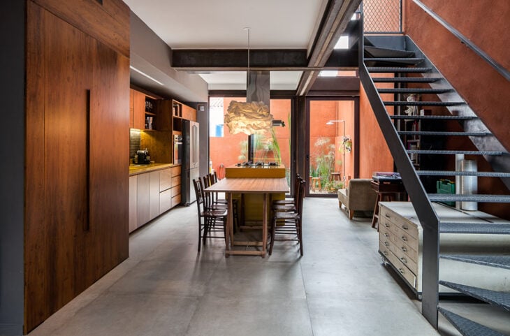
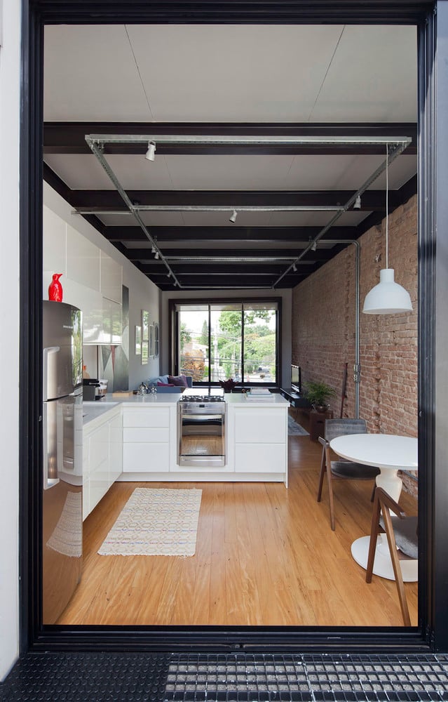
47. in the integrated area, white was necessary to highlight the brick wall
48. for those who seek lightness, choose tones that go through gray and beige
49 But for those who do not hesitate to dare, the tiffany surprises
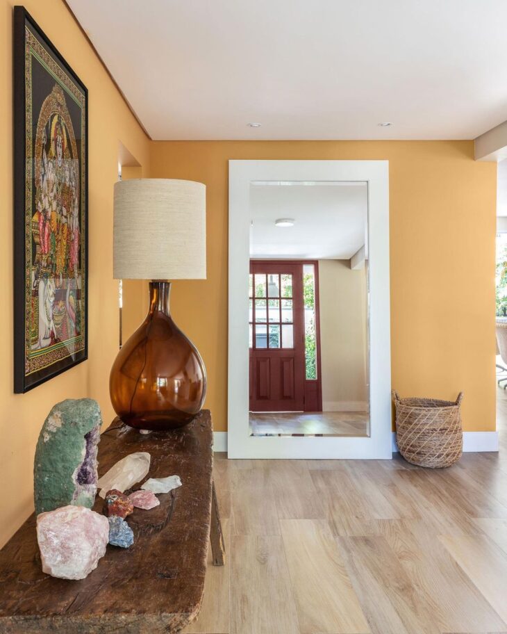
50. the ochre hall added coziness
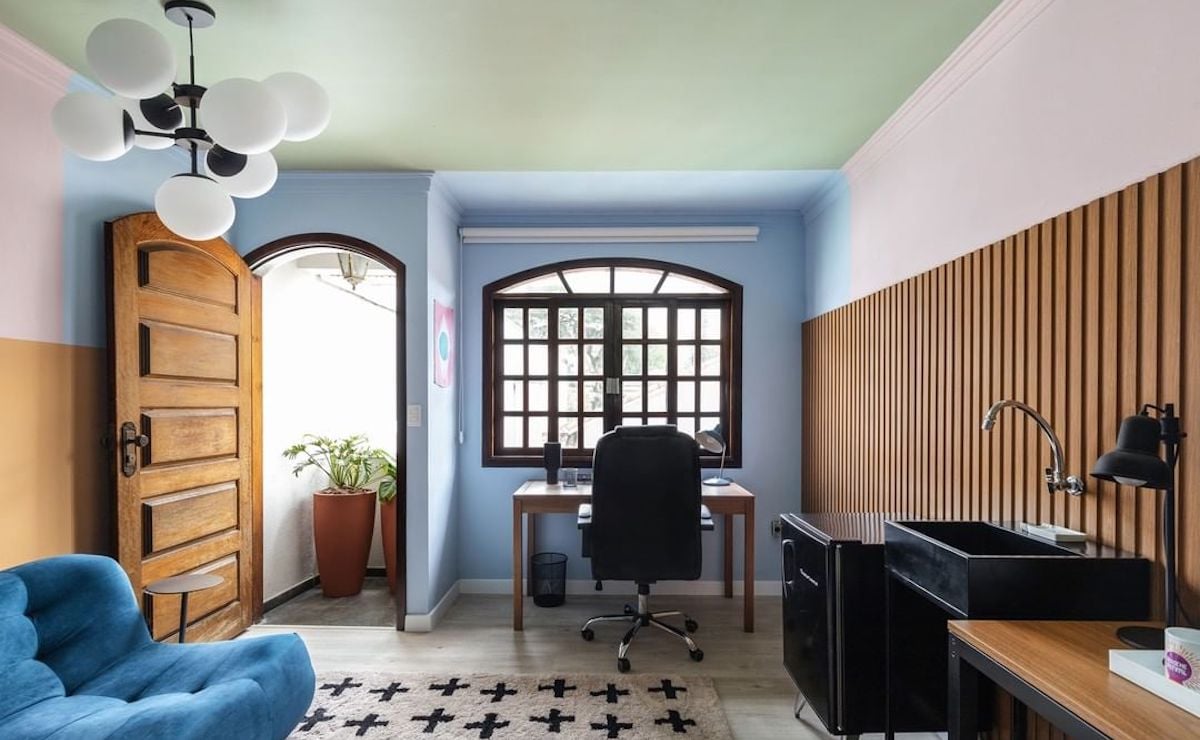
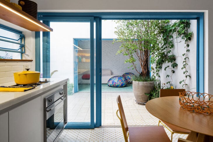
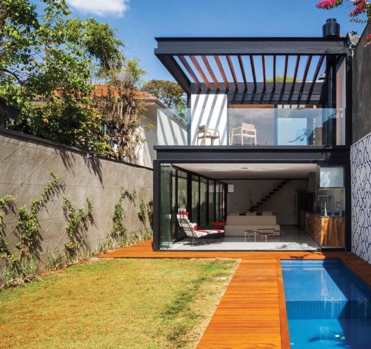
51 - When the outside colors talk to the inside
52. finally, explore the different coatings
53. like the famous wallpaper
54. or a stylized painting
55. the truth is that a good dose of color can change everything
The choice of colors for the inside area of the house can even be influenced by the current trends, but it is important that they match the decorative proposal you want to follow. Think carefully about the options that will bring you pleasant sensations and that will not make you sick with time.
Home Color Videos
To enrich the information you already have in hand, the following videos bring you more technical and intuitive tips to make your choice of colors a safe one. Check them out:
Wall Colors
In this vlog, you will learn how to choose the colors for the walls of your house with the help of the chromatic circle.
See_also: New Home Tea List for a stylish moveHow to choose the color palette for decoration
Here, the youtuber gives up technical tips and talks about references and sensations that must also be considered when creating a project.
Colors for Facade
If you are looking for tips on color trends for facades, this video is essential.
Whether it's a sober-toned facade or a kitchen with predominantly warm colors, the best choice for your home's palette is one that brings you a sense of belonging.