Table of contents

According to architect Marcela Zampere, "colors bring a lot of influence to decoration and knowing the theory of colors is a way to create color combinations that make sense in a certain environment". To understand this subject, it is very important to observe how colors can be applied through the chromatic circle. Therefore, follow the architect's explanations.
See_also: Patchwork: 60 tutorials and ideas to make your home more colorfulHow does the color circle work?
Created by Isaac Newton, the color circle is a table that simplifies the theory of colors. The most basic form of it divides 12 colors and, from that, it is possible to make combinations using a kind of harmonization rule among them. To understand how these compositions apply, it is necessary to go deeper into the concept, knowing some of its aspects.
The colors of the chromatic circle
Did you know that the primary colors are responsible for the formation of the most diverse colors? Yes, the first concept of the chromatic circle is to understand how these colors are formed, because "through them we can make several studies:
- Primary colors: These are considered pure, because they don't need to be mixed to be formed. From them it is possible to form the secondary colors", explains the architect.
- Secondary colors: Here the colors start to form from the various mixtures of the primary colors. In this category, violet (red + blue), orange (yellow + red), and green (blue + yellow) start to make the chromatic circle a bit more complex.
- Tertiary colors: In this category, the colors are the result of the mixture between secondaries. The result of this composition are the colors: purple (red + violet), bluish violet (violet + blue), mustard yellow (orange + yellow), lemon green (green + lemon yellow) and turquoise (green + cobalt blue).
- Neutral colors: Neutral colors are responsible for complementing, because they darken or lighten a certain color. This category is made up of white, black, gray, and brown.
Understanding how colors are formed and their position in the chromatic circle is a good way to create combinations.
The properties of color
In addition to mixing, colors have other basic properties that act as a 'dosage'. It is these properties that create the infinite variations in the color circle:
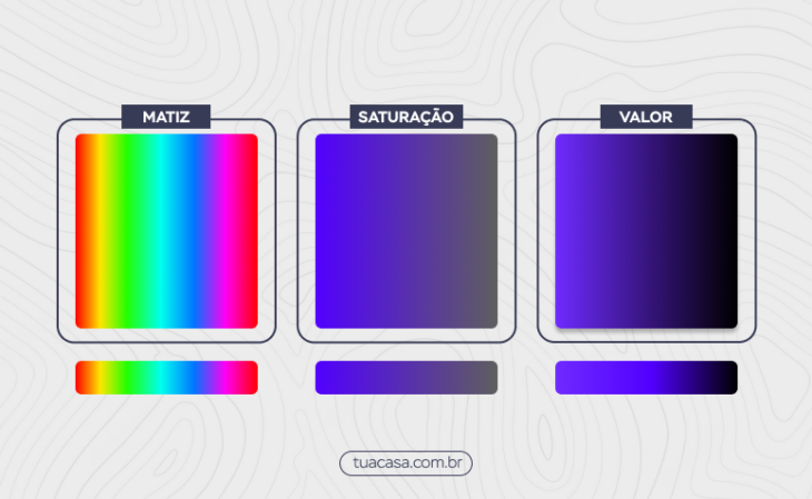
- Hue: Known as hue, hue represents the pure state of a color, without the addition of neutral colors to darken or lighten the color.
- Saturation: also known as chroma, this property refers to the intensity of the color. Thus, "a saturated color is close to the hue, being purer and brighter, while a poorly saturated color is close to gray", explains Zampere.
- Value: the value is responsible for the amount of lightness in the color, adding white or black to create lighter or darker tones. With this addition it is possible to create different intensities and tones.
These properties are essential to apply in your design. To help you, play around with variations of these properties rather than using pure color. This is how you can create unique shades!
Cool colors and warm colors
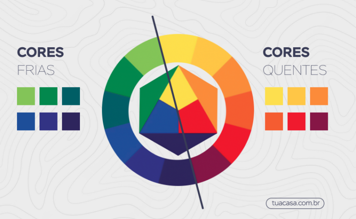
The chromatic circle is also divided by temperature, into cool or warm colors. Temperature refers to thermal sensations, creating an even more elaborate context. For the design, "we can create a more intimate or more sober environment:
- Cool colors: Here the palette of blues and greens predominate, because "they are colors that convey a sense of tranquility and softness, very associated with water and cold.
- Warm colors: Zampele says that "warm colors are responsible for transmitting warmth and happiness, because they naturally refer to fire". In the circle it is possible to detect warm tones with shades of yellow, red, and orange.
Also, remember that when mixing colors with each other, the temperature can change completely. Try mixing yellow with red and red with blue. While the first combination creates a cool result, the second will add more warmth.
Color Combinations
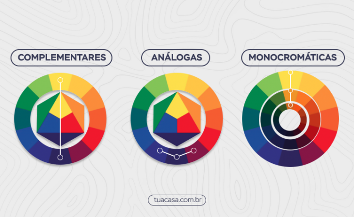
It is also possible to create color combinations using the chromatic circle. For this, there are 3 basic rules that help to understand how to create harmonized and aesthetically beautiful palettes:
- Monochrome: For this option, you need the pure color and its variations of black and white. The white makes the color lighter and the black makes the color darker.
- Complementary: "The complementary color combination is made by choosing opposite colors in the chromatic circle," explains Zampere. They present greater contrast between each other and are often used to highlight some elements of the space.
- Analogues: It is usually made up of a primary color and its adjacent ones, and helps to build a sense of unity in the environment.
There are other techniques for combining colors with the color circle, so don't limit yourself to just these three options. The world of color theory is full of details, but you will already be able to create beautiful compositions by mastering the basics.
How to use the chromatic circle in decoration?
Color theory may seem abstract, but through the color circle you can make the theory more practical. Below, Zampere shares some tips for adding everything you've learned to your decor:
Complementary Colors
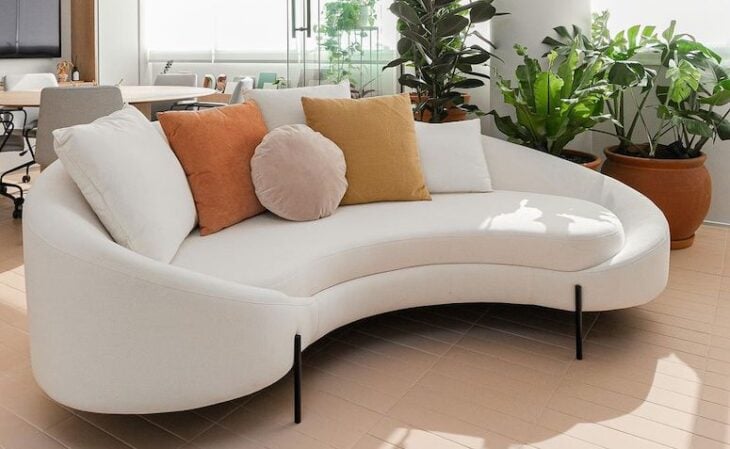
"In this type of combination we have greater effects of contrasts, because the colors are more vibrant. They are great for environments where we want to stimulate creativity, bring joy and personality. It can be used in living rooms and kitchens, where we receive friends and have a moment of leisure. Commercial offices that work with creation can also opt for this combination", he says.Other options for complementary, or opposite, color combinations are green and red, red and blue, and yellow and purple.
Analogous Colors
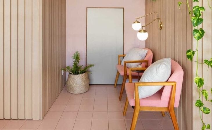
According to the architect, "analogous colors create a feeling of unity and balance in the project. Here, in addition to the combination of analogous colors, we must pay attention to the shades of the colors. Warm and analogous colors are ideal for more relaxed environments, while cold and analogous colors can make the environment more elegant.
Cool colors
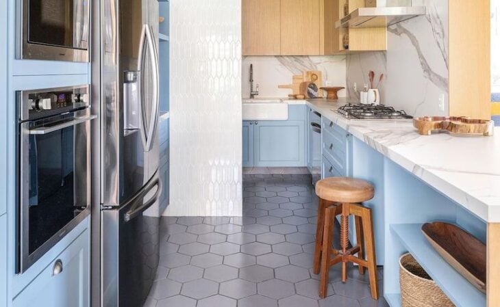
"The cold colors bring a sense of tranquility and softness, being ideal for environments of long permanence, such as bedrooms, work and study places. We must be careful when using cold colors in excess to not convey a feeling of sadness in the environment. However, it is possible to work with cold colors on walls, floors and give a touch in furniture fabrics with cushions withwarmer colors".
Warm colors
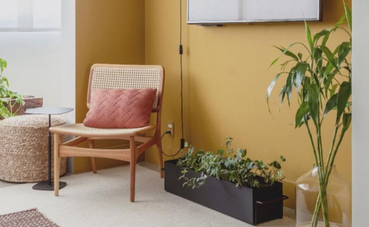
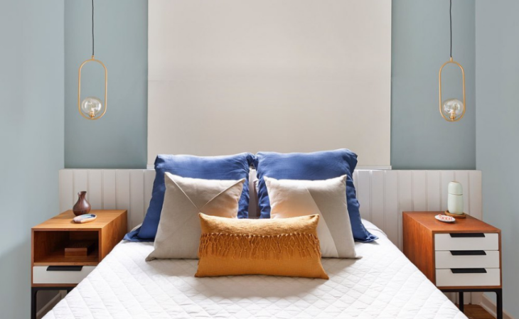
"Warm colors transmit a welcoming sensation, awaken joy and are great for dynamic environments. Here it is interesting to consider the size of the room, because small rooms with warm tones can seem even smaller. Therefore, the ideal is to create a balance between warm and cool tones." In this project, note how the yellow of the wall and the pink of the pillow make the room more welcoming,while the green tone of the plants has a cooler touch to balance the colors.
Monochromatic colors
"To create the gradient, avoid using the same tone on many surfaces of the room, because it is important that the tones have visible variations. Another option is to work with different textures in the same tone. This technique explores othersenses beyond the visual, creating a cozy effect," explains the professional.
Finally, Marcela clarifies that "although there are no rules, it is very important to know the effect that each color causes and what you plan to convey. The balance between colors is essential, and compositions created through the use of the chromatic circle can help.
How to use the color circle in decoration
The selected videos show the application of the color circle in practice, and even share extra tips to complement your knowledge:
How to use the color circle in decoration
In less than 5 minutes you will reinforce your knowledge of the color circle and how it is applied to decoration in a harmonious way.
See_also: Rocking chair: 50 attractive models for any decorationCombining colors in small environments
Adding color to a small room can seem like a complicated task, especially when you know that some colors make the room look even smaller. In this video you learn how to use specific colors for decoration in compact environments and also understand what influences they bring to the room.
How to combine colors in decoration
Do you know that unusual color that you love, but don't apply in your decoration, because you don't know how to combine it in the environment? Here you will learn how to use your favorite color and get out of the basics. If your desire is to get out of the obvious, the suggestions in the video bring wonderful unique examples!
Understanding the chromatic circle is the basics to master the art of color combinations. Choose the shades that best represent your personality and adapt the theory to your project and create the perfect color palette for your environment.