Table of contents
Acclaimed by clean style lovers, pastel shades (or pastel tones, as you prefer) are no longer exclusive to decorating children's rooms, but are now part of the color palette of any interior environment. Their softness and delicacy are perfect for those seeking balance and a sense of lightness in the composition of the space, besides offering an extra youthfulness to the room.The low saturation of its colors allows this palette to be combined with diverse proposals: from industrial to classic, the freshness will always be guaranteed.
But if the intention is to create something that escapes from sobriety, don't forget to take advantage of the versatility of pastel shades to combine colors with more striking materials and textures: wood and burnt cement are examples of great allies for a more mature decoration, besides being timeless. For more feminine proposals, how about including carrara marble and copper in this harmonization?
Check out the following list of projects with the most varied proposals including pastel shades in the composition, with a lot of personality and identity:
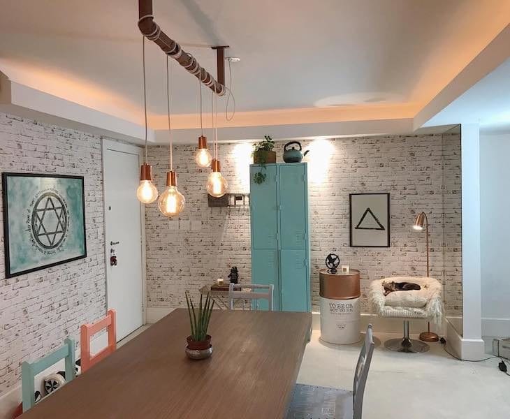
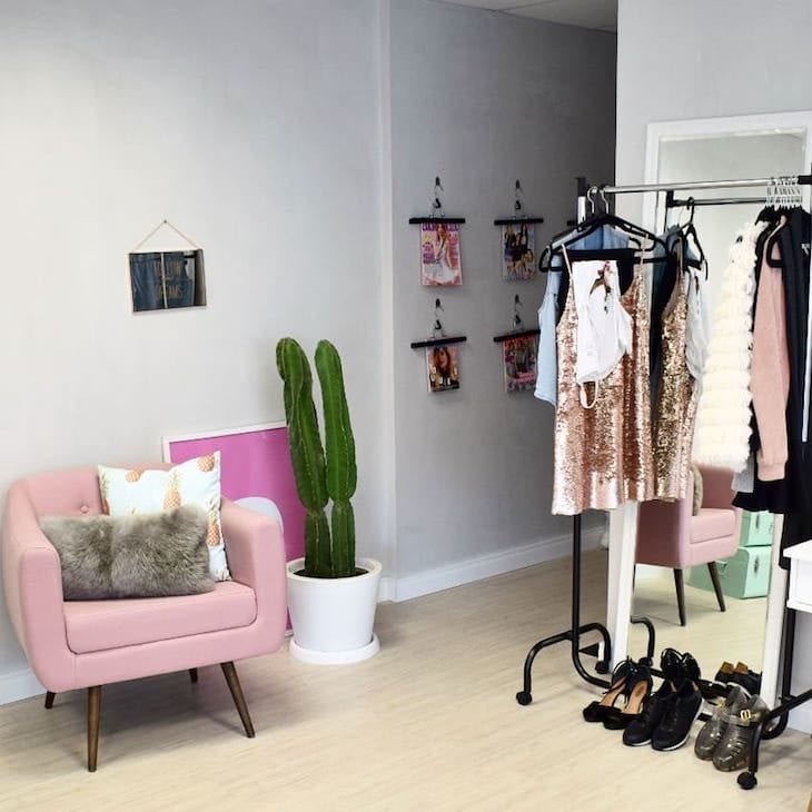
1. a fresh pink locker in the living room
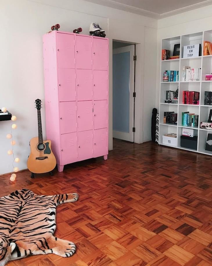
Pink, besides being a feminine color, is super youthful, main characteristics of this spacious room.
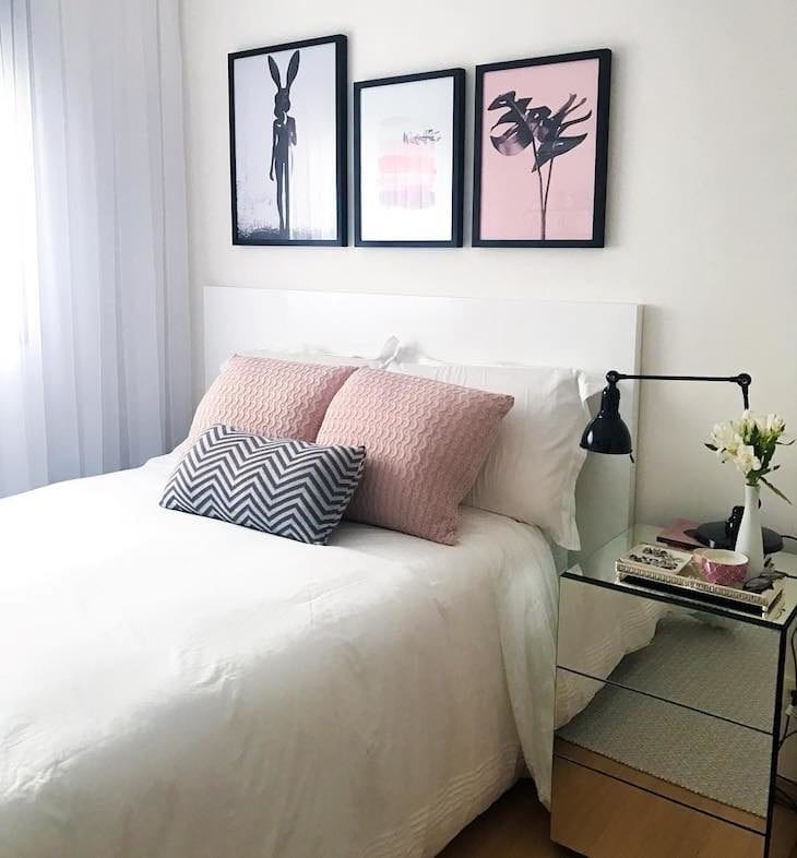
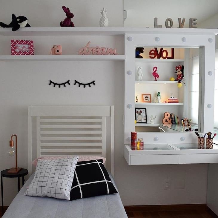
2. gray and off white are perfect allies for a clean composition

For the decoration of this clean bedroom, gray and off white were true allies to meet the proposal. The burnt pink tone of the headboard is the sophisticated touch of this composition.
3. filling the house with joy
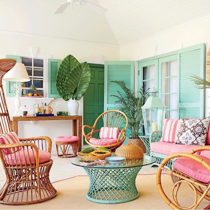
For those who can't do without the natural joy of striking colors, how about investing in the warm options of pastel shades? In this balcony, pink and tiffany were the big attractions.
4. softness to accommodate the dressing table
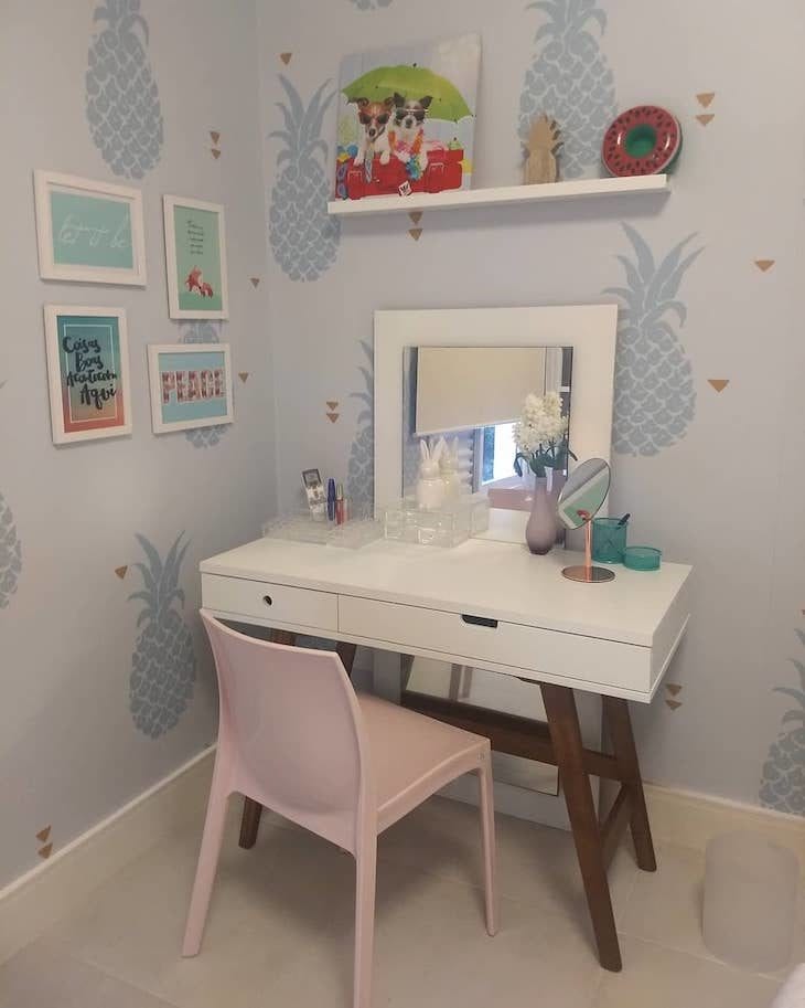
This vanity corner of the women's room was wallpapered with blue pineapples, responsible for brightening up the space. The wooden table leg is that hint of coziness that the bedroom needed.
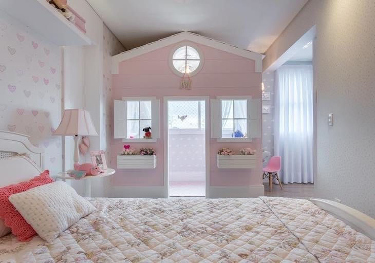
5. the princess's little room

The most traditional way to use pastel shades in decoration is to combine them with white. This is the main characteristic found in women's or children's rooms, with a classic and clean style.
6. the coziness of wood
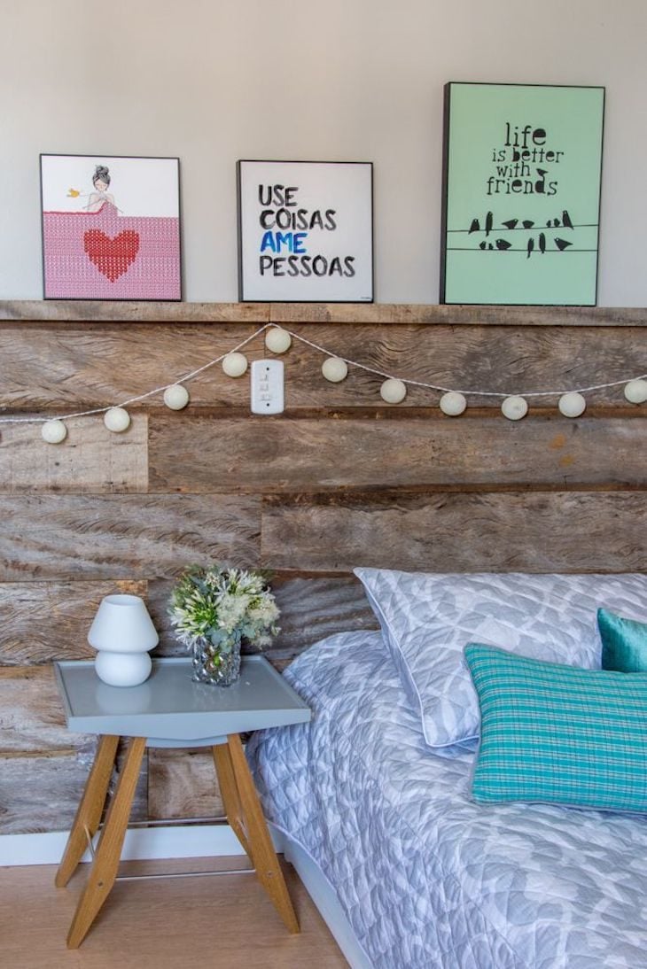
The rustic headboard had its texture neutralized by the pastel shades applied to the comics, bedding, and side table. The result: a cozy bedroom full of identity.
7. a playful space for the little one
The mixture of wood and floral wallpaper was the right balance between delicate and cozy that this little girl's room needed.
See_also: 24 decoration ideas with crates to make your home more charming8. wood imitation wallpaper

For the spacious dining room, the owner chose a wallpaper that imitates wood, in a pastel blue tone. The contrast of the mahogany of the table was well highlighted by the light tone, adding lightness to the decoration.
9. fun geometric shapes

The study corner of this girl's room also got a wallpaper, this time with colorful geometric figures, in soft tones, to match the rest of the composition.
10. a differentiated chalkboard
For those who want to have the trend of the moment, but don't like the idea of including a dark wall in the decoration, how about producing a chalkboard on the green wall?
11. you can't go wrong with coloring the walls

Those who are not afraid to dare can completely escape from the traditional white wall and include a pinch of color in the decoration by adding a pastel color to the wall. Besides keeping it neutral, it is still possible to combine it with several other proposals.
12. pastel shades can easily be used in children's rooms

Traditionally used in children's rooms, pastel shades ensure that the environment is soft, guaranteeing a light feeling for the room of babies and older children.
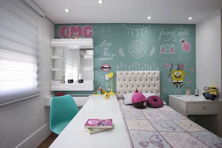
13. ... in juvenile rooms...
For the girl's bedroom, the shades of pink were applied softly in prominent details. Notice how the composition of pictures and pillows gave a more sophisticated look to the bedroom.
14. ...And in double bedrooms too

This soft color palette is not exclusive to children's and playful rooms. An adult's room becomes more sober with the delicacy of pastel shades. Notice how this space has become an invitation to coziness painted in blue.
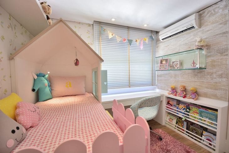
15. the dollhouse
It's hard to get the kids out of the room when the decoration has thematic solutions. Of course, a light pink could not be missing in this composition, right?
16. white in good company

A white room will always be timeless, especially when it comes to bedrooms where the resident will still grow, change style and personal tastes. The best solution to personalize the environment in a different phase? Investing in just one wall to be colored with a soft tone!
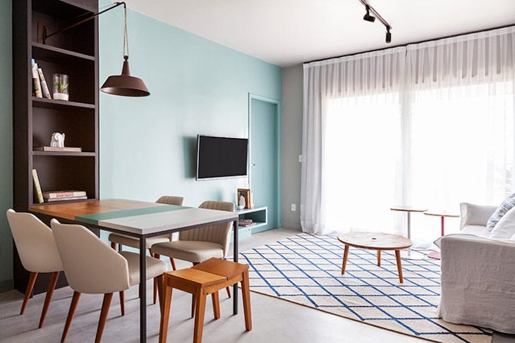
17. the jovial living room

The turquoise and baby pink in this decoration made the room even more cheerful and relaxed.
18. light gray amidst industrial

See how the versatility of a pastel tone allows this type of cartel to be included in many different styles and proposals: the industrial kitchen looks super stylish with the gray cabinets.
19. the elegance of rose quartz

This burnt pink has become synonymous with sophistication in recent years, and has become a trend in the world of decoration. Materials such as wood and copper are the color's greatest allies.
20. pink + green

The sisters' room has a single, huge upholstered headboard. Its pink print is a perfect contrast to the green coloring applied to the wall. Isn't it beautiful?
21. sleeping in the clouds

Look how cute is this thematic project, which included niches with shelves next to the bed, representing the towers of a castle.
22. the classic satin arabesques

The popular satin wallpaper with arabesque print is a classic, found in various shades and styles. For this young woman's bedroom, the choice was a light pink, almost beige, installed on the largest wall in the room.
23. added to the geometric wall
The decoration with geometric walls is becoming increasingly popular in Brazil, and a sure tip for those who want to adhere to this trend in a small room is: invest in pastel shades to make yours!
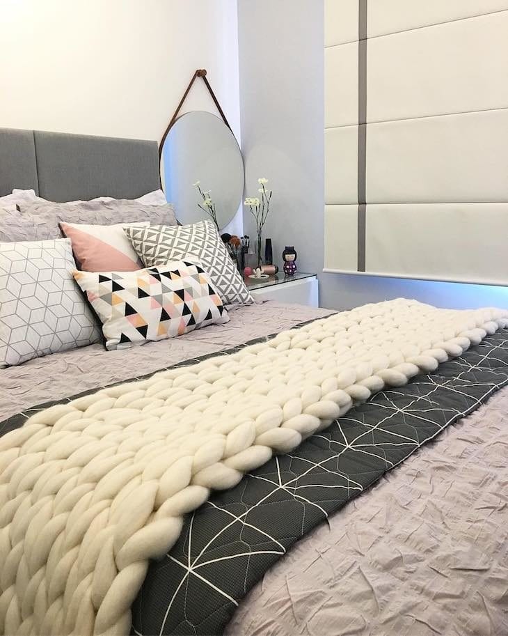
24. that fluffy blanket on the sofa

For those who like to always change the decoration of an environment, it is essential to invest in sober colors on the walls and furniture, and add colors and textures through objects, such as ornaments, pillows, and comics.
25. his majesty the rack
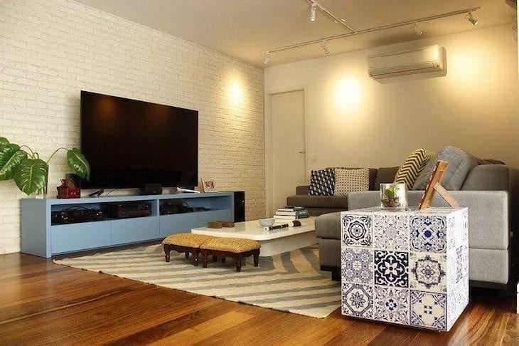
For more emphasis in the living room, the blue rack was added, amidst other sober options such as white and gray. See how it does not go unnoticed?
26. curtains and carpets

Don't think twice before including rugs and curtains in pastel shades in your decor. It will certainly be as elegant as it is versatile.
27. pastel shades = more clarity

Did you notice how all environments having pastel colors as their predominant shades are lighter? If your space needs to boost natural lighting or is too small to need a feeling of spaciousness, invest in this option!
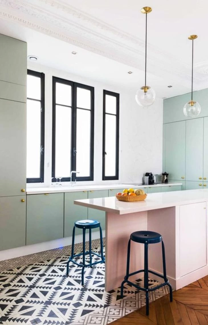
28. the perfect marriage
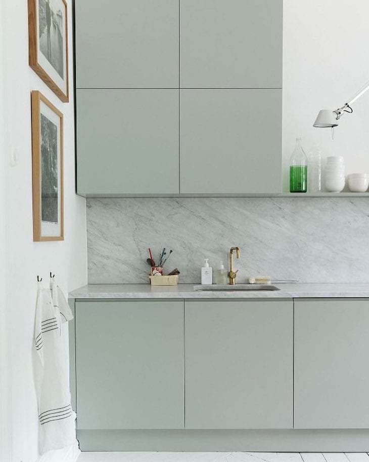
In this kitchen, the carpentry project had a very delicate result: the marriage between the green cabinet and the marble could not have gone better. The final touch was the golden faucet.
29. the face of coziness
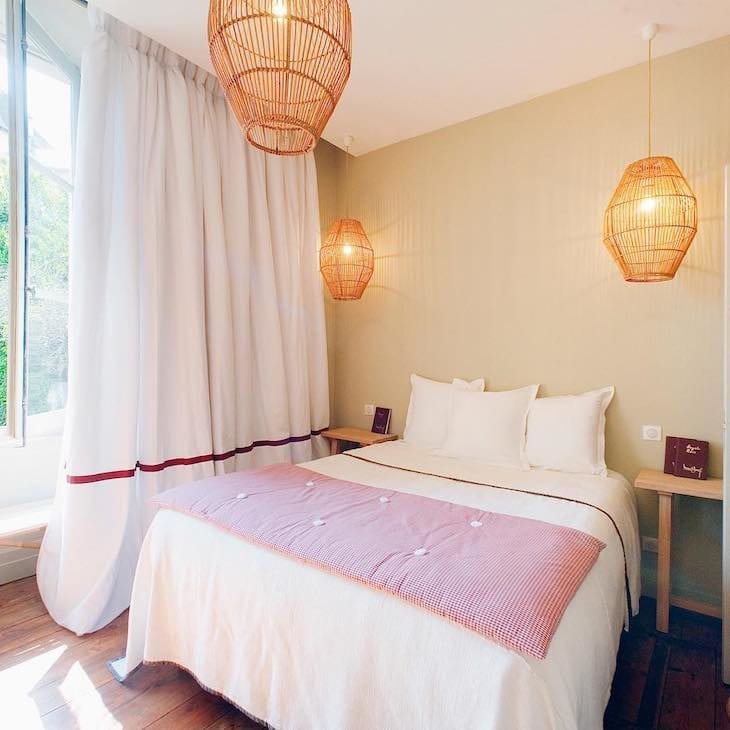
A cozy bedroom relies, without a doubt, on solutions that make its inhabitant feel "embraced". And this, the shades of beige do well. And to ensure a gracefulness, nothing like a feminine touch of pink, right?
30. the elegance of tiffany blue
It's hard not to fall in love with this color, which pleases 100 out of 100 girls! The Scandinavian style of this decoration included brick wallpaper, leather in the armchair and colorful chairs in pastel shades. A cutie!
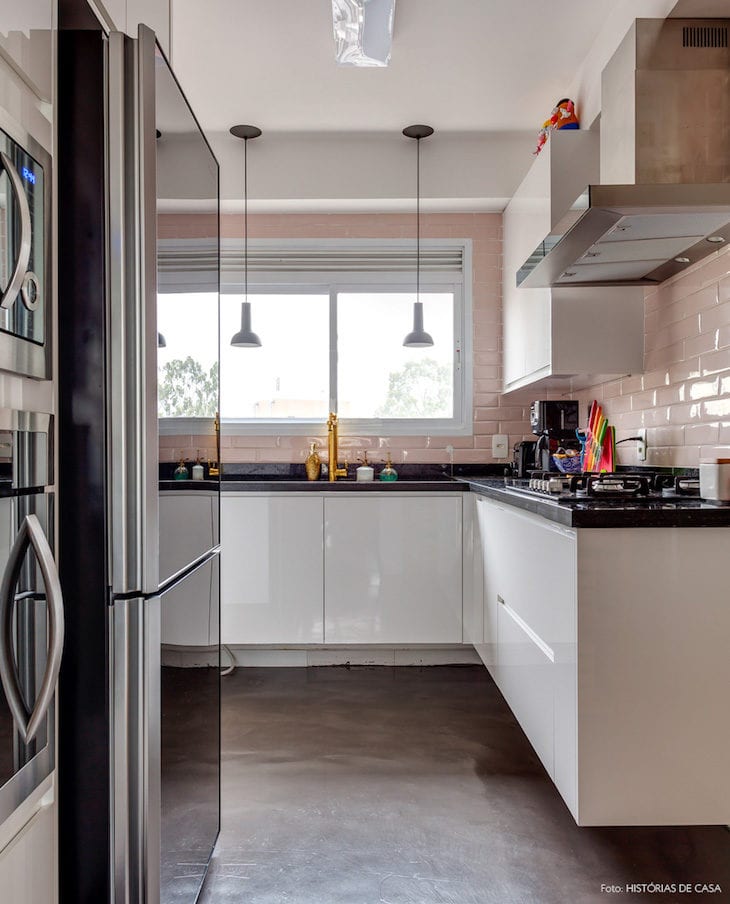
31. breaking the rusticity
The rudimentary decoration composed of wood paneling and table, and the burnt cement floor, gained a new look with the addition of upholstered chairs. Certainly, the environment was loaded with personality.
32. referring to vintage

Speaking of personality, how can you not fall in love with this room with vintage icons? The baby blue wall gained an air of maturity with the addition of all the seventies decoration included in the space.
33. quiet corner
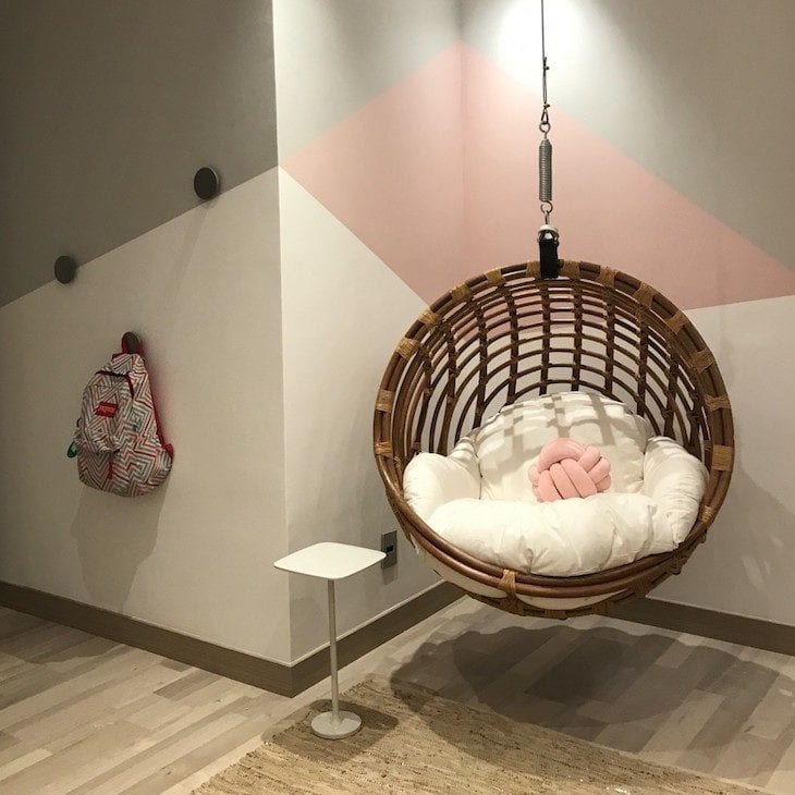
That "broken" corner of the room has come in handy: the hanging chair was already an iconic item in the room, but everything took on a new shape and style with the geometric wall in pastel shades: a perfect place to relax or catch up on your reading.
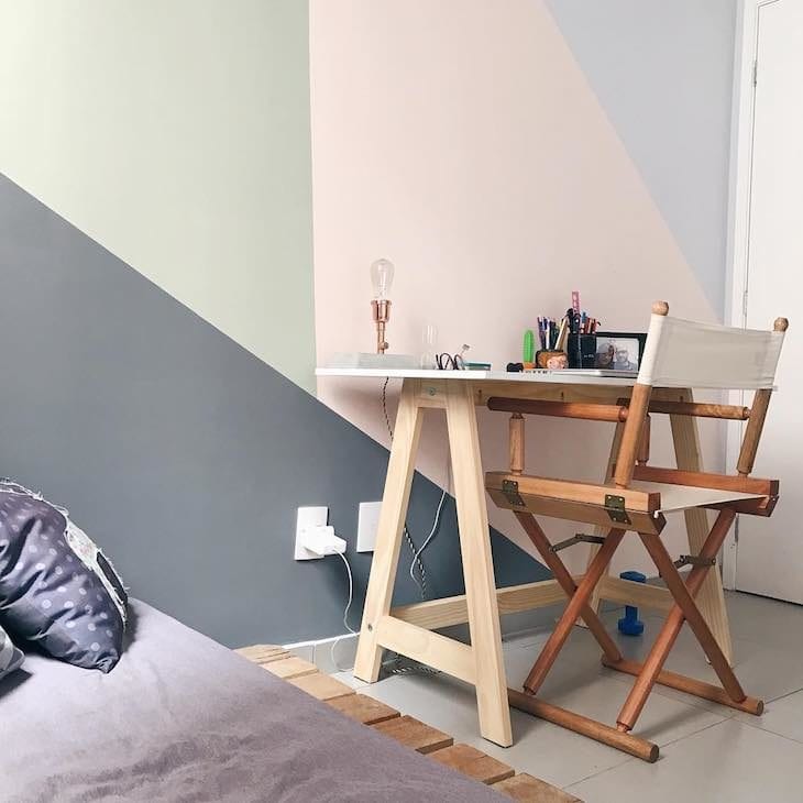
See_also: Rustic luminaire: 80 ideas to renew the lighting of environments34. the dream home office
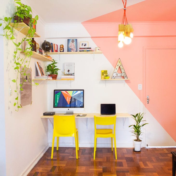
A well-designed work area helps any professional to have more inspiration, right? This is what the resident of this special corner thought when producing the geometric wall of his home office, using the color salmon as the main tone.
35. an inspiring study corner

Just like the home office, the study corner also needs to meet the same premise. Besides being comfortable, it also needs to ensure good lighting, space, and of course, the personality of those who use it, right?
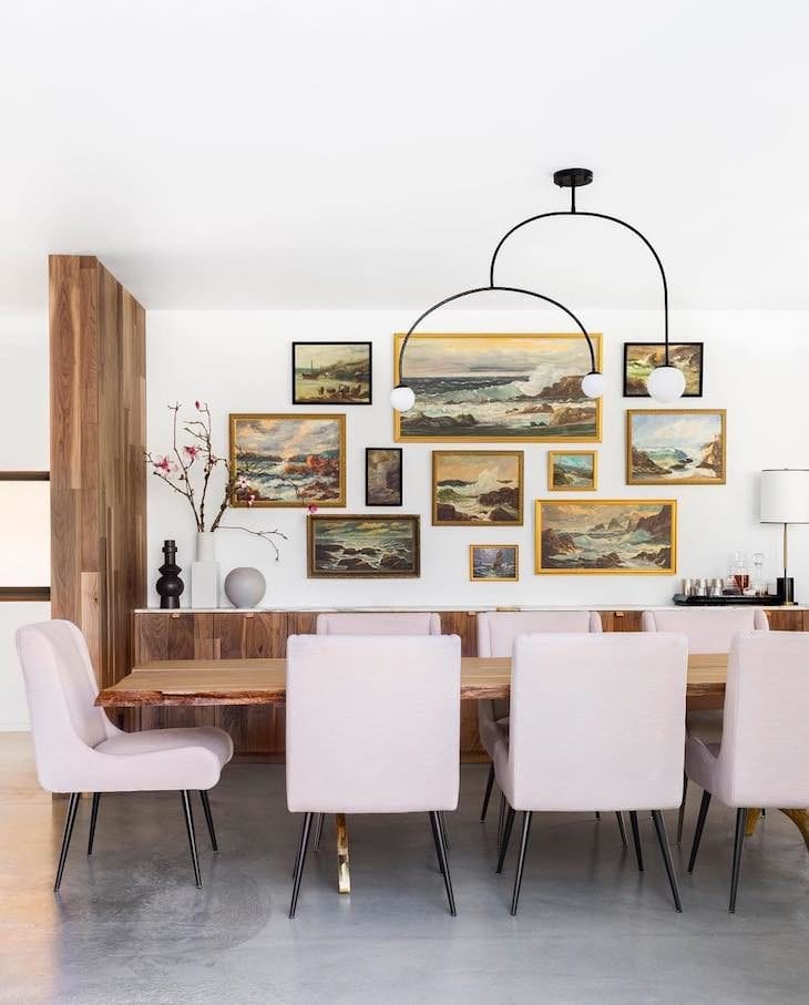
36. the Nordic dining room

The sobriety of the Cromanil wall helped the pink sideboard to stand out, so instead of being an industrial decoration, the combination resulted in a Scandinavian style.
37. rose quartz + metro white
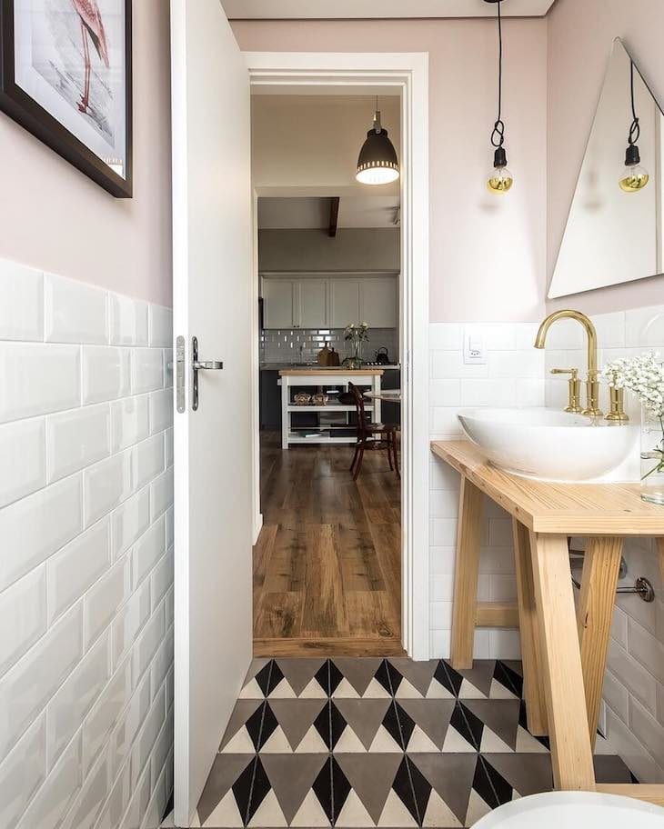
The bathroom in this apartment has a hydraulic floor with a retro touch, while the metro white coating is a mix between vintage and Nordic, mainly because it composes the wall along with the pink, while the metals of the space ensure a classic touch of decoration.
38 - The armchair gave another face to the space
If the idea is not to invest in major renovations, how about adding an iconic item to the space?
39. double room: double style
In this project, the modern double bedroom received a dash of pastel shades in the composition, both on the walls and in the furniture. It is hard not to fall in love.
40. an unconventional door
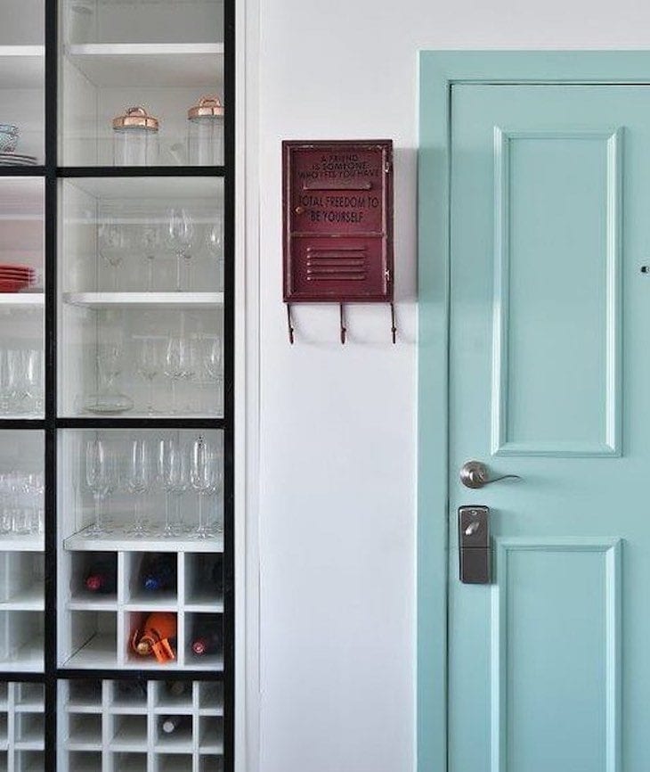
A colorful entrance door is a welcome card to the home, don't you think? This apartment received a colorful Tiffany blue one, making the hall much more cheerful.
41. getting the bathroom decoration right
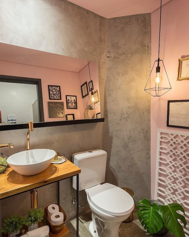
Who says a bathroom needs to be forgotten when it comes to decorating? Contemplated with burnt cement and pink walls, all it took was adding some comics and plants to transform the space into an elegantly exotic place.
42. how to live without comics?
Speaking of comics, they are responsible for adding more personality to the space, since they represent the personality of the resident. When their colors are still in candy colors, how can you not love them?
43. charming stained glass windows in the living room
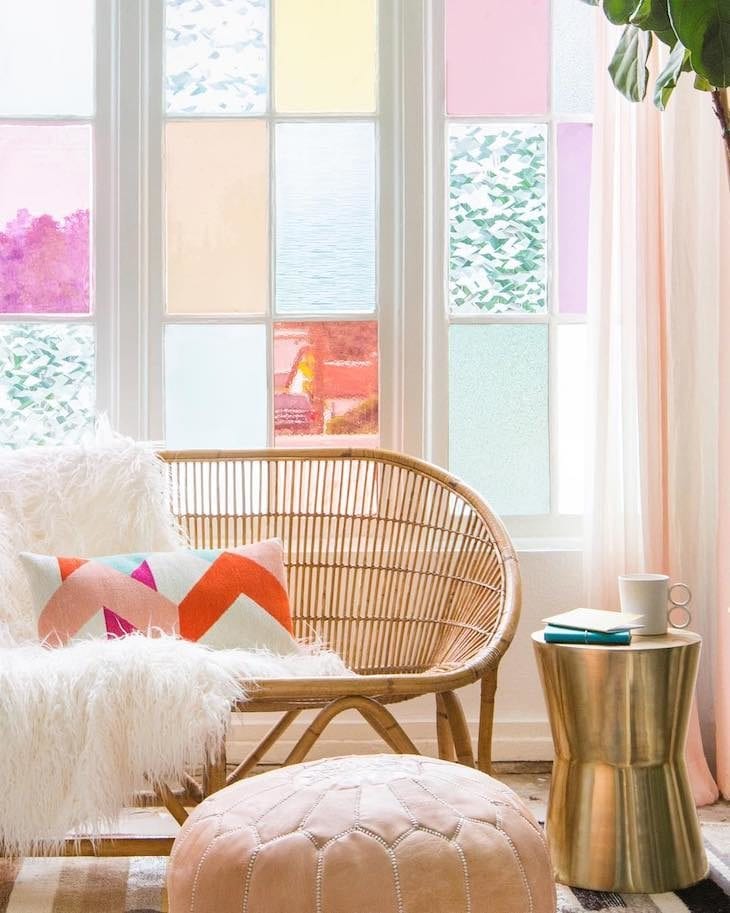
The windows of this nice living room were decorated with stickers applied to each stained glass window, each in a different color, totally different from any proposal.
44. one painting solves everything
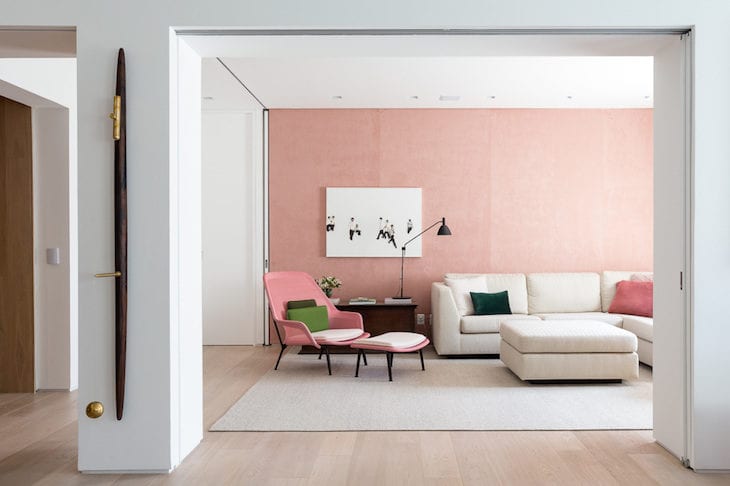
Can you imagine this environment without that pink wall? It would be just another neutral environment, right? Now it is more than proven that a painting makes all the difference, don't you think?
45 - A decoration with the owner's face
Special objects are the girls' favorite things to use for decoration, and in this little room it couldn't be different: this is how the pastel shades were applied.
46. candy color coating
The white cabinetry contributed to lightening the ambience, while the burnt cement floor added a touch of rusticity to the kitchen.
47. a dollhouse kitchen
For this project, the professional added two colors in the planned cabinets. In the tall cabinets, green was predominant in the decoration, while the countertop brought the beauty of the space in the shade of pink.
48. decorating with utensils
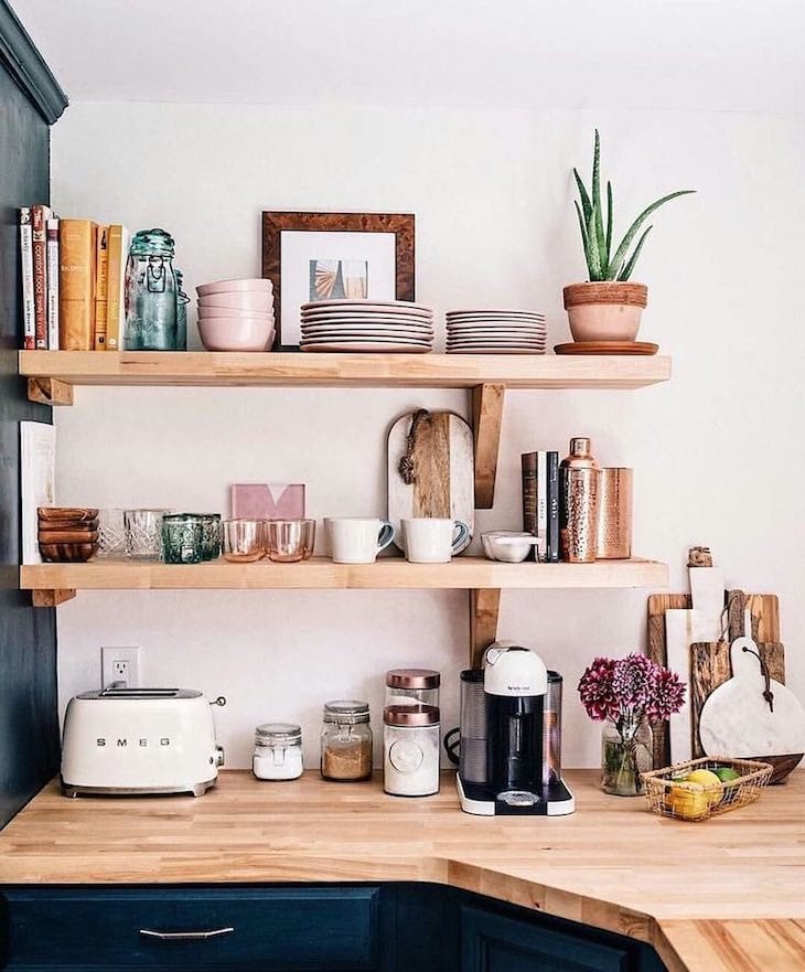
The pastel tones of this decoration were due to the utensils displayed in the kitchen with dark cabinets and wooden countertops: that Nordic touch that has become a national passion.
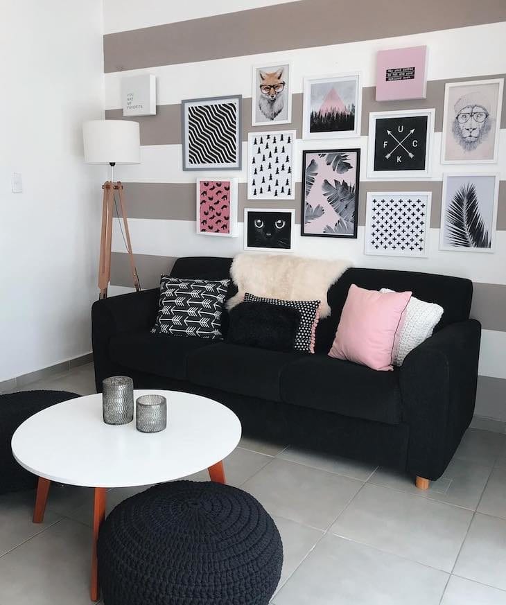
49. tiffany with black
The black bookcase contrasted in perfect harmony with the Tiffany wall, composing the decoration of the room with a lot of modernity and joy.
50. tones included in subtle details
The bedding in the double bedroom is the highlight of the decoration. Notice how the colors were subtly added in small details in the pillows and bedspread.
What did you think of this incredible selection of inspiring projects? Now all that's left is the next step: getting down to business in your favorite corner. And to help you in this endeavor, how about learning how to choose the ideal colors to paint your wall?