Table of contents
The facade is the identity of your house, the first impression it gives. There are many possibilities of colors for house facades and combinations to be used in the project, whether on the walls or on the walls. Check out tips and inspirations that can make your decision easier.
Colors for house fronts
There are several colors that can be used on the facade, it all depends on your project and what you like. It is common to see houses using trendy colors or small touches of vibrant colors in their external areas, but there are some house facade colors that are considered classic.
Architect Alisson Bordin answers about which colors he considers classic: "White and its variants are always a joker in every project, providing it with characteristics of lightness, imposingness and sophistication, besides allowing more easily the insertion of decorative complements. For me, white is a classic for facades."
Architect Bruna Boato adds: "I consider the palette of gray very classic for application in the facade. In general, all facade styles are harmonious with a well used gray palette.
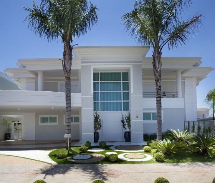
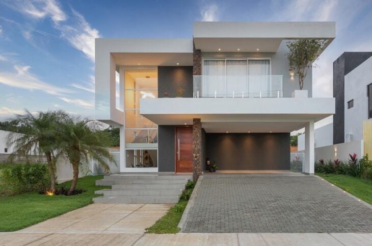
White
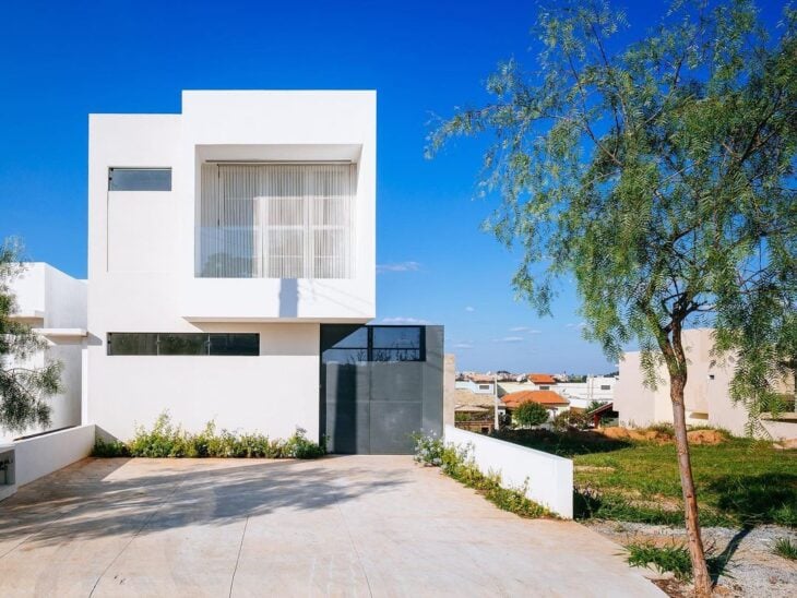
Classic color, super elegant, and goes well with any other color or material. Good for warm regions, because it absorbs less heat. Its only downside is maintenance, any stain or dirt stands out on the white wall.
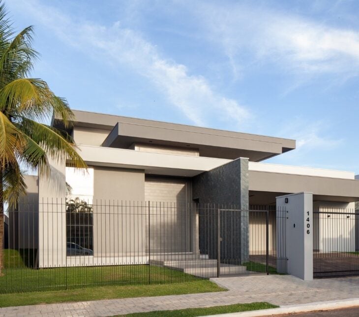
Light Grey
Another classic color, very present in modern homes. Easy to combine with other elements and has the advantage over white of being less messy. Trendy, it was chosen as the color of the year by Pantone.
Dark Gray
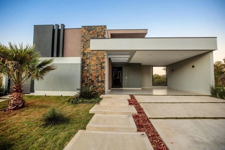
Neutral color, modern and very good to be used in details of the facade. It is not recommended to paint the entire facade in this tone, because it is a dark color and absorbs a lot of heat.
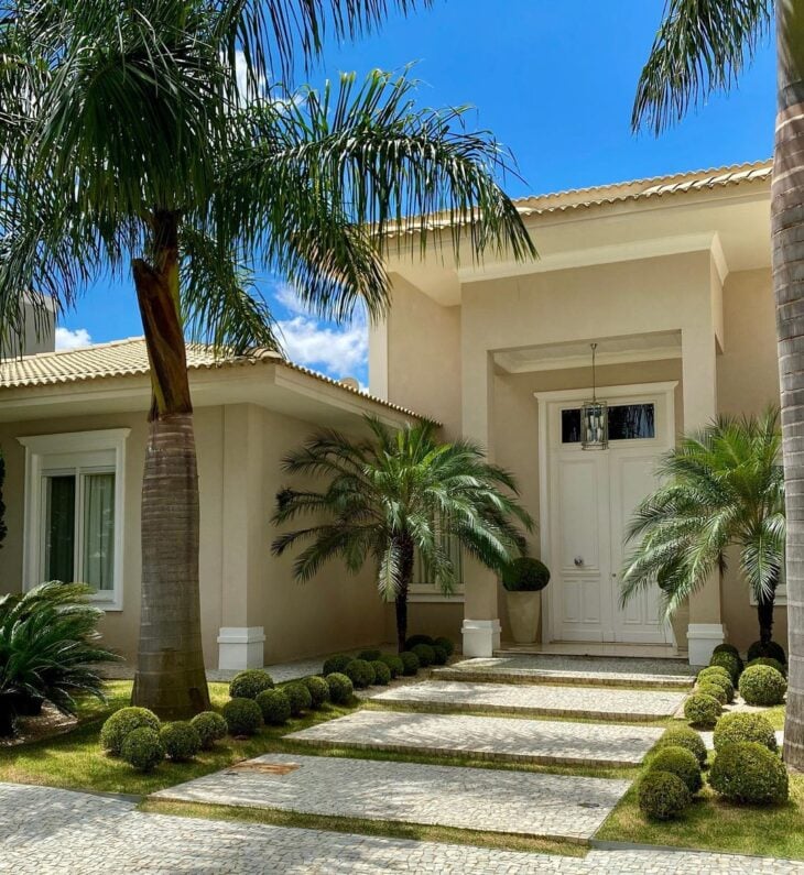
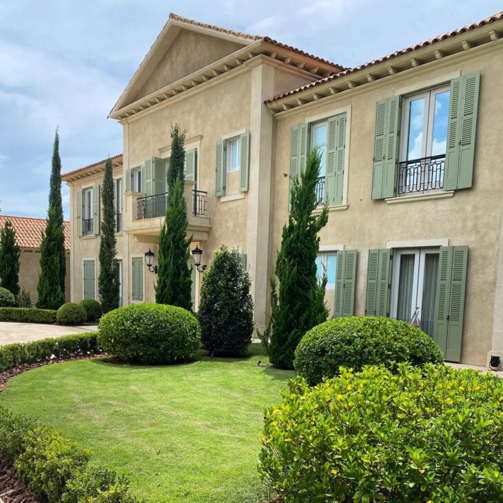
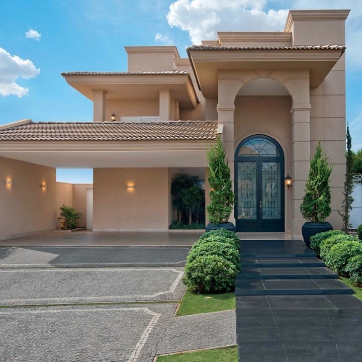
Beige
Super elegant and neutral, it goes super well with woods and stones. Since it is yellowish, it does not show dirt as much, even though it is a light color, and has the benefit of reflecting heat.
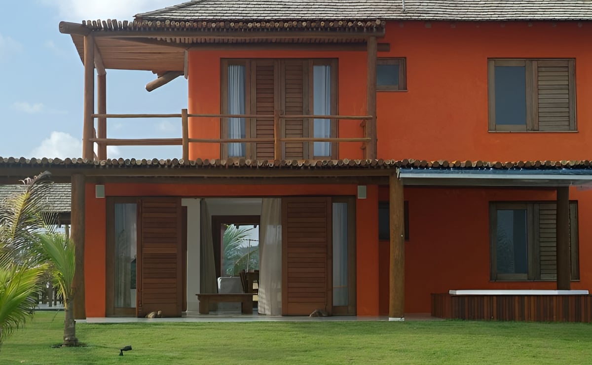
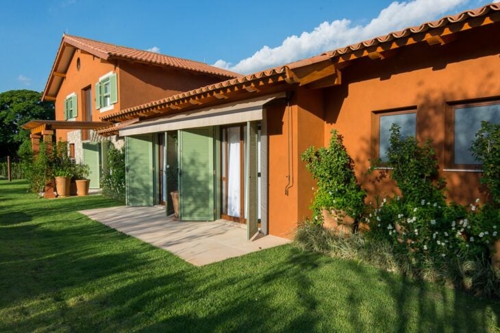
Terracotta
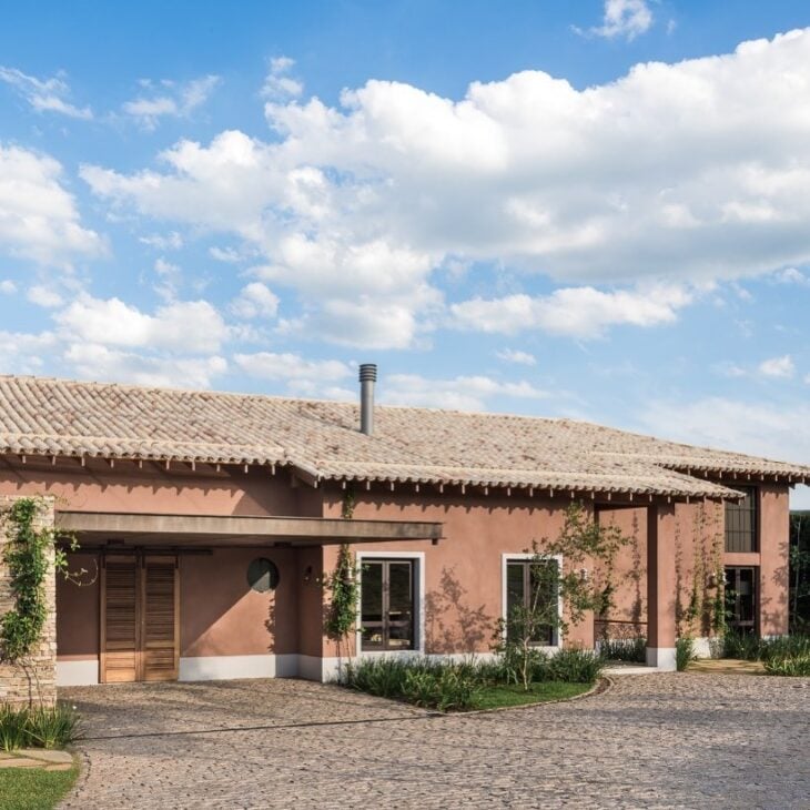
Often used in country houses, terracotta hides dirt well. It is a color full of personality that can be used for painting the whole house, or for details, if a more discreet effect is desired. It absorbs a little heat because it is darker, but not to the point of causing discomfort.
Grayish Brown
Timeless, neutral, and easy to combine with other colors and natural elements, such as wood and stone.
Black
Super modern and striking, but is recommended only for façade details. It absorbs a lot of heat and can make indoor environments uncomfortable if used in excess.
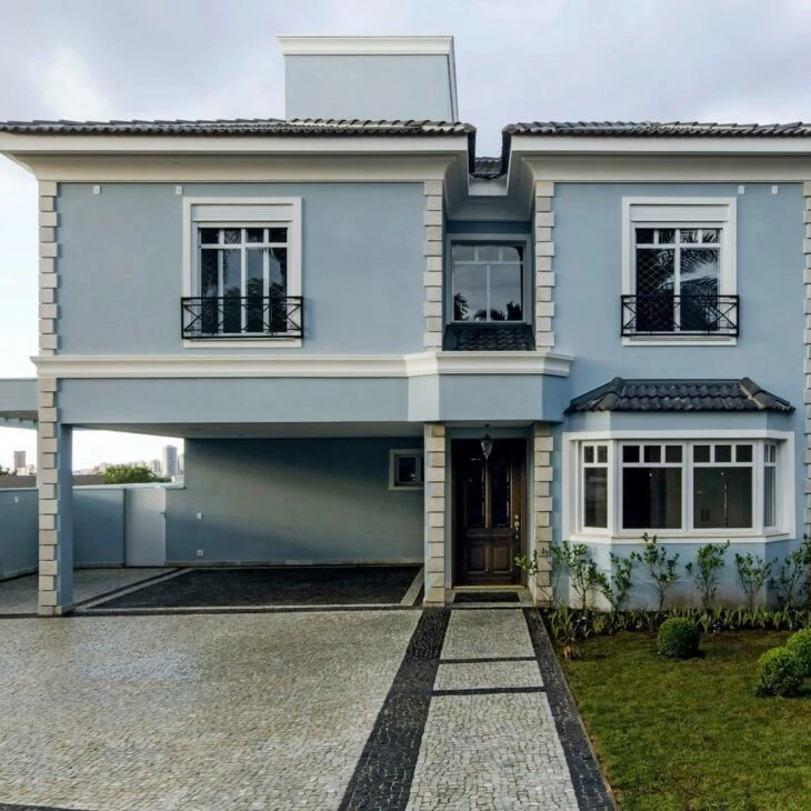
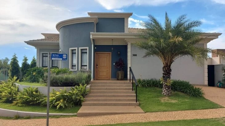
Grayish Blue
A super light color, it gives a touch of personality without losing elegance. Since it is a grayish tone, it is more neutral and goes with almost everything. It does not absorb much heat and does not need much maintenance regarding dirt.
See_also: The best soccer team in the world deserves a champion Brazil decorationLight Blue
Practical and with good thermal comfort, it can be used on the entire facade. It does not hide dirt as well because it is clear, but maintenance is still easy. It gives a calming and serene feeling.
Dark Blue
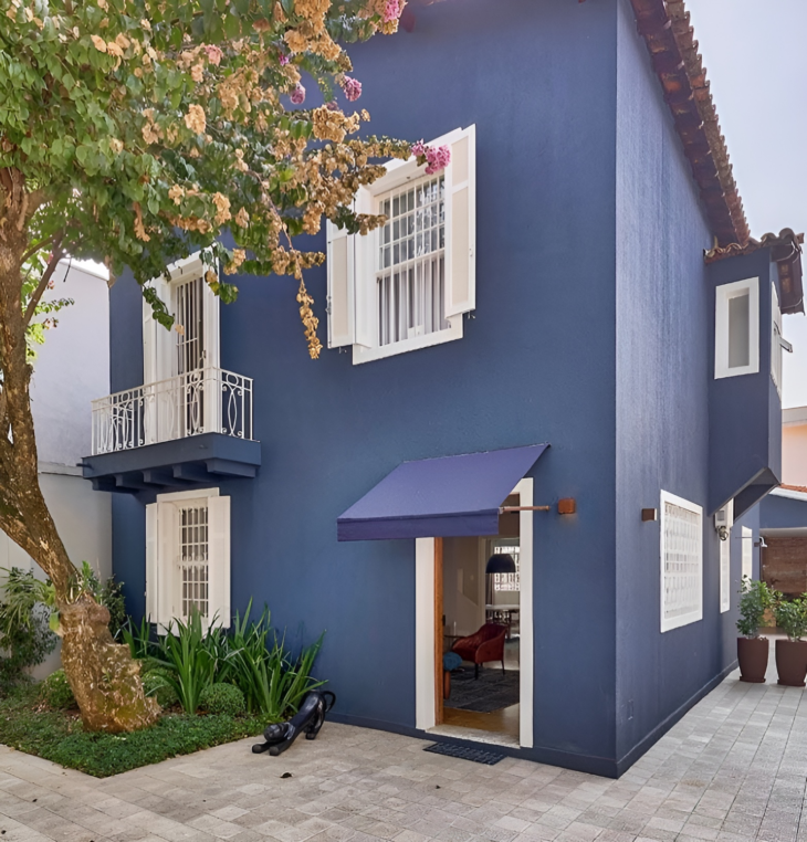
A great color for those who want a modern and elegant detail on the facade. Since it is a dark color, it can warm up the house more, but disguises dirt well. Just like its lighter version, it is a relaxing color.
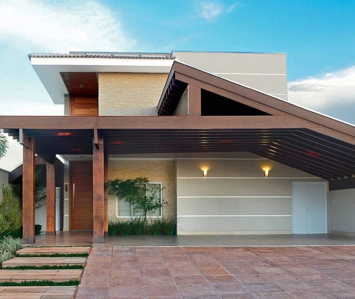
Turquoise
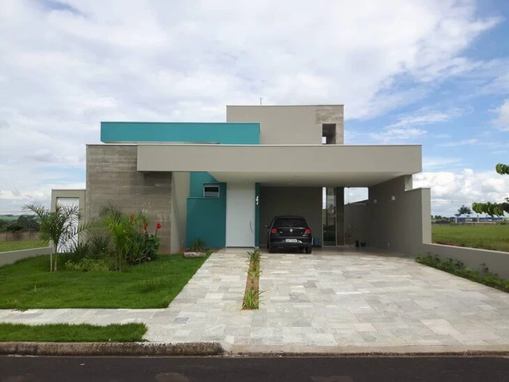
Widely used in details such as doors and highlight walls, turquoise is super modern and youthful. It is a color that transmits tranquility. It does not absorb much heat and is easy to care for.
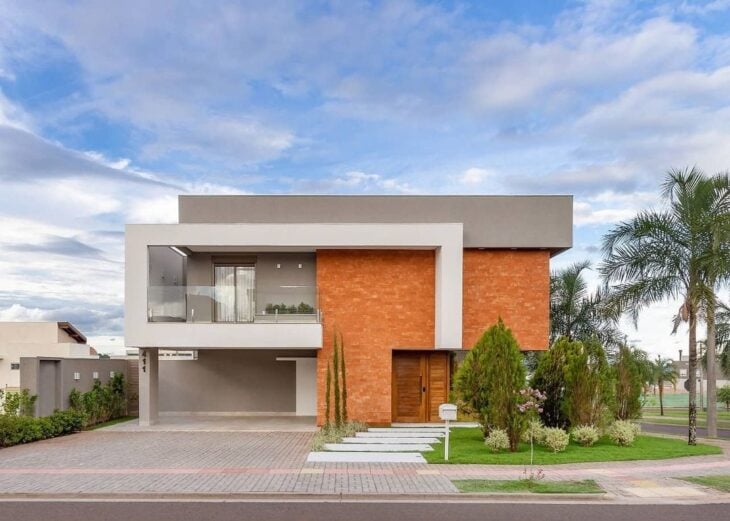
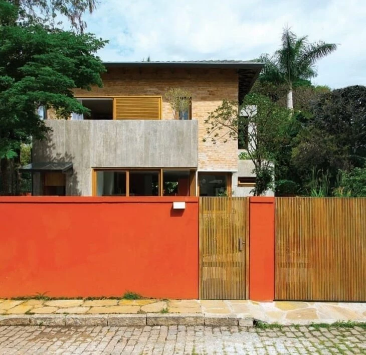
Rustic Red
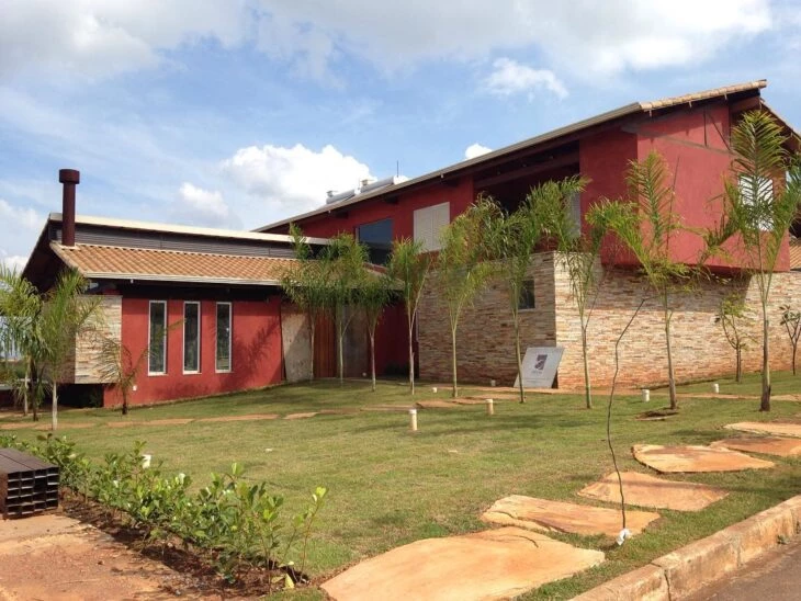
An energetic color that makes the facade look modern and imposing. In order not to become tiresome, it should be used in less vibrant shades or only in details. Easy to maintain, but not so efficient in reflecting solar radiation.
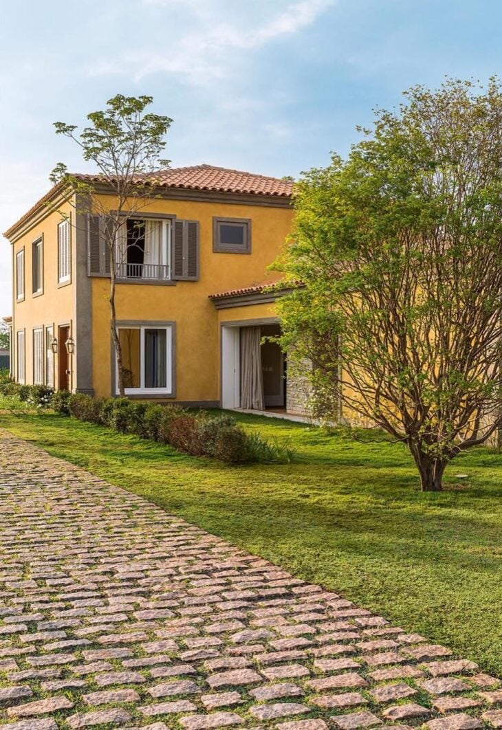
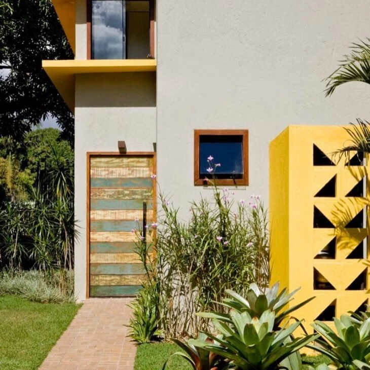
Yellow
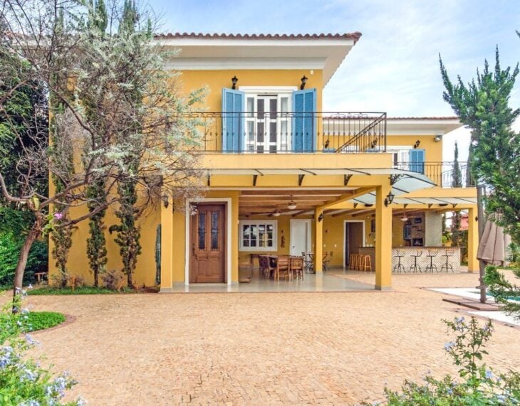
A super cheerful and fun color, great for those who want to bring personality and modernity to the house.
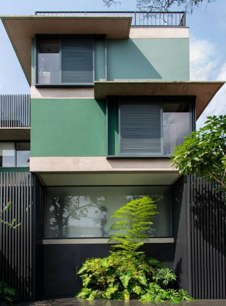
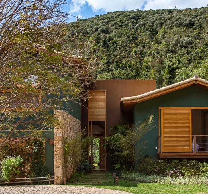
Light Green
Green reminds us of the connection with nature. It goes superbly well with other natural elements, such as wood. Like the other light colors, it does not warm up the interior of the house, but it is not as efficient in camouflaging dirt as earthy ones.
Emerald Green
This shade of green is super-elegant. Because it is a green it transmits serenity. Since it is a darker shade, it accumulates a little more heat.
It is always interesting to test different shades and arrangements in your project. Many colors look super harmonious when combined with each other and with other materials.
How to choose colors for the facade of houses
When choosing the colors for the facade, the needs of the dweller, his style, and the architecture of the house are considered. Here are some of the best tips from architects for choosing the right colors for a project:
Alisson Bordin: "The color emerges together with the architectural party taken. The insertion of finishing materials such as stones, wood, cement pieces, metals and others, dictate the best color path to be taken. I usually opt for colors of the same palette to compose the facade. In an example of a facade with wood, the color palette will be between neutral colors and earthy tones."
See_also: Tissue Paper Flower: Tutorials and 55 Delicate Decorating IdeasBruna Boato: "I choose the ideal color according to the client's style and the architecture of the facade. The ideal color is the one that represents the client's profile and enhances all the details and volumes that make up the facade."
Here are some tips that will help you in your choice:
- Personality: Your house reflects who you are, so one of the first things to think about should be what color you would like on the facade. Even though it is an unconventional color, it is possible to use it without losing elegance, the following tips can help you with that.
- Color Combination: White goes well with any color, as do shades of gray. When using more than one color, make sure they are analogous or complementary to create a harmonious palette. For example, a light gray house goes super well with yellow. An example of analogous, would be green and turquoise.
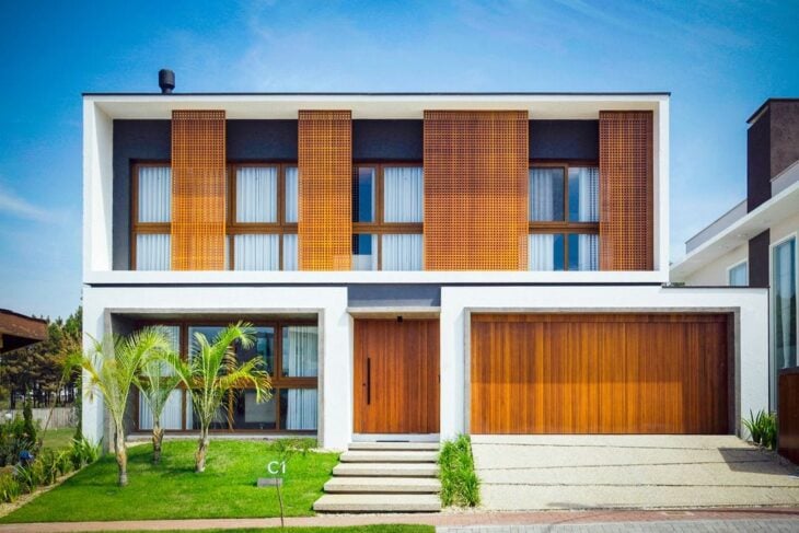
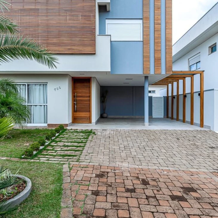
- Harmonization of elements: The use of wood, metal, and porcelain tiles on the facades is very trendy. Remember to match the color of the facade to the other materials that will be used on it. The rule of analogous and complementary colors also applies here; a house with orange wood matches superbly with blue.
- Highlight color: If you want to have just a touch of color in the facade, you can choose just one of the walls to paint in a more striking color. Another alternative is to paint the door or the windows with the highlight color, so the facade looks modern without using too much color.
- Practicality: Neutral colors such as white, gray, and brown are easy to find on the market and go well together. If you don't want a headache searching for colors, invest in the classics. Besides, if maintenance is needed, you will easily find the same color.
- Maintenance: Light colors tend to make dirt more apparent, so for those who have children or pets, it is interesting to work with earthy tones, such as brown and beige, or with medium tones.
- Thermal comfort: Dark colors absorb more heat than light colors, a white house is cooler than a black one. If you are living in a hot place remember to use dark colors only in the details of the facade, to prevent the house from accumulating heat.
Explore different color combinations for house facades before you make your decision, nowadays a good professional can help you simulate different looks quickly.
40 facades to help you choose the perfect color
See images to bring you inspiration about colors for house fronts, showing more examples of color and material combinations.
1. light brown goes very well with wood
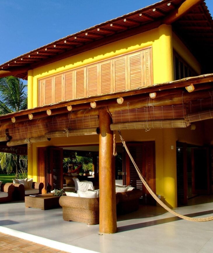
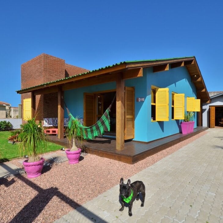
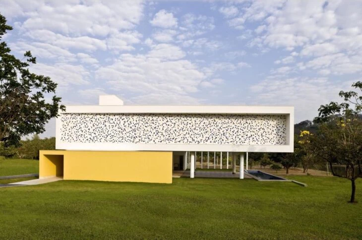
2. yellow is perfect for a beach house
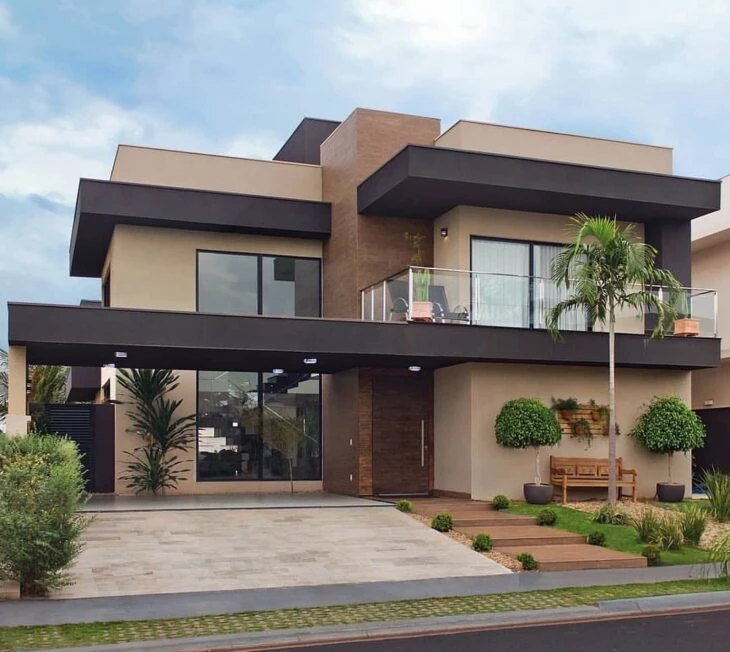
3. the sand tone became modern with the black details
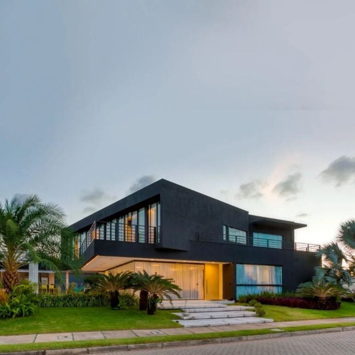
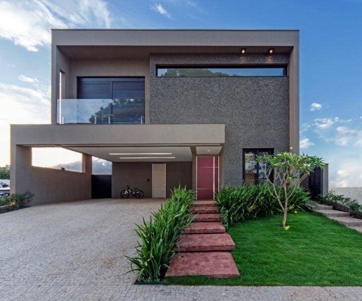
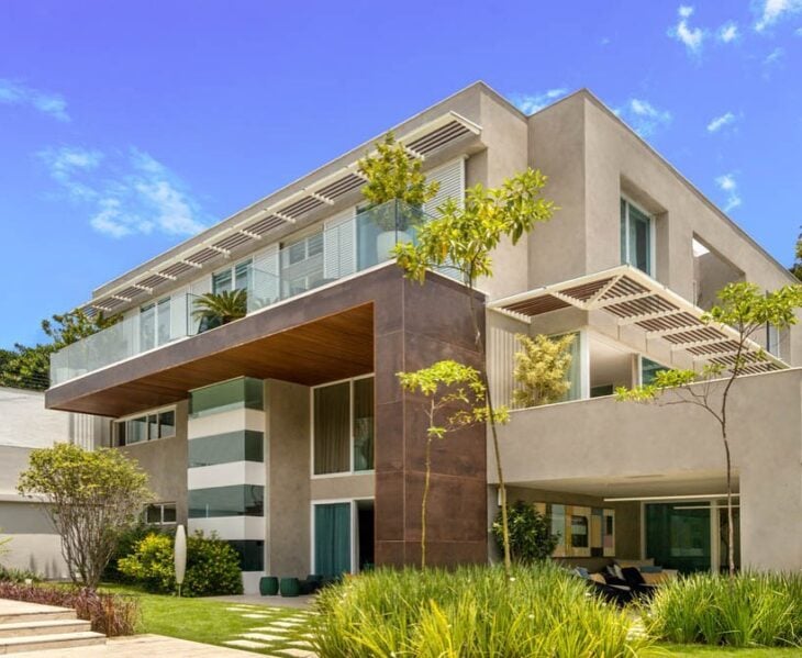
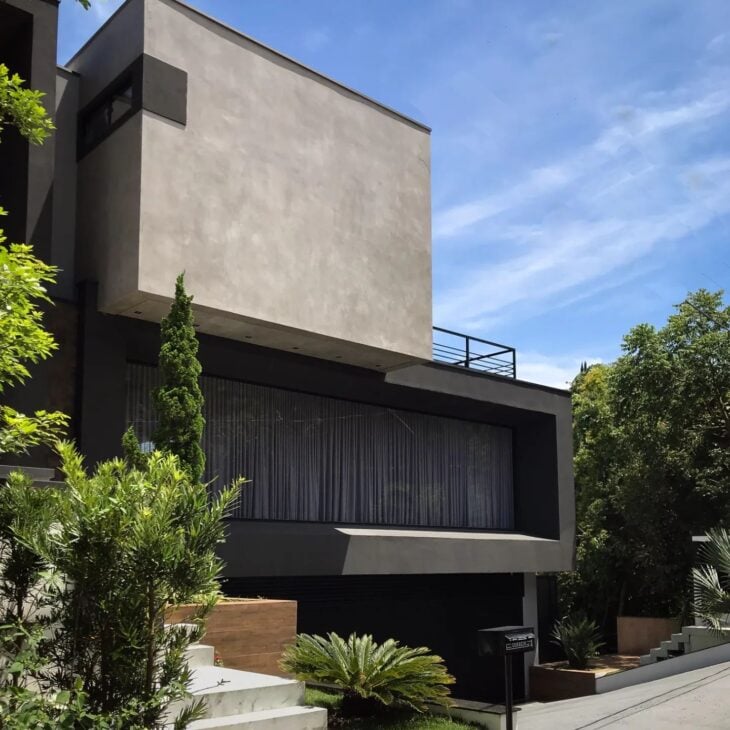
4. fearlessly bet on the combination of dark tones
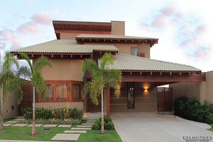
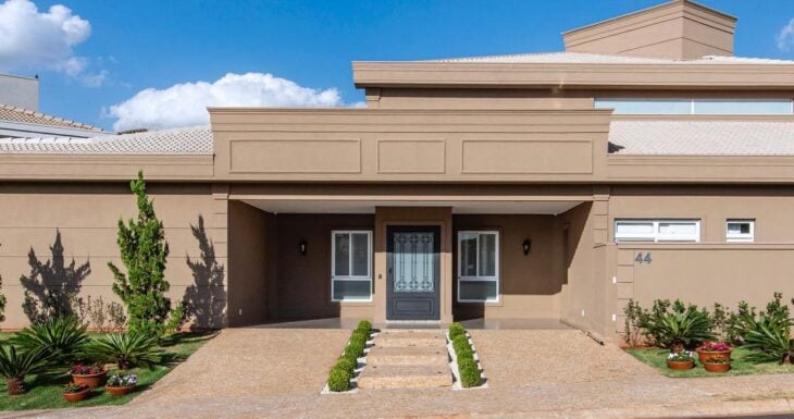
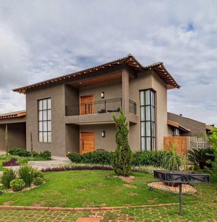
5. this house became super modern with the shades of brown
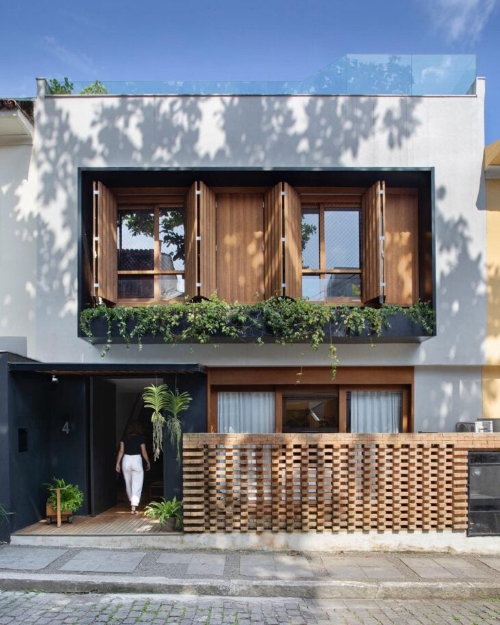
6. soft colors look great with wood
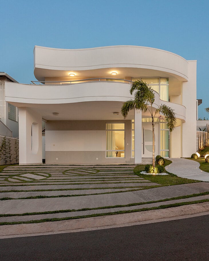
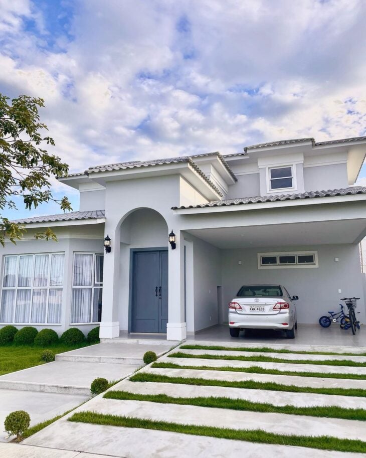
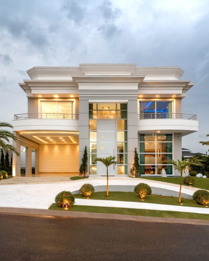
7. classic facade
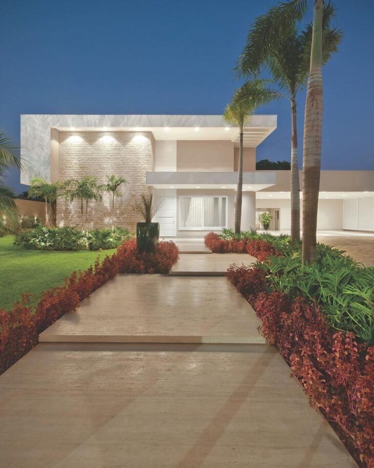
8. modern look using neutral colors
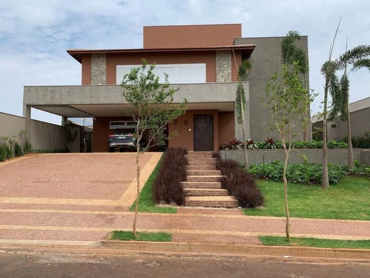
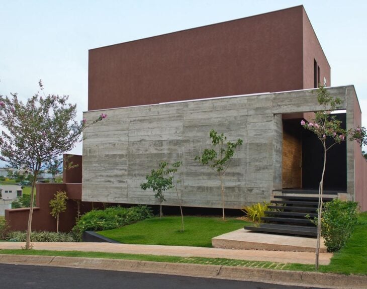
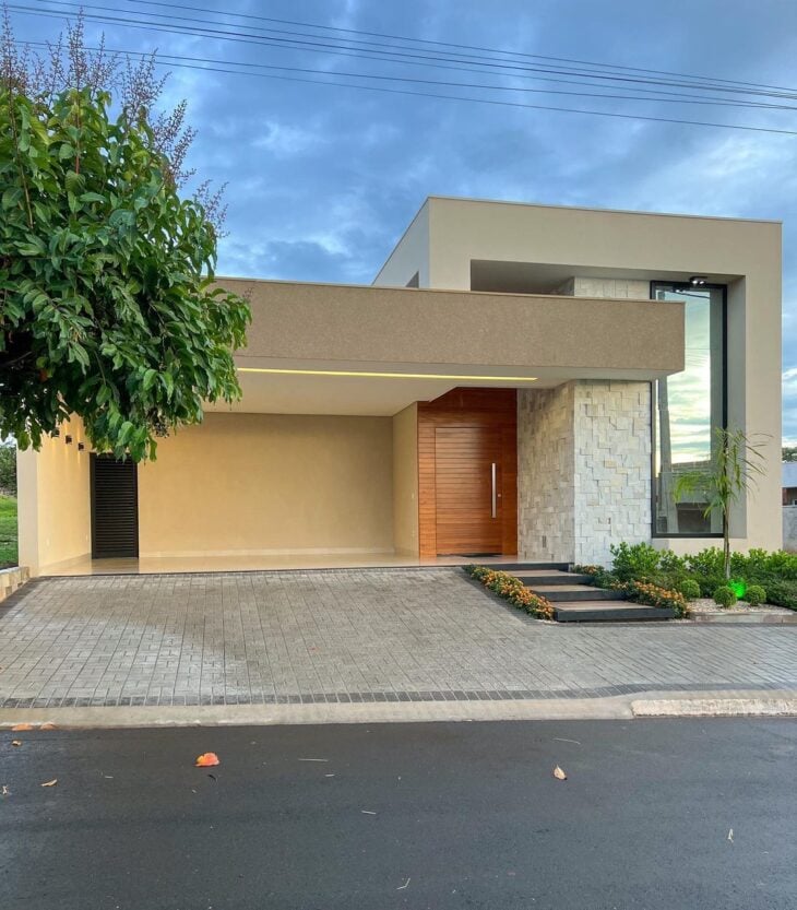
9. concrete with brown for an authentic facade
10. a cheerful and colorful look
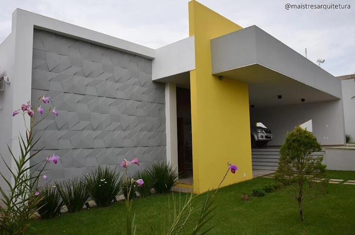
11. and with fun and trendy tones, like this gray and yellow facade
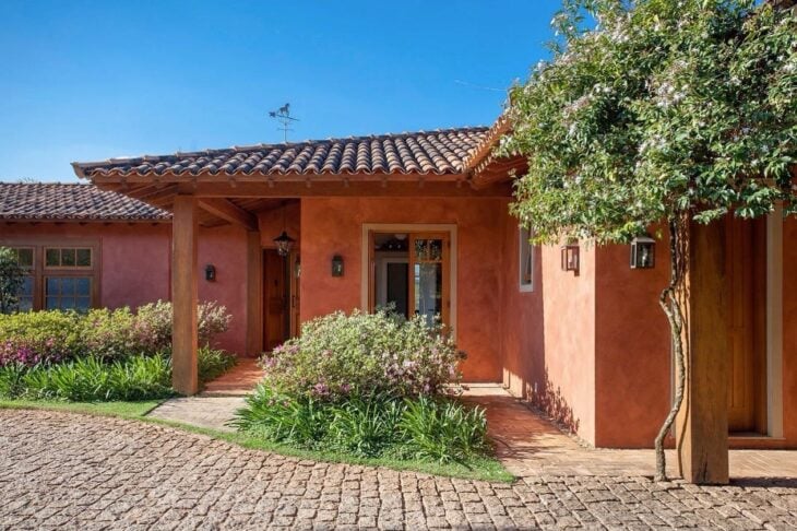
12. terracotta color is great for country houses
13. and create a cozy atmosphere
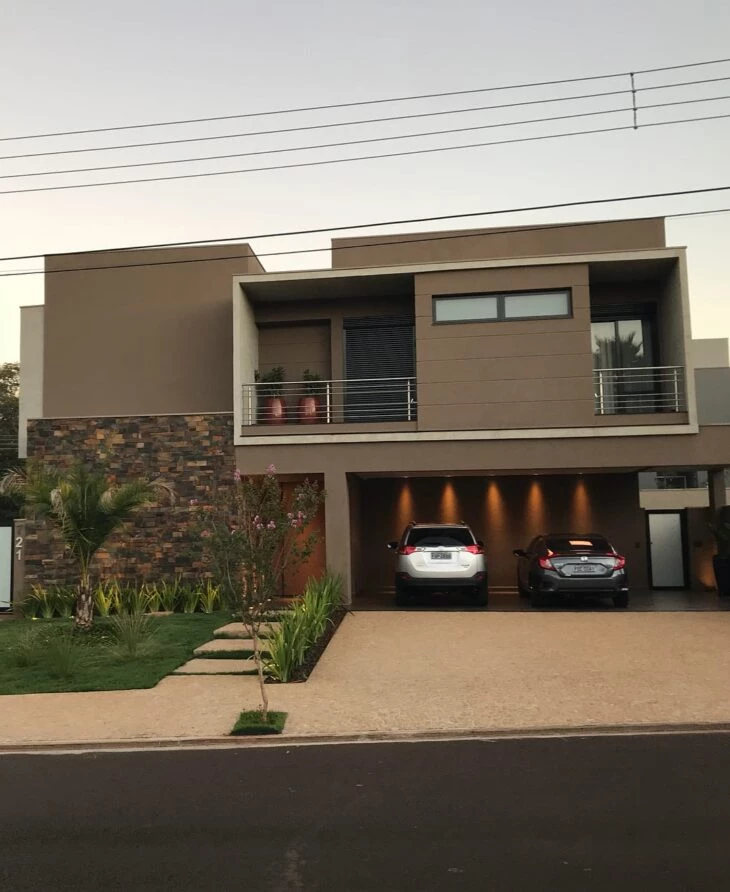
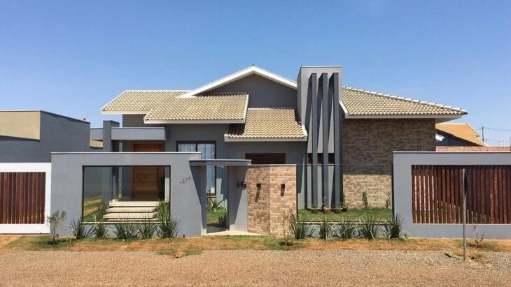
14. how about combining gray and brown
15. or with the orange of the exposed brick
16. color can bring more liveliness to the home
17. or complement with elegance
18. light tones also have their beauty
19. and you can explore different textures
20. the emerald green valorized this modern and simple façade
21. black and gray are a timeless combination
22. light tones look very elegant
23. yellow is ultra-modern on this facade
24. and also gave the touch of sophistication combined with the light gray
25. the white house is highlighted by the blue wall
26. how about adding wood details
27. this facade looks super elegant with the grayish blue
28. green and brown in a perfect combination with nature
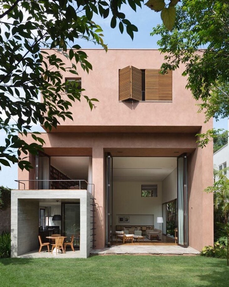
29. for many a neutral look is the best choice
30. a touch of salmon is delicate
31. classic house also goes with colorful
32. but you can also opt for a sober and discreet tone
33. and yet display your personality
Vibrant colors also have a place
35. the orange wall made this facade different
36. how about a darker tone
37. a shade of blue is perfect for escaping the common
38. sober tones go with modern looks
39 For those who live in colder regions how about this dark gray facade
40. choose your favorite color and give a different touch to the facade
Now that you know how to choose colors for house fronts, how about reading about exterior wall cladding?