Table of contents
Beyond romantic decorations, the color pink is versatile and can compose the most different styles and environments. Several of its shades are perfect for those who want to compose a fraternal and cozy look, offering an intimate touch to the design. Whether in details, on the walls or on the furniture, check out how to use the various shades of pink with inspiring ideas for your home:
Meaning of the color pink
The color pink is a shade derived from red, but softened by pigmentation with white, so it is also related to feelings. However, because it is a softer option, it symbolizes romanticism and tenderness. In addition, it is a symbol of youth and innocence. It is widely used in the feminine universe, but can also compose neutral and masculine spaces. The lighter shades of pink are more related toto delicacy, while the darker ones are associated with sensuality.
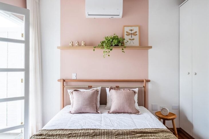
Thus, shades of pink are ideal for transmitting sweetness, calmness, and romanticism in an environment. They are indicated for spaces such as women's rooms, babies' rooms, and children's and happy environments, since the color also helps to dispel negative thoughts and transmits feelings of optimism and happiness.
Shades of pink
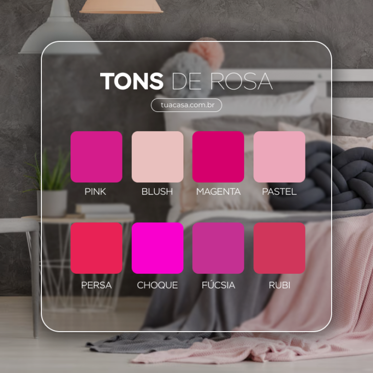
- Pink: Pink can also guarantee a look loaded with personality, especially when combined with other darker colors.
- Blush pink: This means that this shade contains brown as a background color, and is very close to the earthy and neutral tones.
- Magenta: The sensations conveyed by this cooler tone are linked to reflection and nobility. When mixed with sober tones, magenta offers a unique highlight to the decoration.
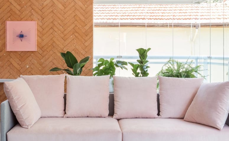
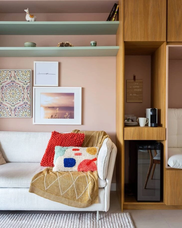
- Pastel pink: One of the most delicate shades in the palette, pastel pink transmits lightness and naivety. It is usually used in decorating children's rooms and in environments that inspire delicacy. It is a fun color when combined with other pastel colors.
- Persian Rose: also known as bubblegum pink, it is possible to say that Persian is the pinkest shade of all pinks. The color transmits joviality and freshness, ideal for environments that need to inspire creativity.
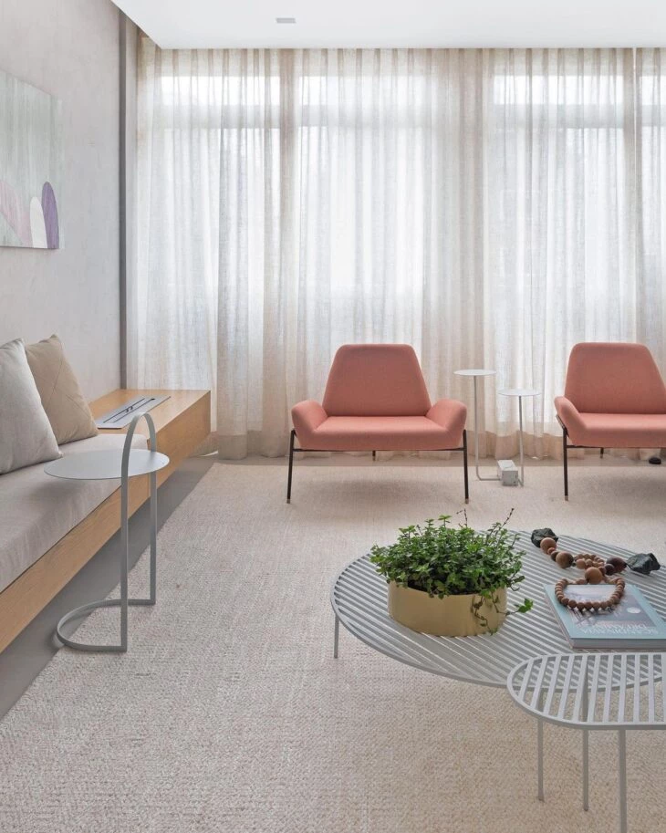
- Shock Pink: The perfect color to add a touch of romanticism to the decoration, because it is a tone that transmits tenderness and sensuality.
- Fuchsia: With purple nuances, this tone represents transformation and inspires mystical sensations, such as prosperity. In decoration, fuchsia can be applied in details or in a piece of furniture that stands out from the rest.
- Ruby: With a reddish background, this tone is very close to pink, so for a tone on tone proposal, this duo is unbeatable. Being a highlight color, it is used to highlight details such as pillows and decorative objects.
Pink has a unique versatility in its many different shades and can influence the decorative style. To make beautiful compositions, how about checking which colors go best with pink?
See_also: Picture Shelf: 30 Ways to Use in Your Decoration6 colors that go with pink
Pink is a color that fits into many decorative styles, and what will determine the type of design is the combinations you make with it. Here are some colors that go with pink:
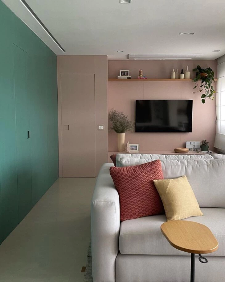
Green
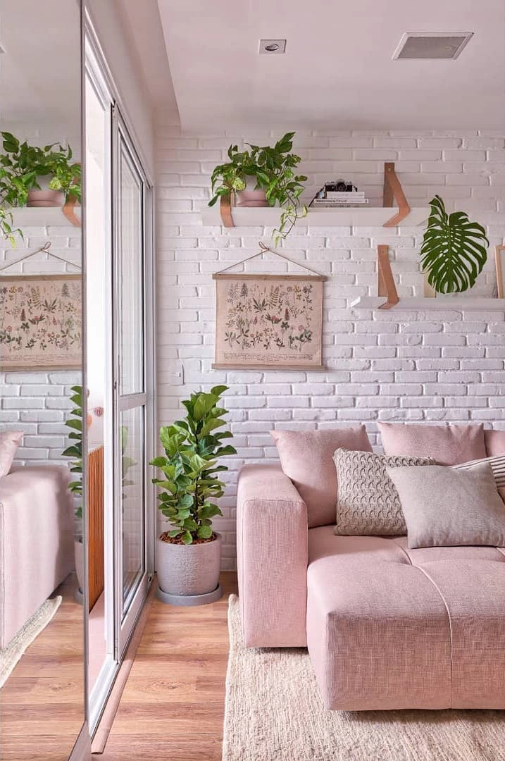
This combination becomes perfect in practically every shade of these two colors together. In the dark versions, they imprint a unique identity on modern or classic decorations, while the light shades, such as pastel green, complement the softness and leave the decoration delicate and jovial.
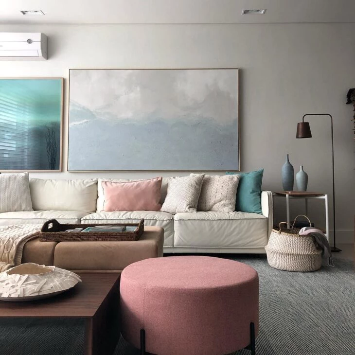
Neutral colors
In a clean decor, pink creates a soft point of emphasis, but without running away from the sober proposal. Therefore, the color matches perfectly with the neutral palette, which includes white, beige, nude, gray, and light wood tones.
Earthy tones
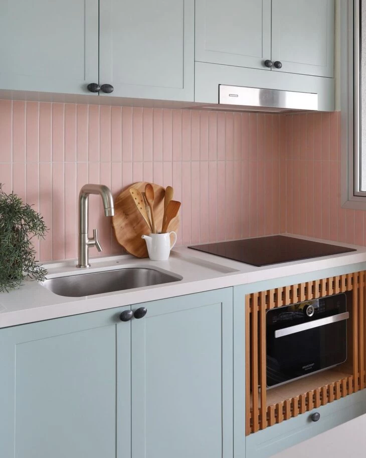
Pink is so versatile that there is even a shade of it to mark its presence in the earthy palette, which is why it combines with the other colors in this proposal, such as brown, ochre, and terracotta, creating a composition full of personality.
Black
In the pastel version, including shades of gray in the design, the composition fits even in an industrial environment. Incidentally, black is a foolproof balance for the more striking shades of pink, such as pink.
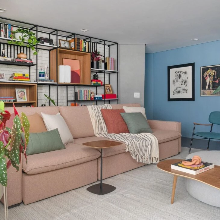
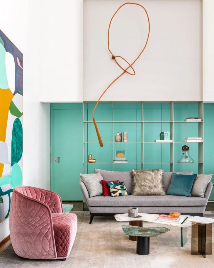
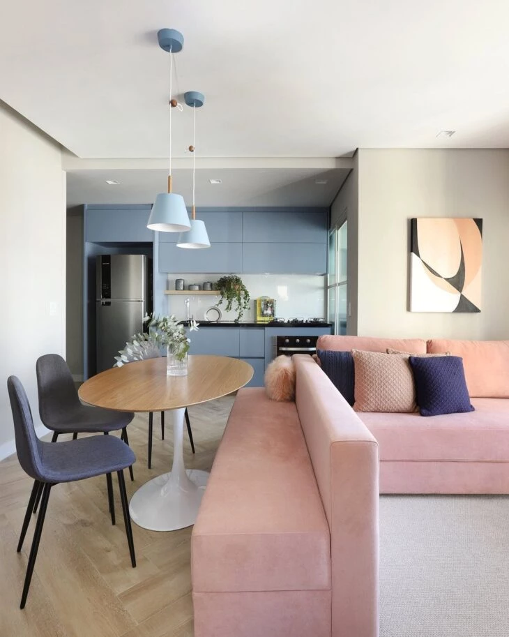
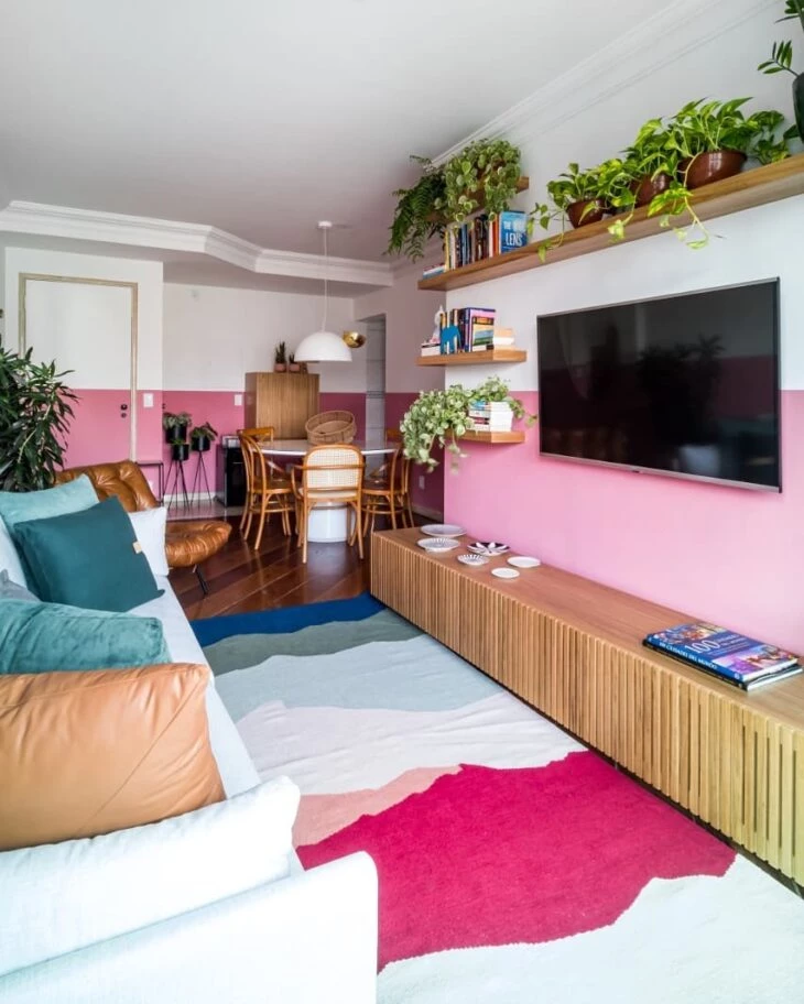
Blue
This combination is perfect for soft proposals, which call for warmth. And those who think that blue and pink only serves children's or women's environments are mistaken. In the example, notice how the room has gained a fun and current decoration with the highlighted colors. For more cheerful proposals, choose lighter shades, such as turquoise or sky. For more elegant and sober proposals, bet oncombinations with navy or royal blue.
Yellow
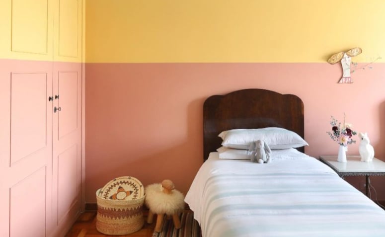
Another relaxed proposal is the marriage of yellow and pink. In pastel shades, this combination becomes a classic. See how a bedroom becomes extremely creative with the suggested proposal.
See_also: Slate: much more than just a gray stoneBesides the colors, pink also gains a striking look when combined with metallic materials, such as gold and copper. It also goes well with natural textures, such as wood and straw. The choice depends solely on the identity of the environment.
65 photos of decorating with pink in various designs
Inspire yourself in the following projects, which feature different shades of pink applied in different ways in the decoration. The countless variations in styles prove how democratic the color pink is:
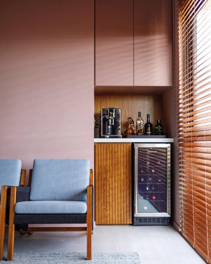
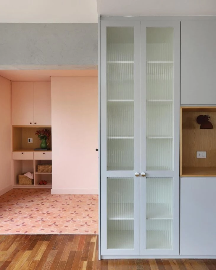
1. beyond the walls, pink can be applied to the cabinetry
2. or in the furniture, walking through the details of the decoration
3. but nothing stops you from including color in the coating
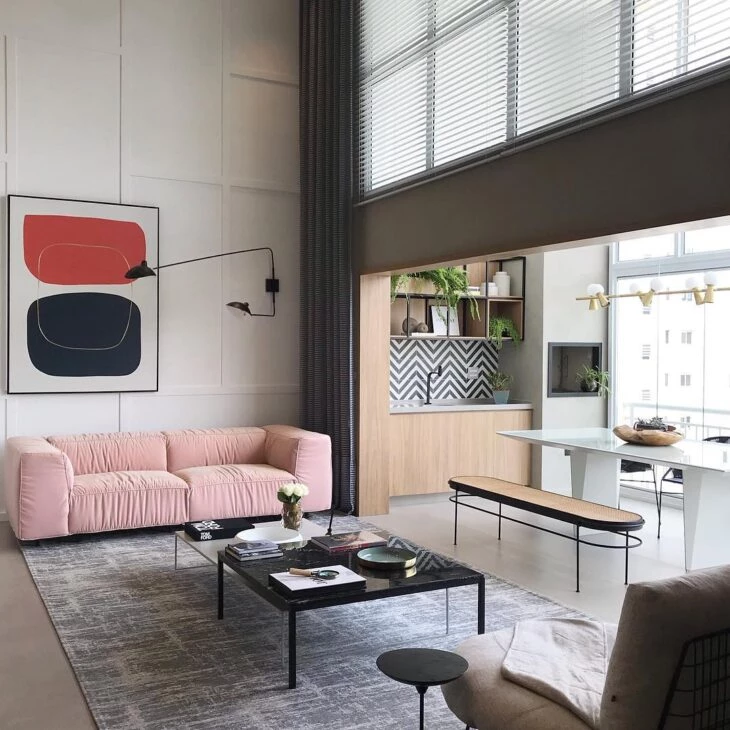
4. in clean decor, it matches perfectly with sober tones
5. for a more contemporary proposal, green goes well
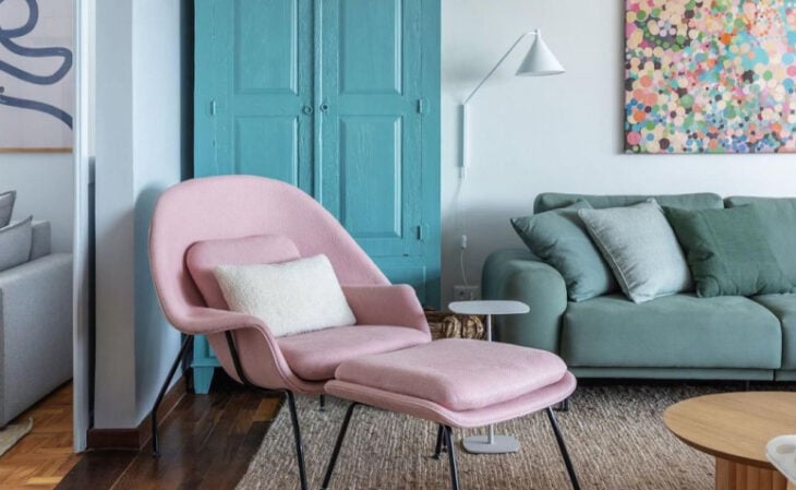
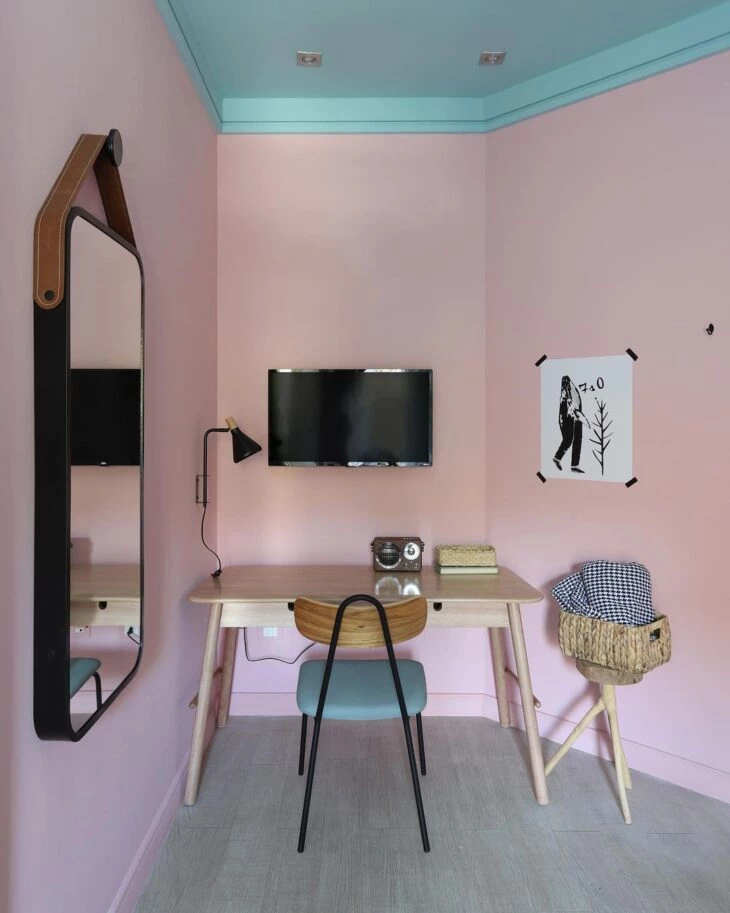
6. a fun composition with pink and blue
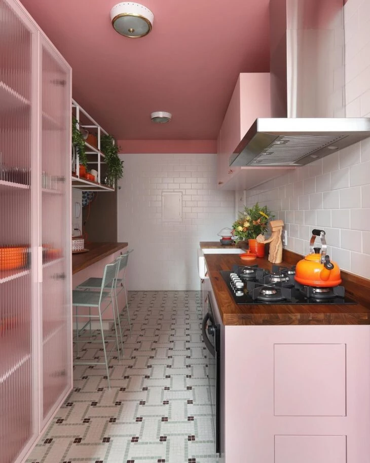
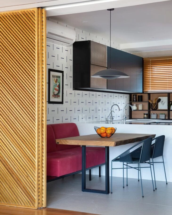
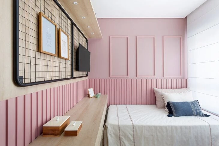
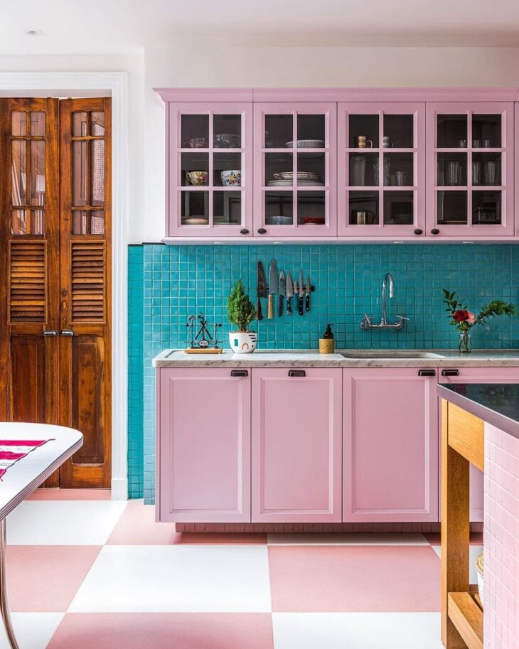
7. with the hydraulic tile, this kitchen gained a vintage atmosphere
8. how about a more striking color in your project?
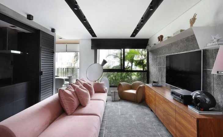
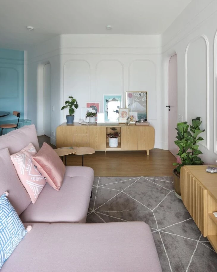
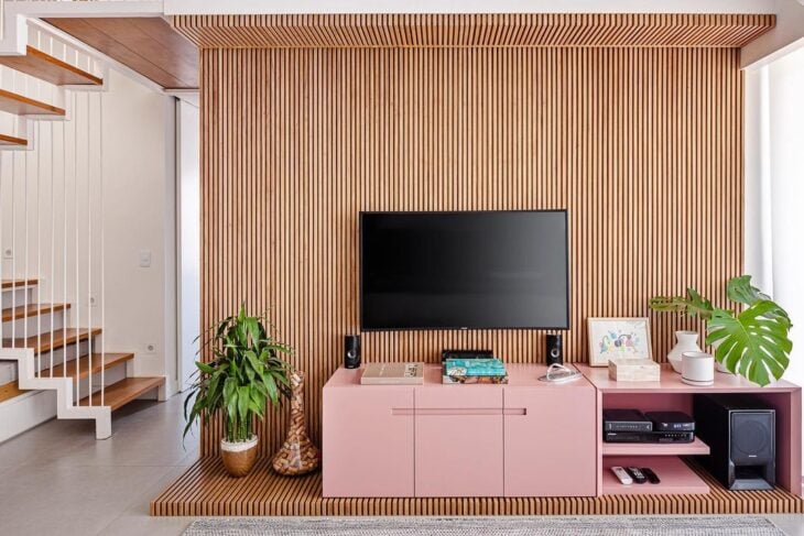
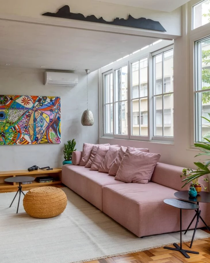
9. in the living room rack, the color looks great
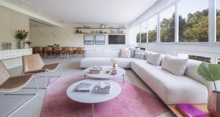
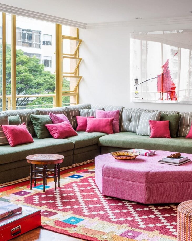
10. in the carpet, pink surprises
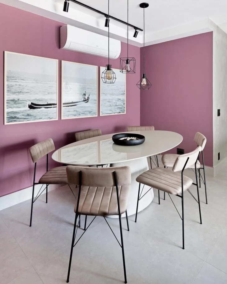
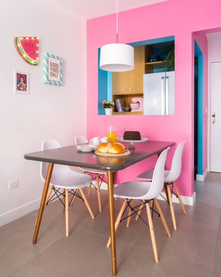
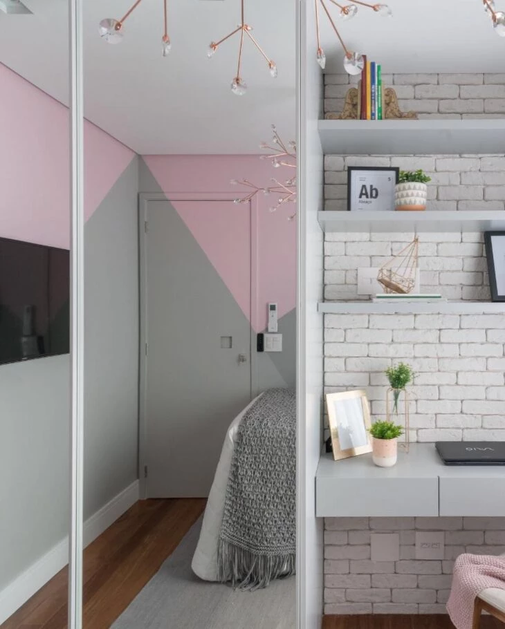
11. the dining room became cozier in this closed tone
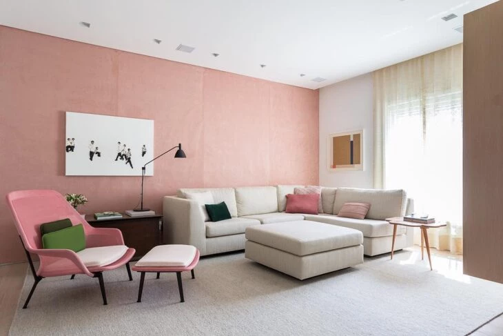
12. besides neutral colors, a tone on tone looks very nice
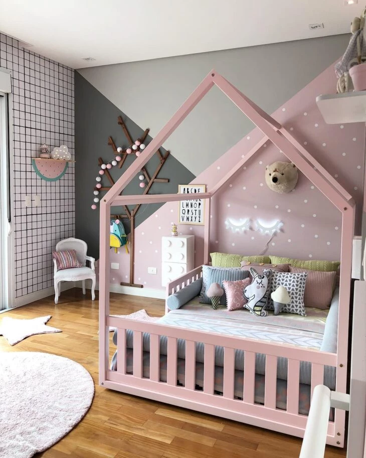
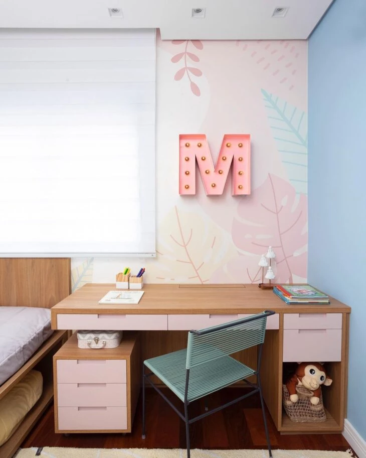
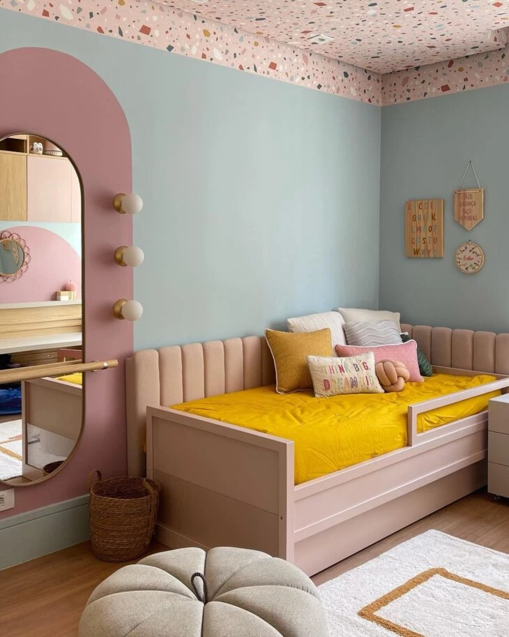
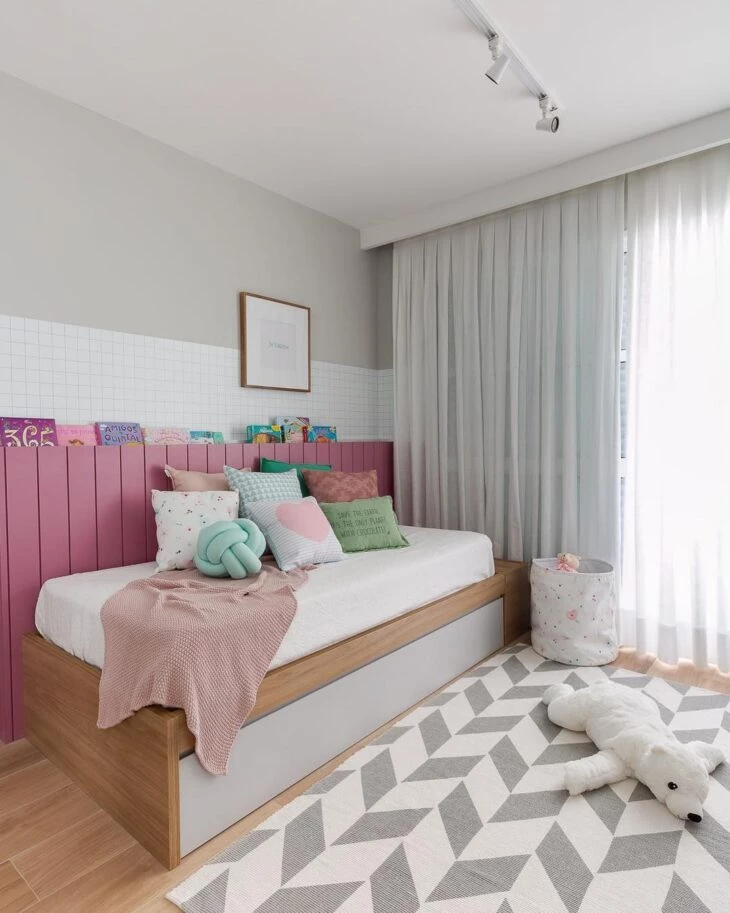
13. in the children's room, the pink was not the usual and gained shades of gray
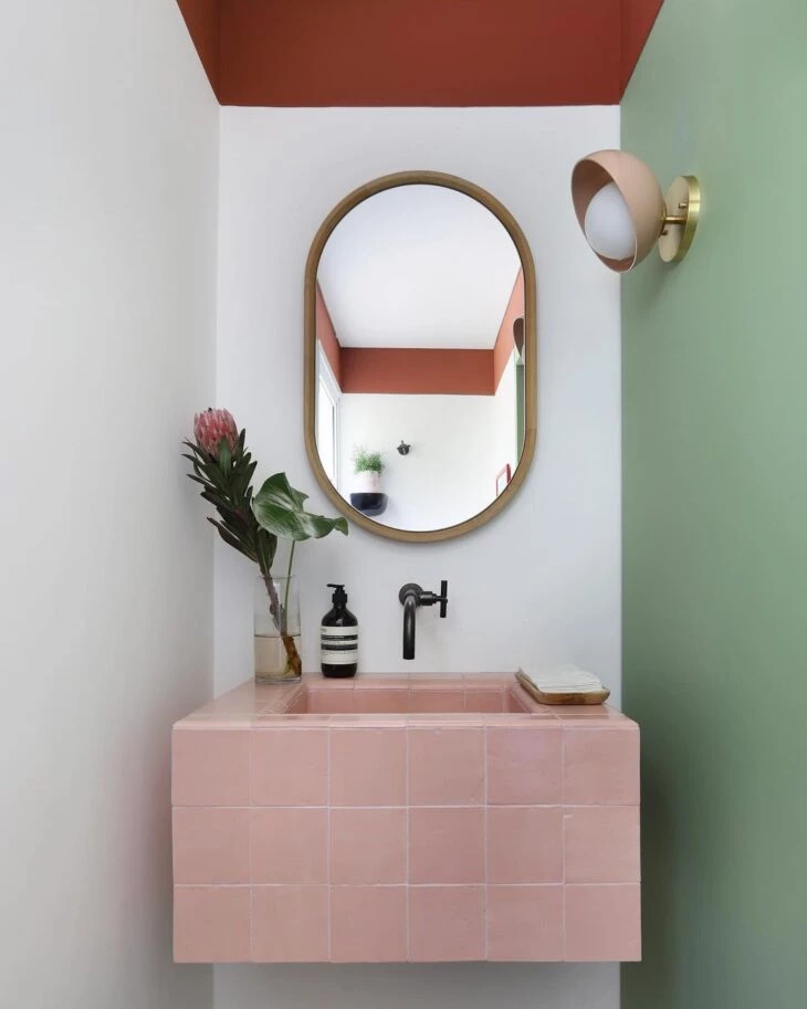
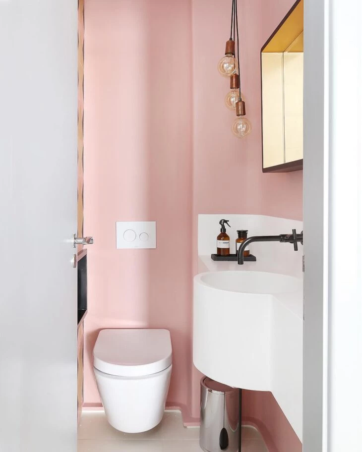
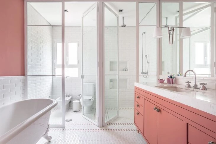
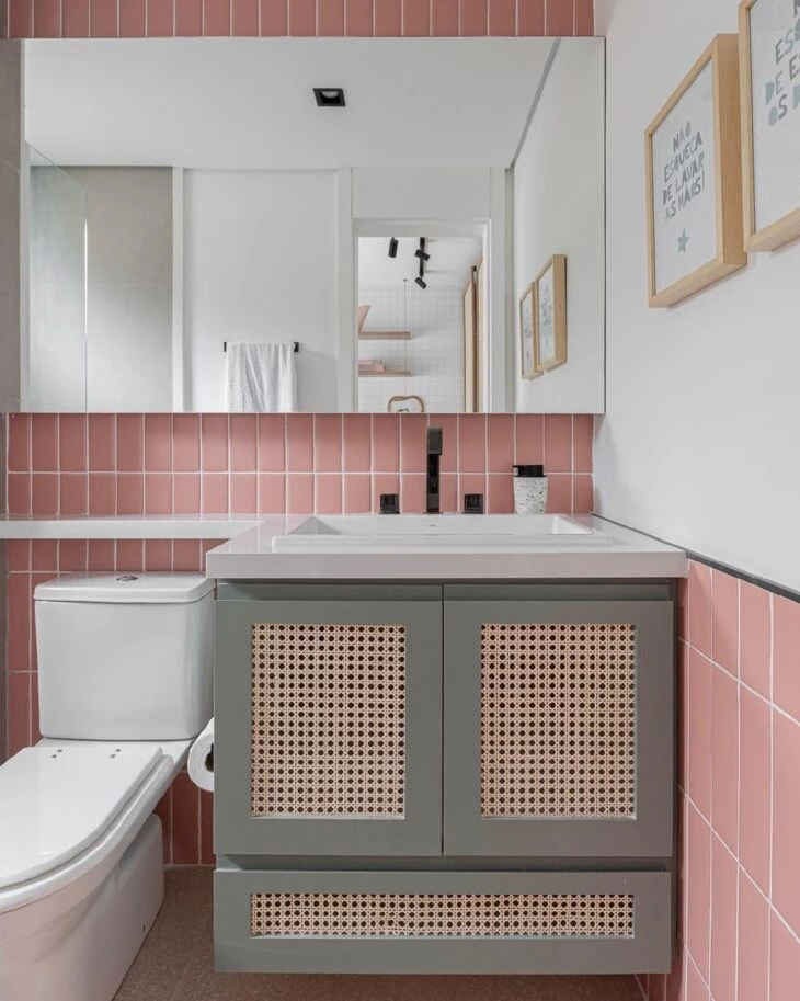
14. this bathroom gained a unique identity with the light-colored walls
15. see how pink fits even in the contemporary
16. modern also does not give up the various shades of pink
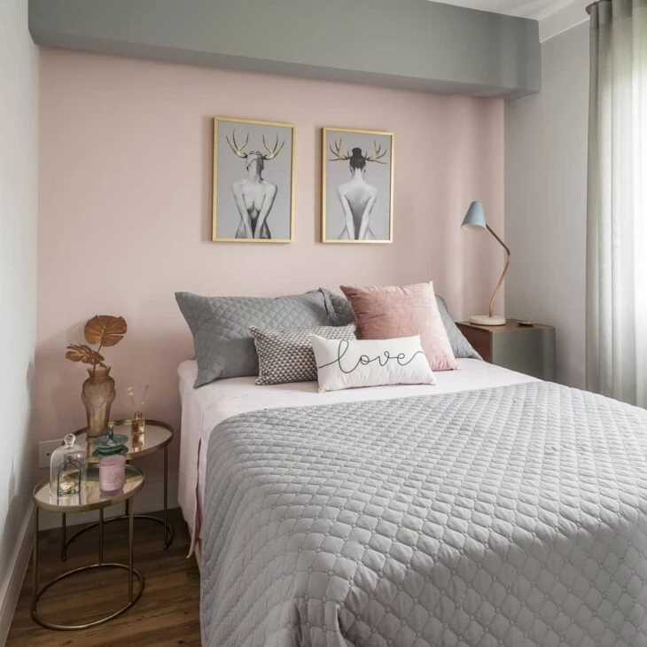
17. with gold and black, the elegant look is guaranteed
18. in this project, pink was applied in a delicate way in the environment
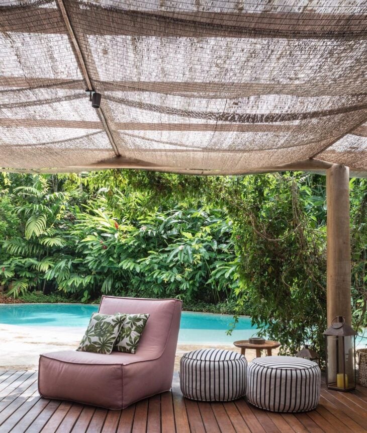
19. in the outdoor area, the pink puff is the highlight
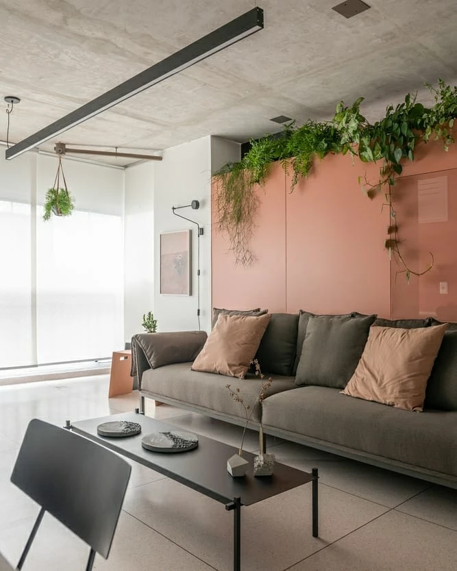
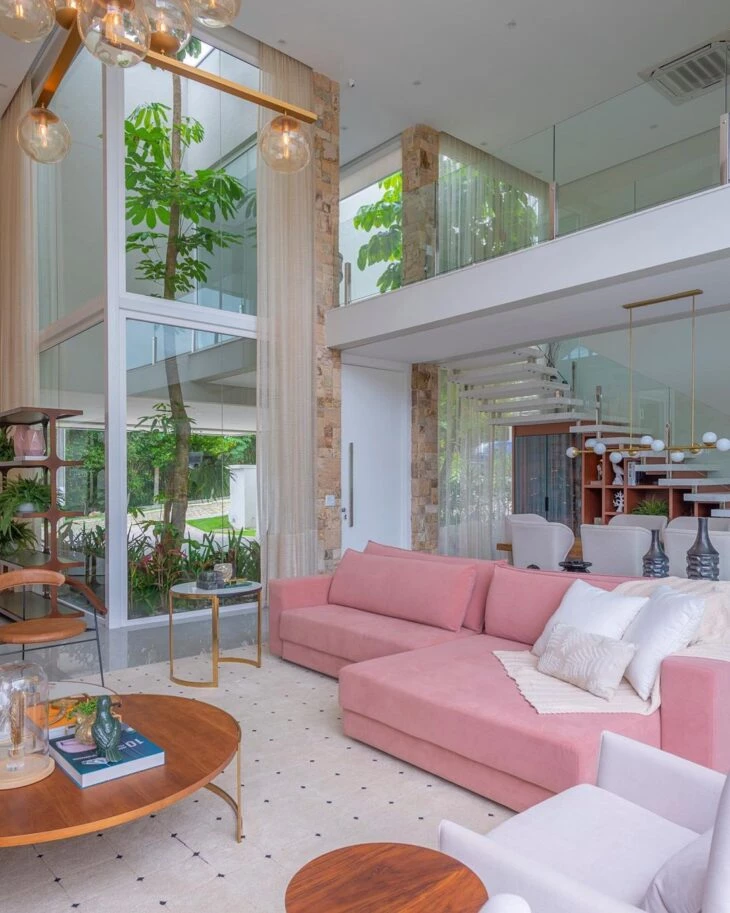
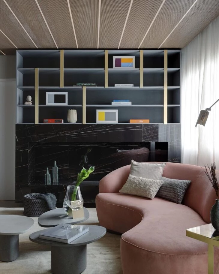
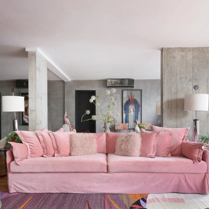
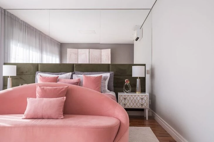
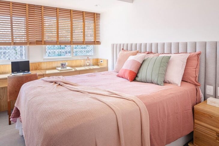
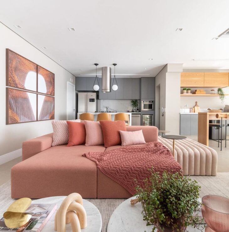
20. a mix of concepts deserved a burnt pink sofa
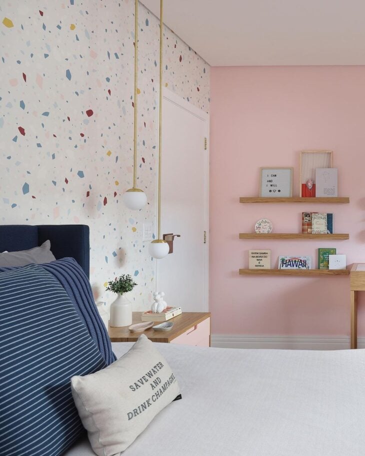
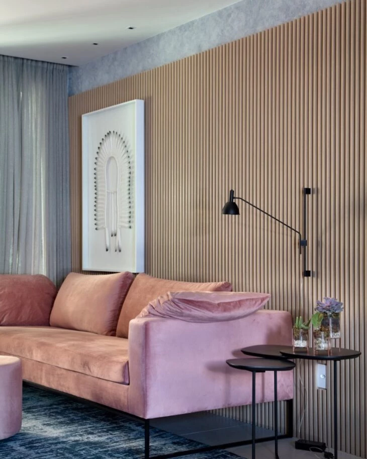
21. and to break the sobriety of the burnt cement, a bubblegum pink upholstery
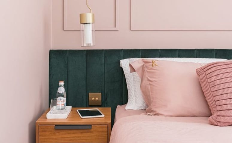
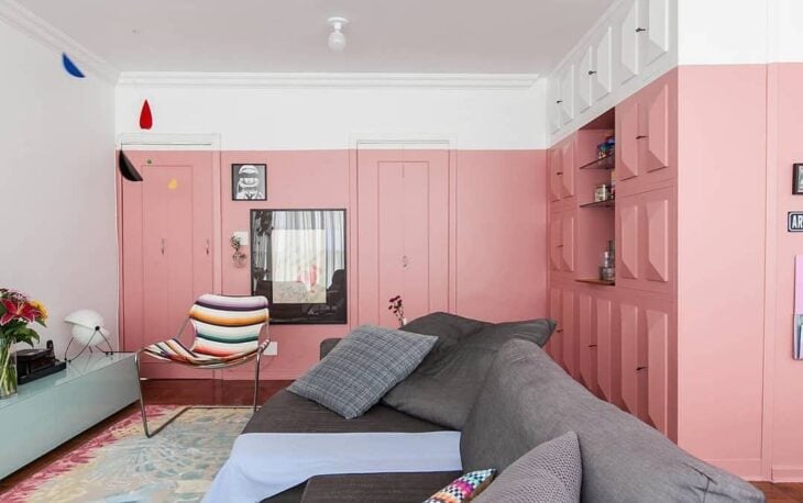
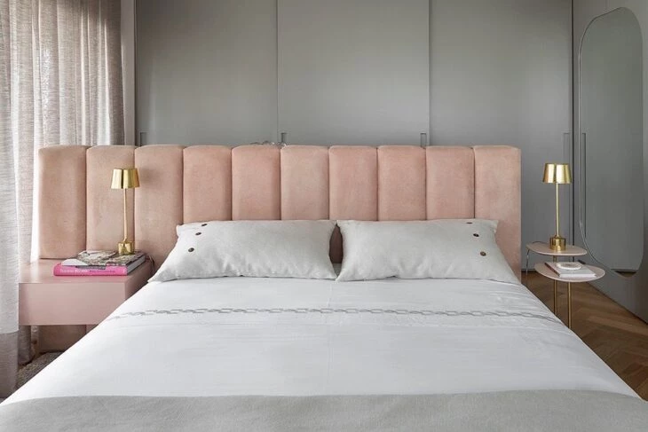
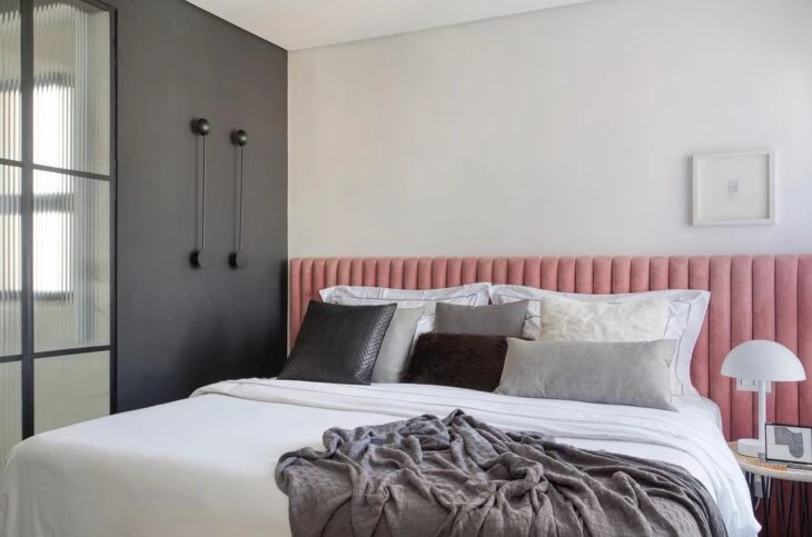
22: But you can also maintain sobriety with the right shade of pink
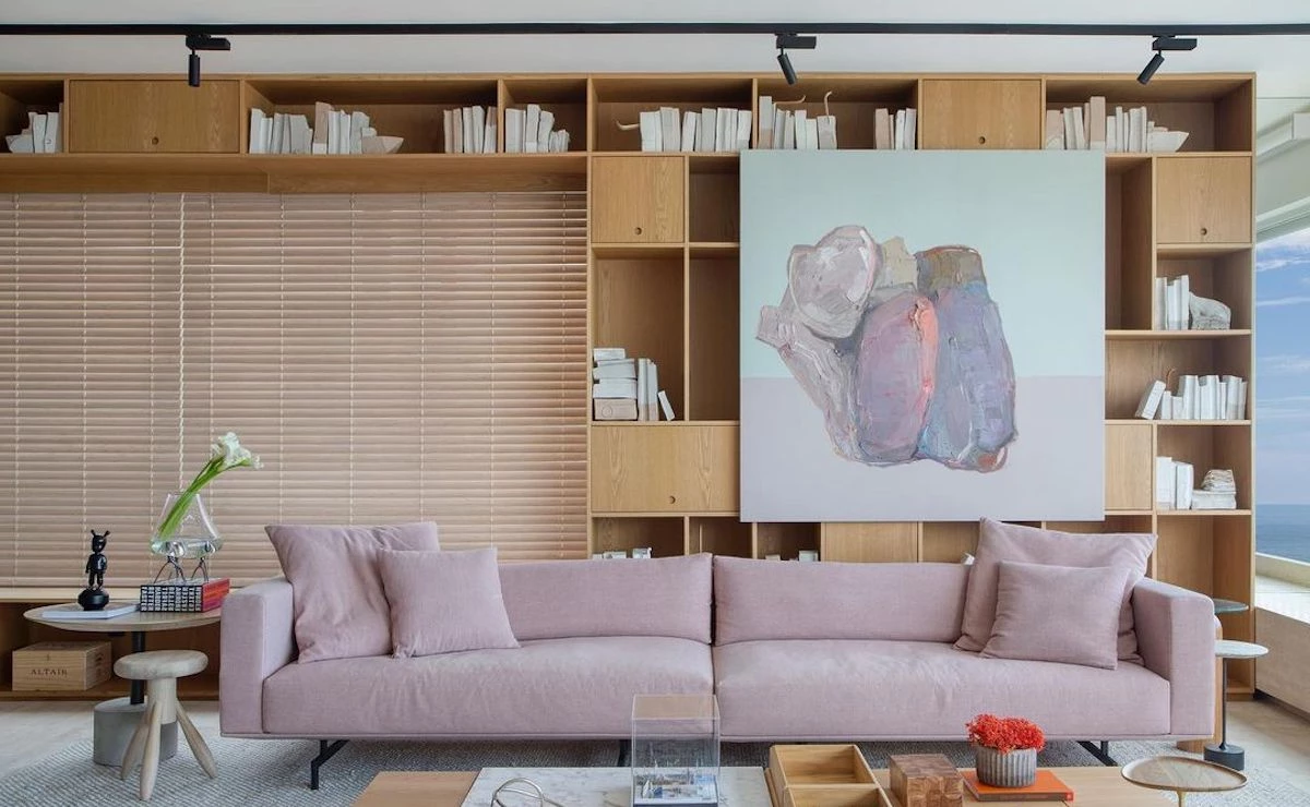
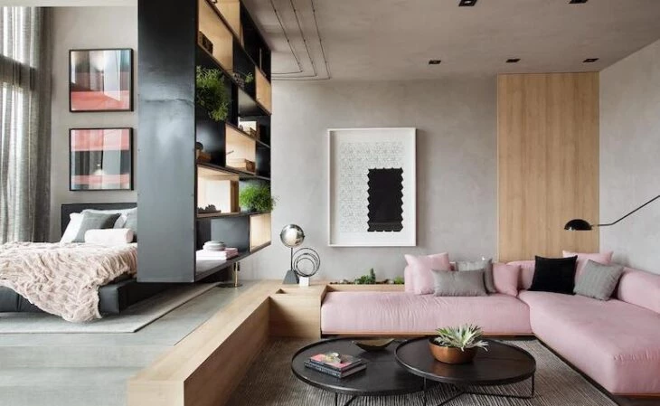
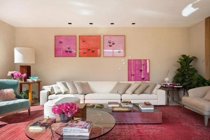
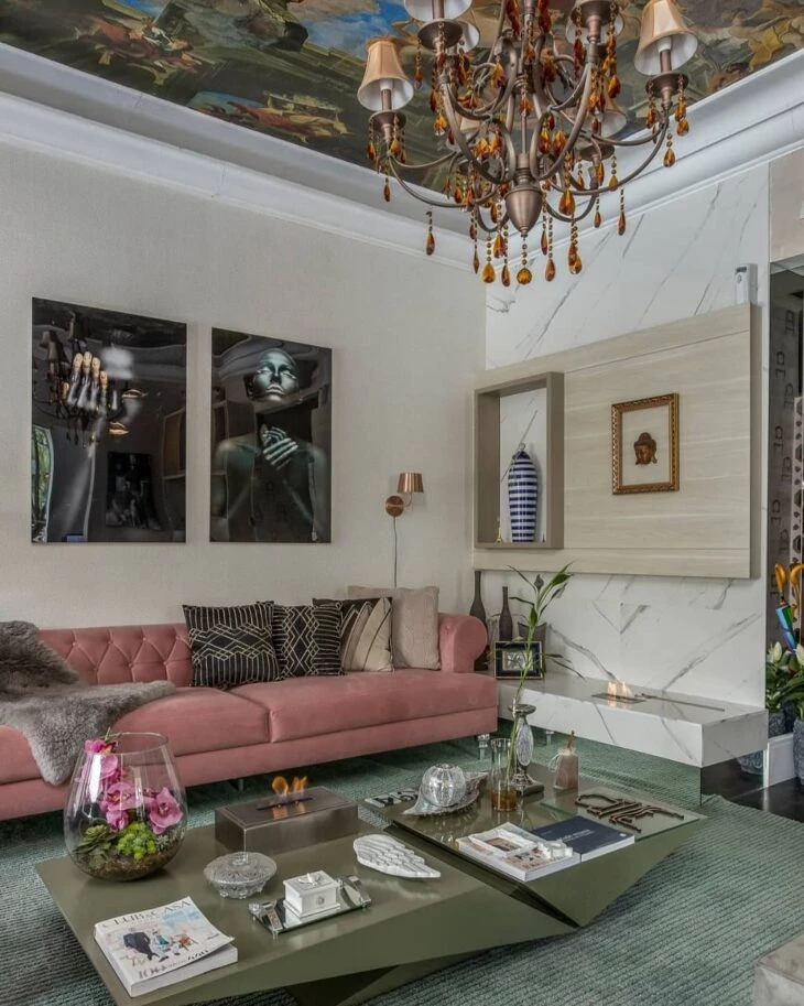
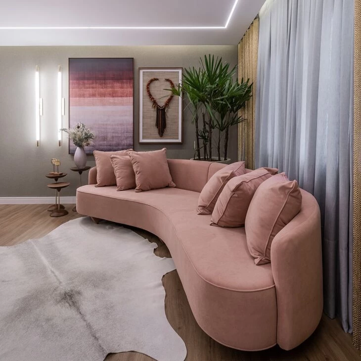
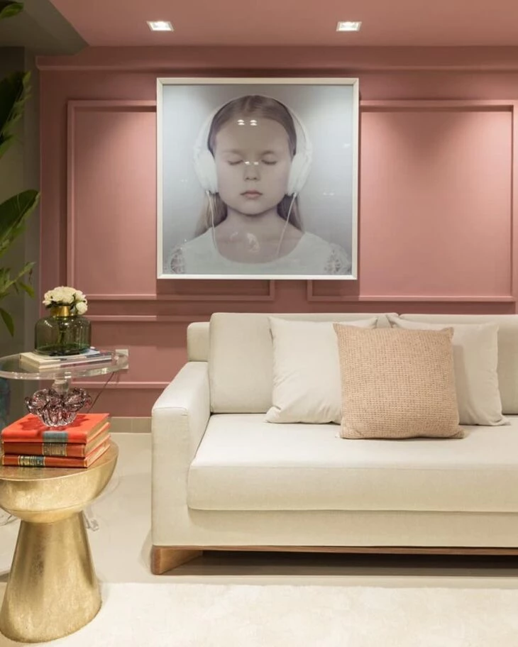
23 The tone on tone of the painting in connection with the sofa
24. already in this room, the analogous colors of the painting served as a counterpoint
25. when woodworking and furniture talk to each other
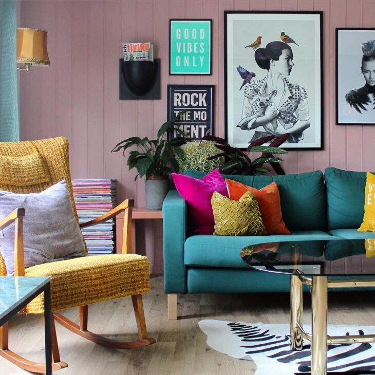
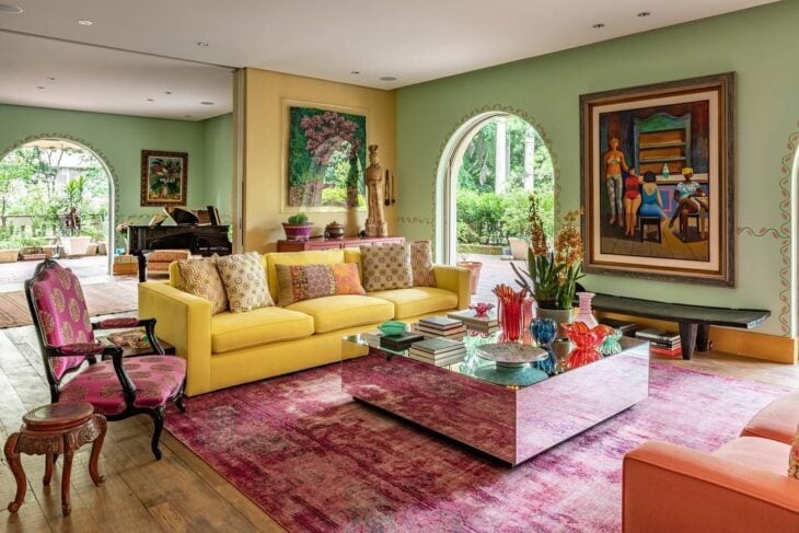
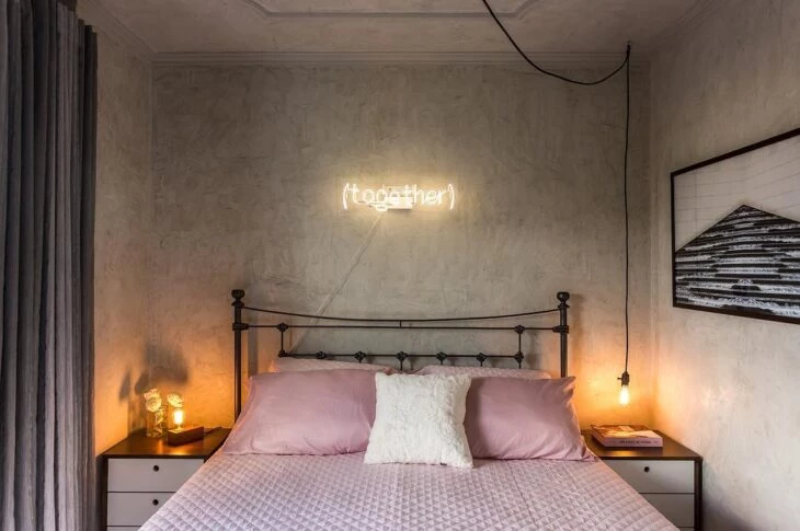
26. green, pink and yellow creating a retro design
27. to create a point of color, bet on a furniture
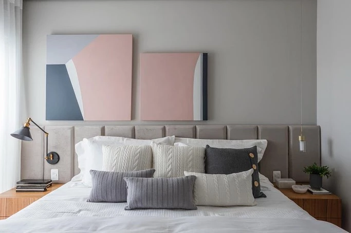
28. a pleasant and ideal color to escape from the common
29. a detail makes all the difference, so use pink in your accessories
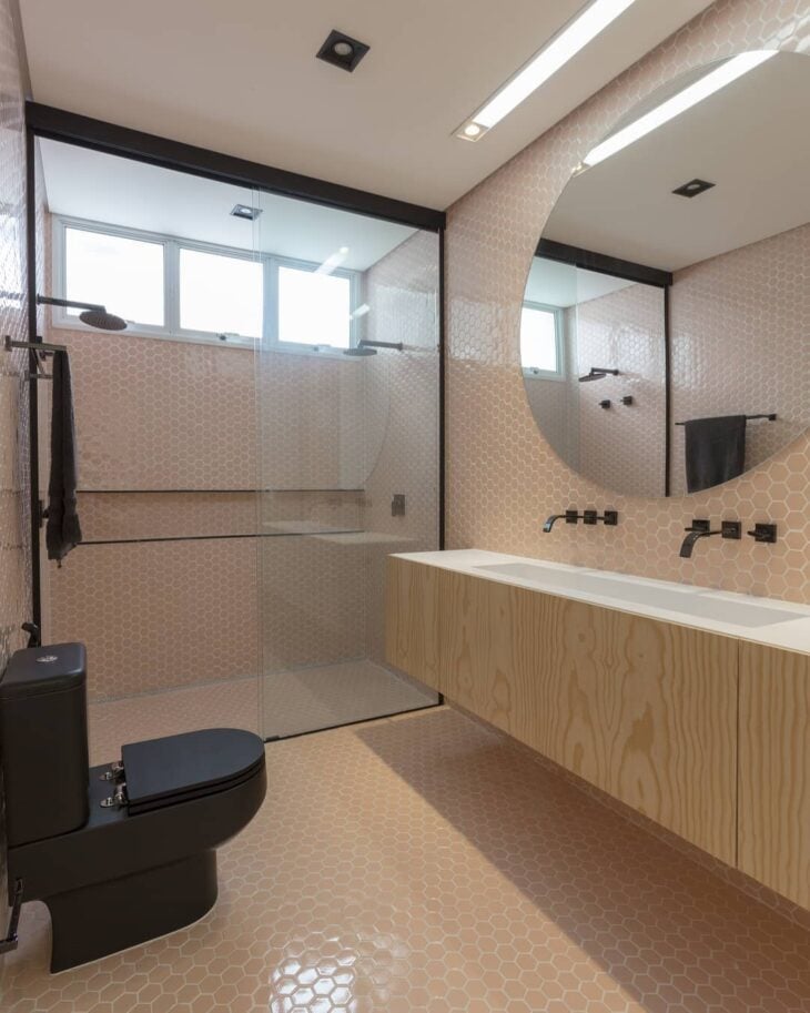
30. with the boiserie, the environment became more elegant
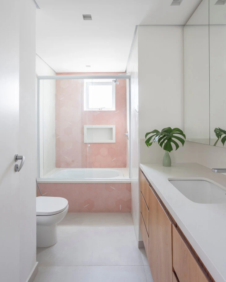
31. colors were a strong presence in this project
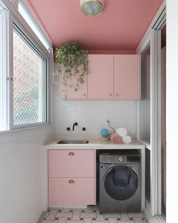
32. in addition to the cabinetry, the ceiling was also remembered when it came to coloring
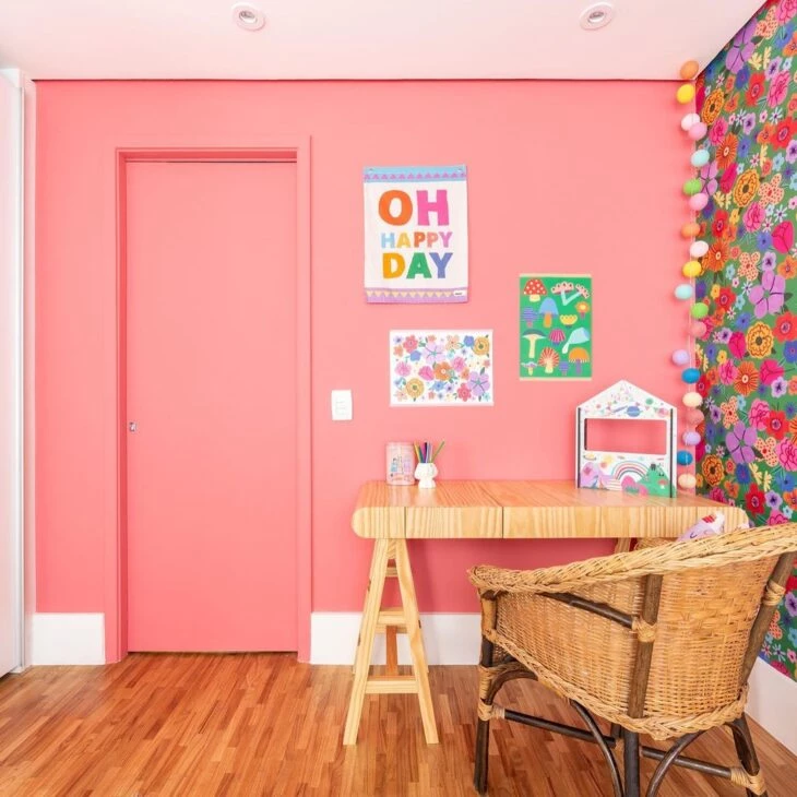
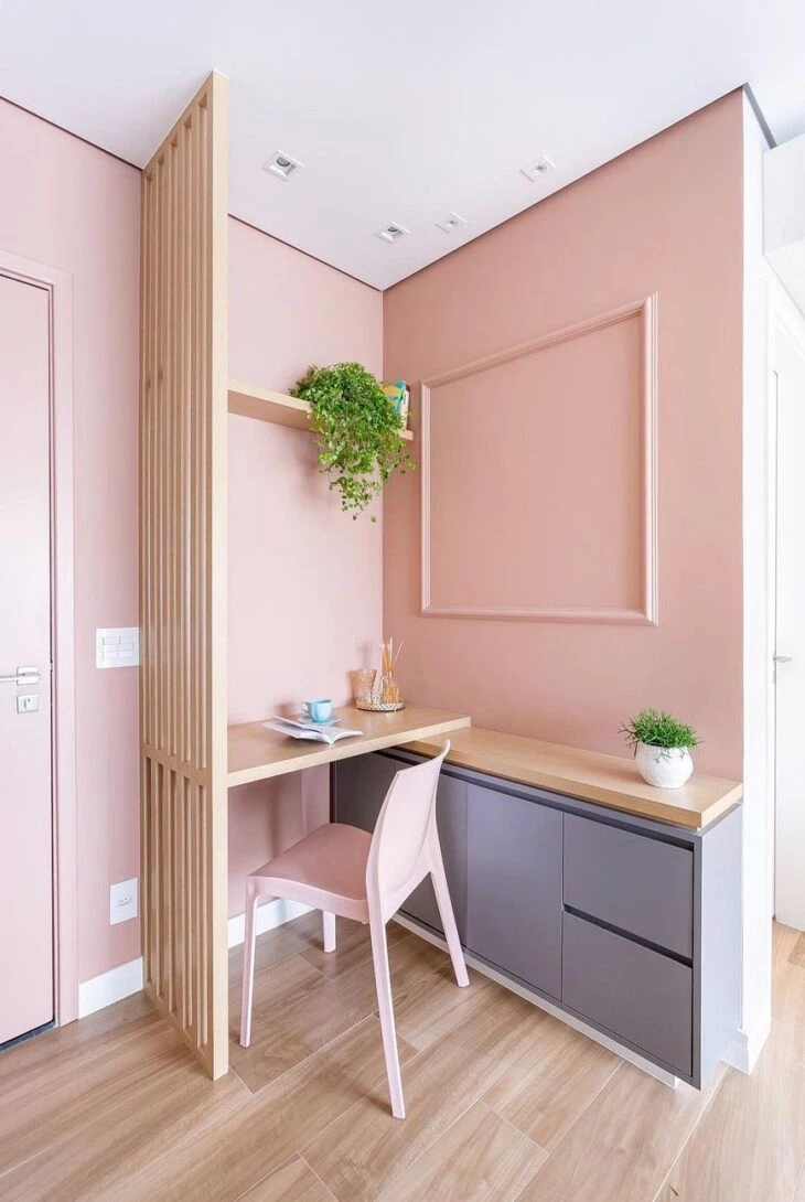
33 In a home school, pink creates an inspiring atmosphere
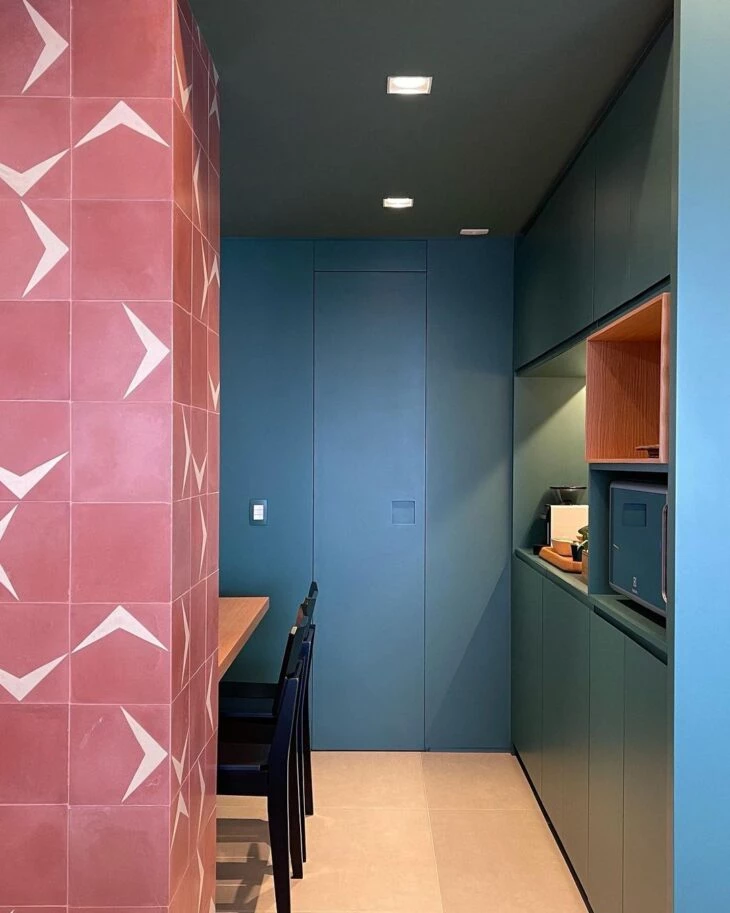
34. the kitchen gained an elegant touch with ruby pink
35. joinery and cladding complementing each other successfully
36 Here you realize what a difference details make
37. a perfect marriage between pink and moss green
38. for this room, the bet was with light pink and wood
Neon pink adds a special touch to the dining room
40 - Ideal for those who want a retro look in their decoration
41. the softness of the tone highlighted the shelves
42. a half wall full of personality
43. print unparalleled delicacy
44. for sure, it pays off to innovate in the colors of the kitchen
45 For an impressive environment, the bet was on pink and blue
46. in this palette, all colors are indispensable
47. and the pink becomes an extra charm amidst the granilite
48. in the bedroom, gray becomes the perfect partner
49. a stronger tone makes children's rooms more vivid
50. for it will be the pink that will bring the perfect identity
51. in bedding, this identity can change with every change
52 For the walls, the ideal tone must be handpicked
53 In the headboard, color becomes the perfect highlight
54 The truth is that pink fits in many environments
55. and every corner registered with color leaves an unforgettable mark
56. from the home office designed in the circulation area
57. even the environment that protects our sleep
58 - Marking presence in fabrics and textures
59. or in a stylish geometric painting
60. you can also combine the wall painting with the cabinetry
61. and even guarantee a differential with the bathroom tile
62. or simply assume pink in every bathroom
63 The versatility of pink is surprising
64: The color pink can accompany you in maturity as well
65. there is a perfect tone for every phase of your life
Pink goes beyond the color palette for women's bedrooms, it can express different identities and sensations in the decor. To do this, simply find the tone that best suits your proposal and include it in the design in a unique way.