Table of contents
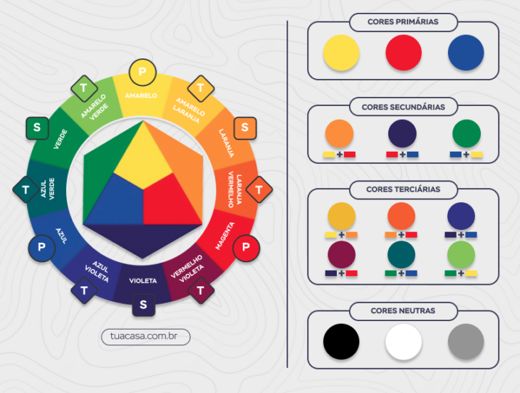
The primary colors are represented by the most vibrant shades of the palette, and can form the basis of everything in the decoration, from coatings to colored furniture. They are formed by pure colors and, together with their variations, create endless design possibilities, for example, sensations, visual tricks and even solidification of styles, explain Fernanda Geraldini and Gabriela Zanardo, fromTo better understand the concept and its application, follow the article.
What are the primary colors?
The primary colors are formed by the trio blue, red, and yellow. According to the duo of architects, they cannot be created from the combination of other colors, hence the denomination "pure colors". They can also be called "base colors", because, when mixed together, they create other colors of the chromatic circle.
Secondary colors
The secondary colors are formed from mixing the primary colors in equal proportions: yellow mixed with red results in orange, blue with yellow forms green, and red with blue results in purple. In addition to this table, it is possible to create a new layer of tones - the tertiary colors.
Tertiary colors
The tertiary colors are provided by the mixture between a color from the primary table and one from the secondary table. They expand the range of tones: purplish-red, orange-red, orange-yellow, greenish-yellow, greenish-blue, and purplish-blue.
See_also: See the colors that go with pink and how to get the decor rightNeutral colors
The neutral colors are formed by white, black, and gray, which are not used in the aforementioned combinations: "This basic trio presents low intensity and is used as a complement in other shades," explained the Triad Architecture duo.
The 12 colors shown form a main set of hues: the chromatic circle. Below, find out how this fundamental scheme can help you create a visual concept for your decoration.
How to use the color circle to create combinations in decoration
The chromatic circle is a fundamental tool to create varied and creative color palettes:
What is the color circle?
Triad Architecture (TA): The color circle is a representation of primary, secondary, tertiary colors and their variations. In total, the circle is divided into 12 parts, like a pizza, with 3 primary colors, 3 secondary colors, and 6 tertiary colors.
What is the importance of the color circle in decoration?
TA: With the chromatic circle, we can create harmony and unity to the environments we create, because colors are essential, transmitting feelings and sensations. Therefore, choosing them correctly is fundamental.
How is the chromatic circle used to make color combinations in decoration?
TA: It is possible to use the circle in several ways and make countless combinations of colors. For this, it is essential to know what you want to convey and what the concept of the project is. The options are: the monochrome, the analogous colors, the complementary colors, and the triad.
What are monochromatic combinations?
See_also: 90 luxury bedroom designs to turn your dream into realityNF: It is the simplest category of all, because you just have to choose a color and use the variations in tone. Remember that this is a harmonic choice, capable of making modern environments.
What are analogous combinations?
TA: This option is very good to create a unity of color in the space. If complemented with cool colors, you will have a more sophisticated and formal environment, while warm tones add relaxation and informality.
What are complementary colors and how to add them to your decor?
TA: The complementary colors are those that present greater contrast between each other. They are in opposite positions in the circle, like red and green. The complementary color of a primary will always be a secondary and vice-versa. The complementary color of a tertiary will always be another tertiary. This type of combination is excellent to create an environment with lively colors, more energy and personality.Be careful not to overdo it with too many vibrant hues, so as not to make the space suffocating.
What is triad?
TA: the joining of three equidistant points (that have the same distance) on the chromatic circle, forming a triangle. By using this combination, you will have an environment full of personality, but softer.
When does the color circle enter into the decoration planning?
TA: From the interview we do with the client, we can already feel what he wants for the space and what he wants to transmit. This way, ideas start to emerge and we already know what combinations to suggest.
Is it possible to plan a decoration without using the color circle?
TA: we don't think it's possible, because we always use a certain color on the walls, then complement it with objects and accessories. The chromatic circle is indispensable.
How can primary colors be highlighted in decoration?
TA: We can stand out by assembling compositions that were mentioned above, using the primary color as the main element of the decoration.
Can primary colors be combined with each other in decoration?
TA: Yes, through the triad combination, they can be combined to create a design concept. Even though they are colors with personality, it is possible to create a beautiful and harmonious environment.
The use of colors in decoration has always been paramount to add identity to the environment. It is necessary to understand the use of colors and the whole concept behind each choice.
How to use primary colors in decoration with taste and personality
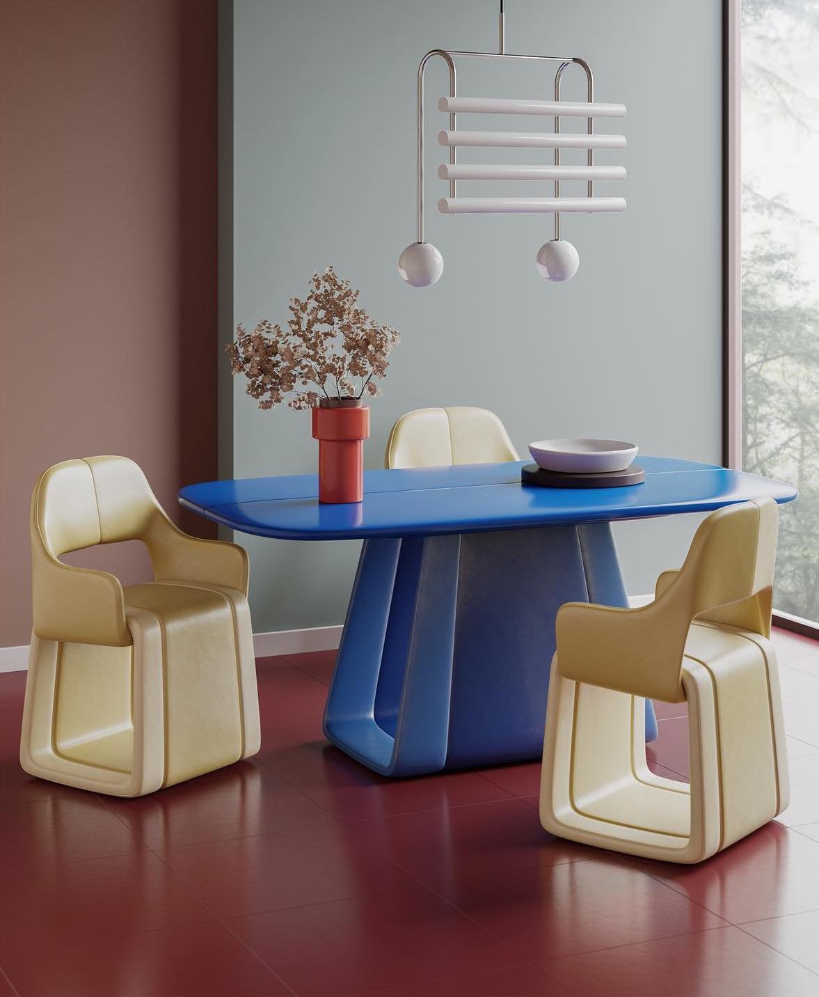
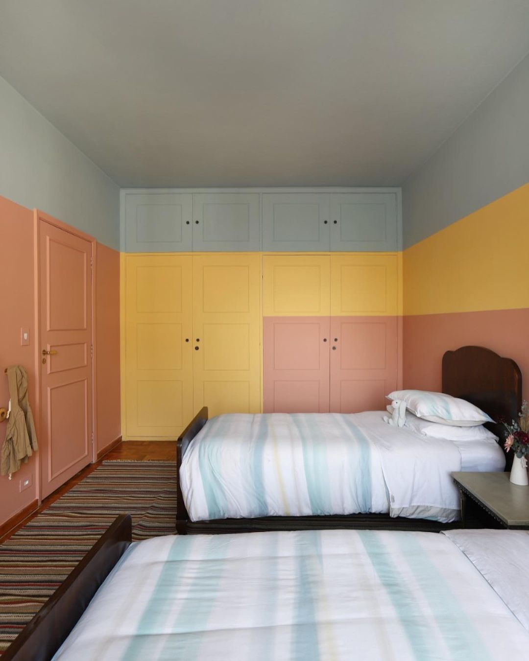
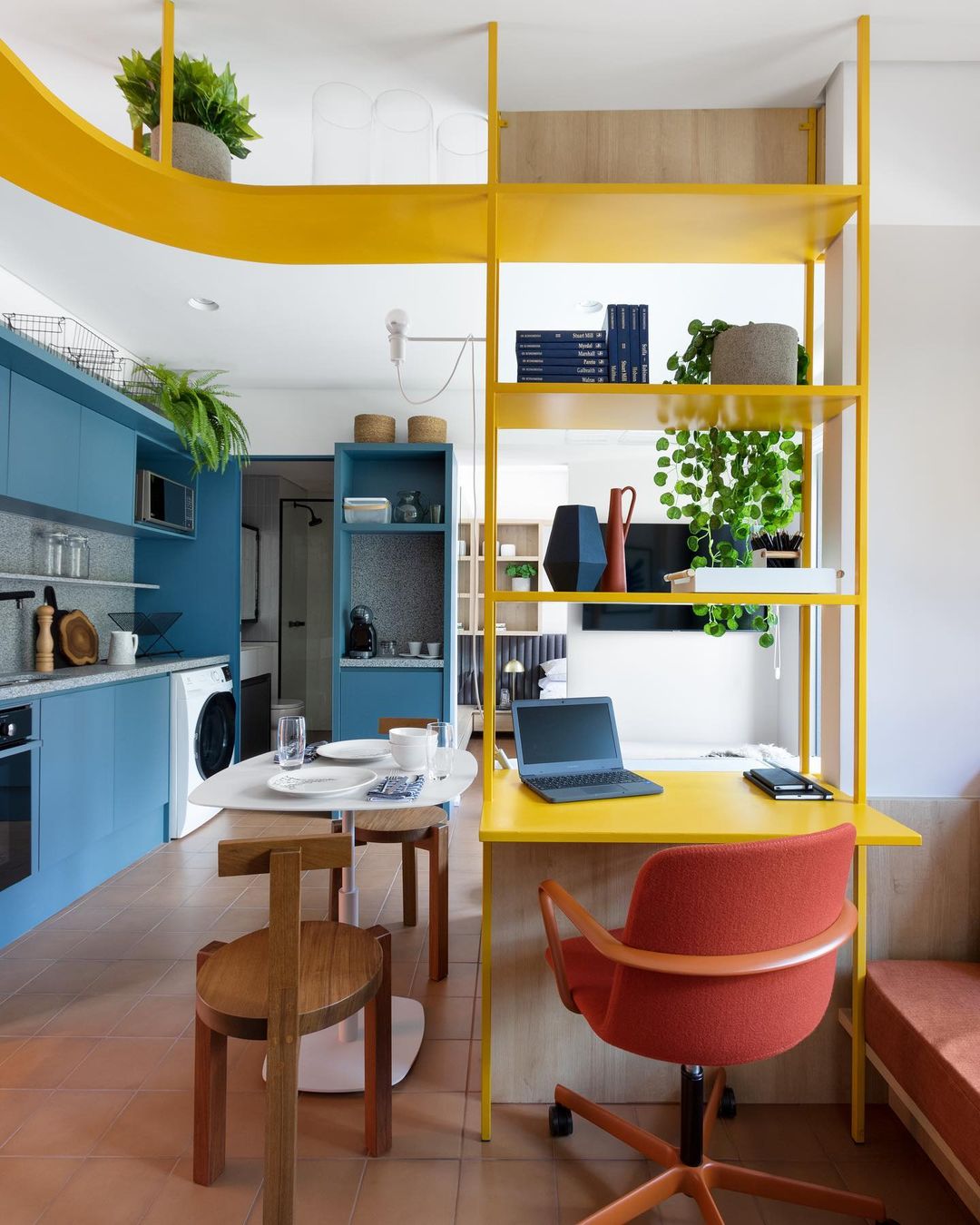
After the architects' explanations, you will see the projects below with new eyes. The primary colors were used in the right measure for each type of decoration:
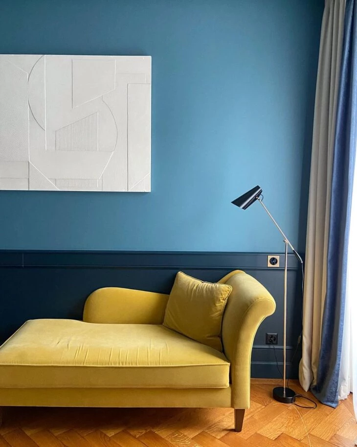
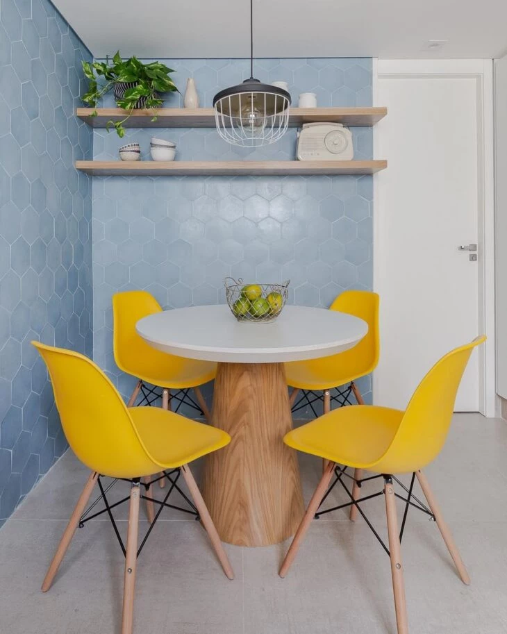
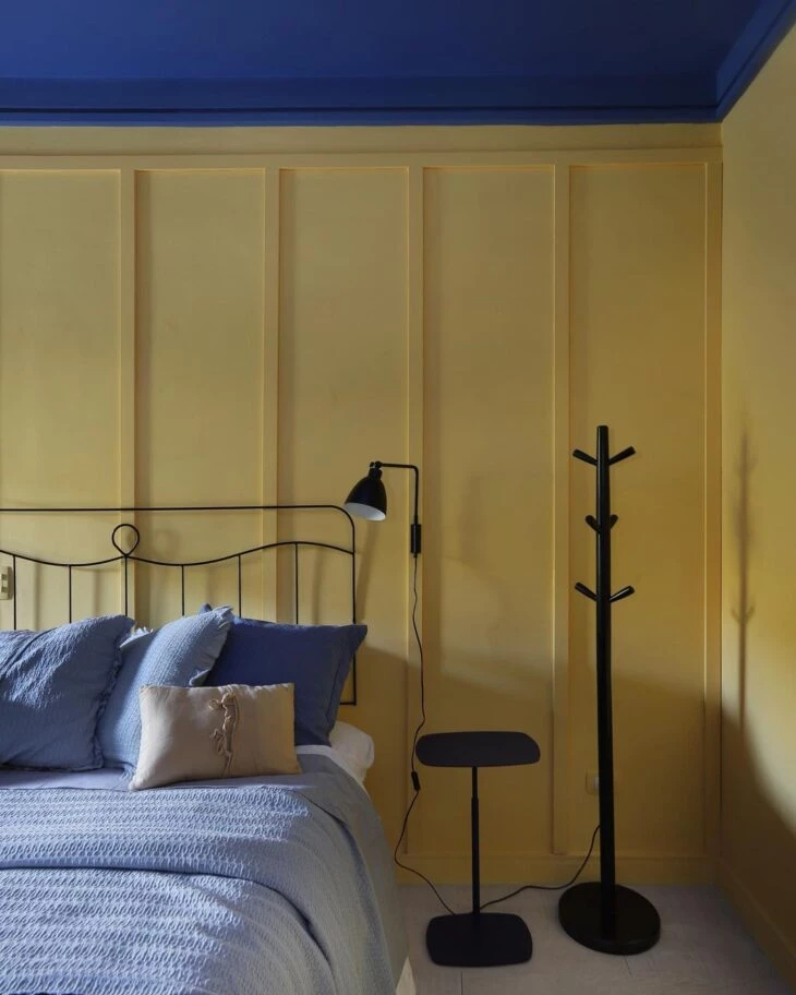
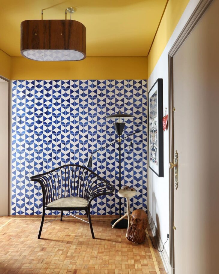
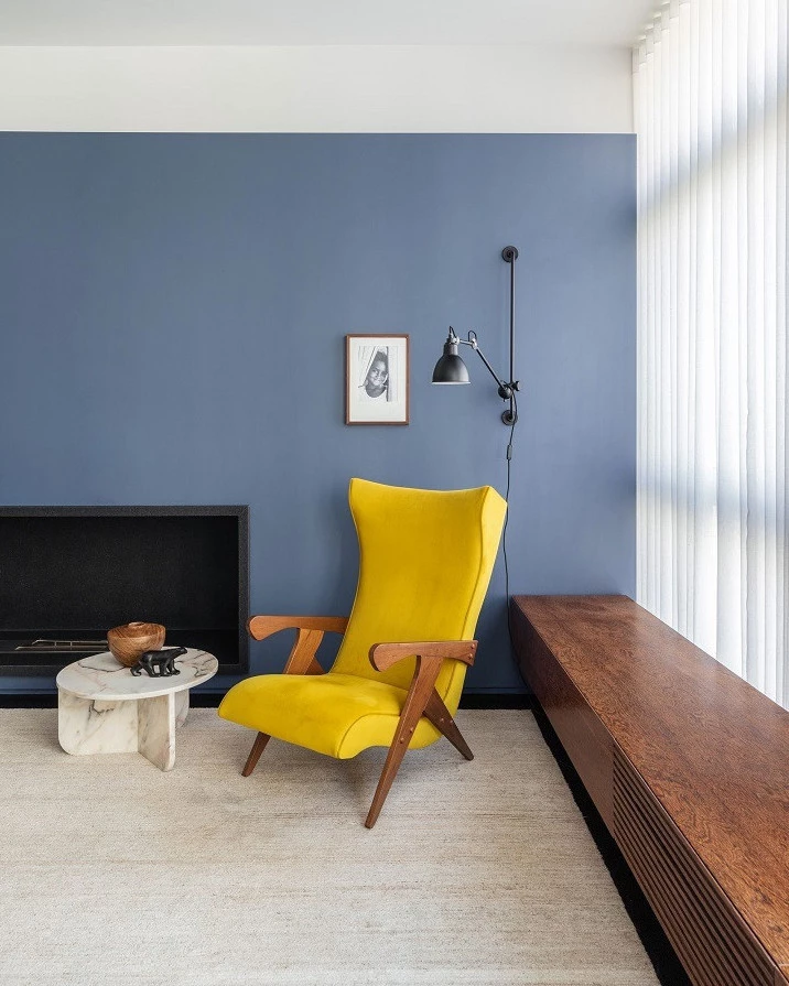
1. for a blue wall, a yellow sofa
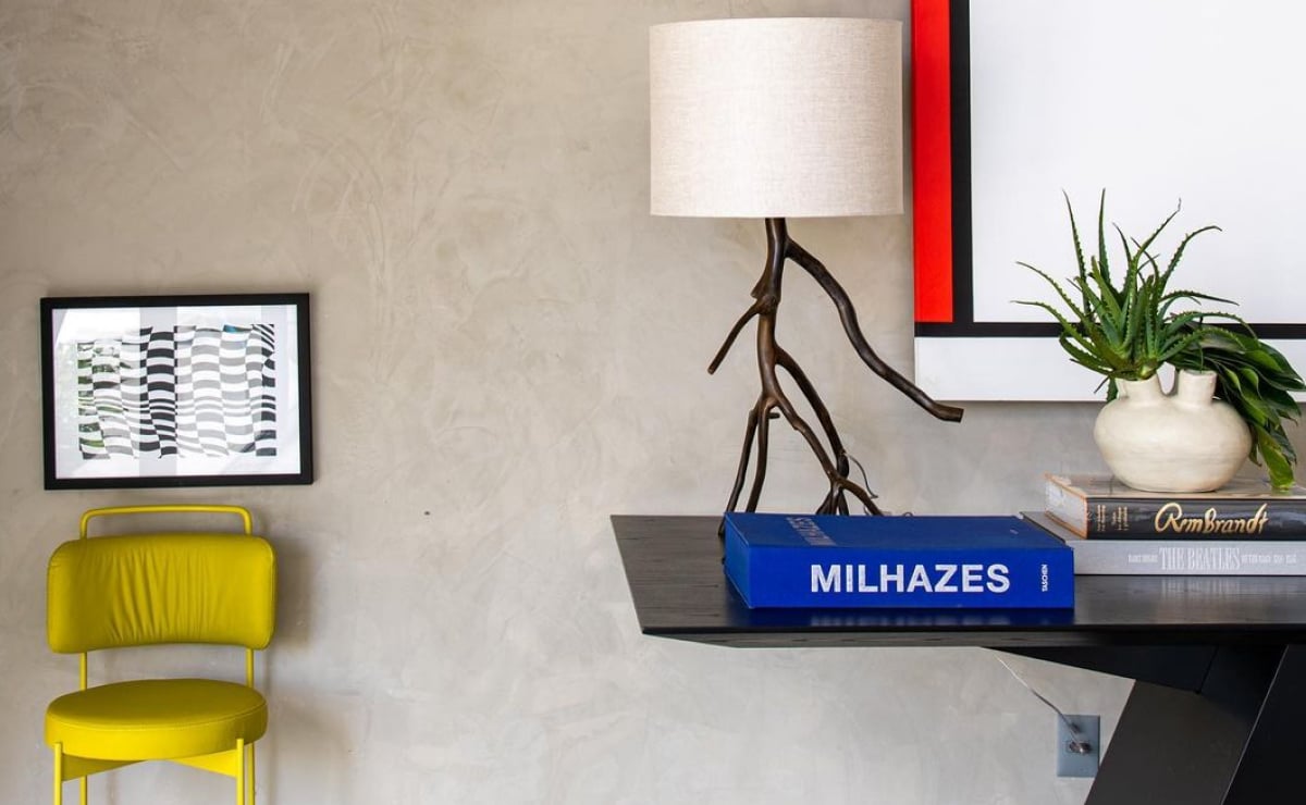
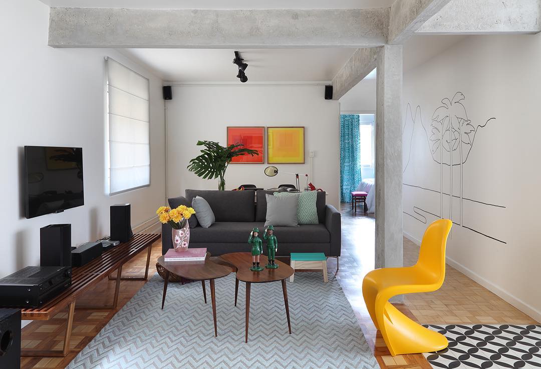
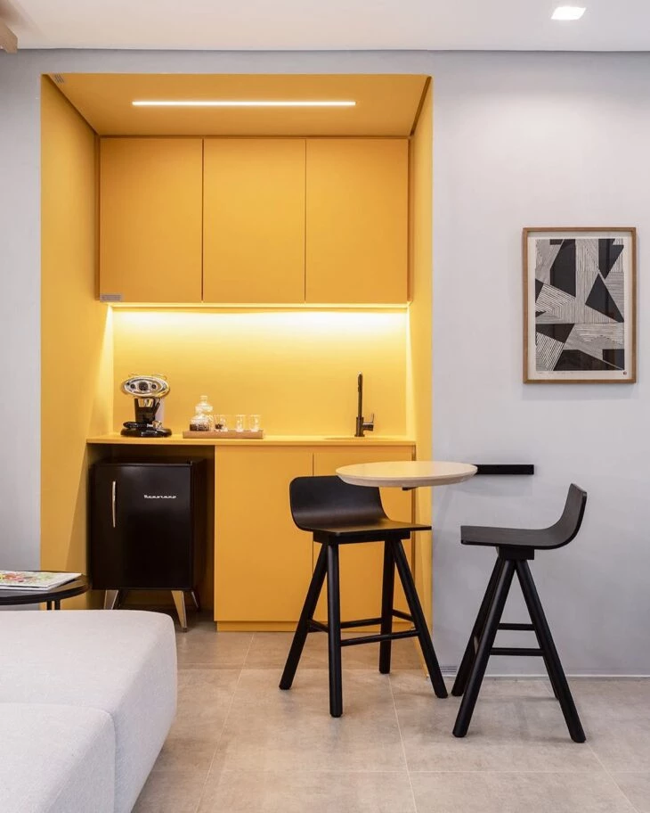
2. to highlight a primary color, use a neutral color
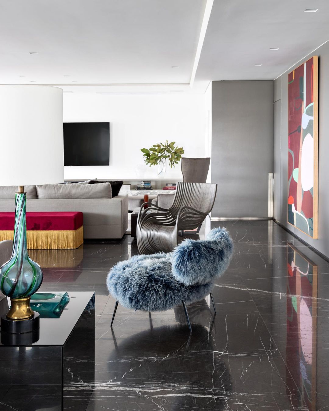
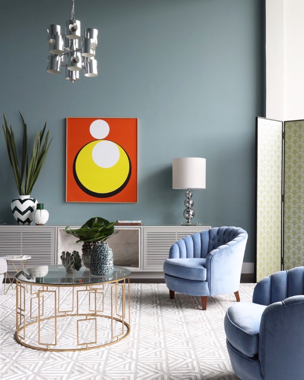
3. so the decoration is elegant
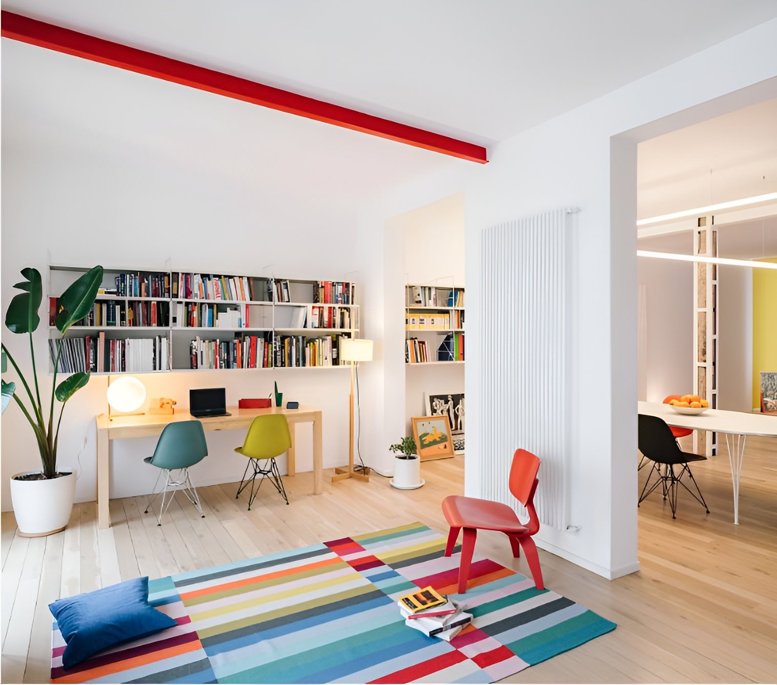
4. the three primary colors can be present in different proportions
5. red fits perfectly even in classic decors
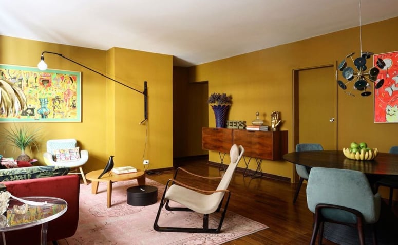
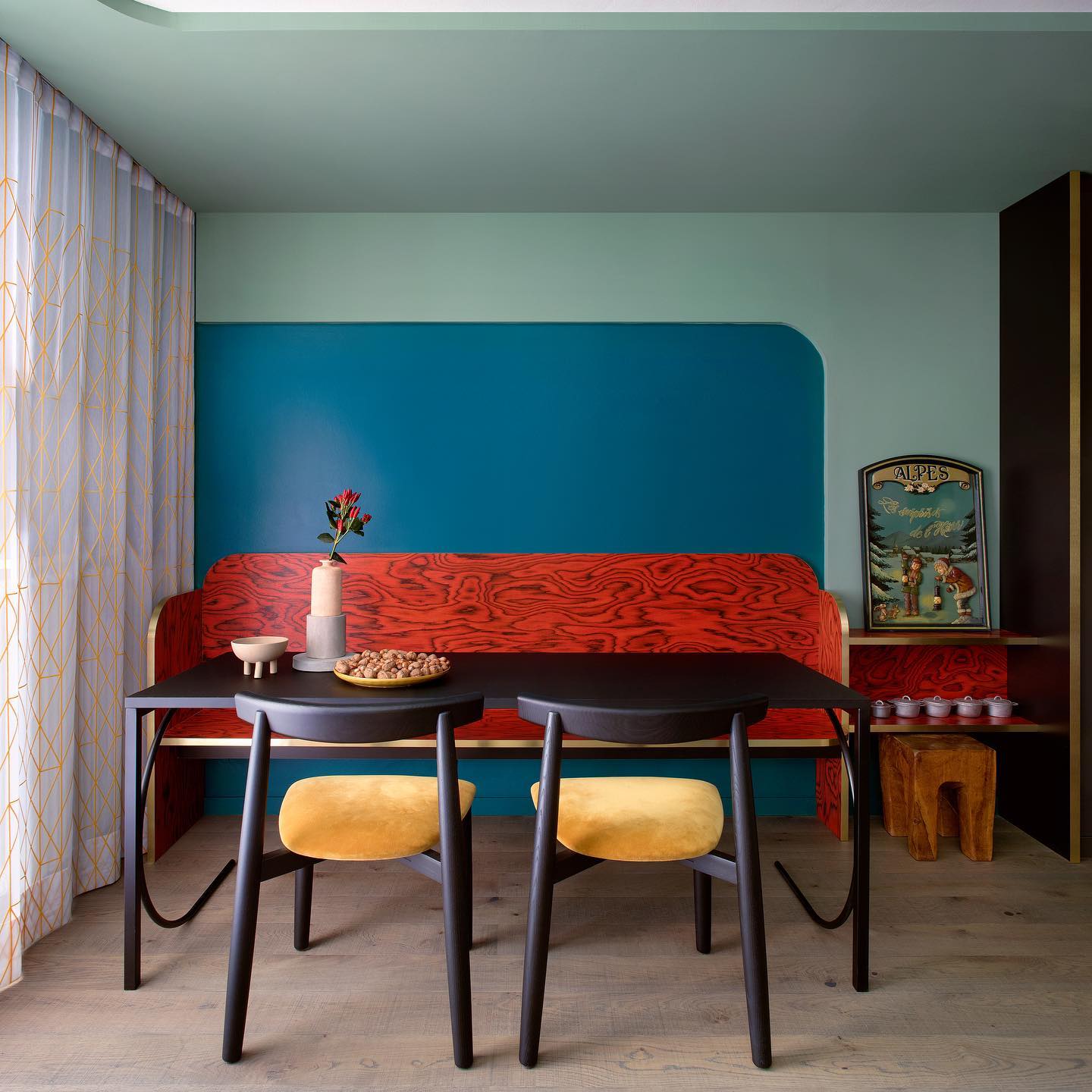
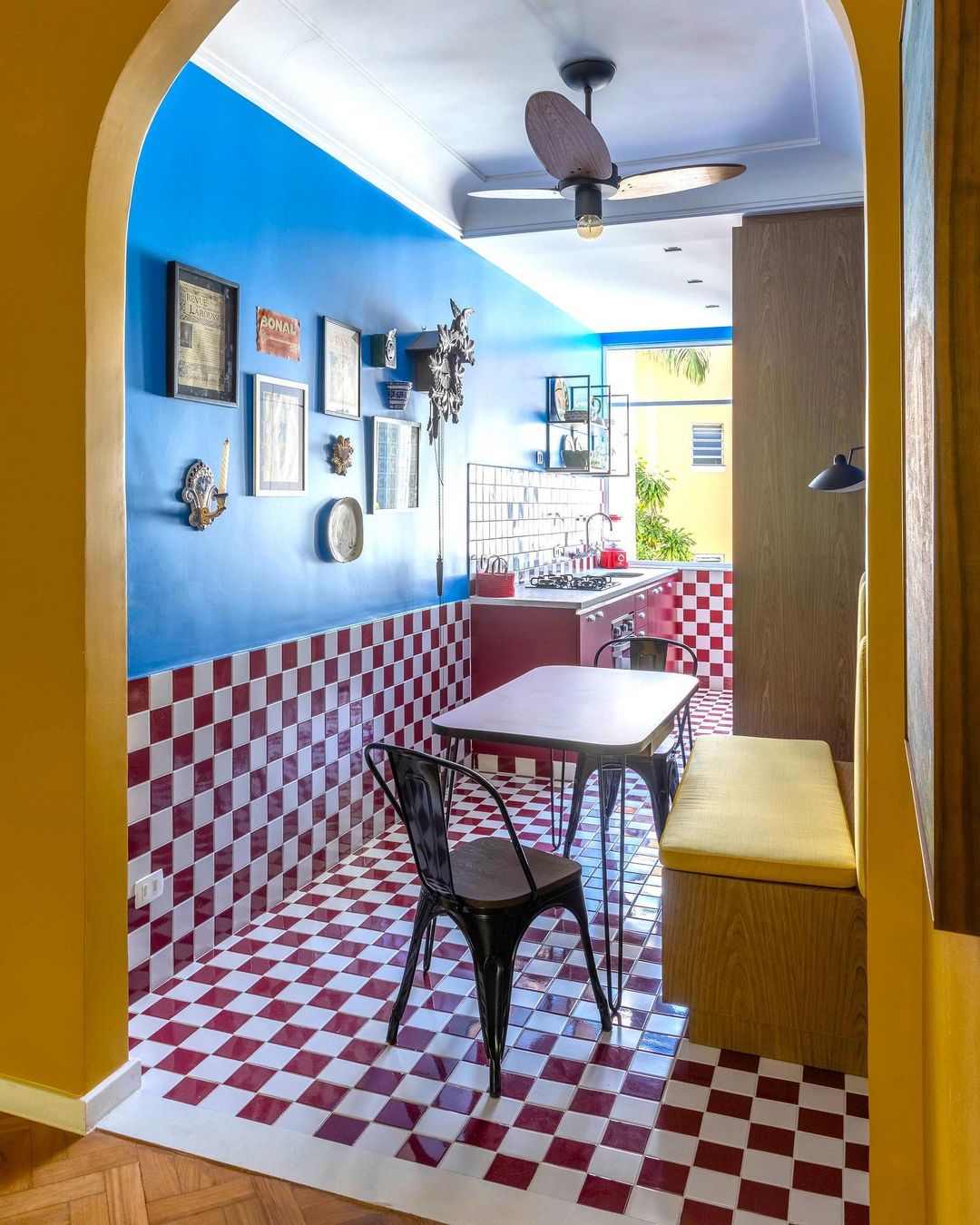
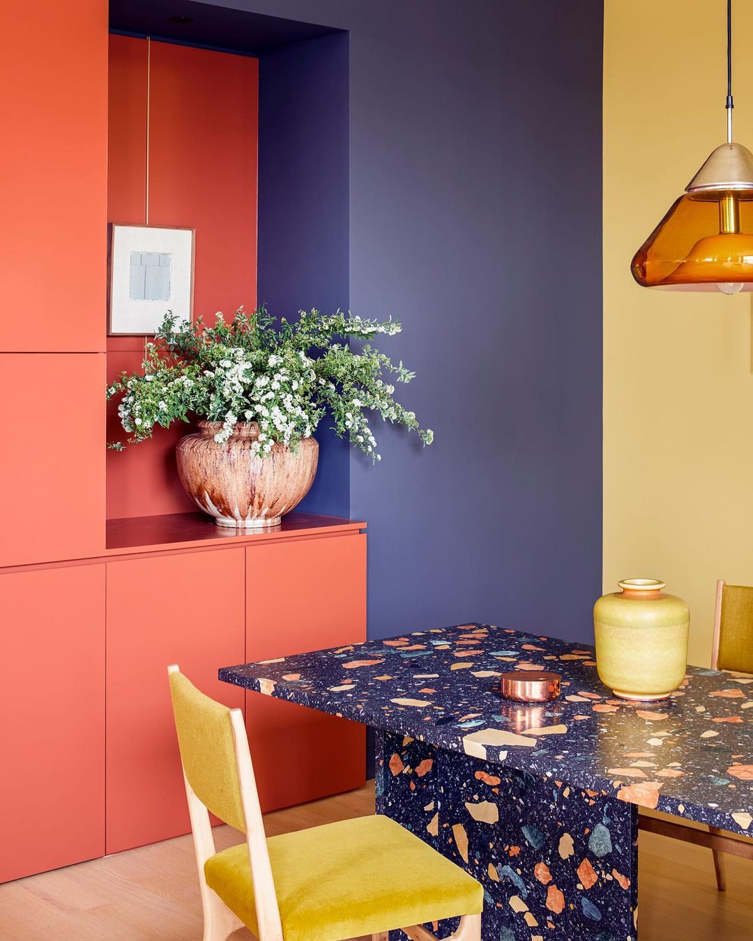
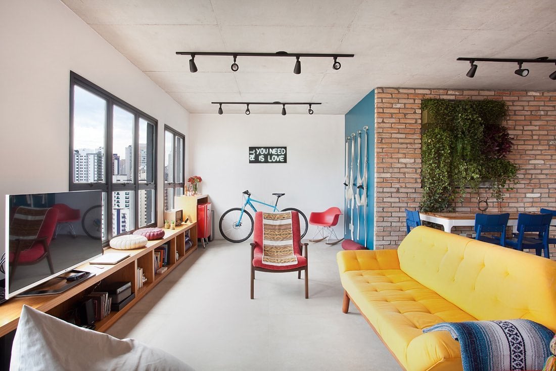
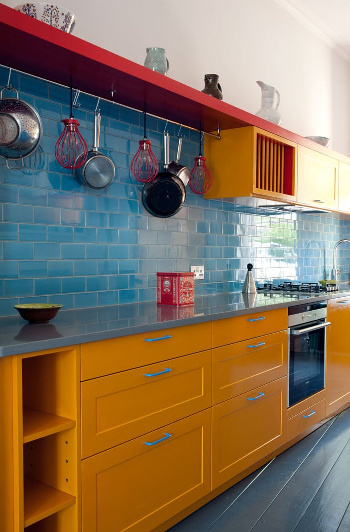
6. a palette of blue, yellow, and a splash of red
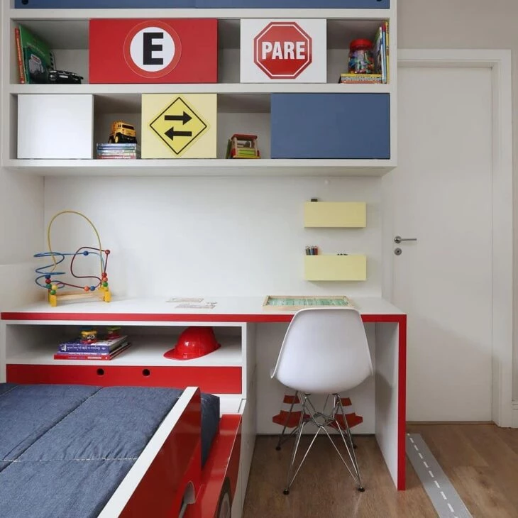
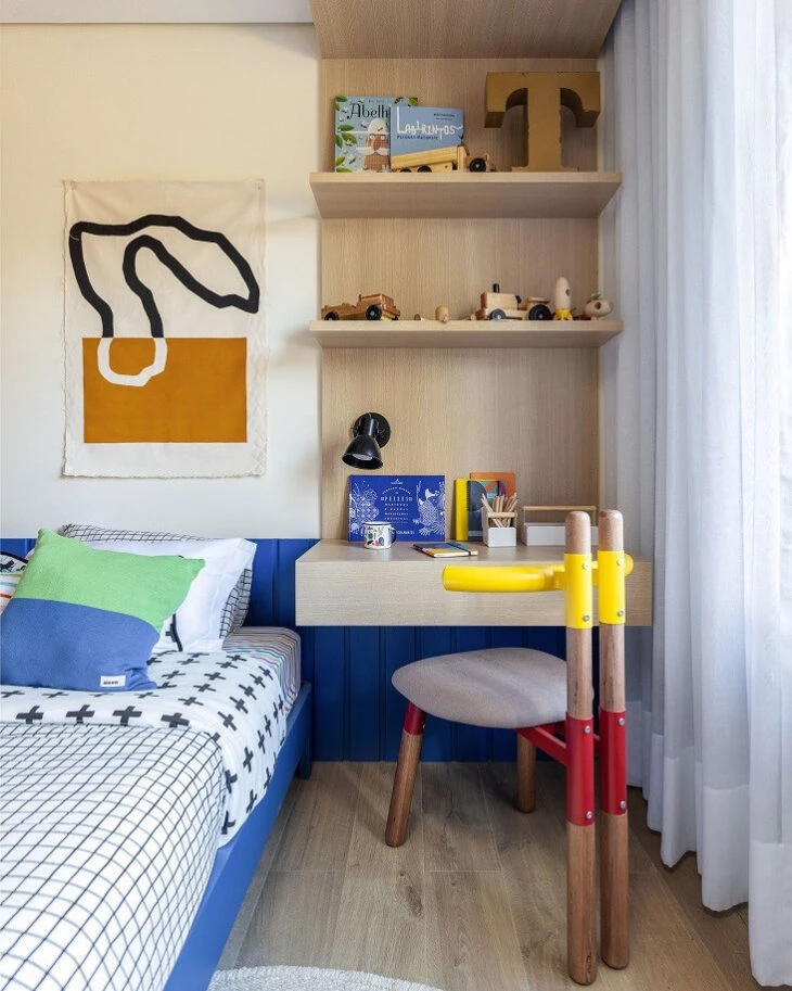
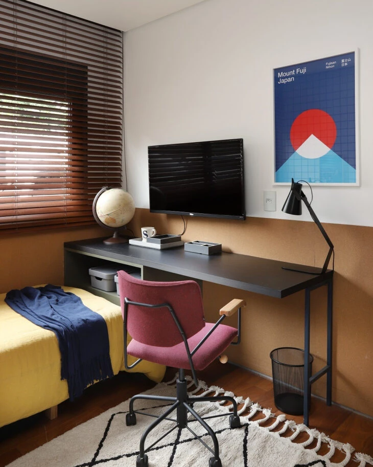
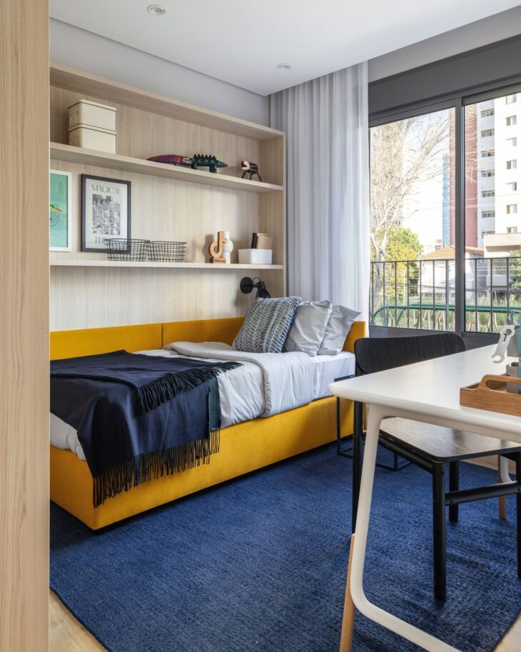
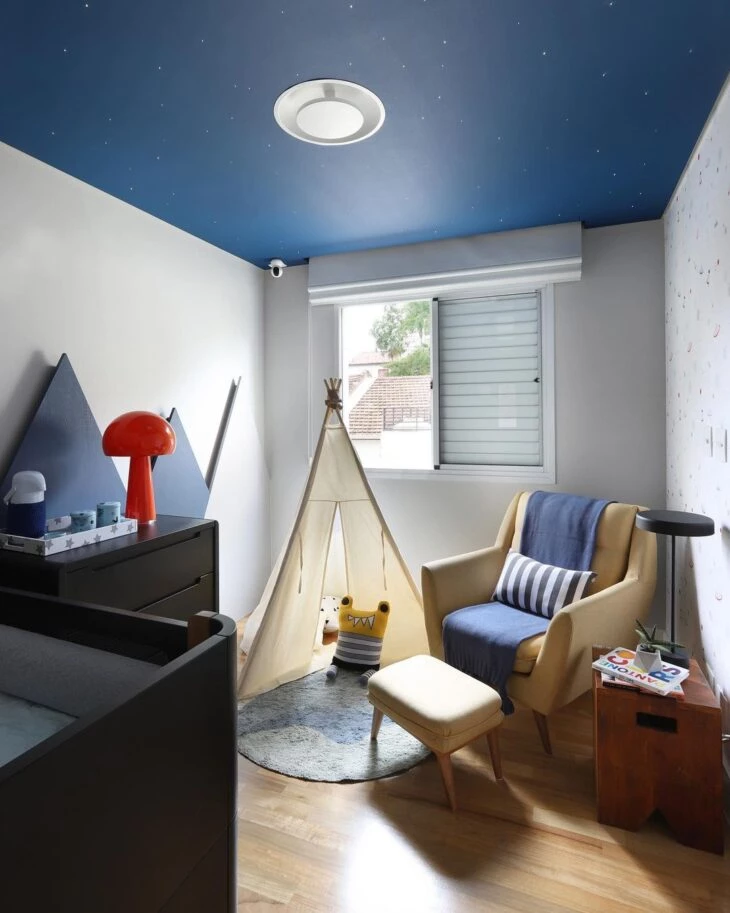
7. see how primary colors work perfectly in a child's room
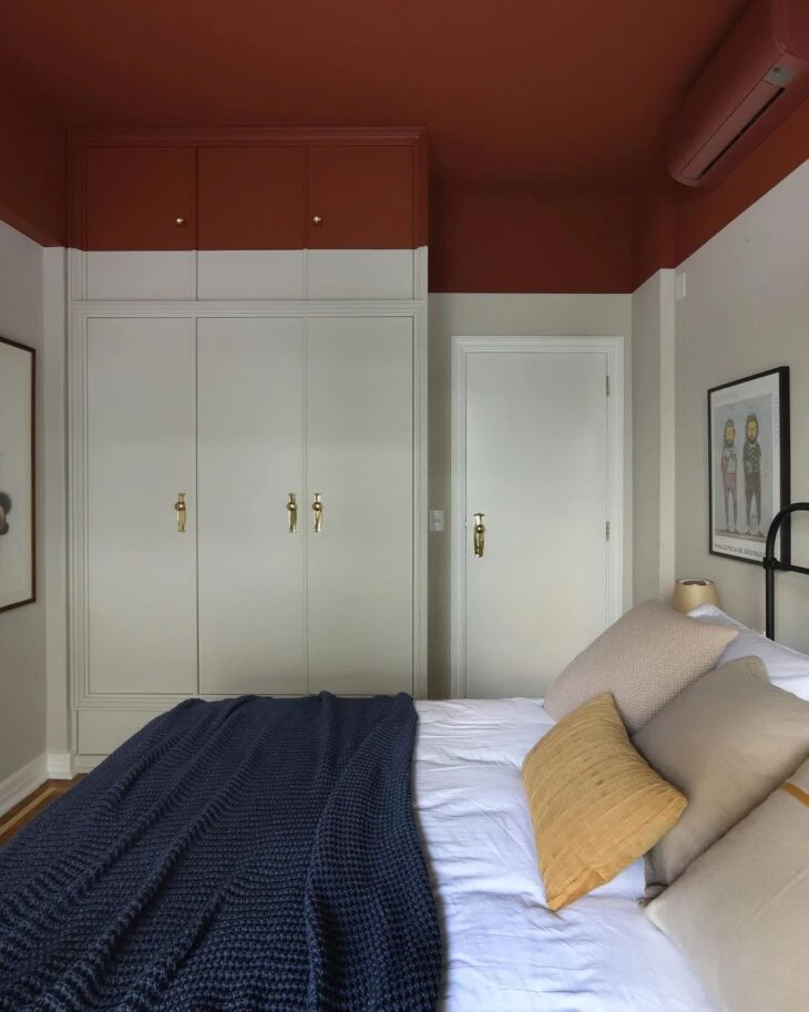
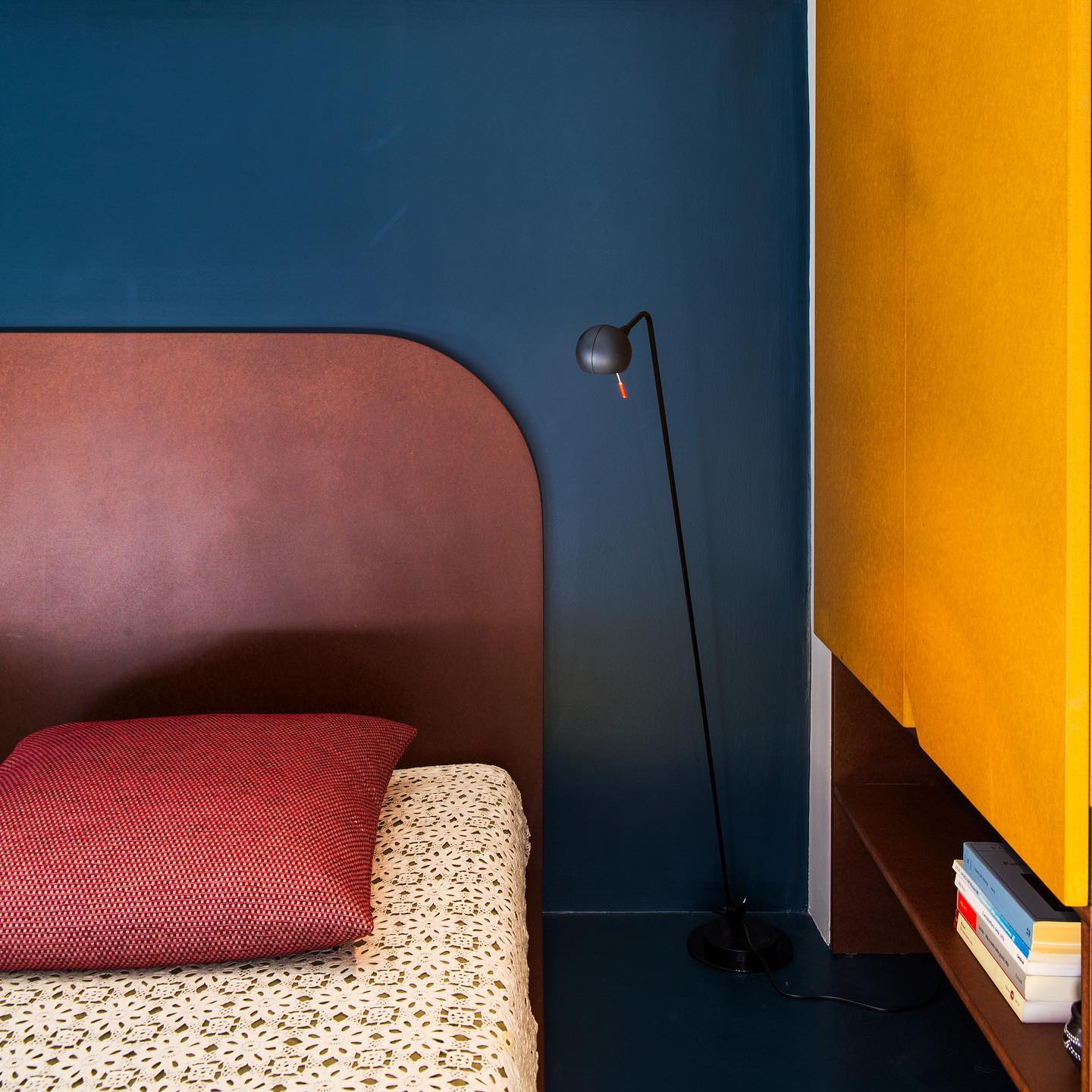
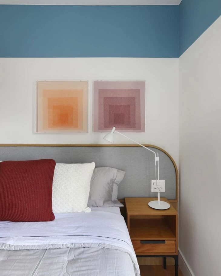
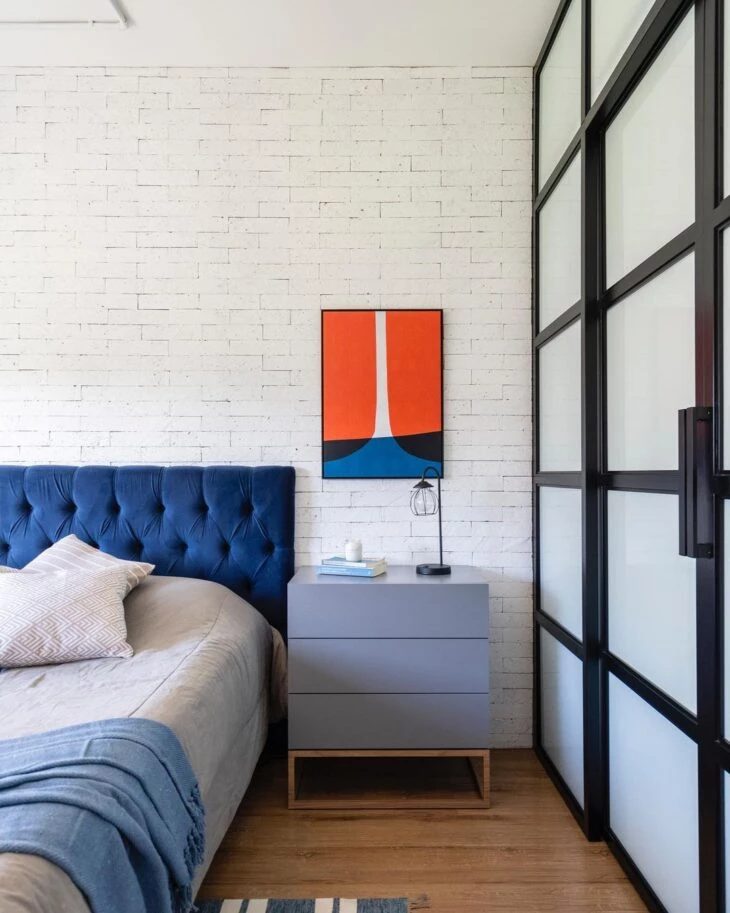
8. or even in an adult dormitory
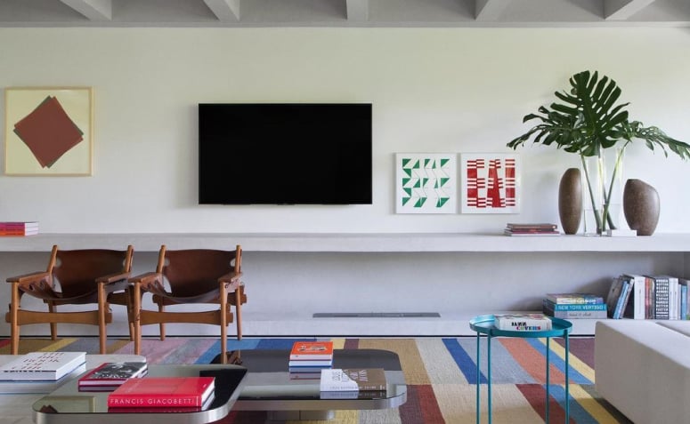
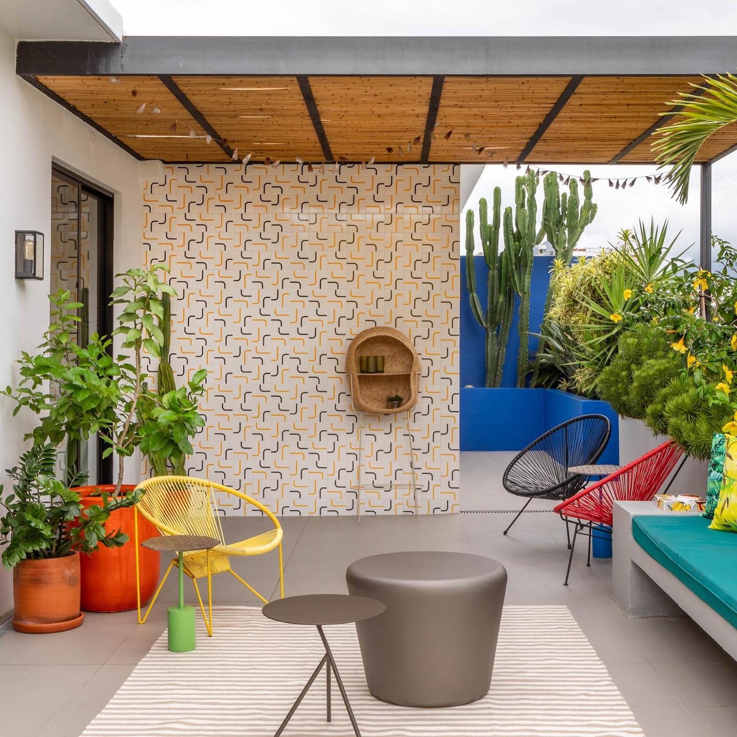
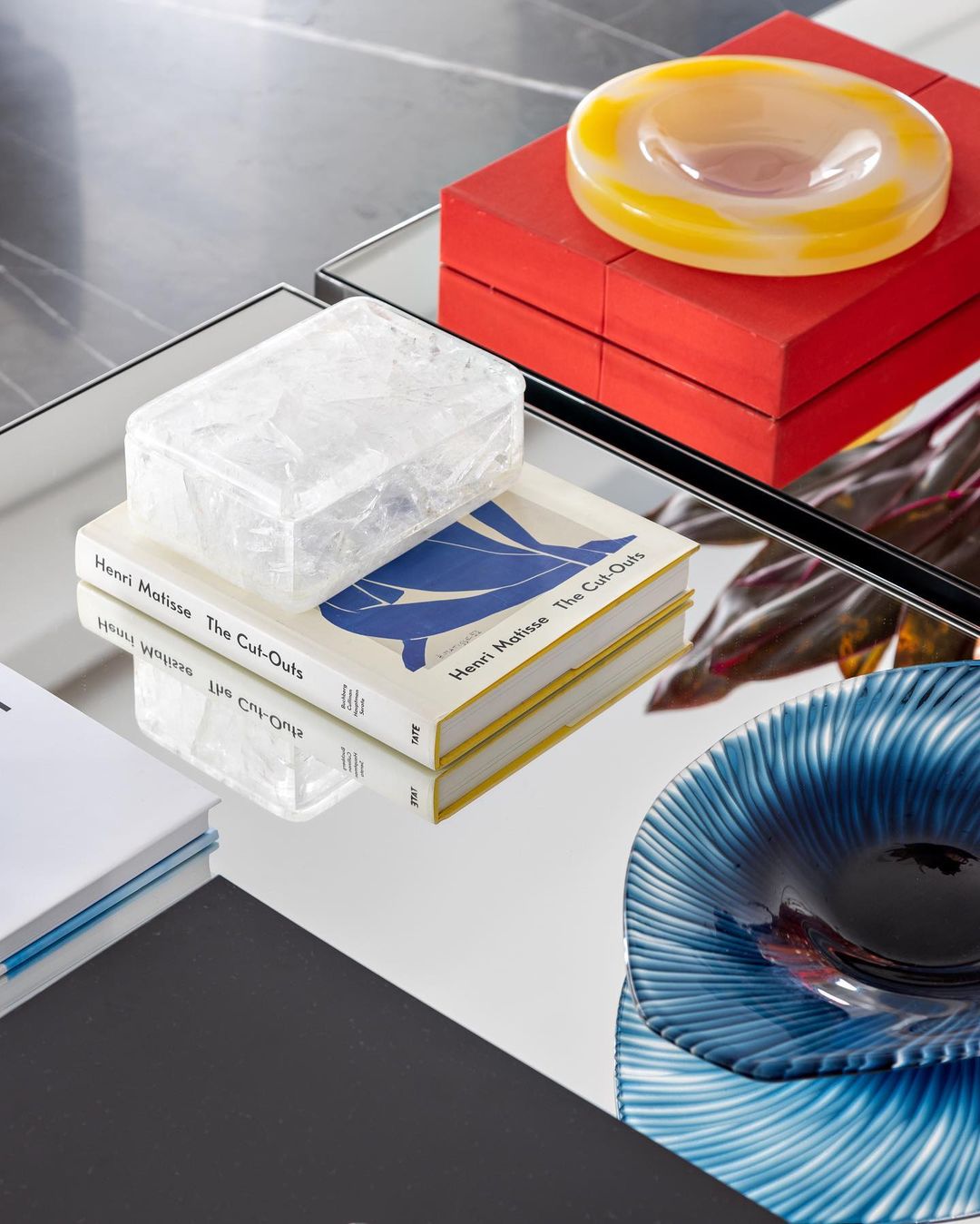
9. you can combine them with secondary or tertiary colors
10. red and yellow accessories added personality to the blue predominance
11. you can use combining two tones as
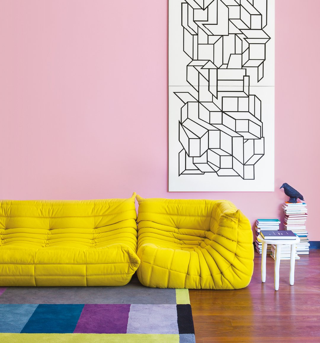
12. blue and yellow create an interesting contrast
13. the combination of the three colors looks amazing
14. a perfect suggestion for those with a retro style
15. yellow also goes well in modern spaces
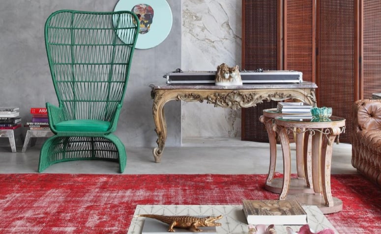
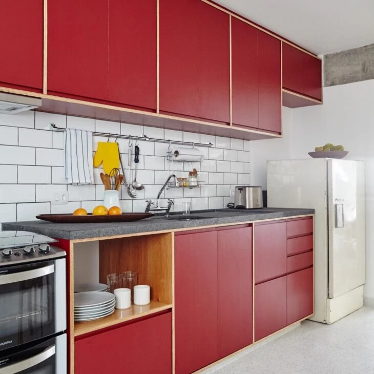
16. red looks great in urban or industrial decoration
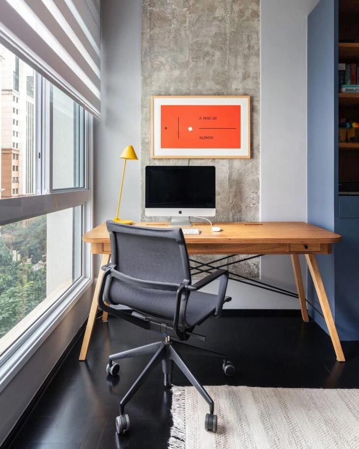
17. a pillow to warm up the environment
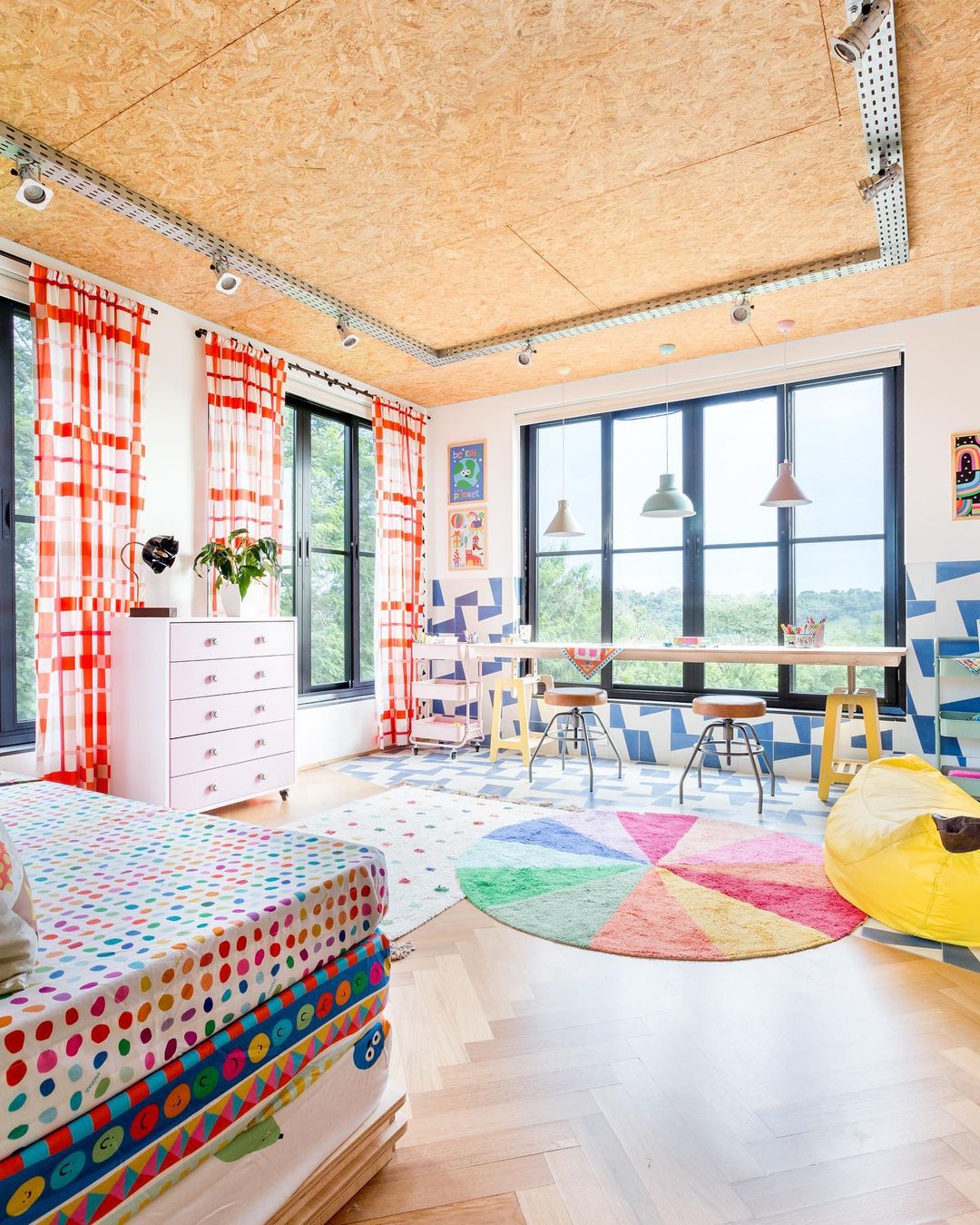
18. a creative palette to instill creativity in the teen's room
19. red, yellow, and blue in modern decoration
20. in this project, primary colors were added in the textures
21. and can make the environment more fun
Who says you can't use them in the bedroom?
23. explore the combination with other colors of the chromatic circle
24. how much in more fun environments
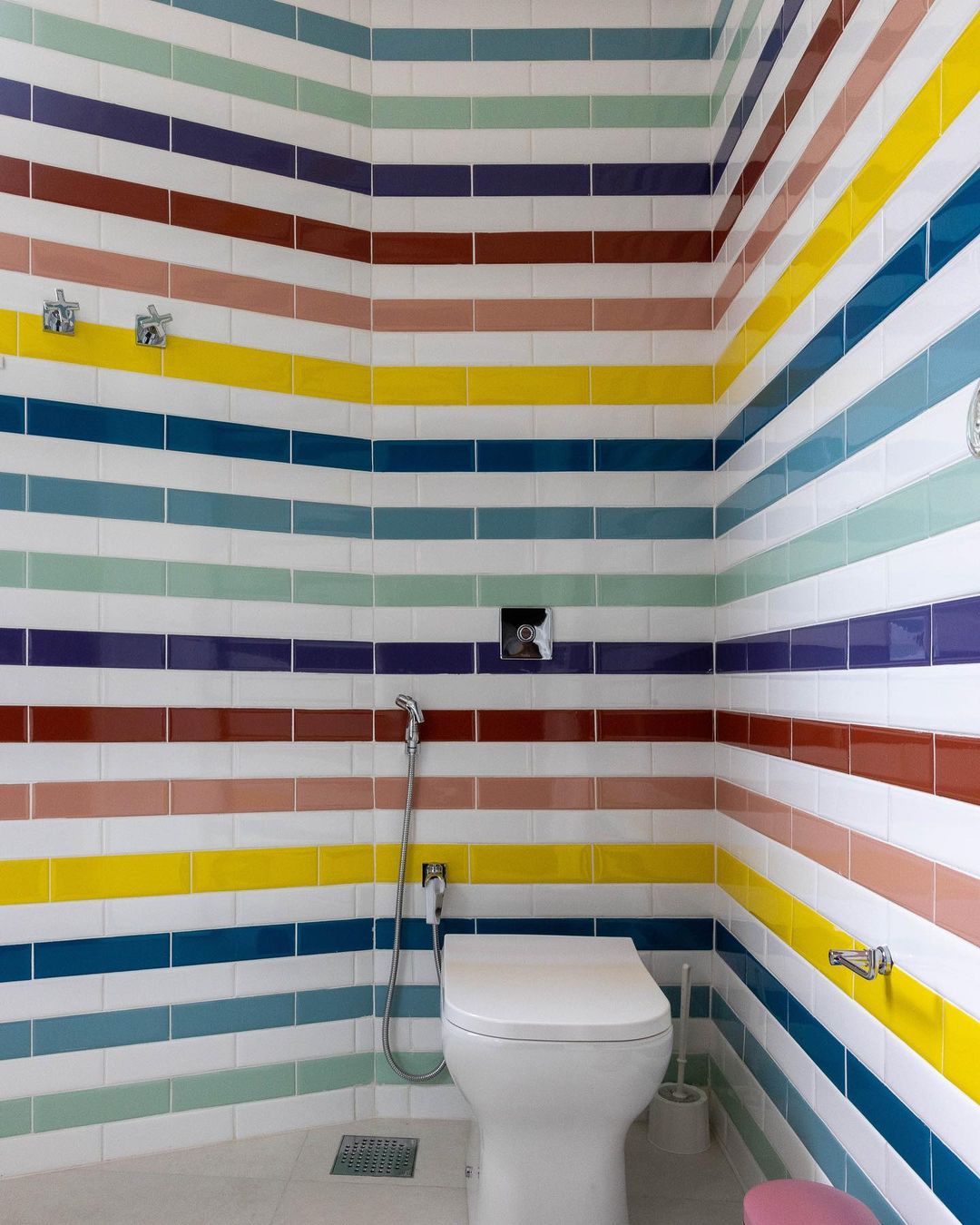
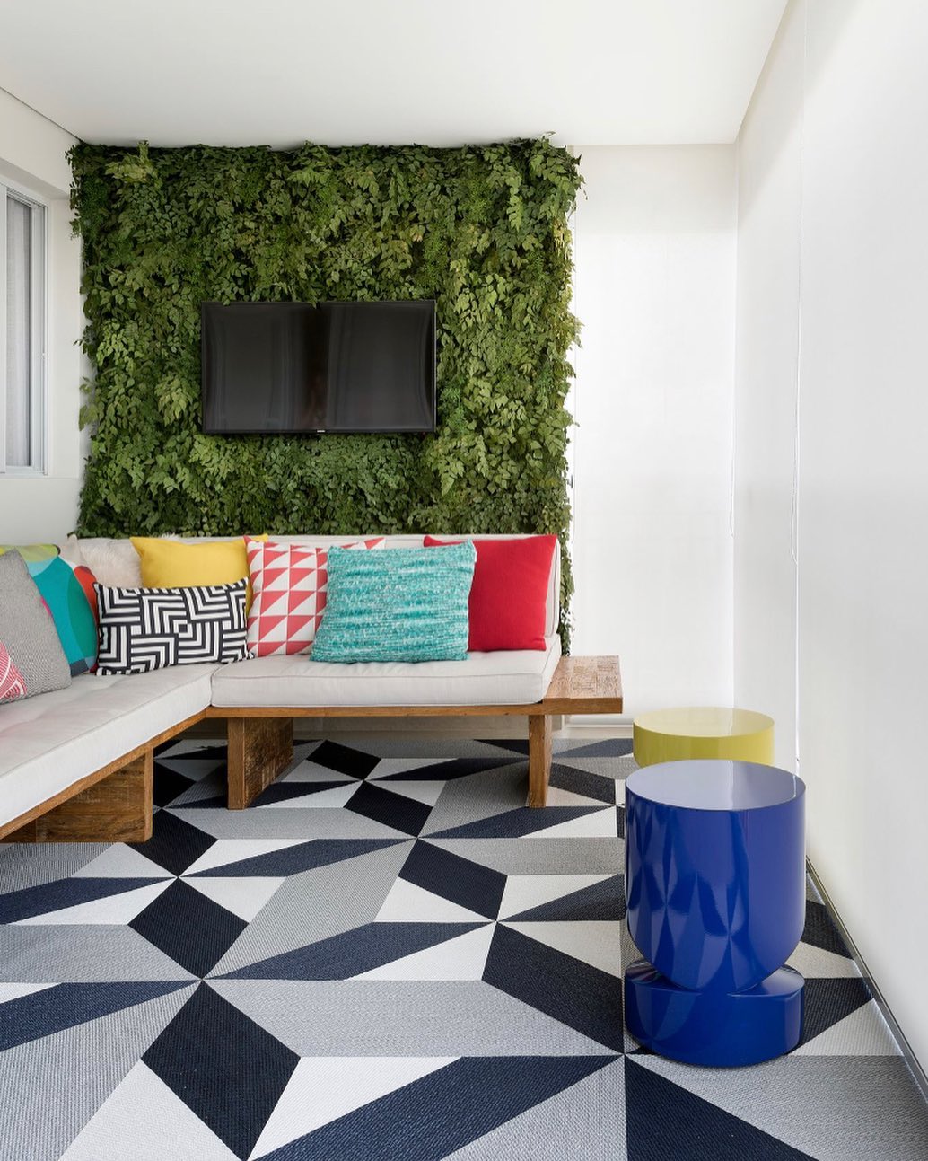
25. the use of colors makes the balcony more cheerful
26. blue, red, and yellow can create a creative environment
27. primary colors can become the focal point of color in basic decorating
28. a good option to highlight accessories
29. explore the color block in your decoration
30. yellow glowing in front of blue in the soft version
31 The three primary colors fit any style
32. the red frame contrasts with the varied shades of blue in the room
33. colors look great on pillows and pouffes
34. red makes a perfect pair with yellow
35. a cheerful union of colors for the spaces
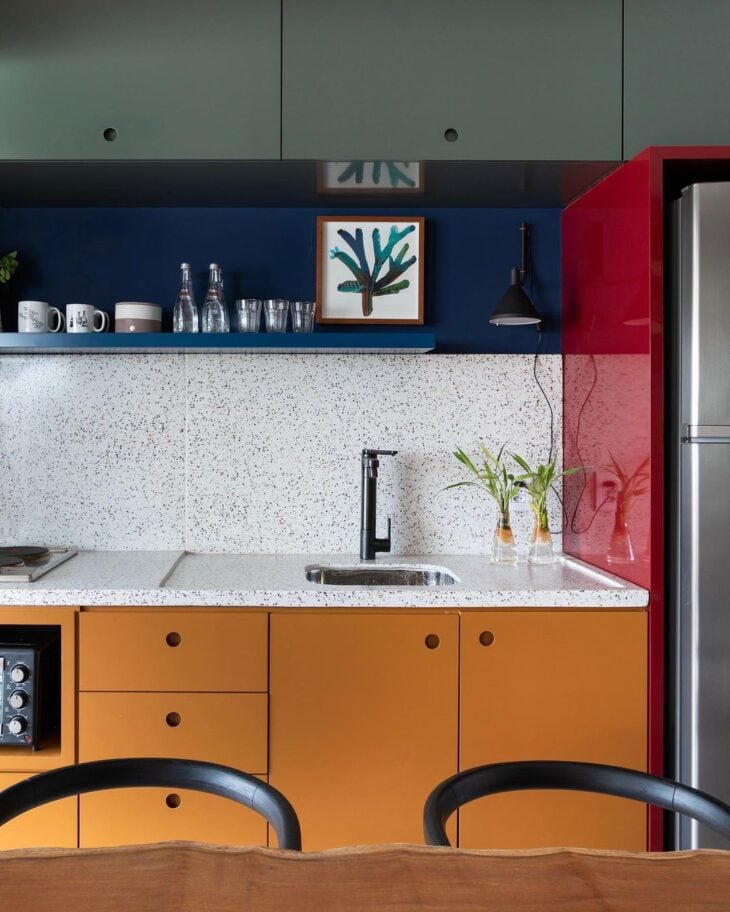
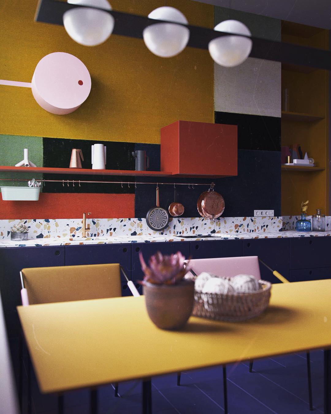
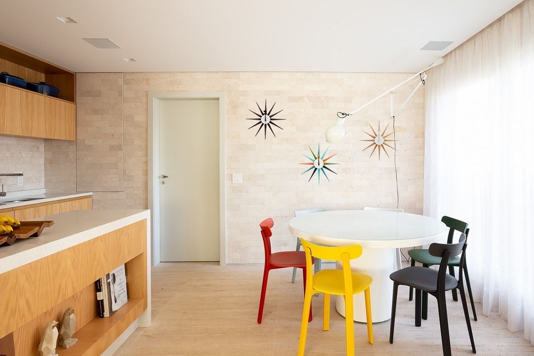
36. the combination is successful in the kitchen
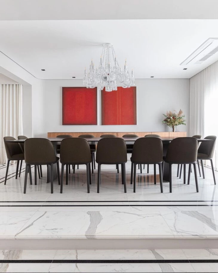
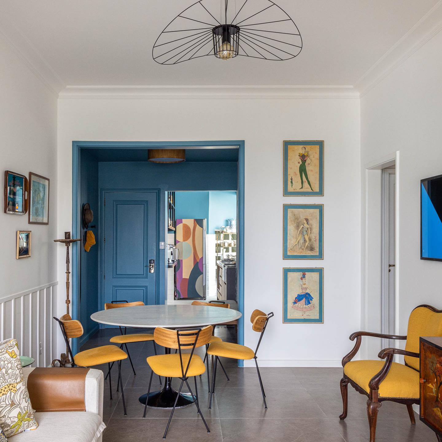
37. and also in the dining room
38. a triad of soft colors
39. colors can sector the integrated environments
40. use and abuse of primary colors in different ways
Whether you use just one, two, or all three primary colors, you can let your creativity run wild! Explore blue, yellow, and red to create amazing combinations among them, or with the other colors that are created by mixing them.