Table of contents
Seduction, power, passion, warmth, and desire are some of the symbols that represent the color red. With more than 100 registered shades of red, this palette is responsible for giving dynamism and energy to the decoration of a space.
Discover twelve shades of red, from the most open to the most closed, and their specifications.
Shades of red
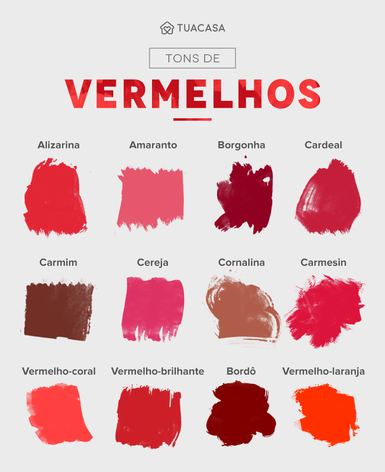
Currently there are more than a hundred variations of red, some darker and some lighter. Below you will find the twelve most popular shades of red and their main characteristics. Shall we go?
- Alizarin: this intense shade of red is derived from the root of the Rubia Tinctorium This shade can be used in any area of the house, providing a lively and vibrant touch.
- Amaranth: Like the flower that bears its name, this tone mixes red and pink. The amaranth tone goes very well in details and furniture where what is wanted is a more discreet effect.
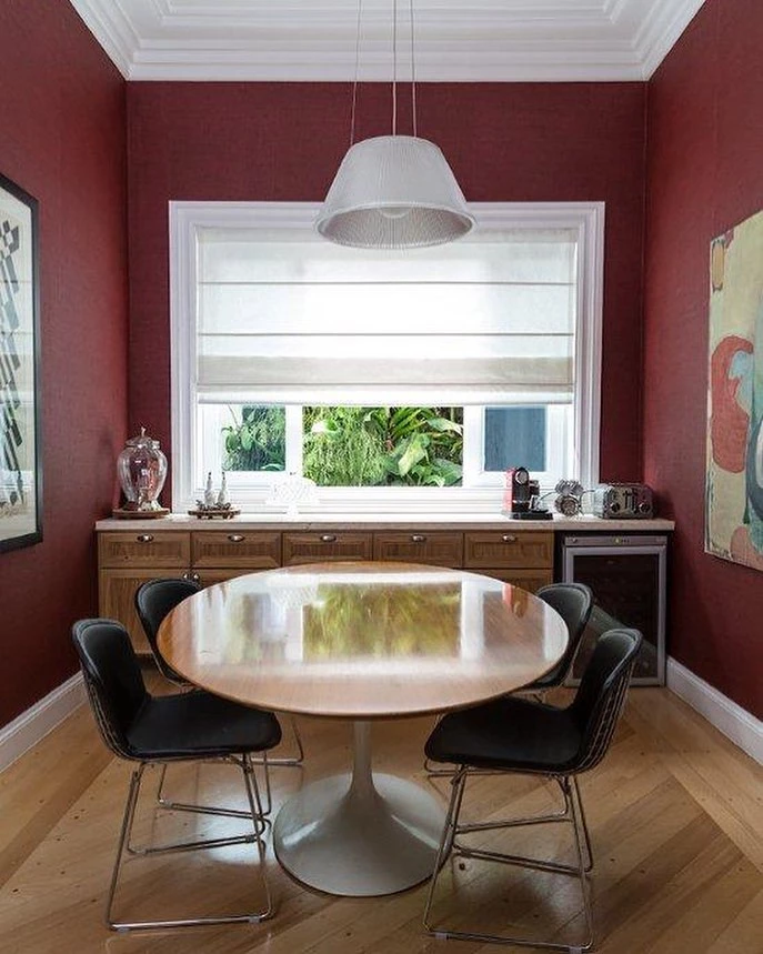
- Bordeaux: More closed and darker than the other shades presented above, burgundy is considered by many to be a more sophisticated and elegant shade. The color decorates kitchens and living and dining rooms with elegance!
- Burgundy: Its name is linked to the shade of the wines from the Burgundy region in France. Because of this, it is also known as a wine-red shade. Very similar to burgundy, for also being dark, it is an elegant and refined color.
- Cardinal: associated with the clothing of the leaders of the Catholic Church, this color is marked by its more intense hue. Because it is stronger, one must be careful not to create too heavy an atmosphere, and therefore other more neutral colors should be used to harmonize.
- Crimson: this color is obtained from a small insect called Cochonila Carmine Its strong and vibrant tone makes it one of the most requested when it comes to fashion or interior design.
- Carmesin: this hue is also obtained through an insect, the Kermes Vermilio Like the carmine tone, this color is a bright, strong red and presents small touches of blue in its composition, approaching the color purple.
- Cherry: Directly related to the small, rounded fruit, this shade presents a variation of pink in its formation. Perfect for decorating the rooms of young girls and even babies.
- Carnelian: Associated with the stone that bears its name, the color is marked by orange and brown touches. Closed and dark, the shade should be used sparingly so as not to create too sober and heavy an atmosphere.
- Bright red: As its name implies, bright red is a more intense color among the shades of red.
- Coral Red: this color is characterized by its slightly lighter, coral tone. it can decorate both living spaces and intimate environments. mix neutral colors to bring more harmony to the decoration.
- Red-orange: As its name says, the red-orange color presents orange shades in its composition. Warm and intense, the shade promotes a more vibrant and dynamic atmosphere to the environment in which it is inserted, perfect for children's spaces.
In addition to these shades of red, there are still several darker and lighter shades. Now that you know some of them, check out the following tips that will help you use these shades successfully in your home decor!
How to use the shades of red
Using shades of red is not a very easy task, because it is an intense and often vibrant color. With this in mind, we have brought ten foolproof tips to ensure a beautiful and harmonious environment.
Primary colors: Red, blue, and yellow are part of this select group of primary colors, i.e., they are shades that cannot be created from combinations of other colors. All three colors are perfect for decorating children's spaces.
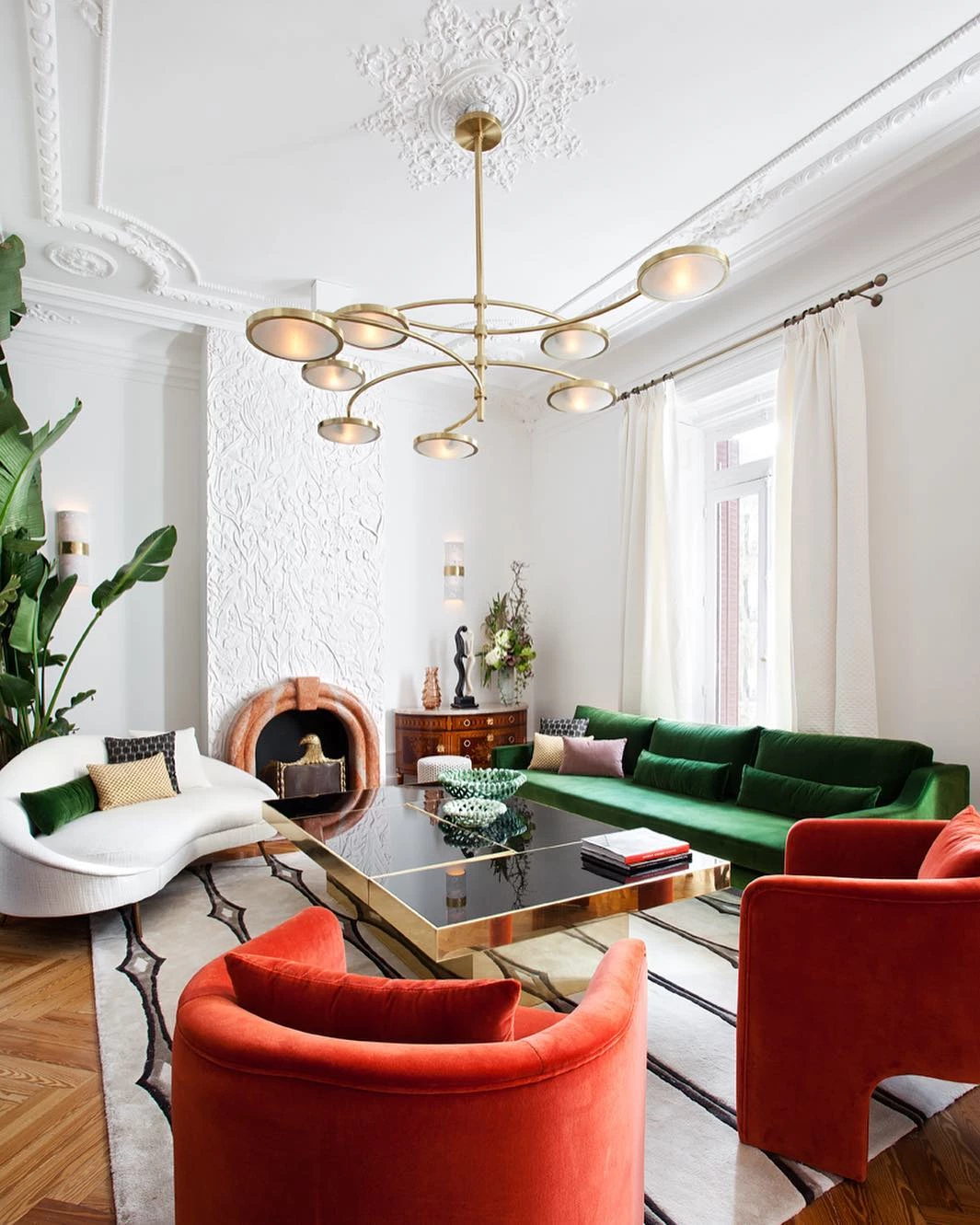
Color Combination: Green, blue, pink, and yellow are also colors that go well with red. Create an authentic environment full of personality, but be careful not to miss the dose! The secret is to insert neutral colors in the composition to balance it out.
Living areas: For living or dining rooms, kitchens, and entrance halls you can choose from more closed shades of red, such as cornaline and carmine, to a more open one, such as amaranth. Just be careful not to weigh down the decoration too much. That said, use neutral and light colors to harmonize.
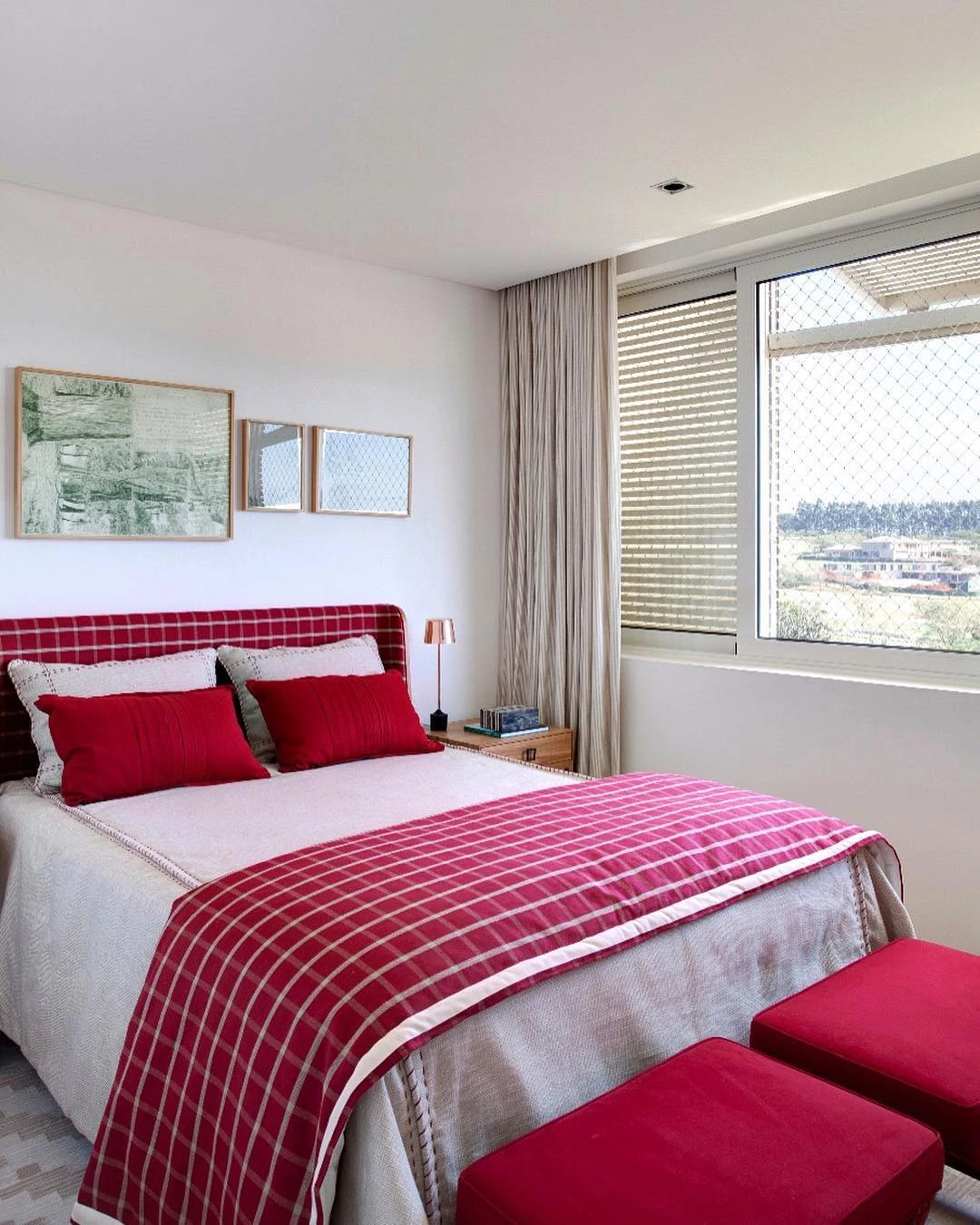
Intimate areas: For bedrooms, choose to insert the red tone in details, since it is a color that does not stimulate tranquility like blue. Therefore, by using it in small items and decorations, the space tends to be comfortable and pleasant to be in. Cherry and coral red are great options!
See_also: Meet the spring plant, a charming shrub for your landscapingWarm environments: If you want a warmer space, opt for the shades of red that have touches of orange in their composition. Besides warming up the space, you give a more dynamic and vibrant touch to the decoration.
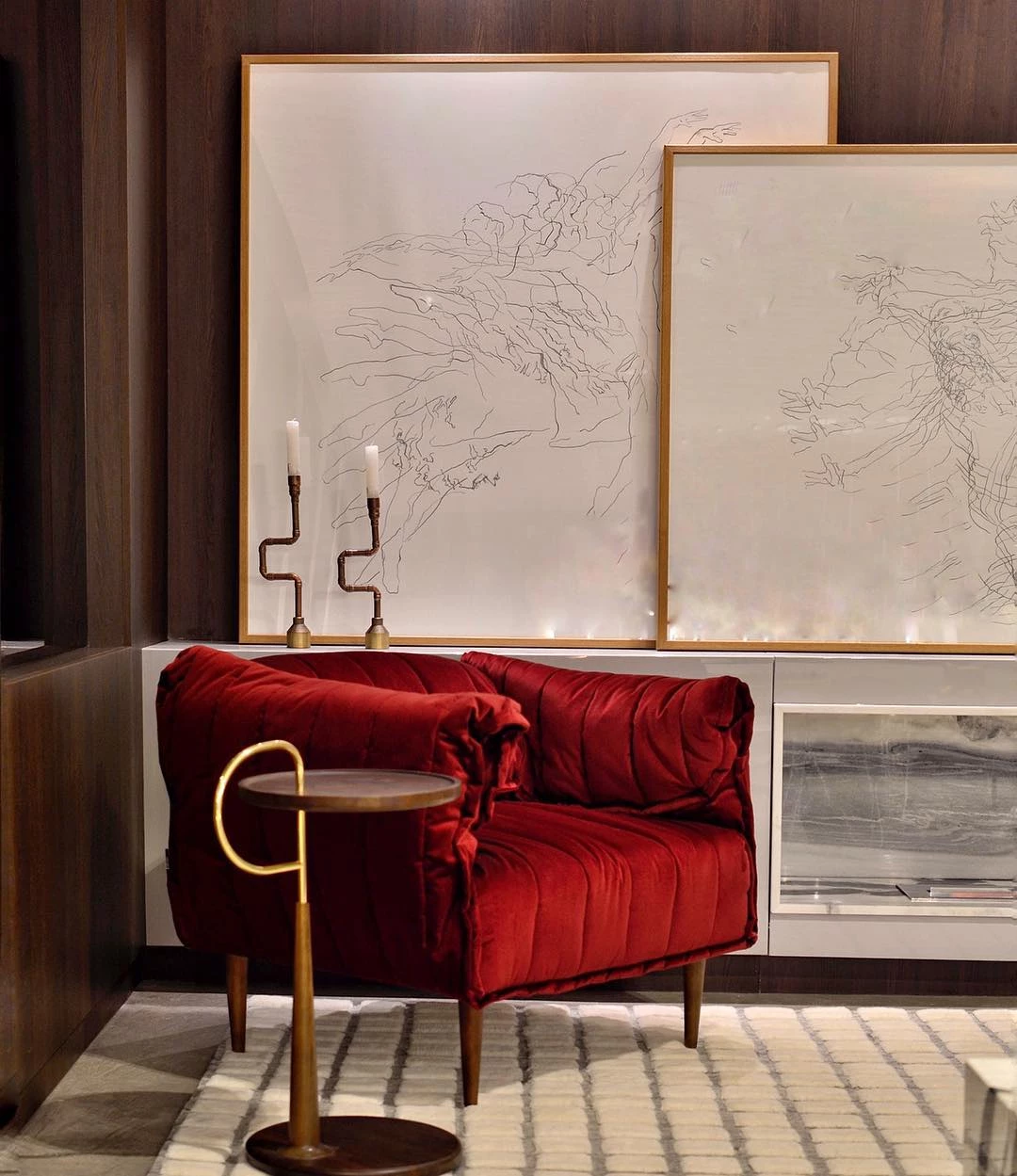
Sophisticated decoration: For a more elegant and refined composition, opt for the darker and more closed shades of red, such as burgundy and maroon. These colors will promote a more intimate environment.
Red wall: If you choose to paint your wall in any shade of red, look for a more open tone, such as coral-red. The rest of the decoration of the place should be in a more neutral palette to balance and harmonize with the chosen red.
See_also: Toys for cats: 45 great ideas for entertaining your petStyle: From light to dark, look for a shade of red that harmonizes with the decor of the place, be it classic, modern, or rustic.
Details: Because it is a more vibrant and intense color, it is necessary to be very careful not to exaggerate.
Wood: Wood is a great wild card when it comes to a good decoration, and shades of red go very well in a composition that relies on this woody tone, creating a warmer and more comfortable atmosphere.
After these foolproof tips, it will be a very easy task to decorate your room with shades of red. To inspire you even more, check out the following several ideas of spaces and shades with this vibrant color to bet!
50 inspirations in shades of red for a powerful space
Check out the following dozens of beautiful ideas of varied spaces in the house that make use of shades of red in their composition. Note the use of other elements and colors to provide more harmony and balance to the decoration.
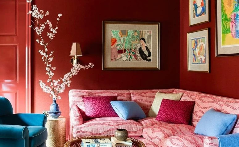
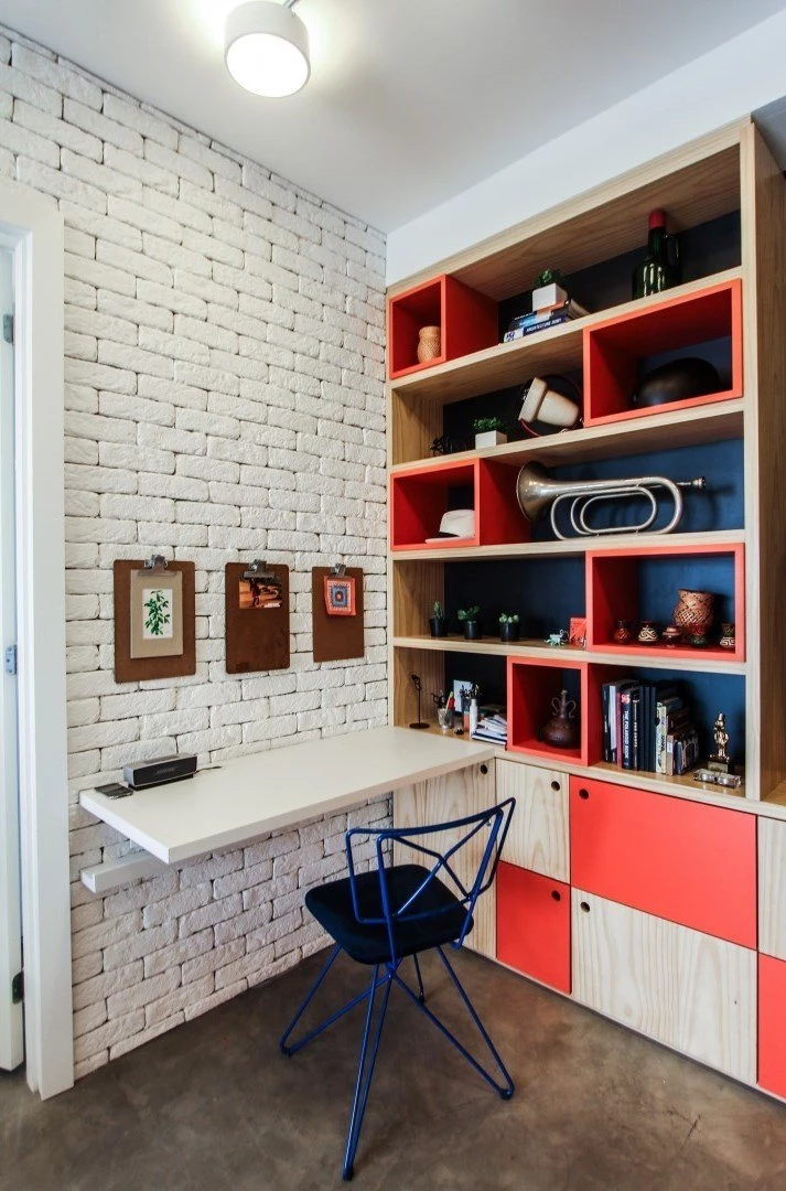
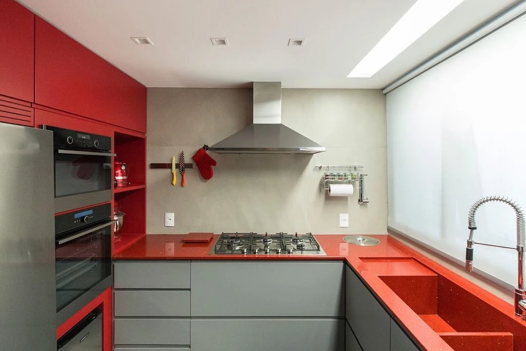
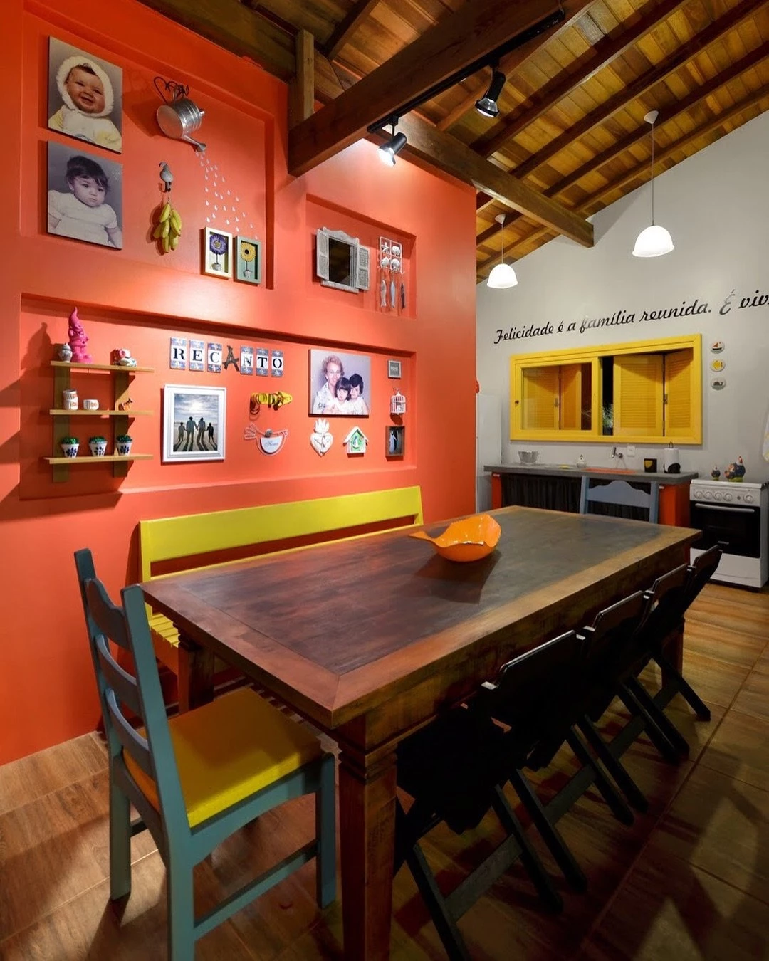
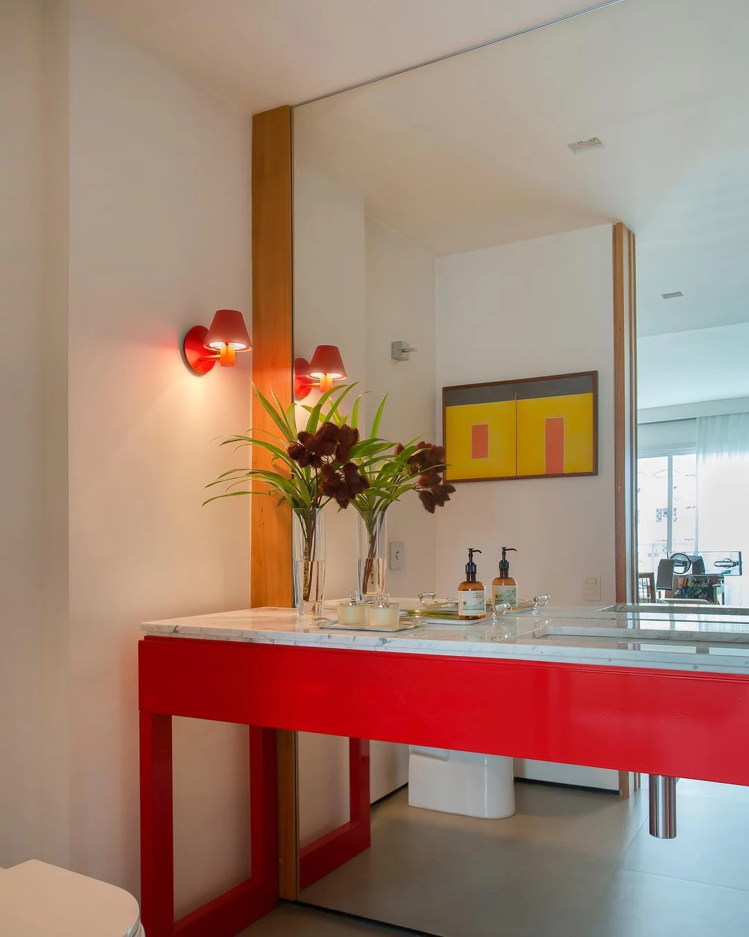
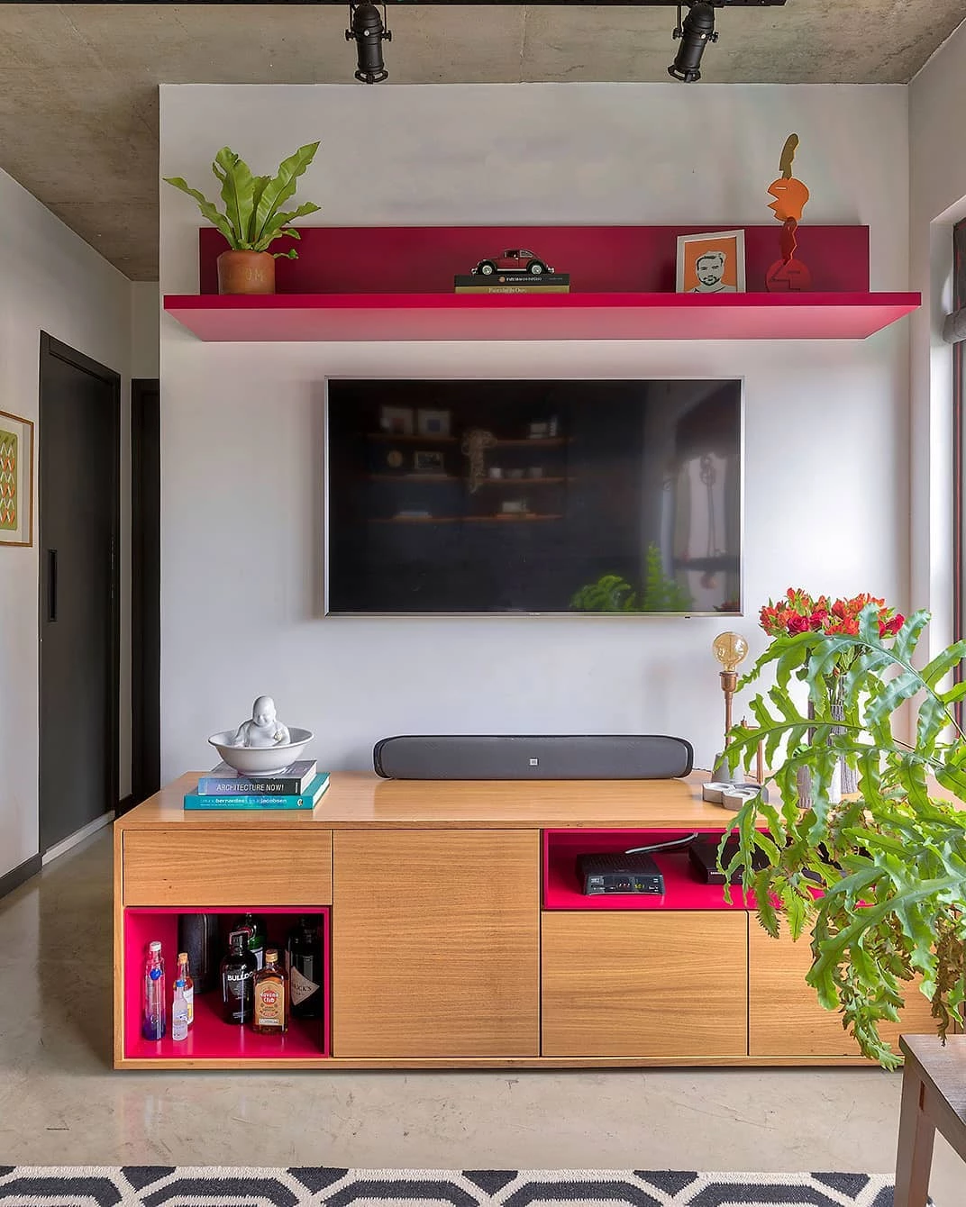
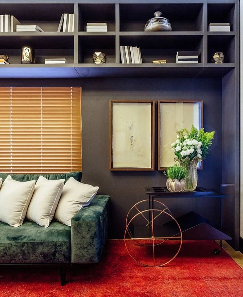
1. shades of red can be in any room of the house
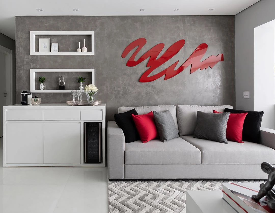
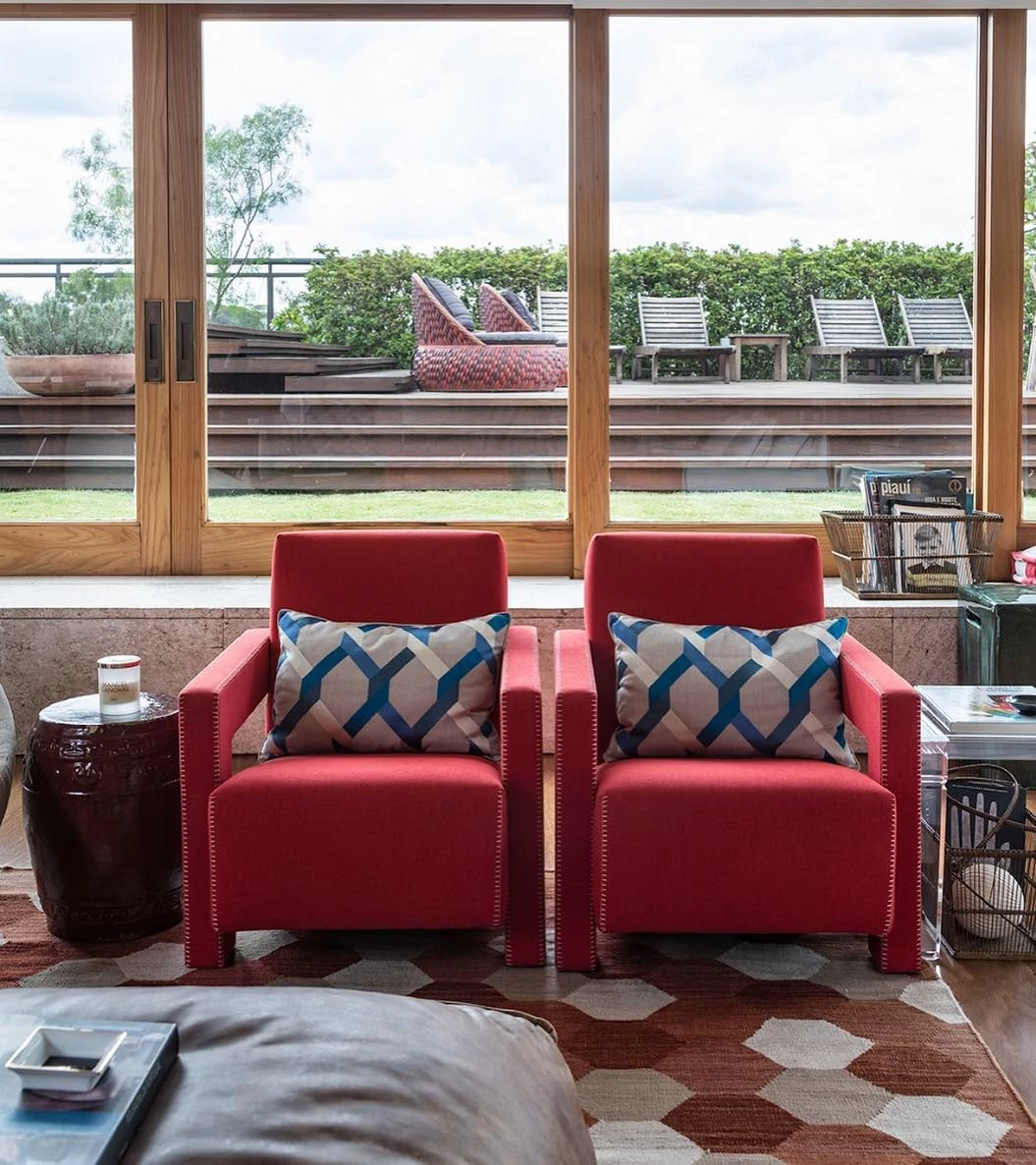
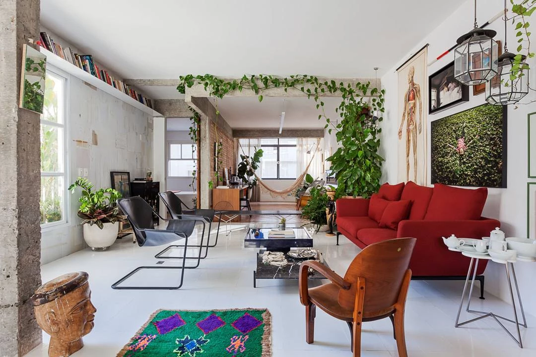
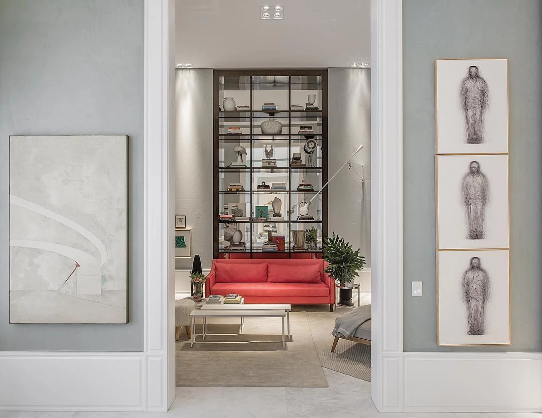
2. in social environments
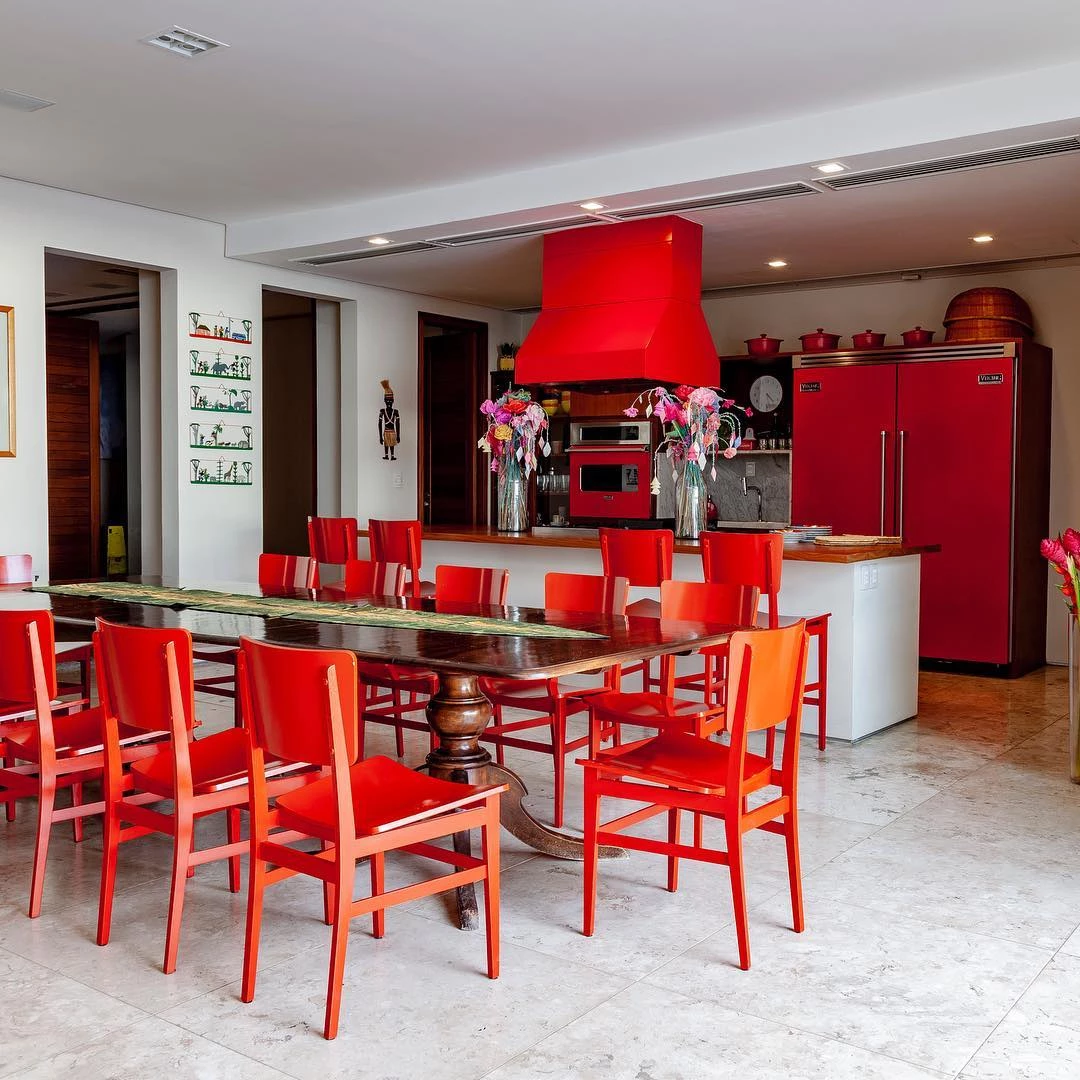
3. as TV or dining rooms

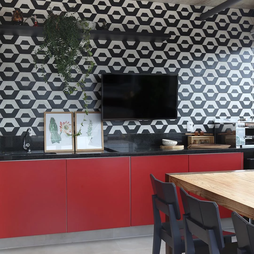
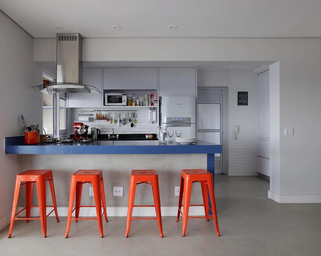
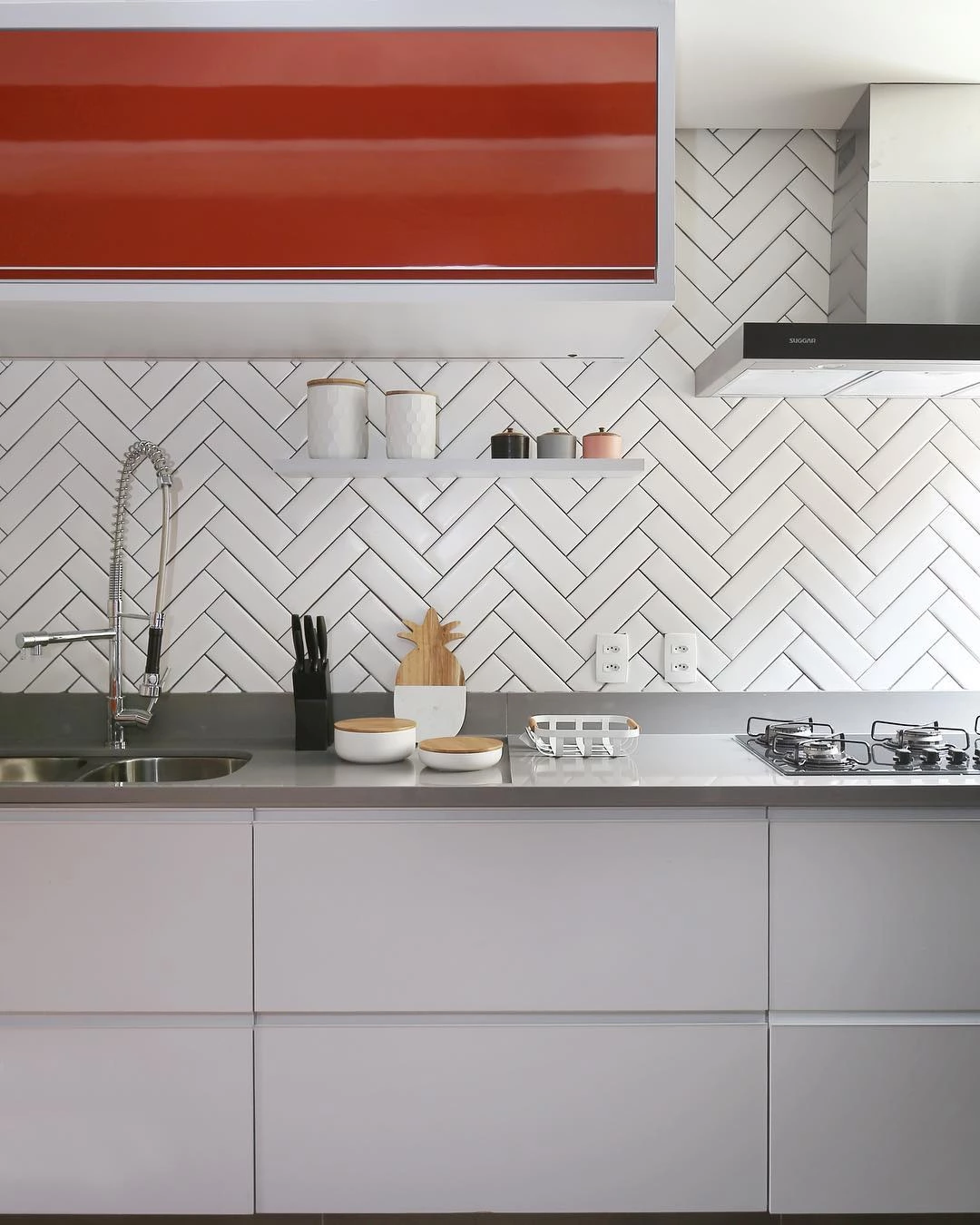
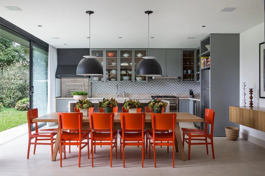
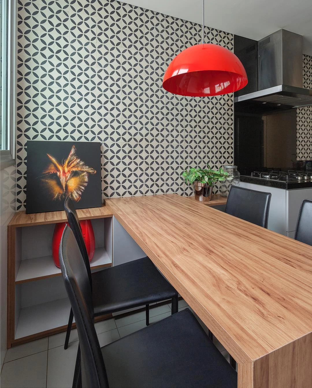
4. and kitchens

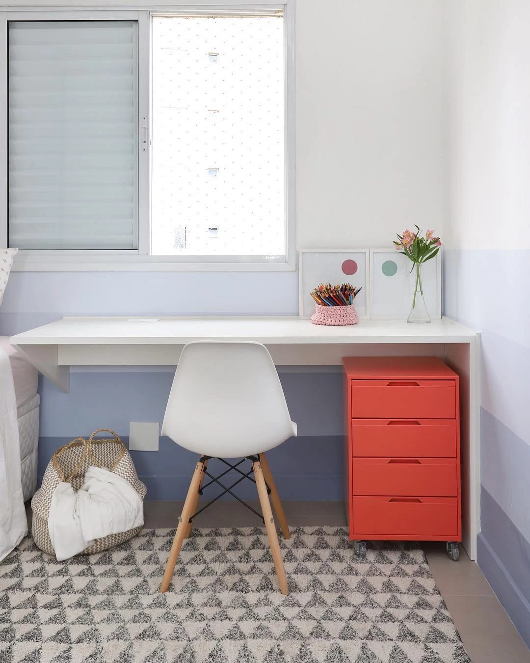
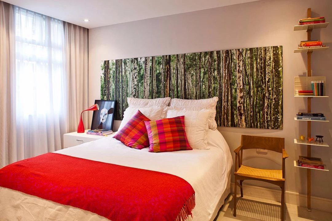
5. and in intimate areas
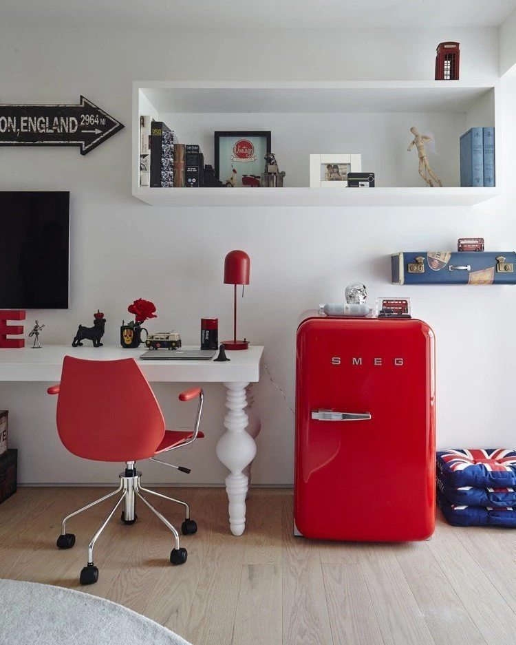
6. as in rooms

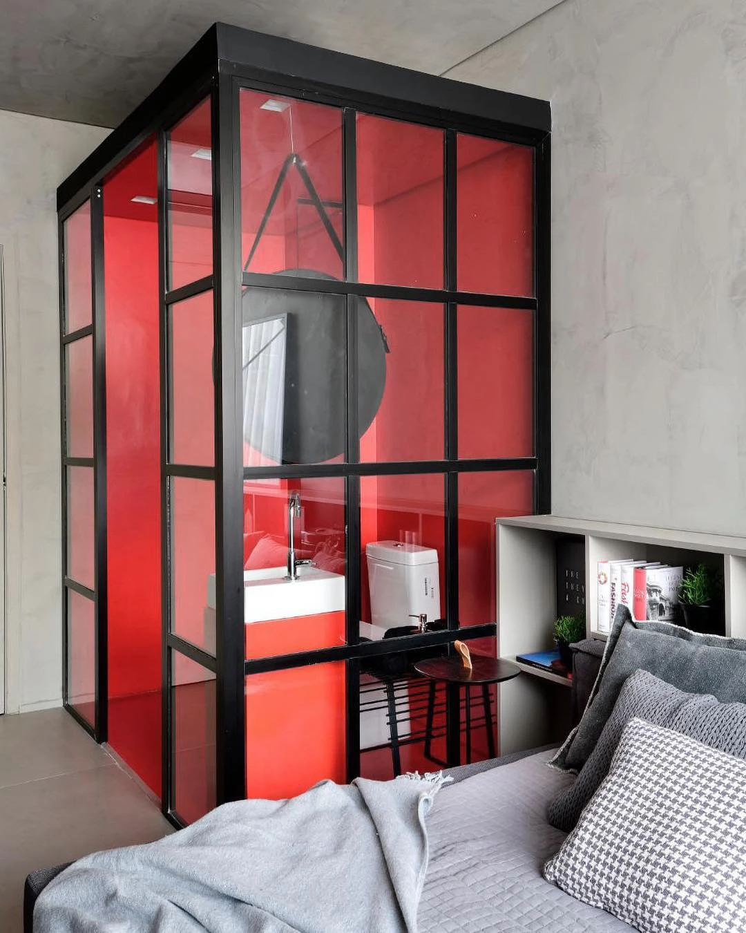
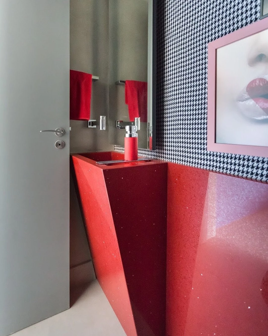
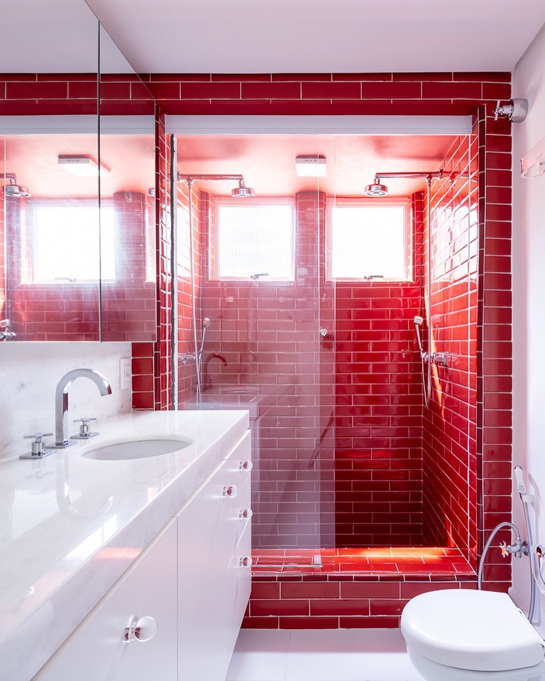
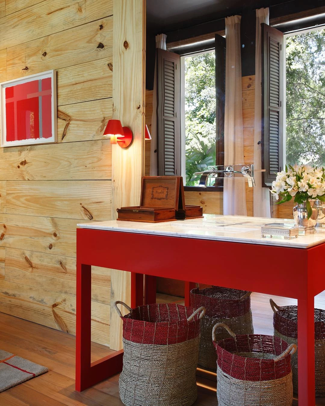
7. and even in bathrooms
8. bet on more closed red tones for classic style spaces

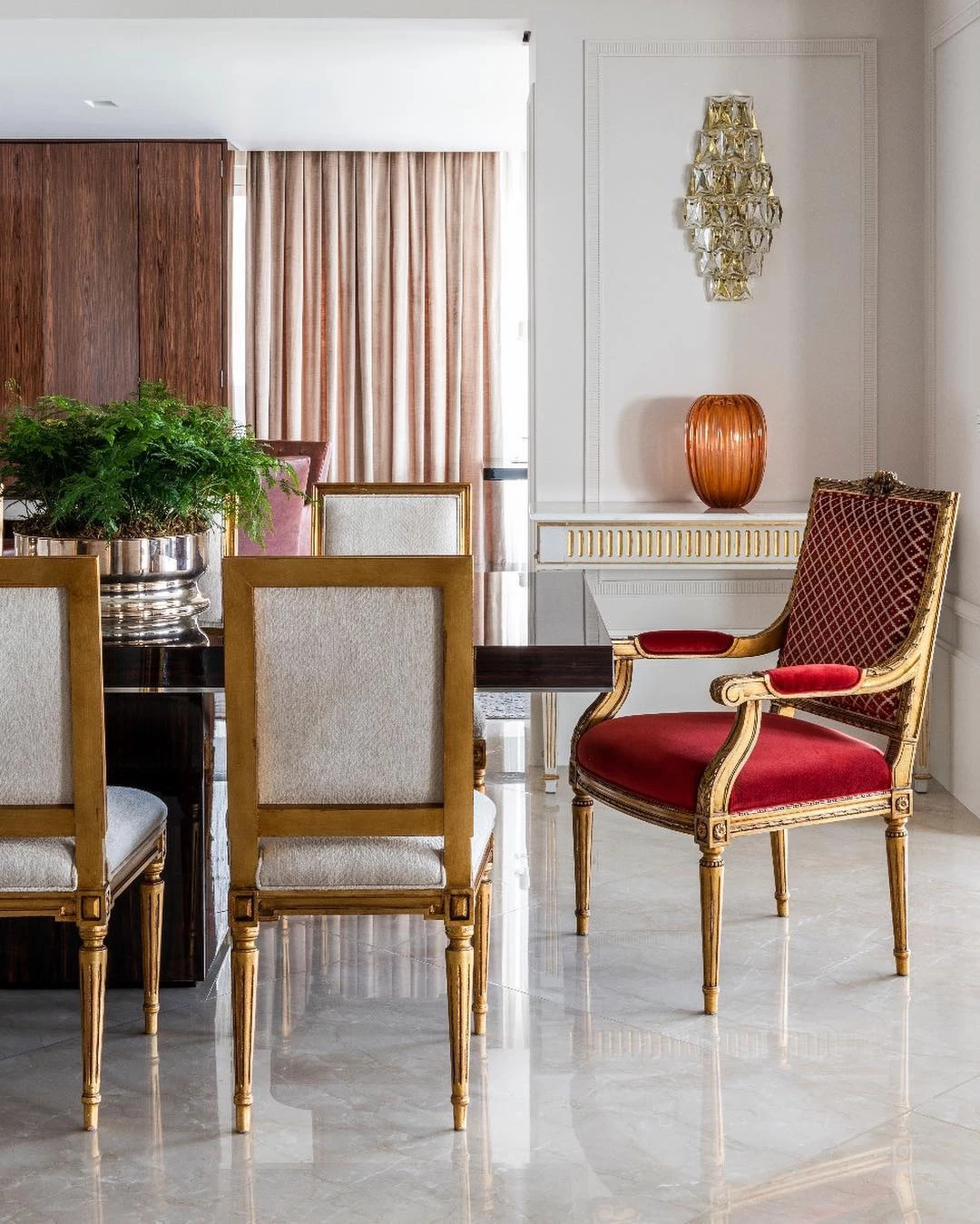
9. as bordeaux and burgundy

10. that complement the decoration with more elegance

11. and sophistication
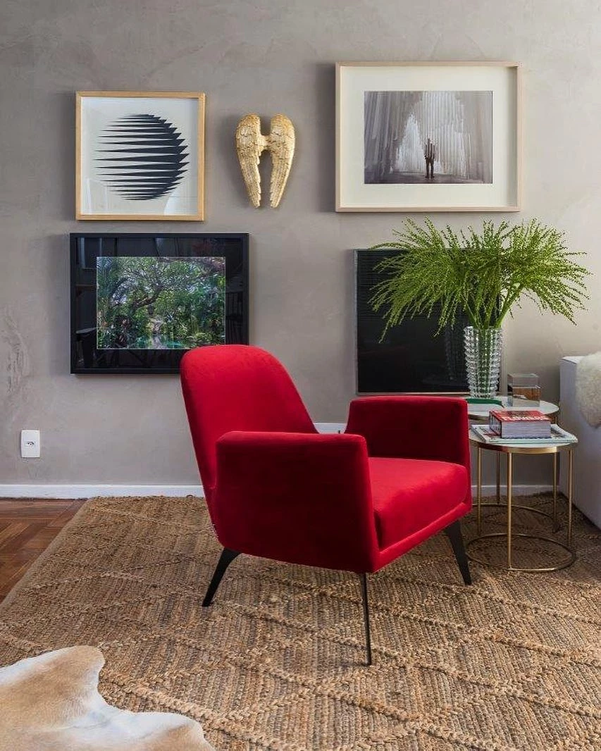
12. don't be afraid to use red
13. just be careful not to overdo it
14. and end up promoting a heavy look to the place
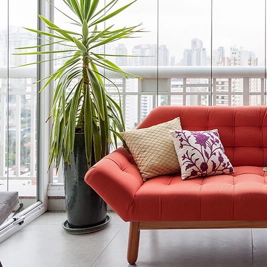
15. so use other colors to complement the look
16. and bring more balance
17. and harmony to the decoration
18. as white

19. or gray
20. primary colors are a sure bet
21. even more if it is for children's spaces
22. wood is a great ally to the red tone
23. because they give the place an even warmer feel
24. besides a lot of comfort

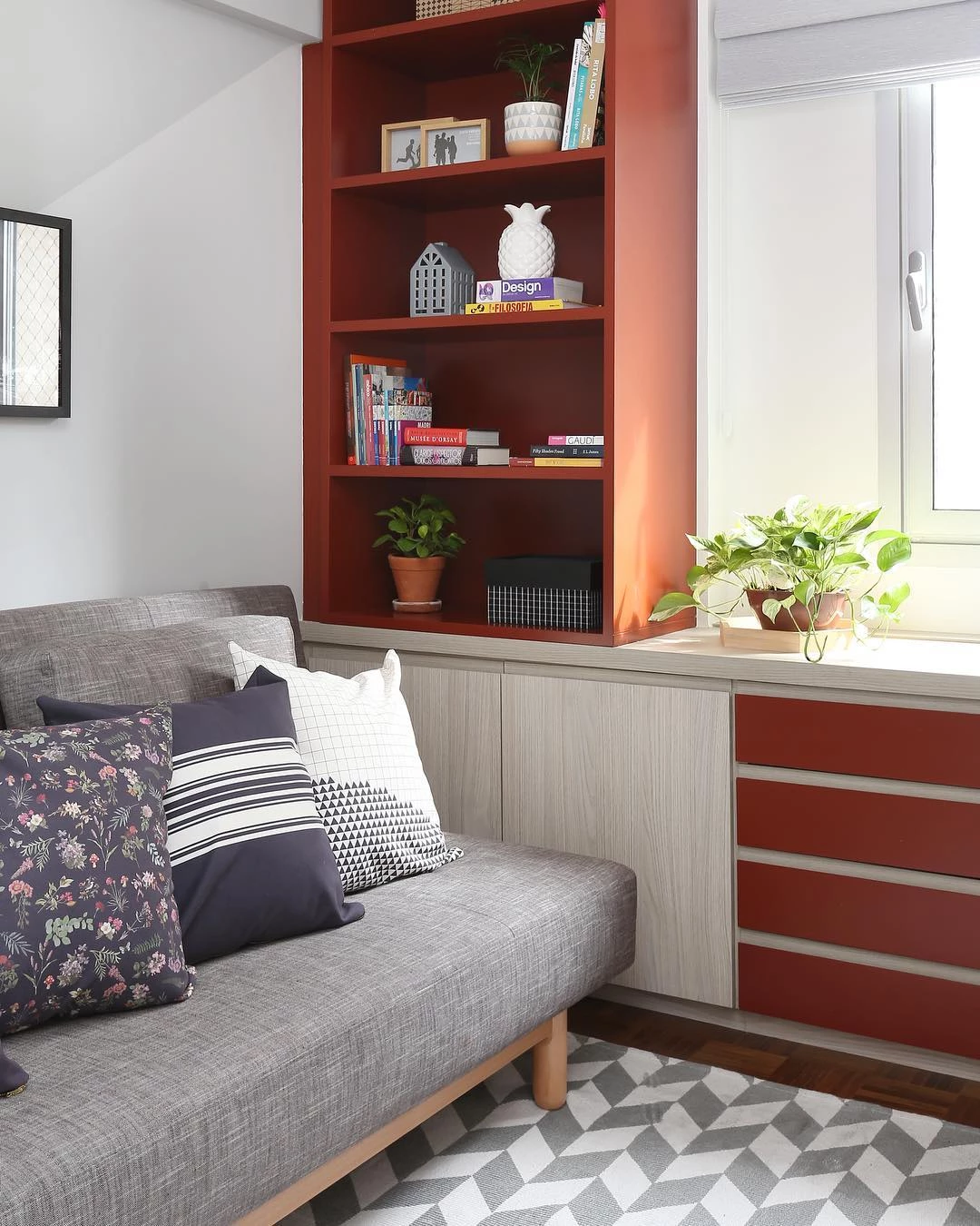
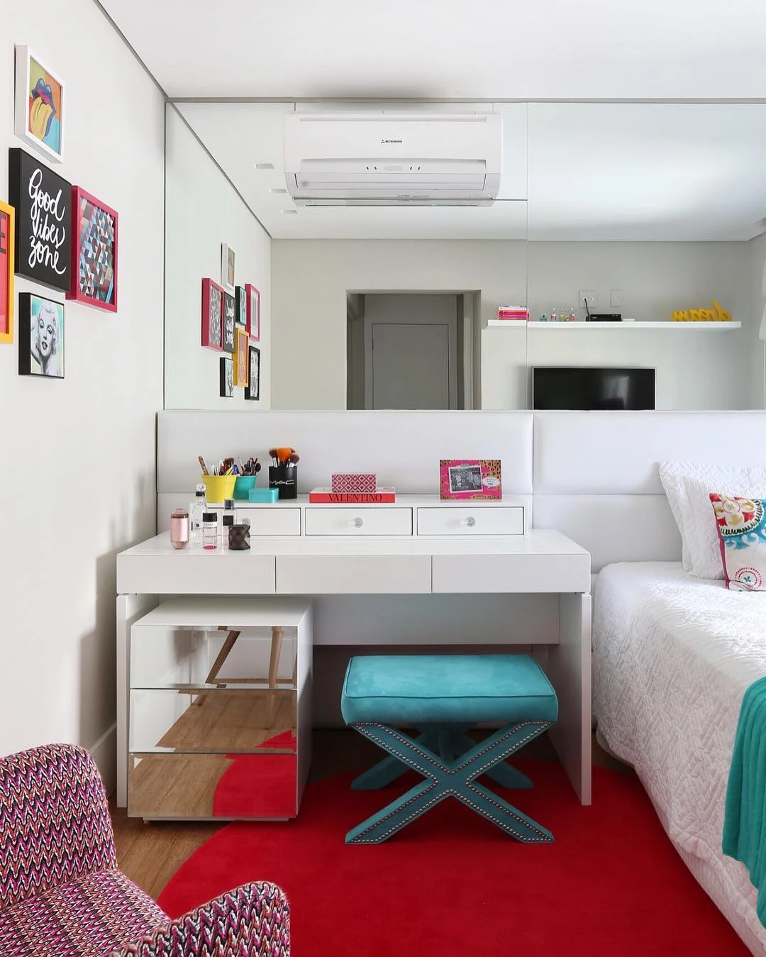
25. if you are in doubt, bet only on details in shades of red
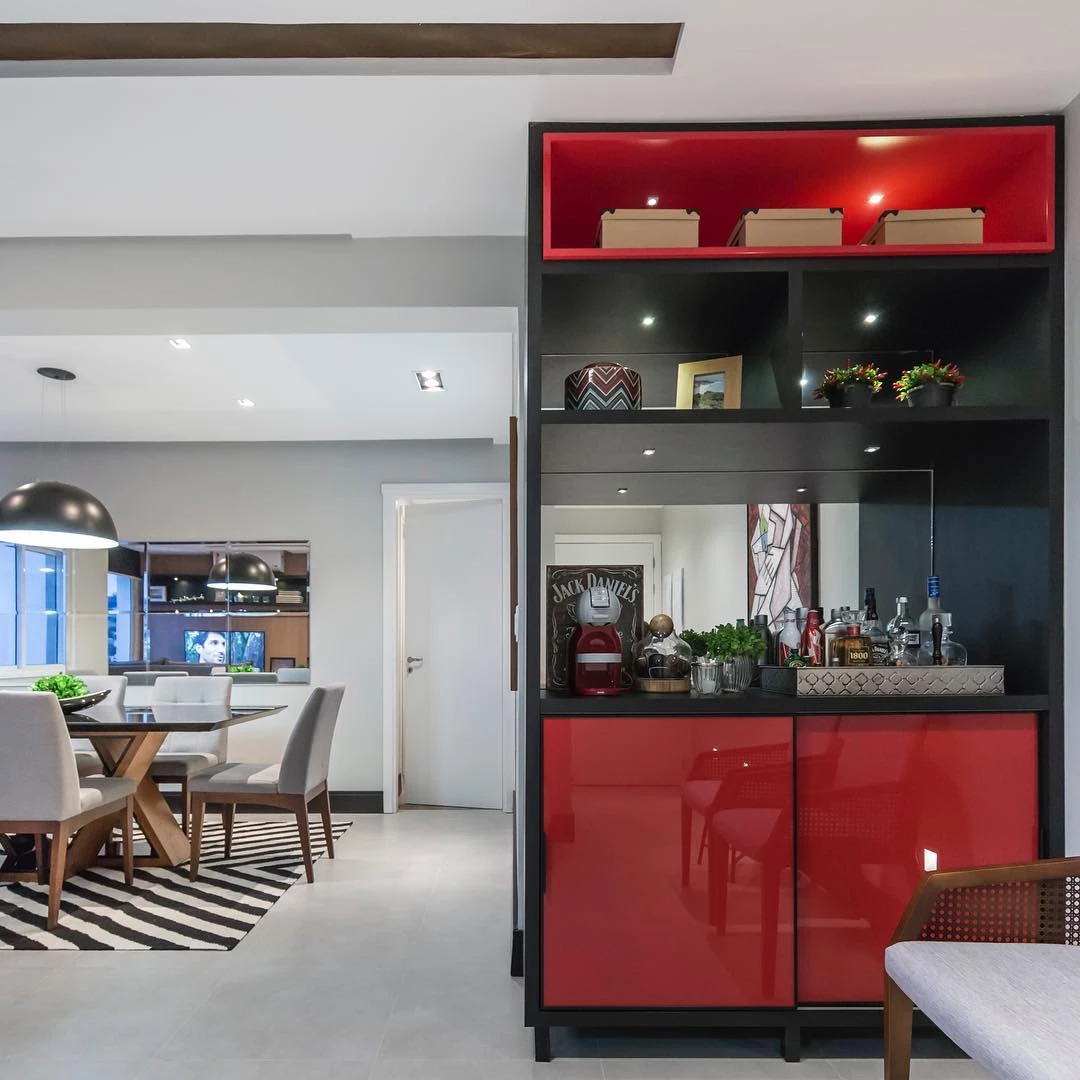
26. like this minibar

27. a part of the kitchen furniture
28. the sofa in the TV room
29. or the rug for the bedroom
30. to use red tones in decoration is to grant vivacity

31. and a lot of personality to the place
32. whichever shade you choose

33. red will bring an atmosphere of power

34. and passion to space
35. complement the red composition with other colors
36. like blue
37. the rose
38. or the green

39 - Isn't this space cute?
40. a pair of armchairs add color to the room

41. just like these dining chairs
42. it is the details that make all the difference to the decoration
43. burgundy is very elegant
44. beautiful and comfortable armchair in dark red tone
45. how about a red dining table?

46. the soft pink hue gives a feminine touch
47. the sofa is the protagonist of the place
48. Doesn't this space look amazing?

49 The color composition is charming!
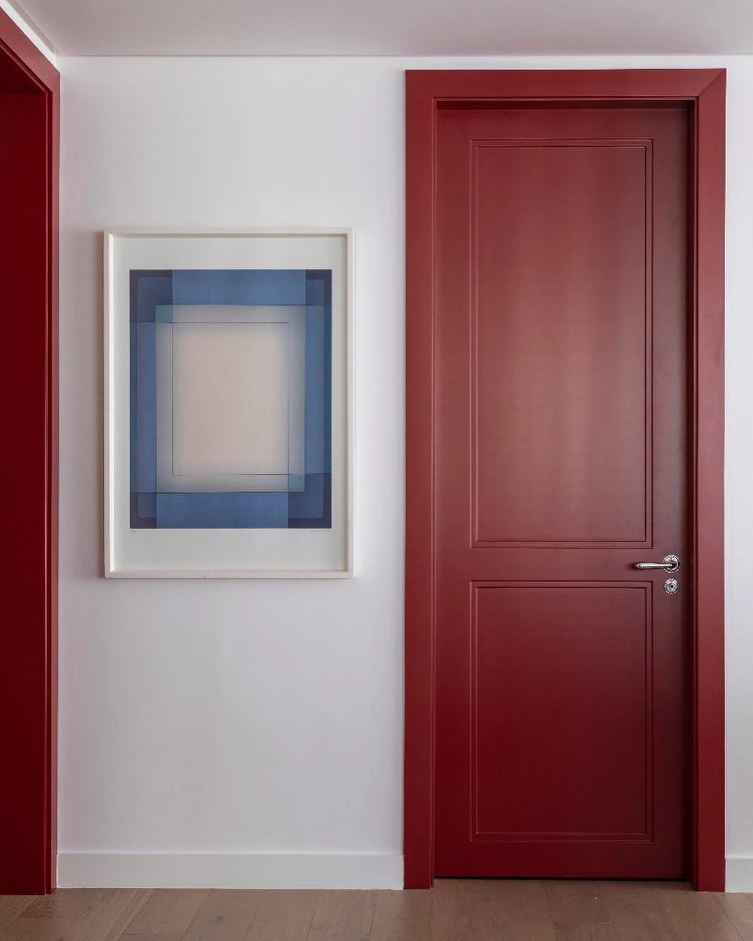
50. paint the doors to highlight the place
The sensation that these incredible and beautiful spaces convey is one of power, passion, seduction, and a lot of charm. We can see that all the environments have some element that brings balance to the shades of red - which, let's agree, steal the decoration scene. Gather the ideas you like the most and start redecorating your corner! And to get the compositions right, check out how to get it right incolor combination.