Table of contents

A space reserved for the preparation of meals, the kitchen is often a meeting place for guests, among them friends and family, where most people feel at ease in meetings over good food.space that unites functionality and beauty.
This is a time in the interior design market where the owners' personality must be imprinted in every corner of the home, combining styles, comfort, and colors.
The color green, for example, symbolizes joy, beauty, hope, fertility and money. When applied in the kitchen environment, it can easily be combined with other shades, from the lightest to the natural shade of green.wood, ensuring an energized and stylish environment.
Check out the following selection of beautiful kitchens using varying shades of green and add more personality to your home:
1. matches perfectly with wood tone
This is a combination that can often be seen in nature. Green combined with the caramel brown of the wood results in a more organic and beautiful environment. Here it can be seen in a dark green tone, used through the painting of the walls in this planned kitchen.
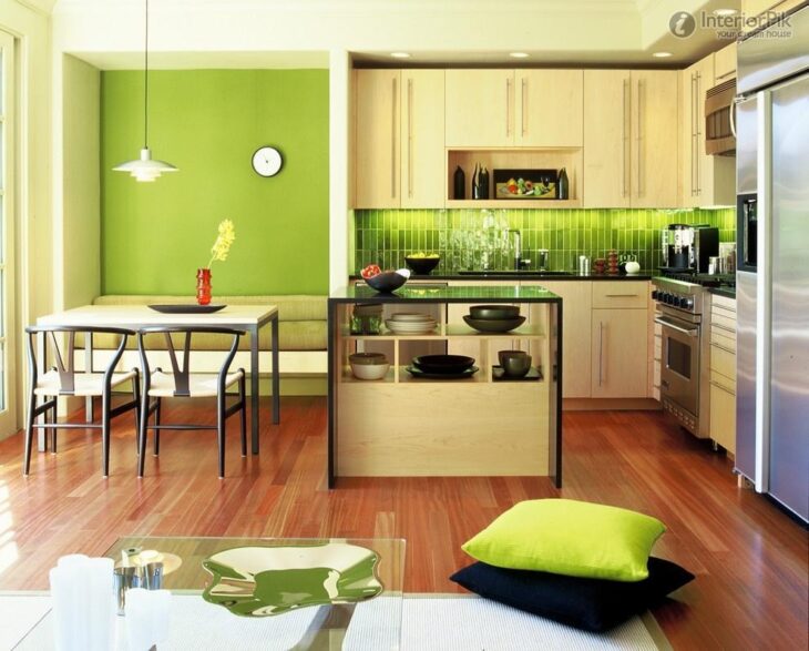
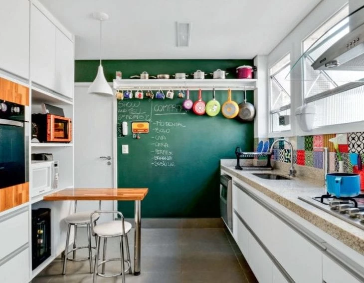
2. balance with white
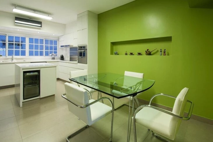
If you are afraid of creating an overloaded environment by using this color, a good option is to balance it with the white color. In this example, the kitchen is decorated with predominantly white furniture and appliances, but the side wall is painted green.
3. add the color in small dots
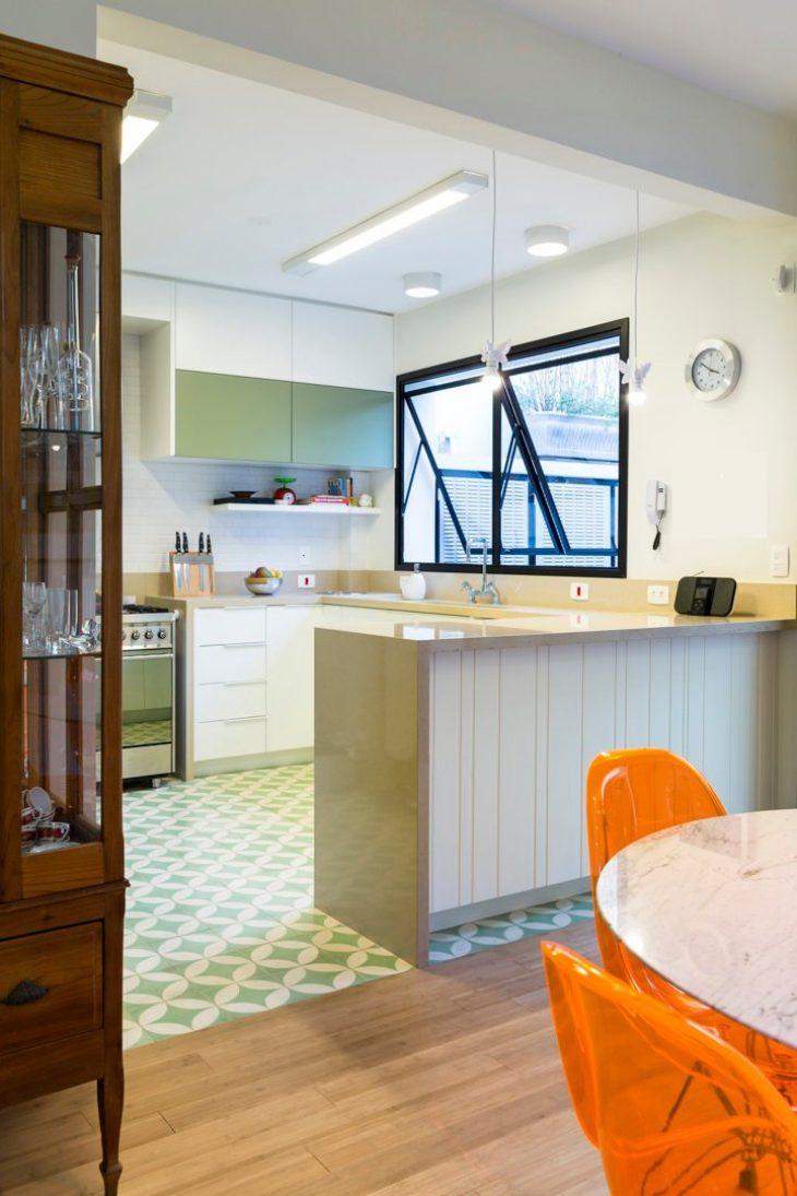
A solution for the more discreet is to add small touches of this color to the environment. Here we can see the door of the hanging cabinet in the ideal shade to match the coating used on the kitchen floor.
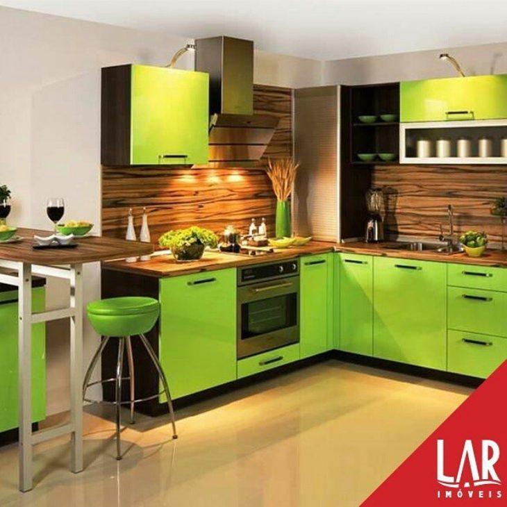
4. it doesn't have to be vibrant shades
For a more sober environment, opt for a tone of burnt green, adding soft nuances of color. Here the environment still has a mixture of woody tones, white and black, ensuring a sophisticated look without overloading.
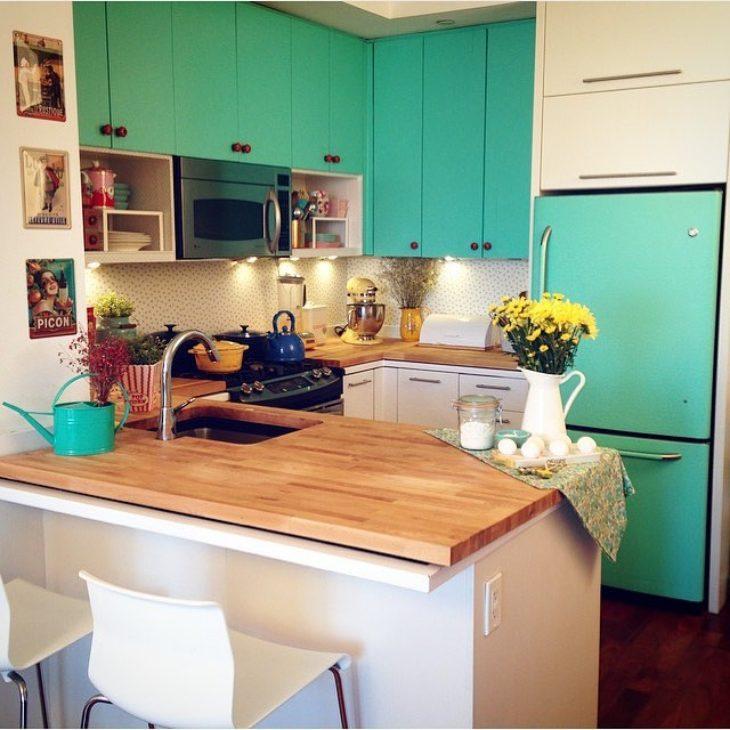
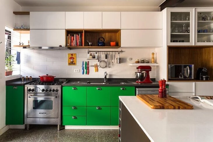
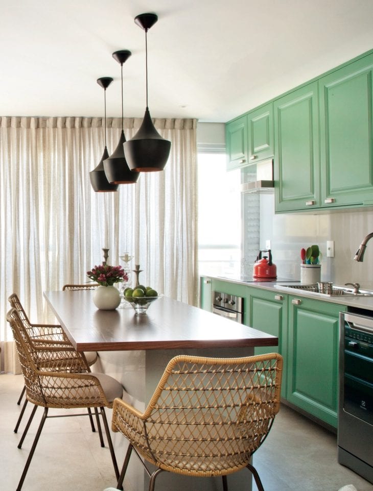
5. vibrant tone for those who are not afraid to dare
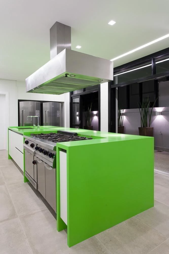
To add freshness and bring more life to the environment, the shade of green used in the custom cabinetry of this kitchen breaks the coldness provided by the use of stainless steel finished appliances.
6. perfect pair with the color sand
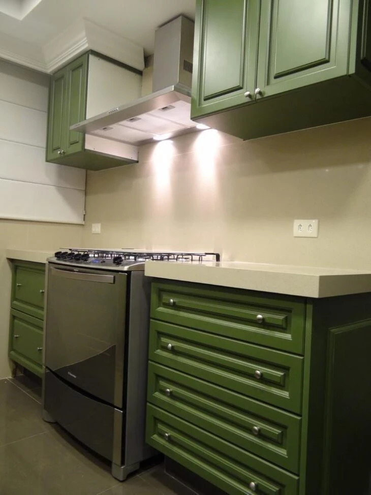
Both the countertop and the wall behind the stove have a beautiful sand tone as the chosen tone for its decoration. The suspended cabinets and the ground cabinets received a dark green tone. To balance, stove and hood with metallic finish.
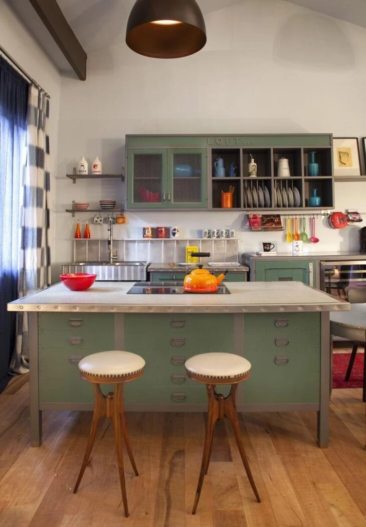
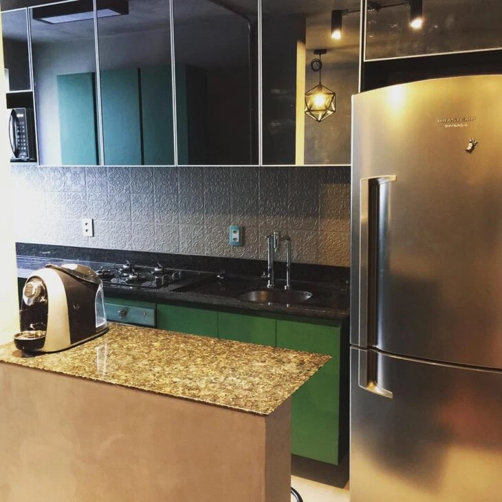
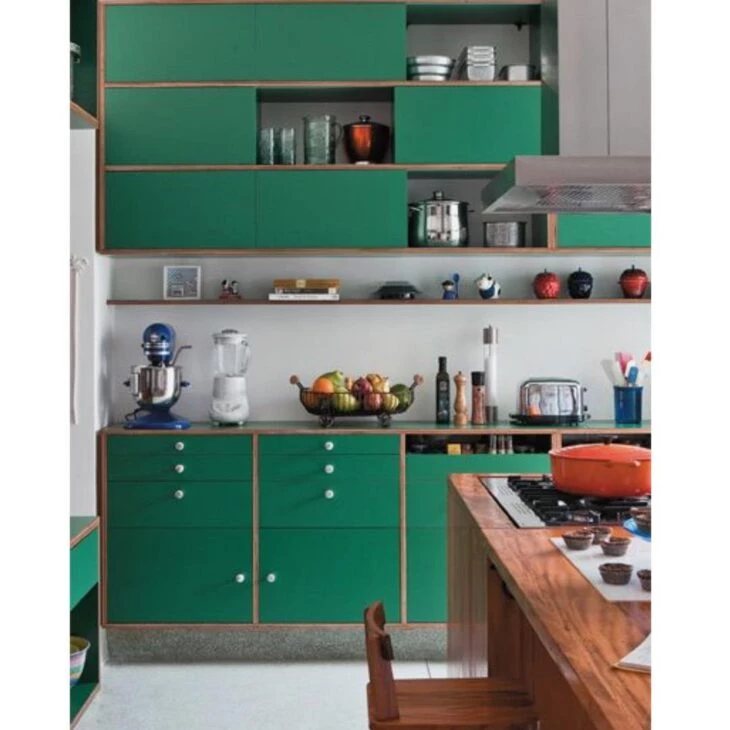
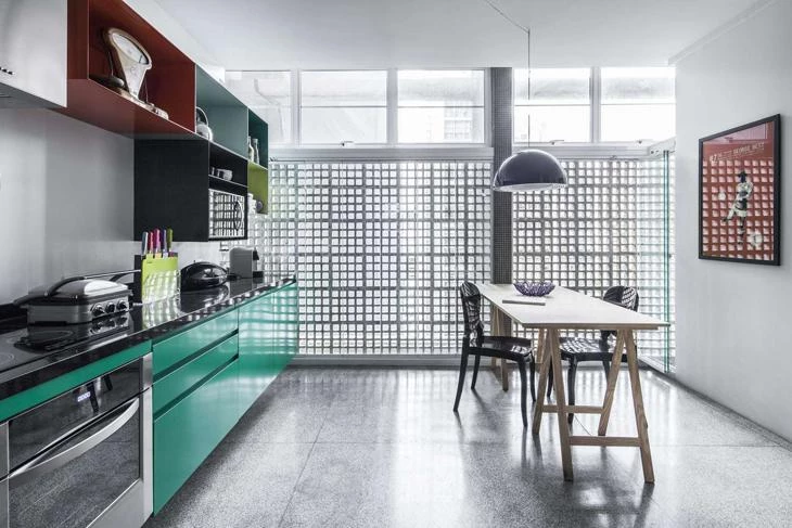
7. same tone and different materials
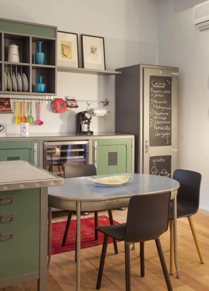
Mixing with gray elements, both the wooden cabinets (suspended and ground) and the countertop made with a metal cabinet received a coat of paint in the same shade of green. A highlight is the irreverent dining table.
8. subtlety and beauty
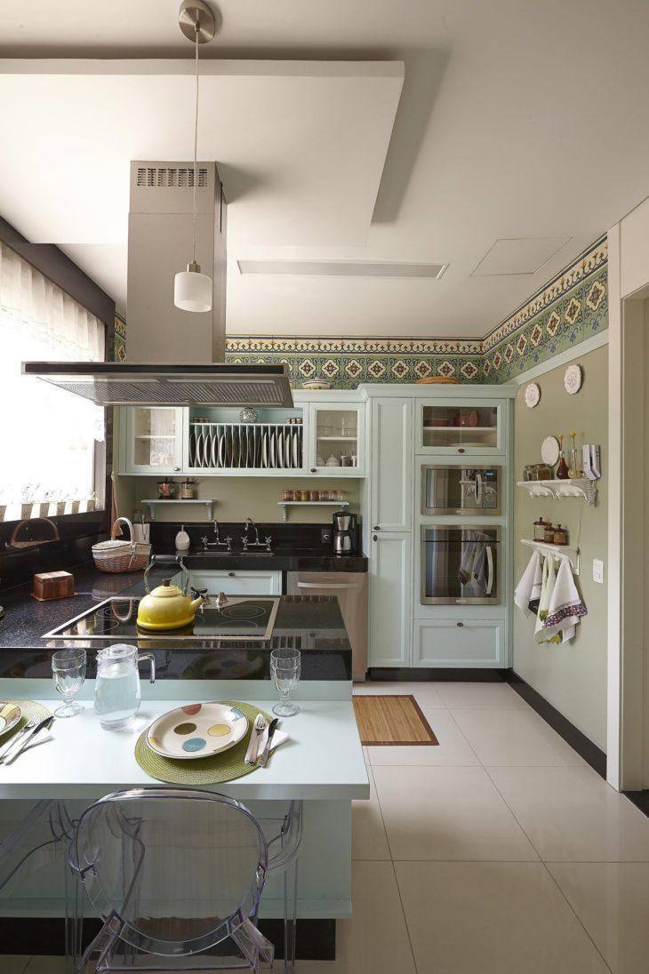
If you are looking for a more subtle look, then this very light shade of green may be just the right one for you! Seen in the kitchen cabinets on the countertop, it contrasts perfectly with the color chosen for the painting of the walls, highlighting the ornate stripe positioned on the top of the wall.
9. use the tablets
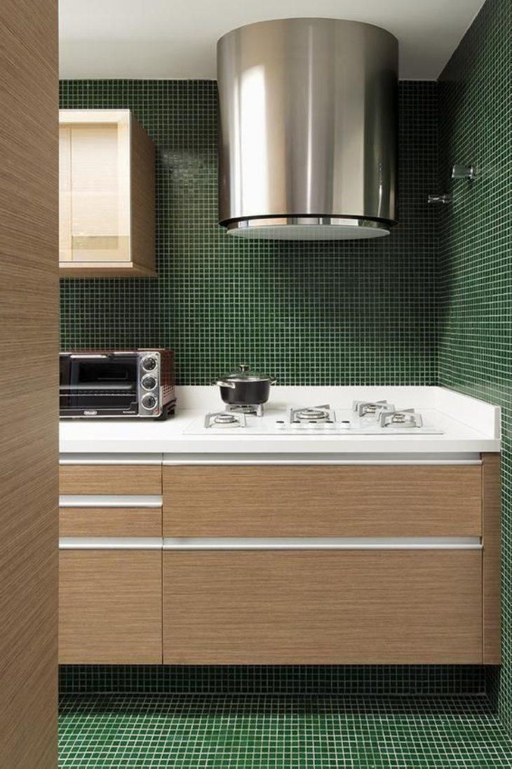
A very common coating in the kitchen, tiles are a good solution to facilitate the cleaning of this room, which has frequent contact with water and grease. In this project, the small green squares harmonize with a beautiful wood tone and white details.
10. tempered glass is a good option
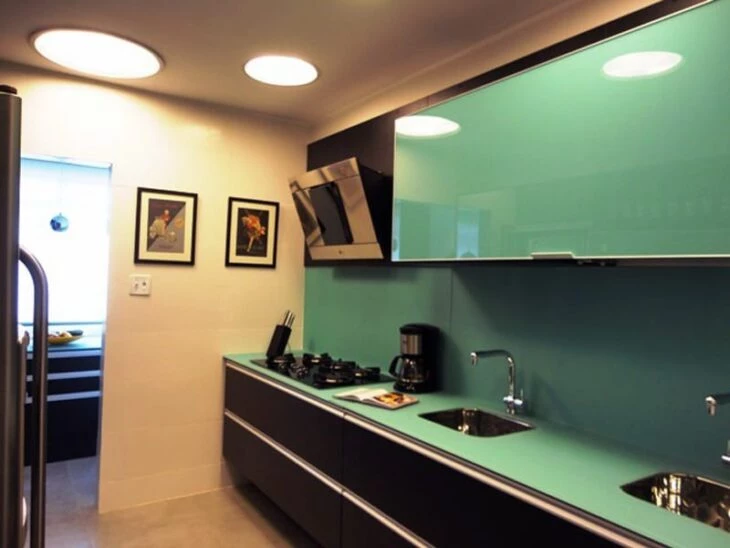
In this project, besides the tempered glass facilitating cleaning, the green color ensures a beautiful and contemporary look to the room. The customized black cabinetry ensured a modern and functional design, bringing personality to the room.
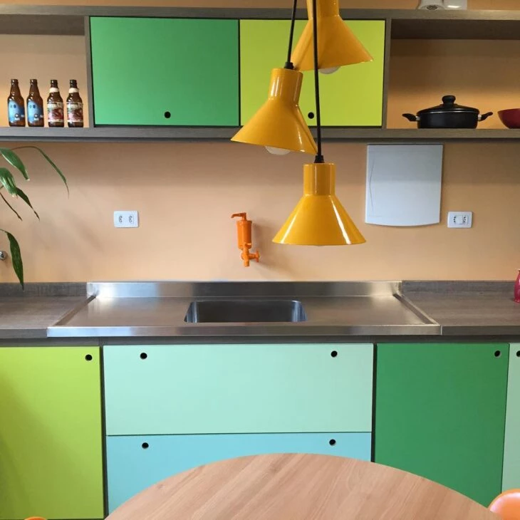
11. the color present in three different elements
Adding more color and contrast to the back wall, two strips of tessellations give a more beautiful look to this small, but charming kitchen.
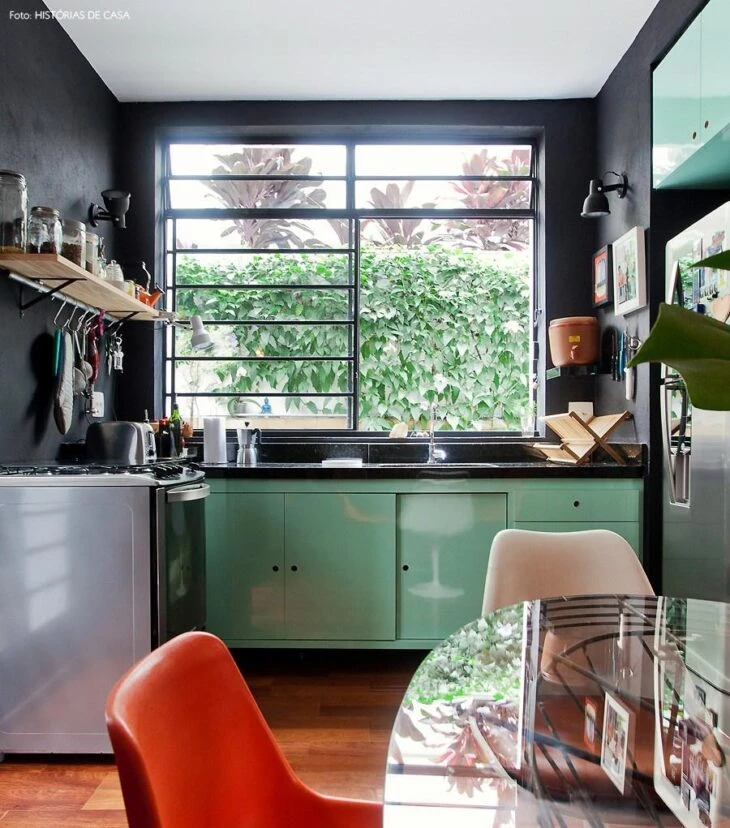
12. beautiful combination with black
Again the green and black duo can be seen. If you want a more discreet result, add the tone in places that are not very visible, ensuring a surprise for those who enter the room.
13. a touch of joy to the space
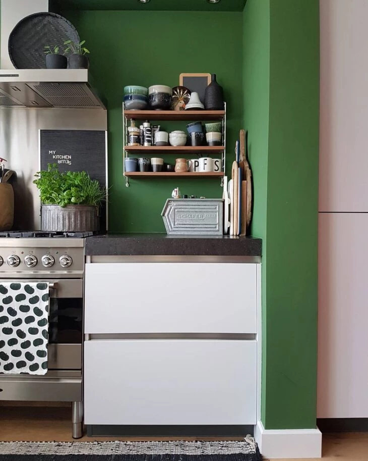
This shade of green, known as leaf green or flag green, is the sure bet for those who want to add liveliness and joy to any corner of the kitchen. Here it appears in association with black and white, standing out over these shades that are so traditional.
14. to feel in the middle of nature
The drawn wood is present in furniture, walls, and floor, while the cheerful shade of light green colors large cabinets in the background, the countertop, the hood, and the brick wall. For an environment full of personality, exalting the colors of nature.
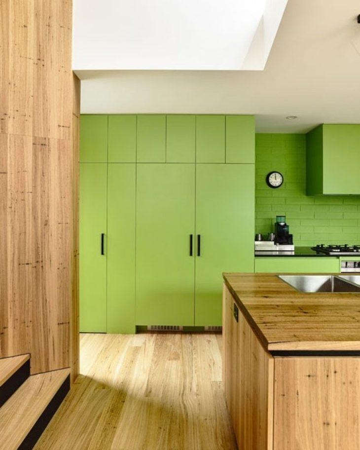
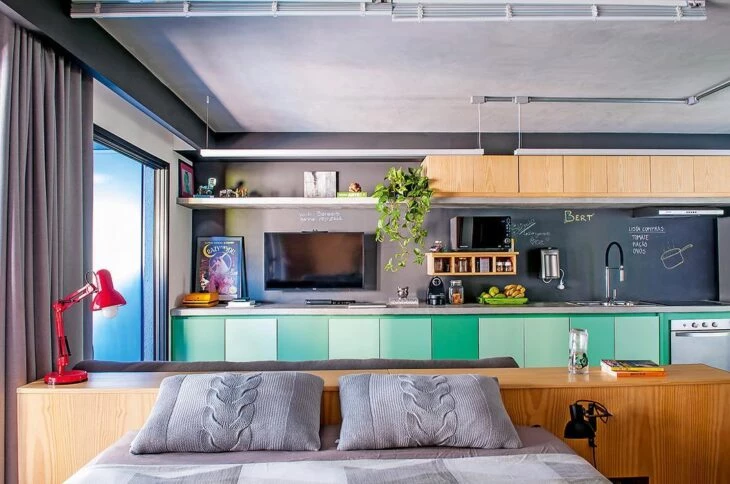
15. industrial style also has a place
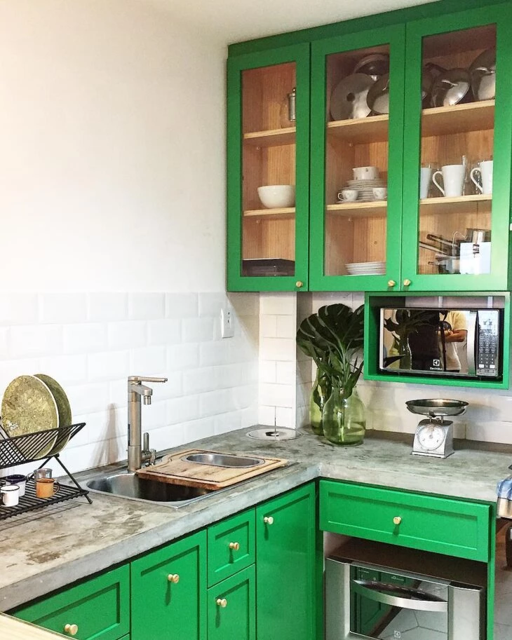
The mix of wood in a vibrant green tone, burnt cement countertops and subway tiles couldn't be more beautiful. To complement the look, stainless steel appliances. It's worth noting that the inside of the cabinets remained in the natural wood tone, ensuring an even more interesting look.
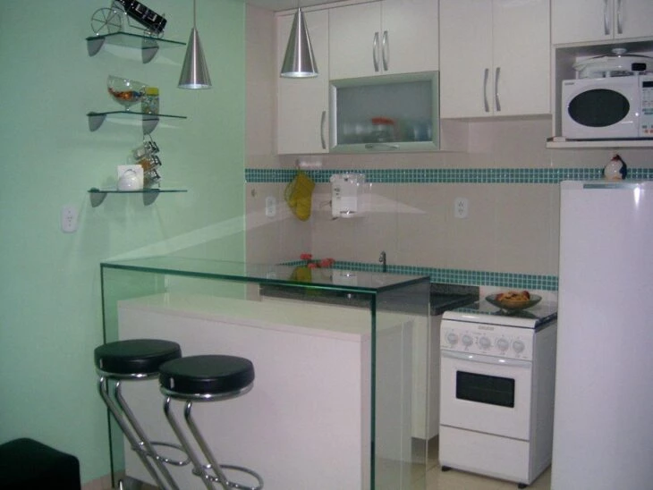
16. aqua green and white, style combination
As the shade of green chosen for the customized cabinetry is light, nothing better than betting on white to complement the look of the environment. The mixture of the two shades ensures joy and luminosity, expanding this kitchen of reduced measures.
17. neutrality and beauty
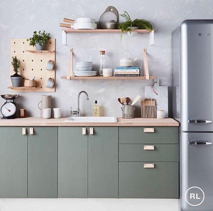
For this kitchen, the Scandinavian decoration style was chosen, abusing neutral tones, minimalist design and the use of wood in light tones. The green used to color the cabinet has a neutral tone, easy to harmonize with the rest of the environment.
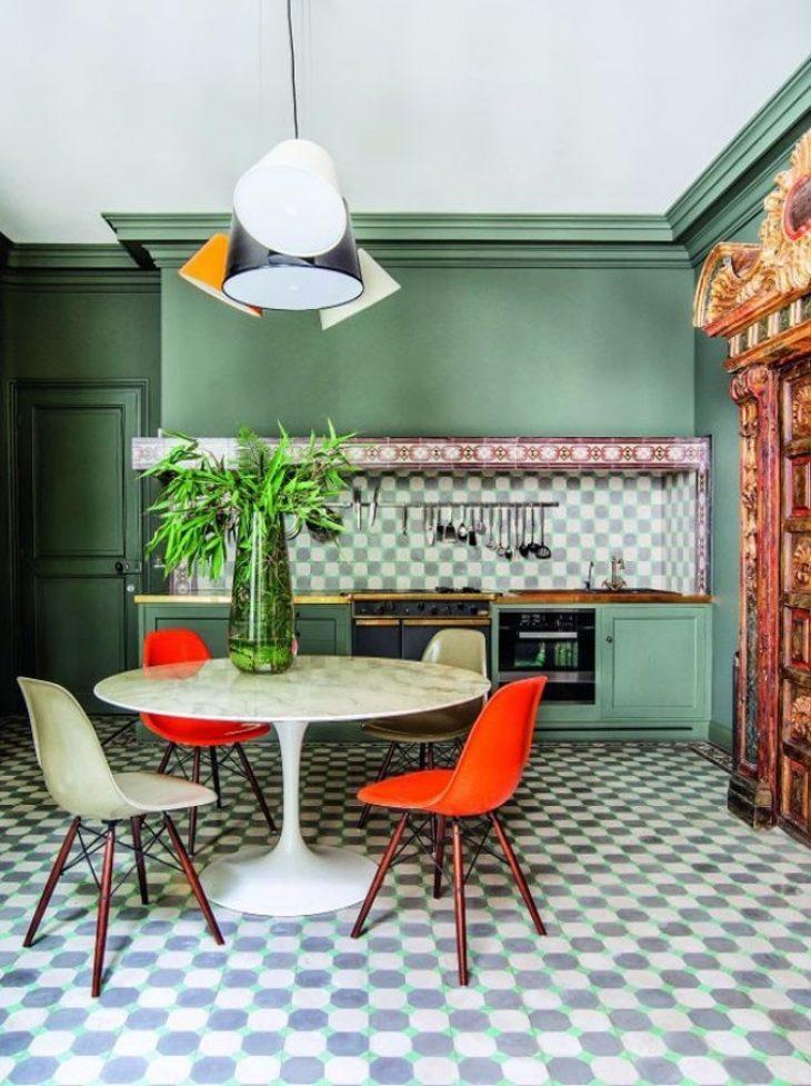
18. retro style and lots of visual information
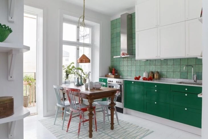
This retro kitchen contains a dark wood dining table and a mix of white and red painted chairs. While the overhead cabinets were made in white, the floor cabinets took on a dark green tone, harmonizing with the wall covering chosen for the wall in which they were installed.
19. mint green and crafted wood
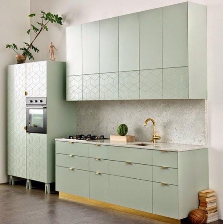
A color often used for those who want to add color, but keep the furniture discrete, is mint green, a lighter shade of green. In this kitchen it is present in the cabinets, which have geometric designs on their doors, giving more style to the room.
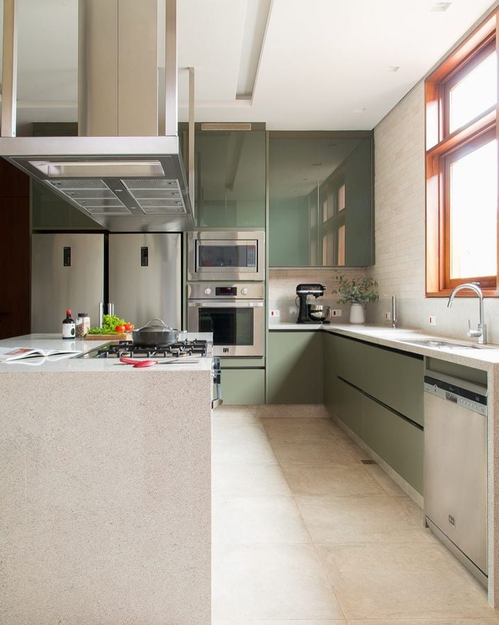
20. refinement and wealth
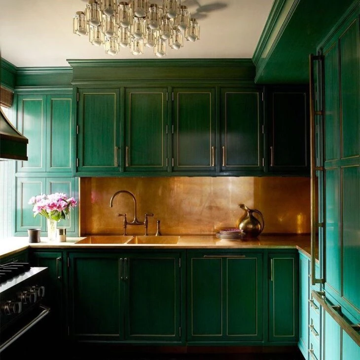
This kitchen gains style and elegance through the combination of the dark green color present in the cabinets with the golden tone appearing in its countertop and skirting board.
21. standing out on the white wall
With a design full of style and functionality, this kitchen cabinet has drawers of various sizes, and special niches to accommodate decorative objects and complement the decor of the room.
22. the right combination: aqua green, white and wood
This trio guarantees a stylish and beautiful kitchen, without overloading your look. If you wish, you can still paint or sticker the appliances, harmonizing them with the chosen tone for the cabinets, paper, or wall painting.
23. use decorative objects in the same tone
A good tip to keep the environment harmonized is to bet on decorative objects or ornamental plants that have the same tone or even a tone very close to the green chosen for the cabinetry or walls.
24. green kitchen cabinets
The color looks great for use in cabinets, pastel green is ideal for those looking for a delicate and soft atmosphere.
25 Bringing luminosity to the room
As the predominant color used in this kitchen is black, the shade of light green seen in the hanging cabinet above the refrigerator and in the ground cabinet below the sink is ideal to ensure adequate light so that the environment has lightness and harmony.
26. integrated kitchen and dining room
With a contemporary look, this space integrates a kitchen of simple but extremely functional measures with the dining area. To further integrate the two rooms, analogous shades of green are used on the dining room wall and on the kitchen plinth.
27. in contrast with other colors
With a fun look, this kitchen has green cabinets, with colorful niches that contrast and make each corner stand out even more. In the rest of the room, the white color reigns and the luminosity is guaranteed thanks to the cobogós wall.
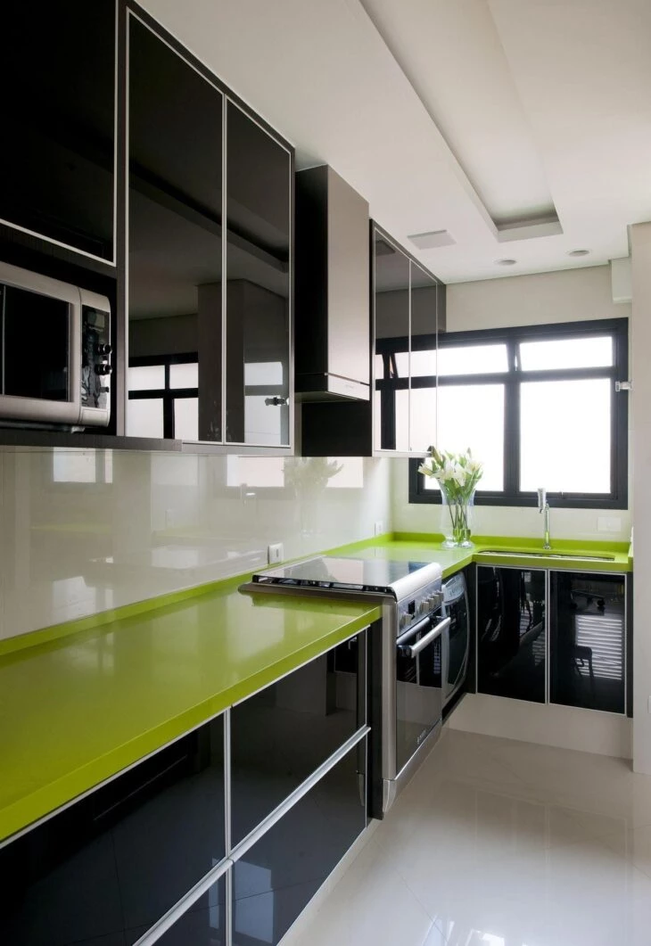
28. one-tone overdose
In an environment with classic style, the same shade of green is observed in the cabinets, walls, and door, and even in the graphic patterned coating applied on the floor and on the skirting board. To complement the decoration, a white table with a mix of chairs.
See_also: Maranta: plants with amazing prints to have at home29. how about a gradient of tones?
This idea is the ideal option for the indecisive on duty who find it hard to choose just one favorite shade of green. Here the ground-floor cabinet received a mixture of three similar shades of vede, used alternately on the doors and bringing more fun to the kitchen.
30. color pot-pourris
Following the same idea of the previous project, by mixing several different shades of green, one in each part of the kitchen cabinet, the resulting look is irreverent, ensuring more personality and fun to the room.
31. breaking up the basic kitchen look
If it weren't for these cabinets in vibrant green, this kitchen would go unnoticed, due to the predominance of white with few wooden details.
32. adding color to this wooden kitchen
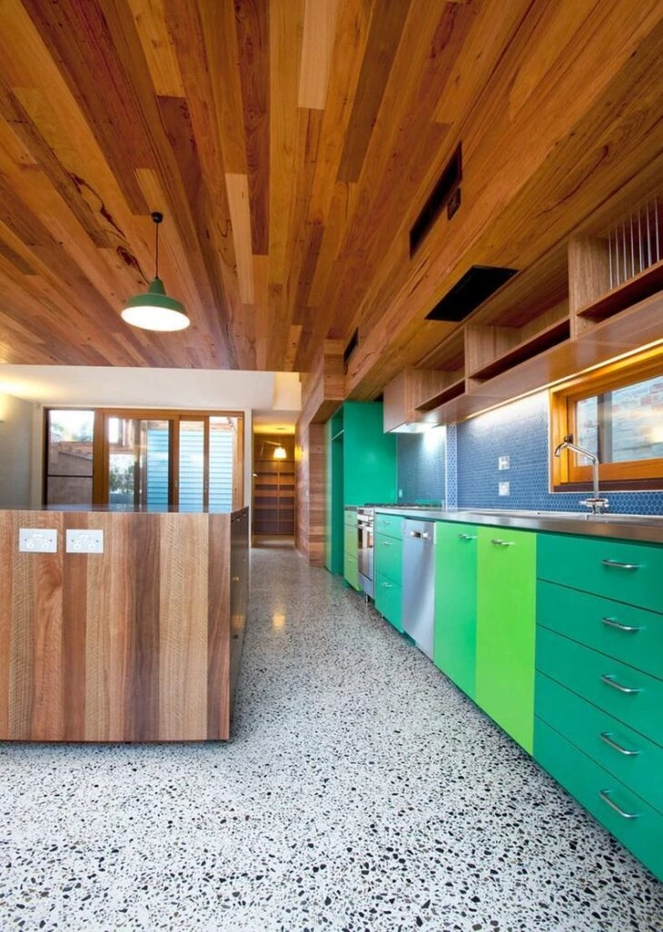
Wood is the most commonly used material in this room, covering everything from cabinets, door frames, and island to the ceiling. To add color to the room, the skirting board uses blue tiles and the ground cabinets play with varying shades of green.
33. a detail makes the difference
In an almost bicolor kitchen, while the cabinets were made of wood with a glossy black finish, the floor and wall coverings remained white. To add more joy to the environment, the countertop was given an avocado green tone.
See_also: 60 cute gorguron bow designs and simple tutorials34. decorative objects in the same tone
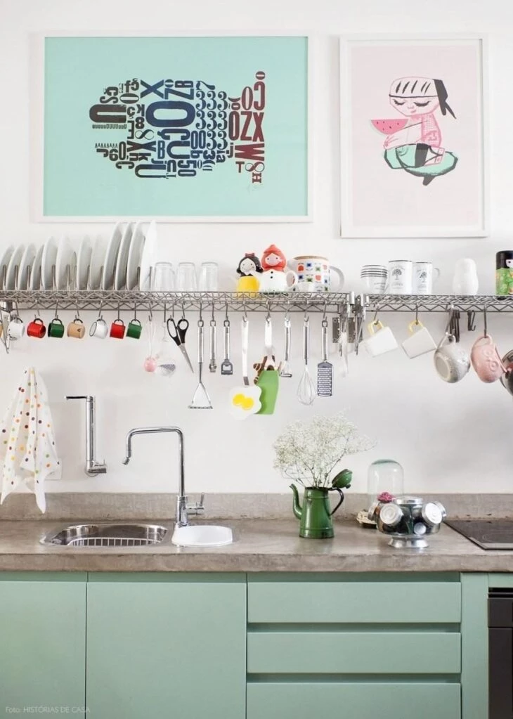
Mint green again features in the cabinets of an industrial kitchen. The look is complemented by the countertop with a burnt cement finish and a wire shelf that adds the functionality of a hanging cabinet. A good trick is to add decorative objects in the same shade of green, as in the case of the pictures above the sink.
35. beautiful combination of green and caramel
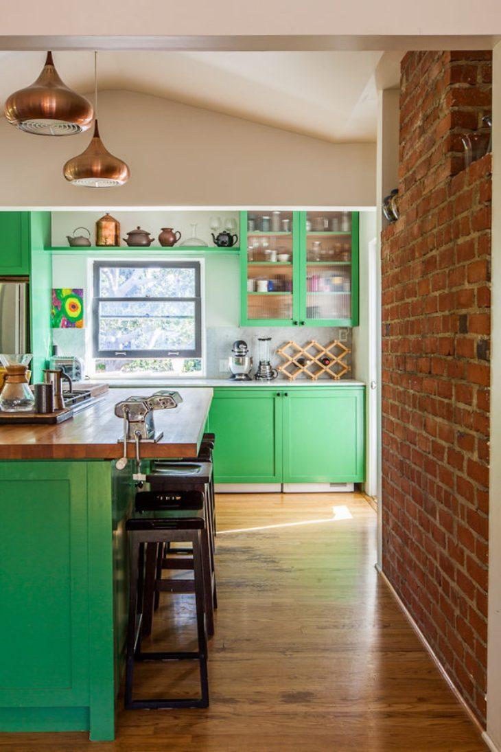
Earthy tones are great options to combine with this color. As an example, we can mention the caramel wood tone visualized on the kitchen countertop and on the floor covering, the copper pendants positioned on top of the countertop and on the brick wall.
36. light green and lots of wood
The cabinets in this kitchen were given a lighter shade of green as a matte finish.
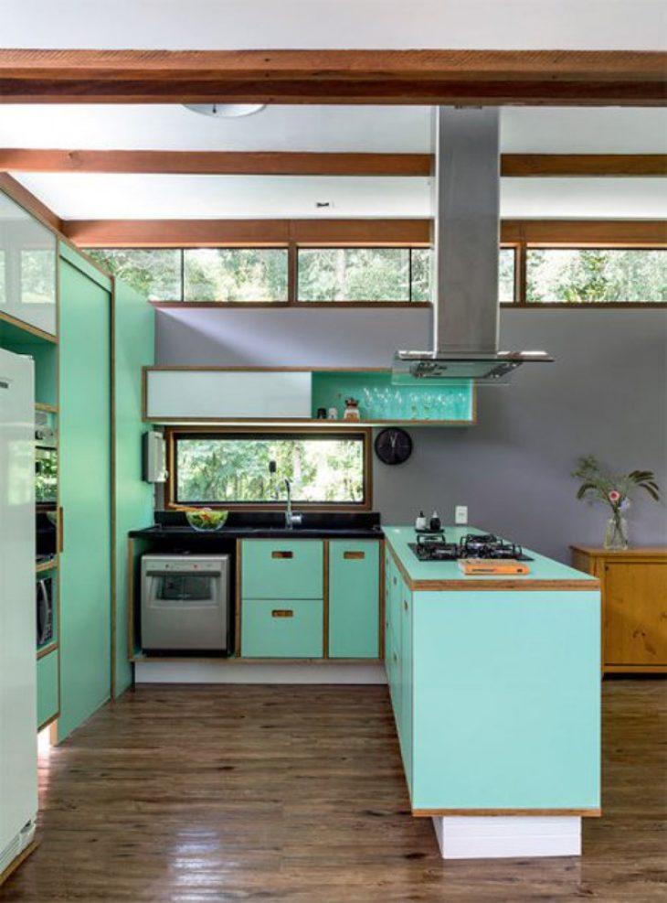
37. dividing environments
Besides being beautiful, the vibrant shade of dark green chosen for the kitchen countertop also helps to separate the integrated spaces. A modern looking environment, it mixes cultural elements with more rustic materials such as wood, burnt cement, and metals.
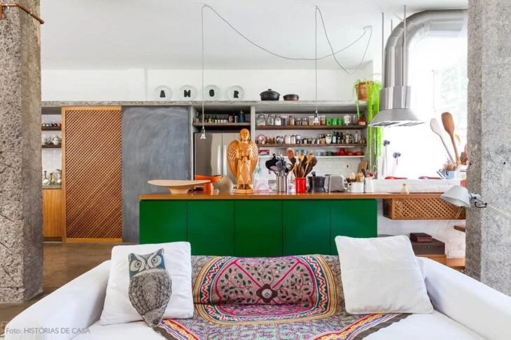
38. avoid the obvious
 to the room.
39. highlighting this corner of the home
It is undeniable that the highlight provided by furniture made in the most varied shades of green ensures life and personality to the home. In this example, despite having a more classic decor, the kitchen gained a more modern look due to the use of this color.
Whether as the main color or appearing in cabinets, walls, flooring, or decorative items, if you want to add personality to your kitchen and ensure more liveliness and beauty to this room, bet on the most varied shades of green and be surprised by the result.