Table of contents
When we think of coloring an environment, we are actually including the personality of its inhabitant in it. It is with the colors that we guarantee the feeling and energy we want for the space, as well as the identity of who will determine such composition. And for the decoration of the living room, this synthesis would be no different.
According to architect Sandra Pompermayer, when the dweller chooses the color, he needs to think, in an individualized way, what purpose the room will serve: "If the idea is to transmit calm and security for a moment of relaxation, such as reading a book or enjoying a movie on TV, it is worth betting on neutral and versatile colors. But if the dweller likes to receive guests, thetranquility can quickly scare them away, so a few strong colors included in the decor in a balanced way inspire socialization.
It is worth pointing out that small rooms deserve colors that create a sensation of amplitude, especially if they also receive little natural lighting: "small environments should receive colors modestly, such as objects, some furniture, pictures, among other adornments. It is also possible to paint one of the walls with a different color, but not too dark, so as not to generate feelings of confinement andcompromise the lighting," explains the professional.
It is also important to analyze if the color chosen is not something that will make you sick easily. Sandra explains that striking colors can also bring this feeling, and there is nothing worse than feeling uncomfortable inside your own home!Always think about investing in colors or pieces that actually match your personality, and that include your identity in the environment, not that take you out of it!
If you already know the color you want to include in your living room, but still have doubts about which other colors you should combine with to create a certain composition, check out the suggestions given below by the architect, so that your decoration not only has your face, but also pours into the environment everything that you are looking for in a more personal and sensory way:
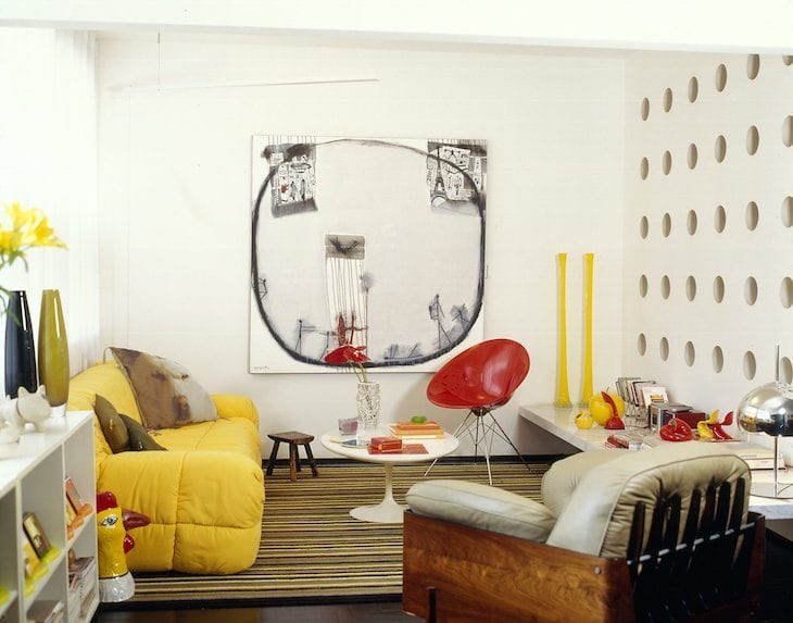
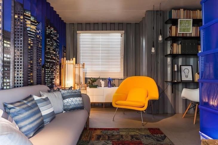
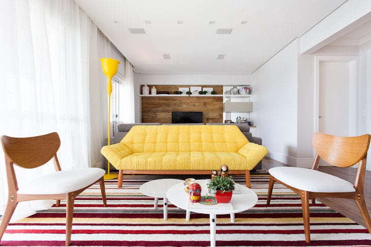
Colors that go with yellow
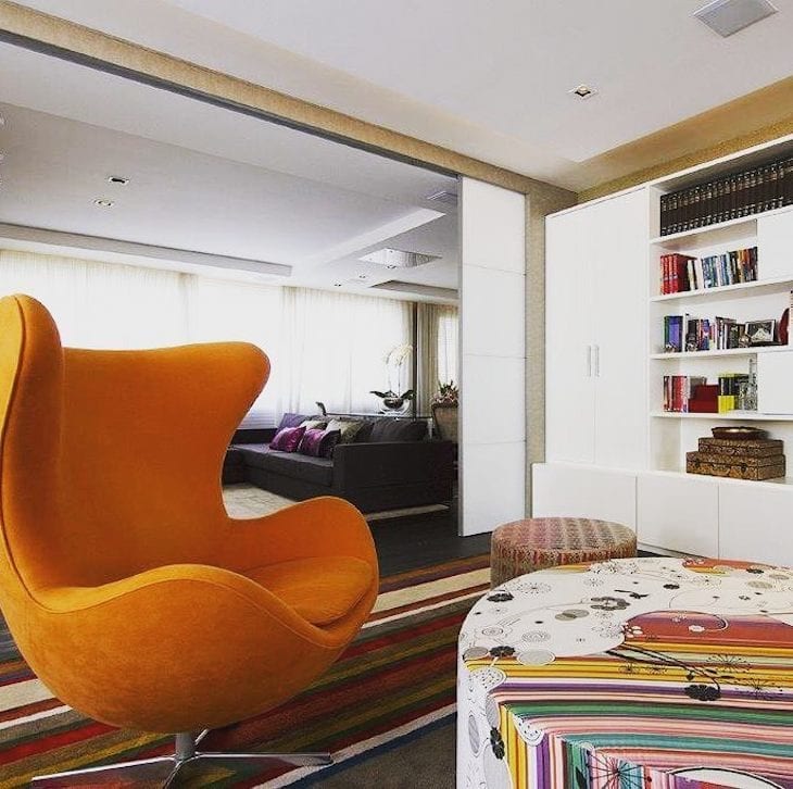
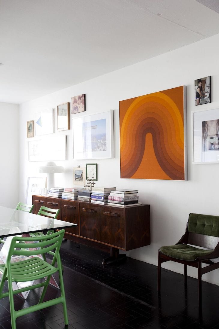
"I really like to put yellow elements in the living room. Yellow is life, it's vibrant like the sun. Its best combinations are with shades of gray, purple and even navy blue," comments Sandra. The lighter shades of yellow, combined with other more neutral colors, such as brown or white, can play a quieter role in the decoration, while its more vibrant tone adds moreA masculine environment is highlighted by the marriage of yellow and black.
See_also: Baby shower decor: 60 pictures + tutorials for an amazing party1. a pinch of joy, without taking away the coziness
2. a stylized color band
Combined with other striking colors, it makes the environment more jovial
4. a more closed tone with a noble appearance
5. the lighting also contributed to make the room more welcoming
6. small colored energy dots
7. yellow has the power to bring joy to any neutral environment
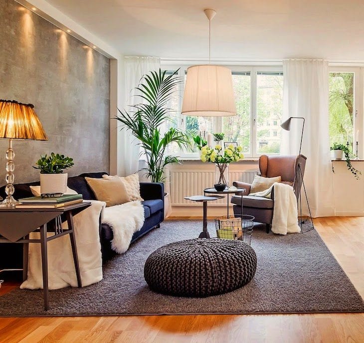
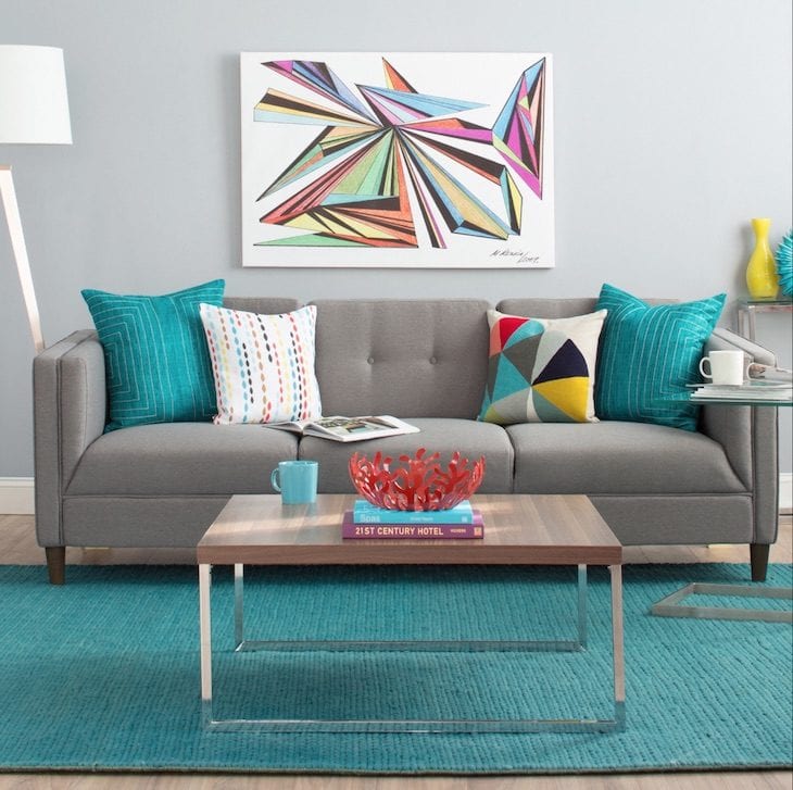
Colors that go with gray
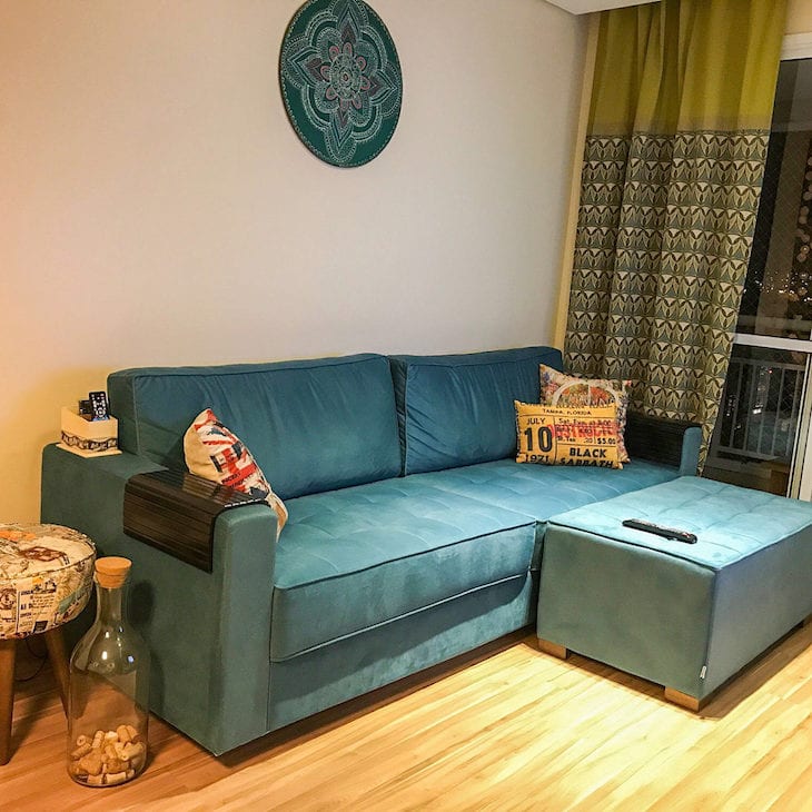
The big bet in interior decoration nowadays is gray. It composes a neutral environment, and its light versions contribute to rebound the natural light, helping to give the perception of amplitude in small environments. Graphite, on the other hand, can be used to create the sensation of depth, or to highlight other more striking colors.I suggest striking tones such as red, black itself, petroleum green, dark blue, and yellow," points out the professional.
8. gray is undoubtedly a big trend these days
9. and it goes well with any style and composition
10. for a more urban feel, invest in textures and natural materials
11. and to add coziness, don't hesitate to include warm colors
12. gray makes the environment cozier and more sober
13. wood to warm up the color palette
14. gray goes well in any decorating style
15. the color dots served to demarcate the environment
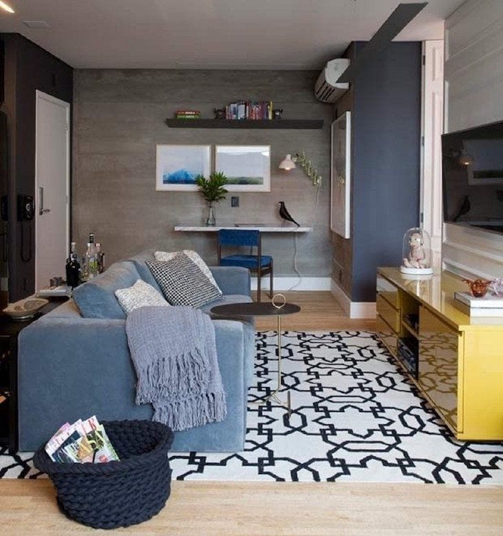
16. the small living room was warmed up by the addition of the dark gray sofa
17. gray and blue were responsible for the modern touch in this room
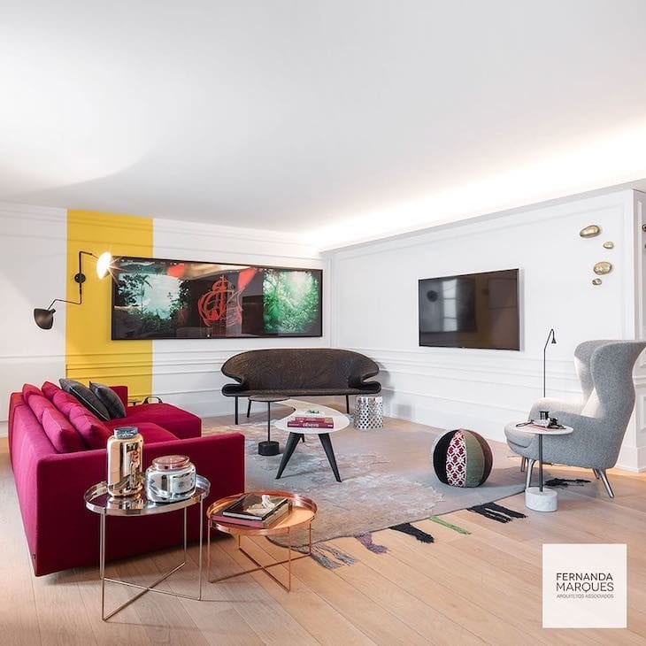
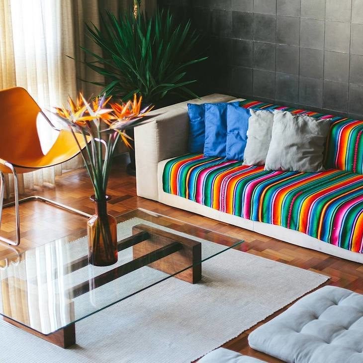
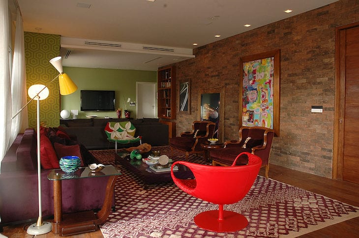
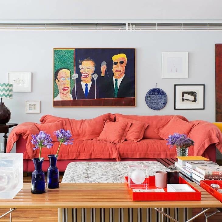
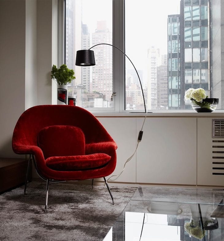
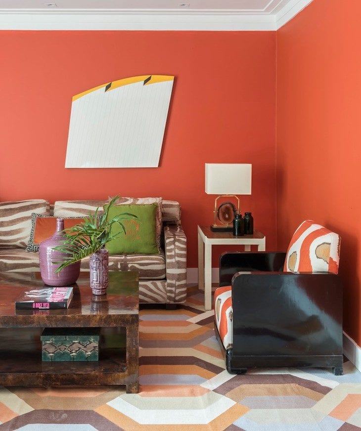
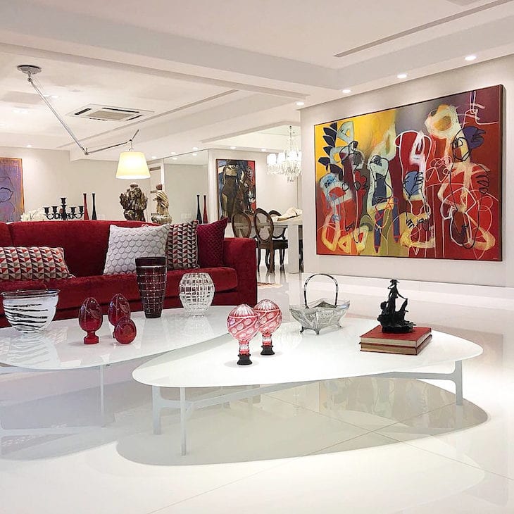
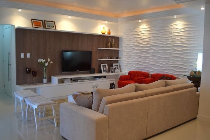
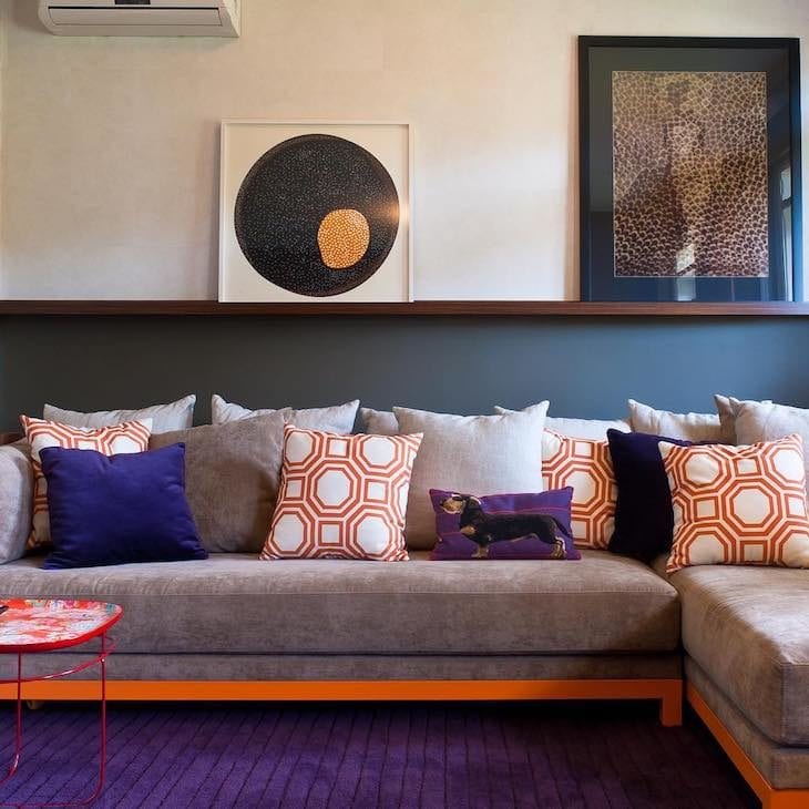
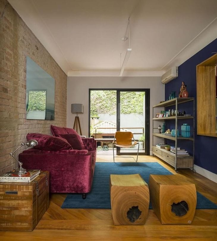
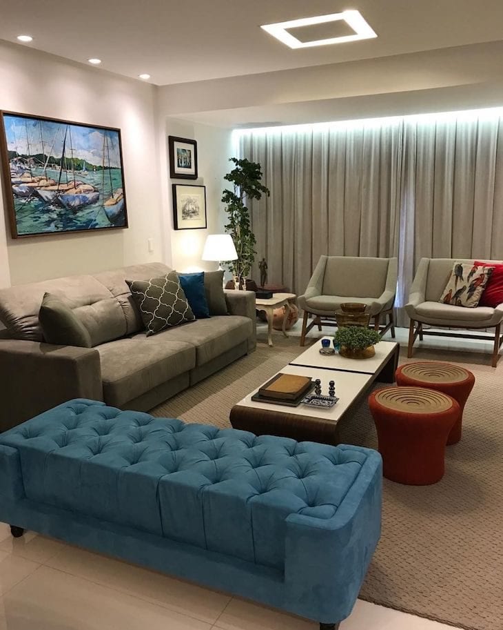
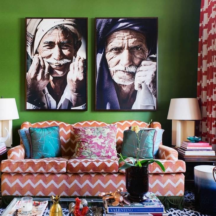
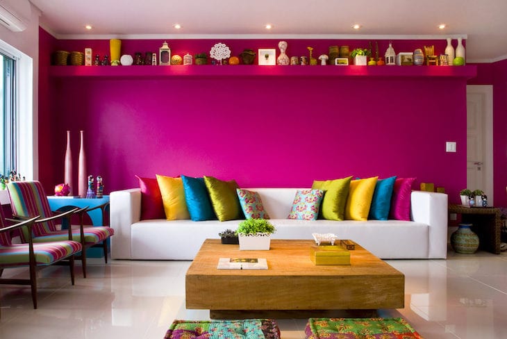
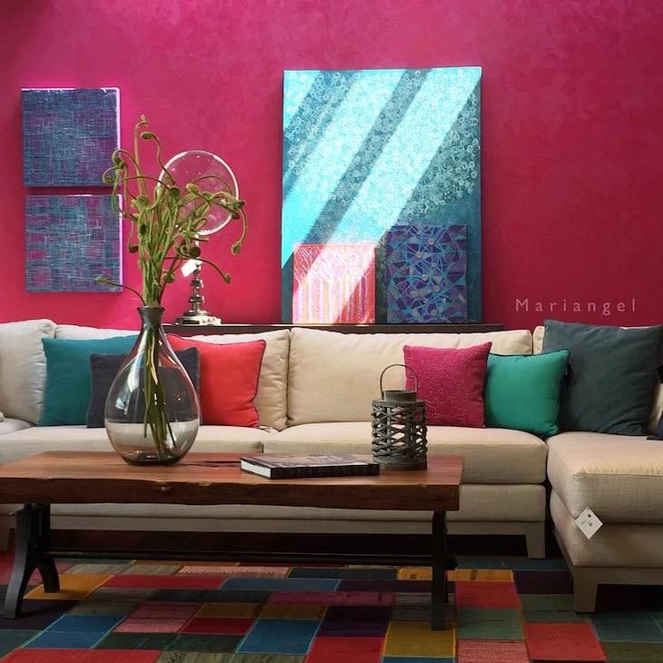
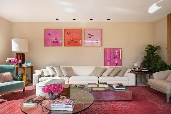
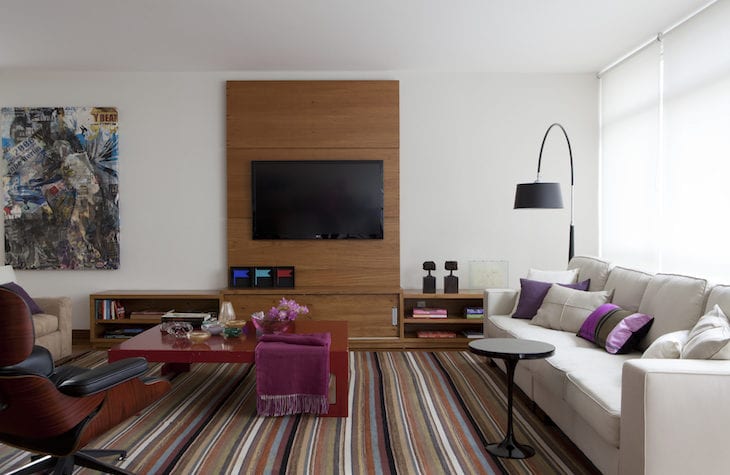
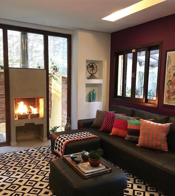
Colors that go with red
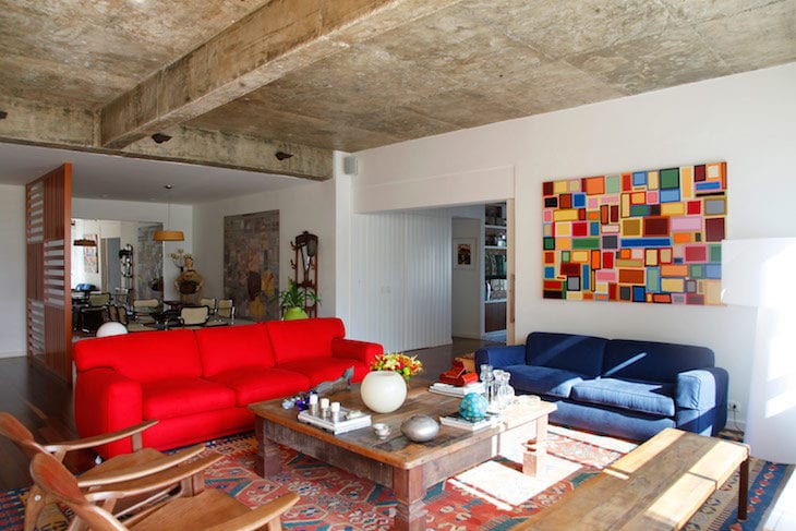
Red is a powerful color, which besides being striking, is very expressive. Because of this, it should be used with caution, and preferably in cozier textures, precisely to provide comfort, not fatigue. In the right dosage, it can also be a very versatile tone, which will include joy to the environment. Think about composing a palette with light gray, white, beige, pinches of moss green and shadeswoody.
18. the harmonization of the various shades of red made the color palette very cozy
19. an almost orange red for this creative corner
20. red and yellow can literally become a dynamic duo
21. a vibrant armchair for the sober living room
22. class touch in due proportions
23. mix of prints to make everything more fun
24. every detail can make a big difference
25. red with white made the space sophisticated and luxurious
26. two armchairs are enough to color the sober room
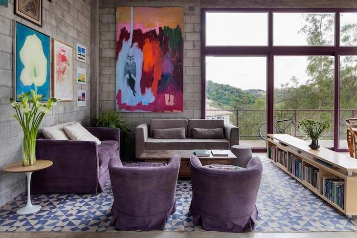
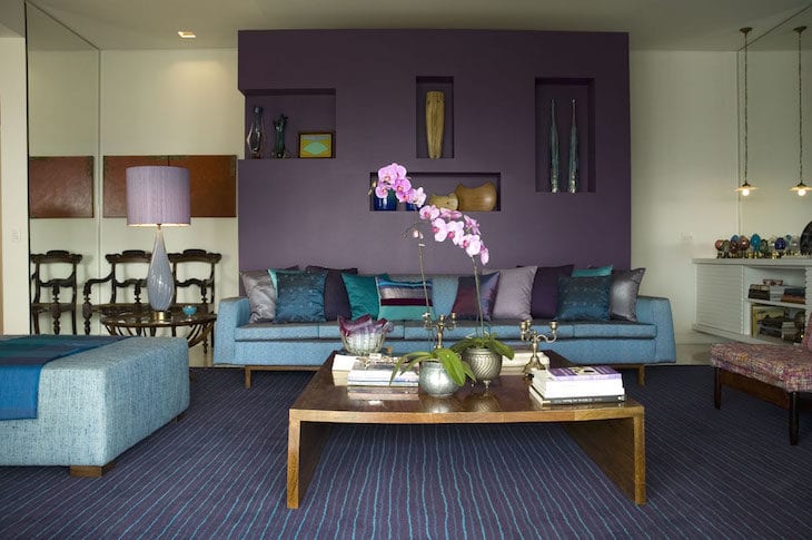
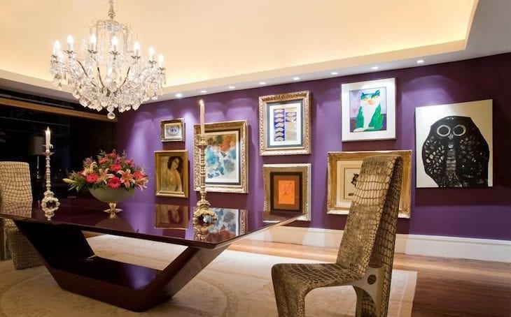
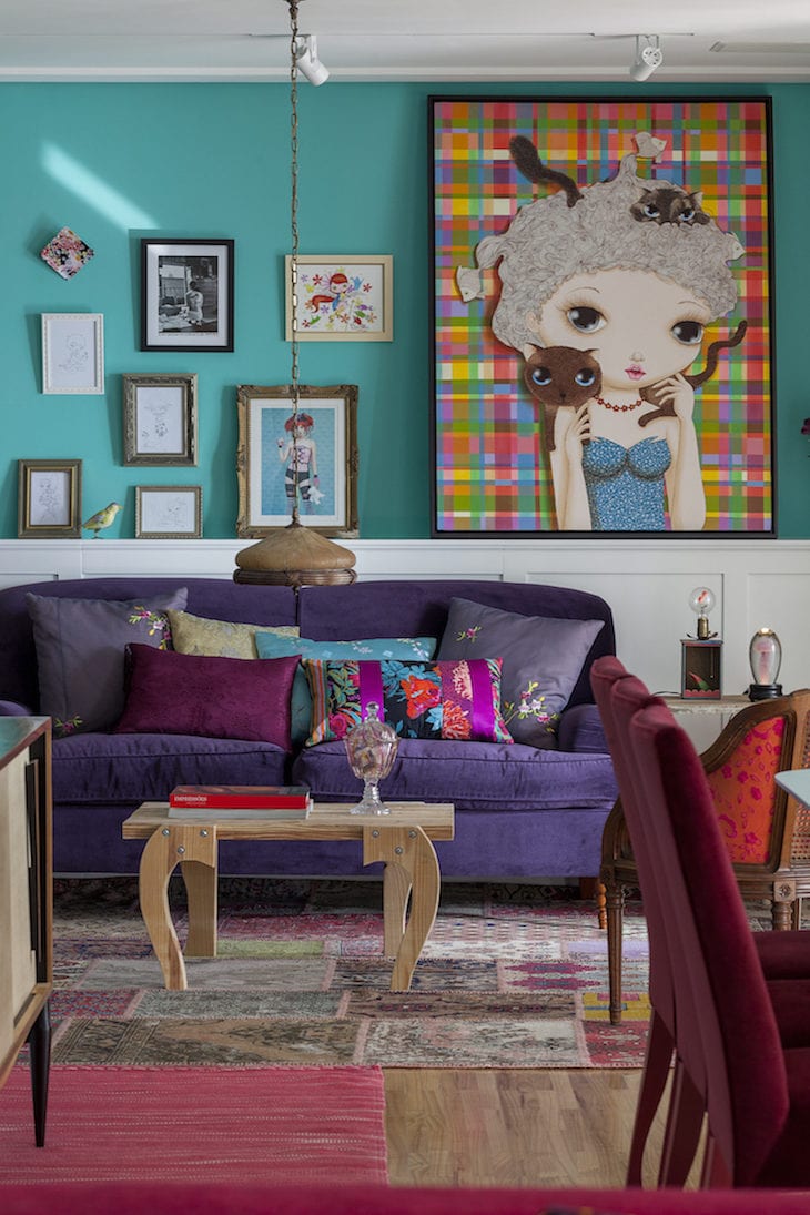
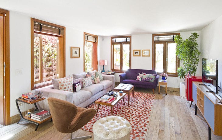
Colors that go with purple
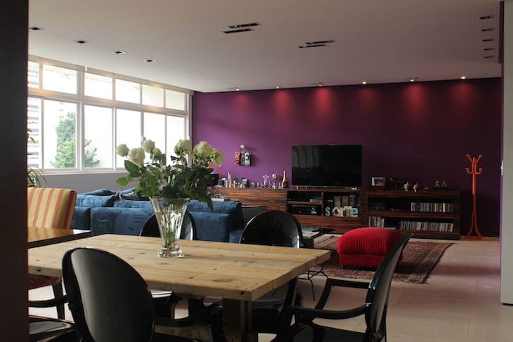
Despite its impact, purple can be a very versatile and expressive color. According to the architect, it goes very well with green, light blue, with the marriage of yellow and gray, and also dark mustard. Ideal for stylish decorations and busy social environments.
27. a gothic touch mixed with blue and gray
28. colorful pictures made the environment more fun
29. purple with light blue and tiffany
30. the highlight of the room was the carpet
31. color gains prominence with warm direct light
32. here the colors were added with care not to take away the lightness of the environment
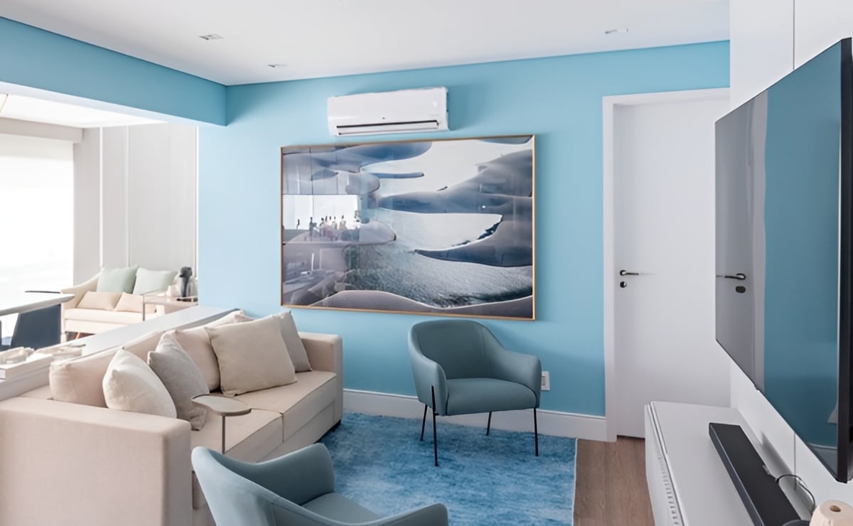
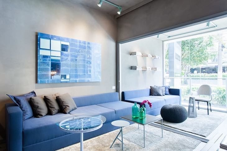
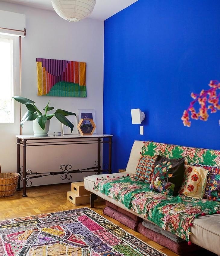
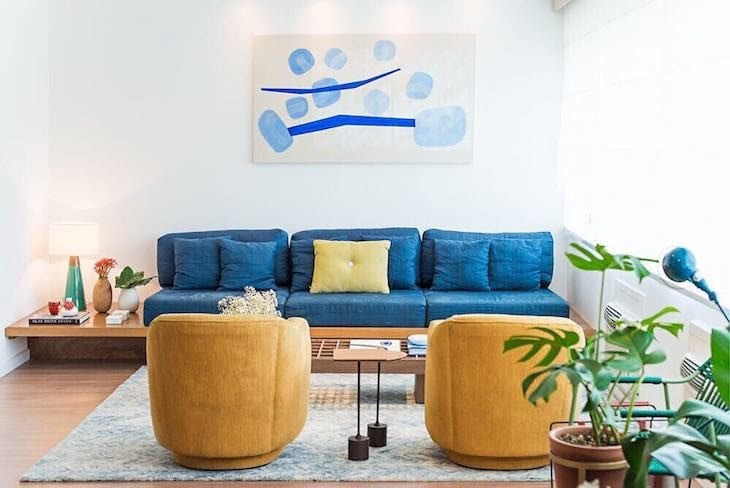
Colors that go with blue
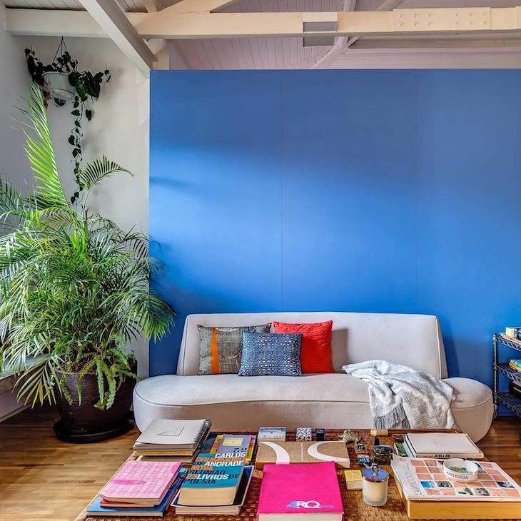
"Blue combines with brown and beige, but everything must be analyzed in the context and in the pigments that these shades of primary colors receive from white or black. A blue with little black pigment can be combined with gray and light brown, while a light blue, with a lot of white pigment, must be combined with a more burned brown", says Pompermayer.
33. blue with beige to have no mistake
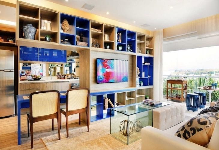
34. some niches in the bookcase were highlighted with royal blue
35. cooler shades of blue are cozier
36. and its lighter shade adds more delicacy to the environment
Who says blue can't be clean?
38. representing the colors of the night on a clear day
39. neutral tones make the classic navy blue stand out
40- The vibrant royal blue for uncluttered rooms
41. closed tones are perfect for rustic environments
42. ... and lighter shades to go with warm colors
43. it is essential to color large environments with high ceilings
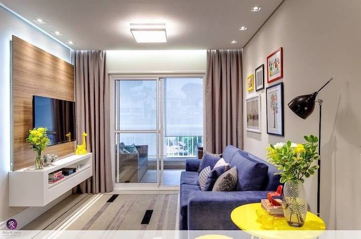
44. blue and yellow combine very well in the predominance of white
45. ...and with small doses of red, they make the room more cheerful
46. compact environments are more valued in their milder tone
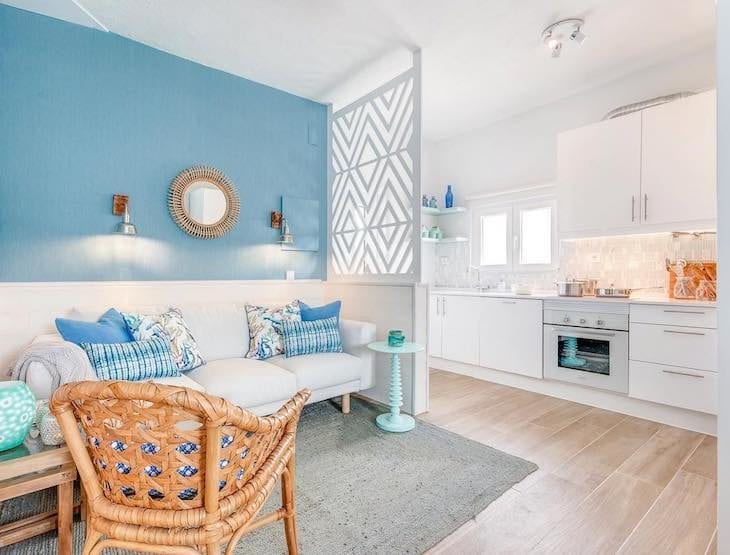
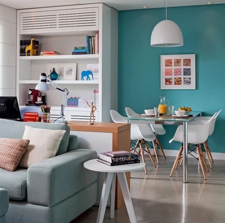
Colors that go with turquoise
Turquoise, also known as tiffany, can be a paradoxical color, since it can provide both a cheerful and delicate atmosphere. It all depends on its dosage. It combines perfectly with orange or lighter shades of red - and according to Sandra, the result of the composition looks gorgeous.
47. but with white, the color offers a softer touch
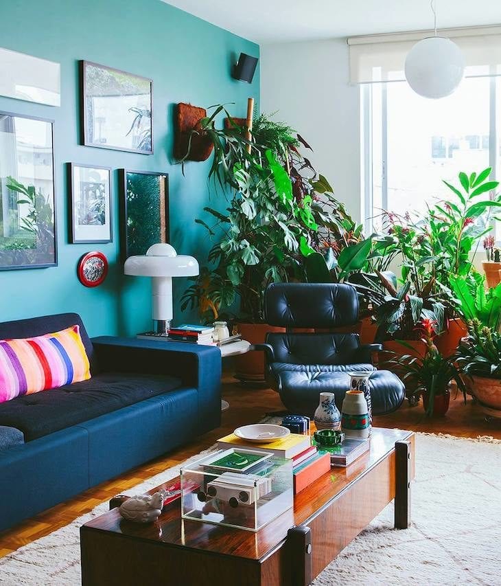
48. and also to bring more joviality to the decoration
49. choose the wall you wish to highlight to receive the color
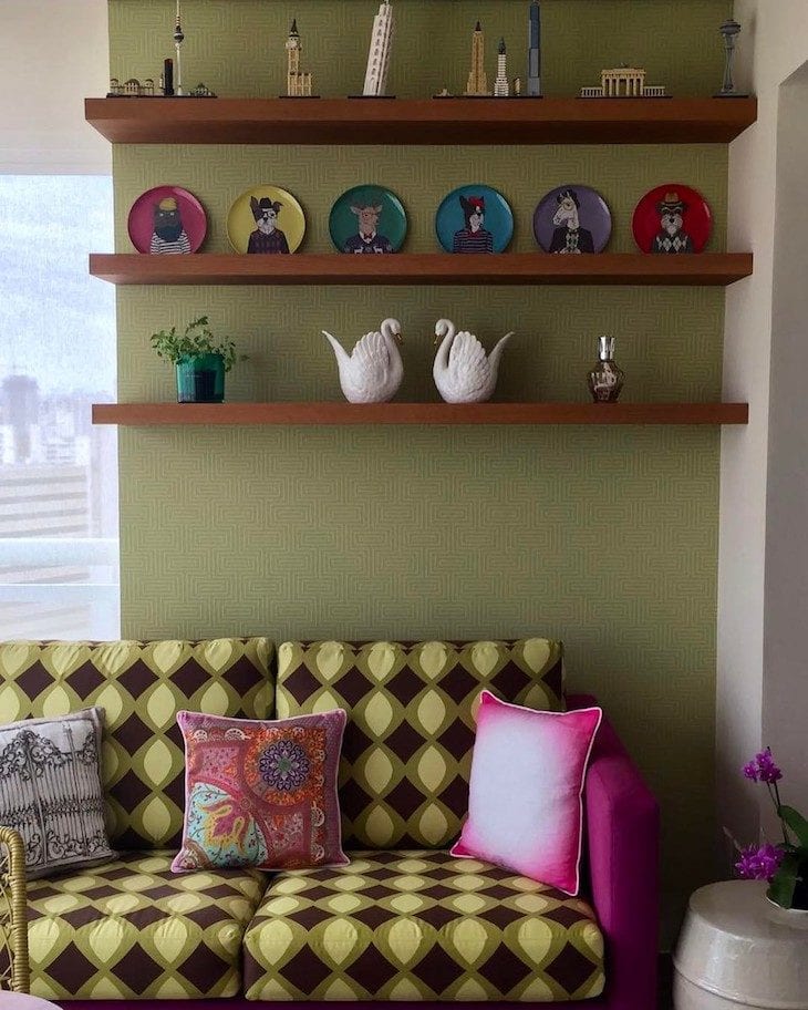
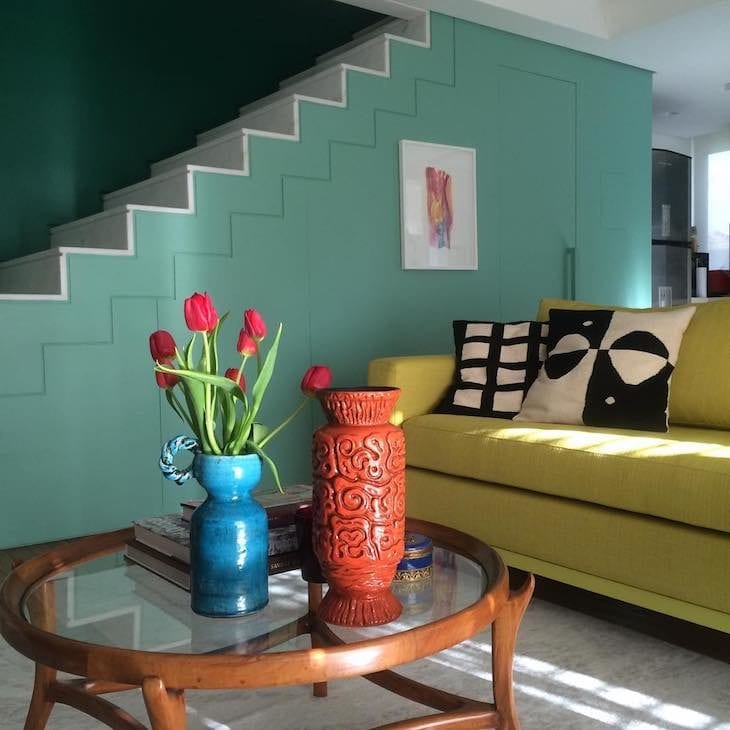
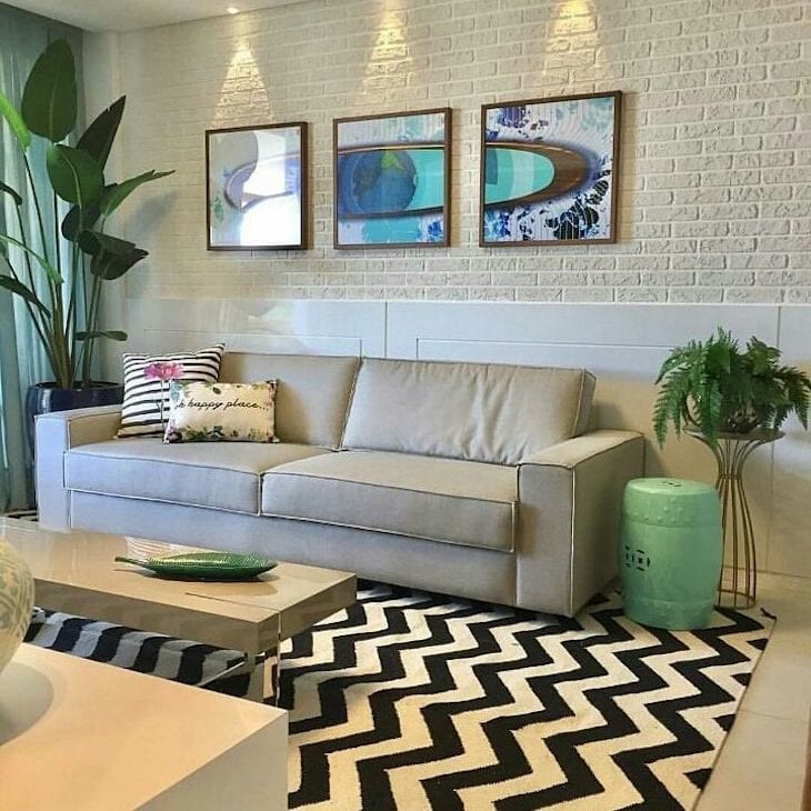
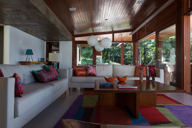
Colors that go with green
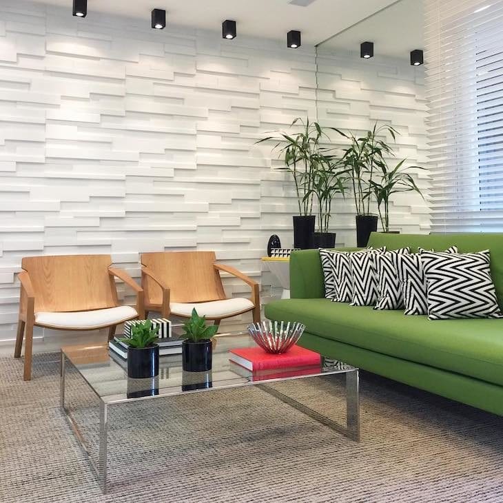
"Green with blue is a wonderful combination that transmits a tranquil and cozy feeling, and a touch of orange generates joy and well-being," says Sandra. Depending on the tone chosen for the decoration, the proposal can gain a tropical atmosphere, and even retro.
See_also: Homemade Disinfectant: 8 Easy and Economical Ways to Make It50 Here the colors were included in the carpet so as not to take away the neutrality of the environment.
51. ... unlike this room, which has gained much more expressive tones, like its paintings
52. moss green gives that retro touch to the decoration
53: Contrasts that complement each other in perfect harmony
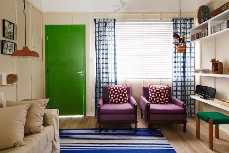
54. think of an element that deserves to be highlighted, such as a door
55 - Ornaments and little plants are also valid, see?
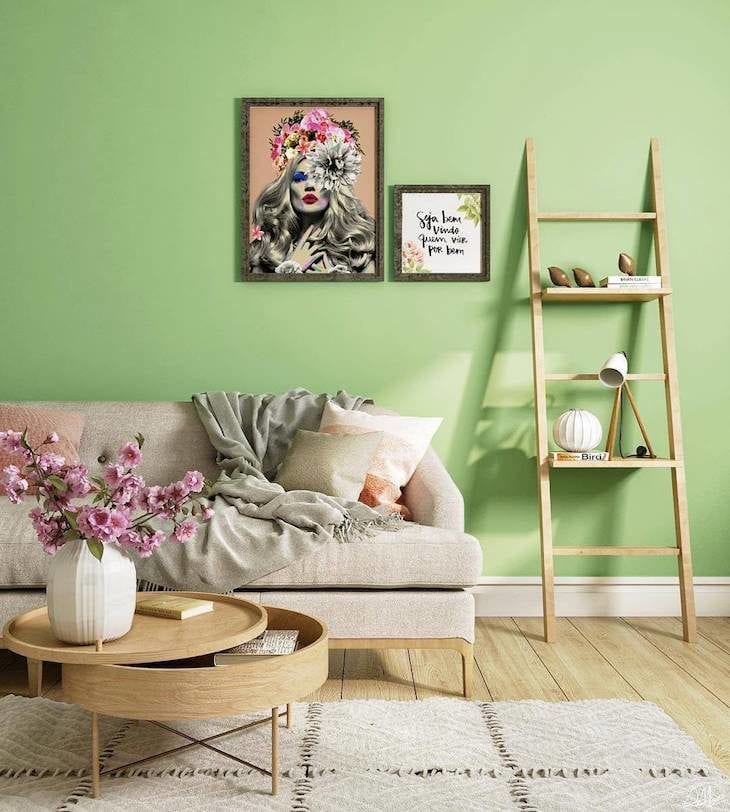
56. all the lightness of light green combined with beige
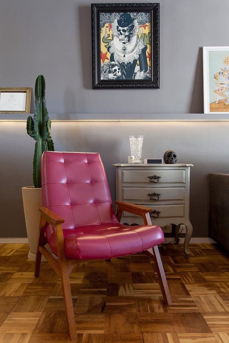
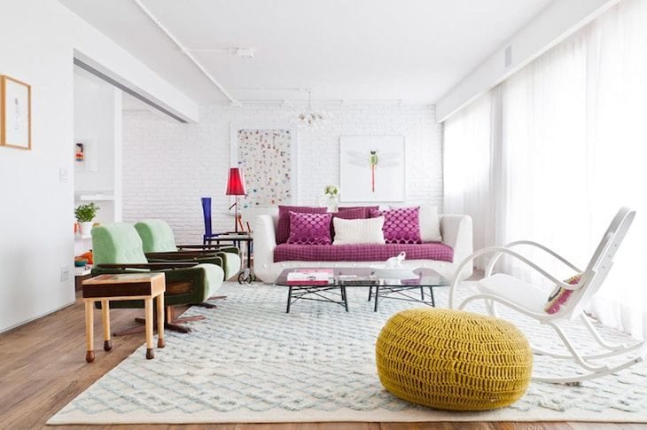
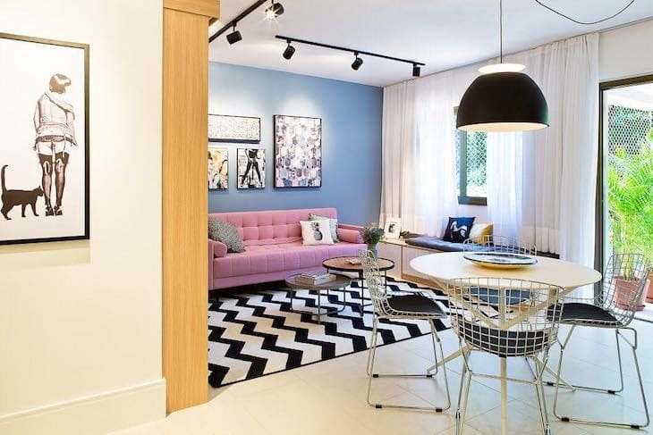
Colors that go with pink
Although there are various shades, not all shades of pink are recommended by the architect to decorate a room: "The pink, that more closed tone, is very classic for a room, very chic! The pink should be used with moderation, while the light pink I would leave aside, so as not to make the decoration too girly, unless this is the proposal". For a more neutral room, combine theIf you want to include more personality, think about a composition with graphite.
57) Do you want a pink wall? Then combine it with other neutral colors, such as white.
58. ... and why not blue?
59: Make things more fun by combining pink with various other colors
60. the black and white prints, together with the wood, broke some of the femininity of the color
61. white, beige and turquoise to cozy up the guests
62. delicacy and irreverence for this pure glamour room
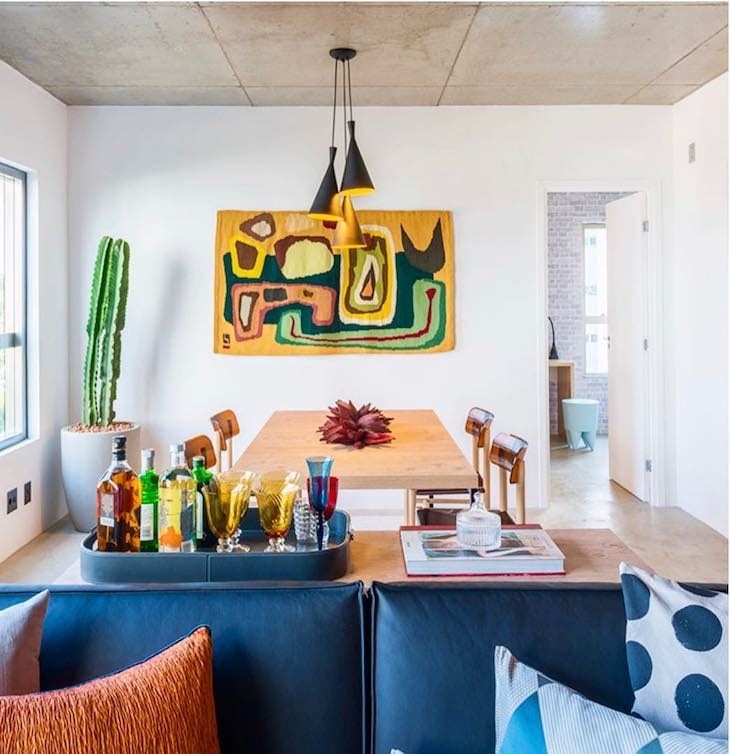
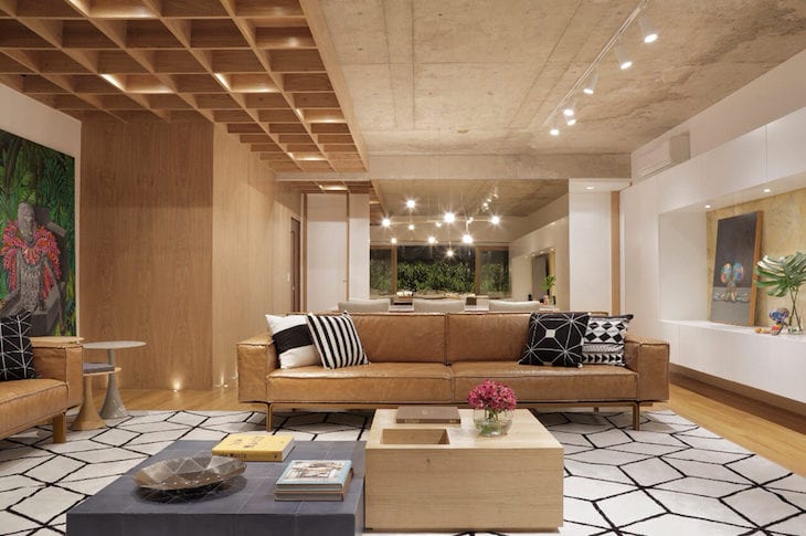
Colors that go with wood
Although it is a material, its color is quite predominant when it comes to decorating, and should not be left aside when creating your color palette: "Wood is responsible for offering warmth, heat, and leaving the room very cozy. It is usually used on the floor and in some elements, such as coffee tables, side tables, and the feet of armchairs," adds the professional.
Mix it with white and yellow, and the result will be amazing!
Red will bring a more creative and daring composition
65 Mix neutrals with bolder colors for a fun look
66 Mixing wood with more noble materials will make your living room more sophisticated
67. choose an eye-catching color to break the sobriety
White and black
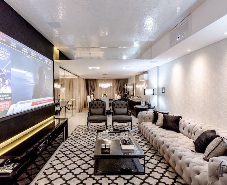
For this combination of neutral colors, anything goes! You can create a more classic decoration, keeping only the two colors, or add points of color with small colorful details, such as pillows, pictures, a piece of furniture, ornaments, etc.
68. black, white and marsala
69. mixed with leather, wood and cement
70. some prints can create a more romantic atmosphere
71 The right choice of stylized furniture marked this decoration as retro
72 With chrome colors like gold, the room looks chic and refined
73 - The fun version of the most beloved combination
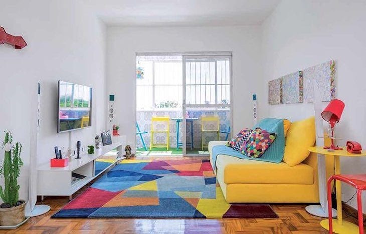
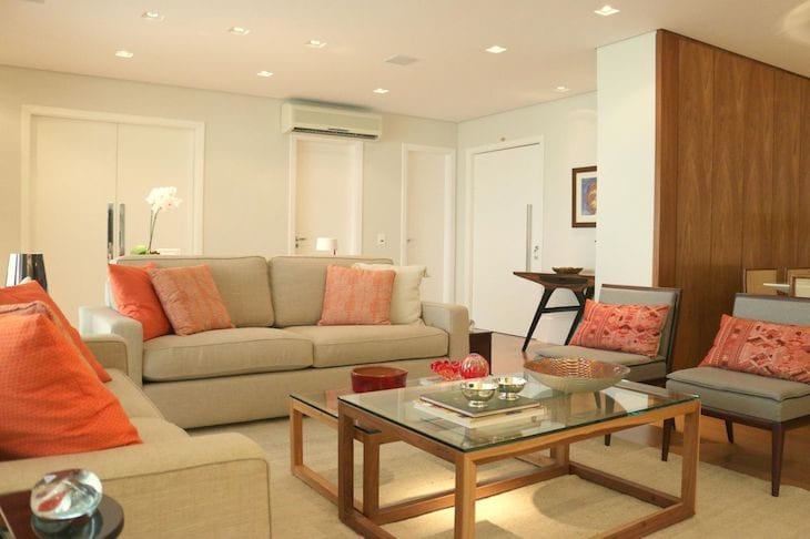
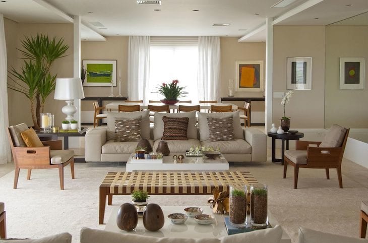
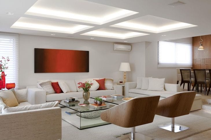
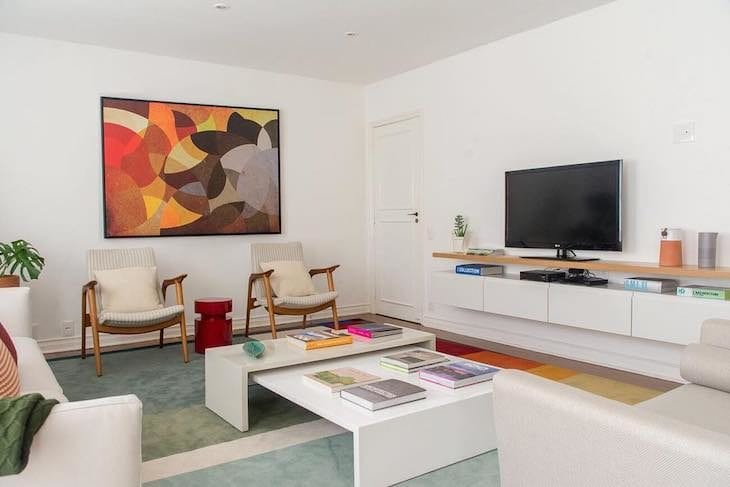
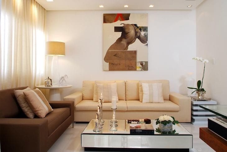
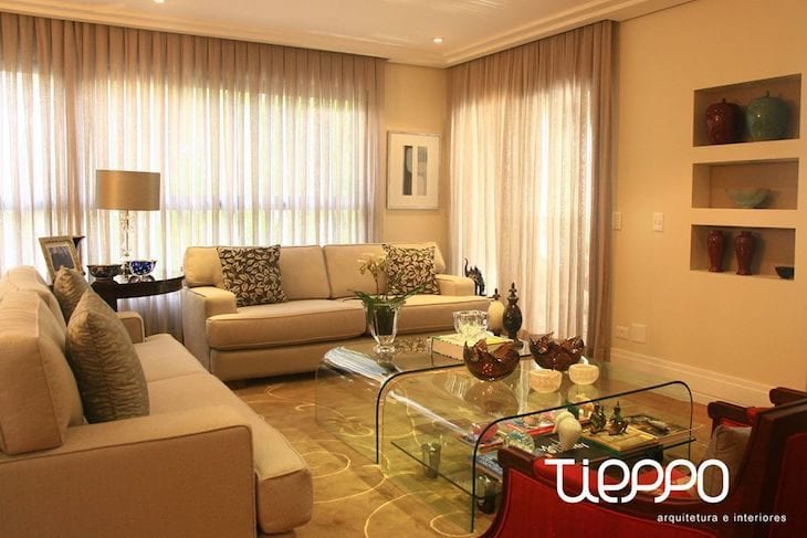
Neutral tones
Choosing neutral colors such as beige, white, earthy tones and their variants ensures greater precision without error when decorating. Depending on the composition, pastel shades can also join in the fun, to give a break from the seriousness that the color palette can convey.colors to add in moderation and make everything more harmonious.
74. chrome and metallic colors make a clean environment more refined
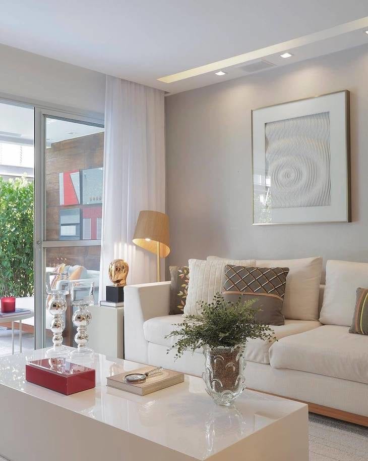
75. beige, off white, white and brown are classic sobriety
76. pictures, plants and other decorations add more life to the environment
77. blankets, rugs and natural materials help to give more comfort
78. vibrant colors to bring youthfulness to the space
79. colorful cushions add more personality to the room
80 - Enhancing the room's spaciousness
81. this color palette is a sure option for those looking for a unisex decoration
82. ... and also offers versatility for those who always like to change, but without big investments
Finally, Sandra explains that it is important to choose the colors that will compose your living room at a time when your mood (good or bad) does not influence your choice, and that it is fundamental to remember the necessary proportions to decorate: "Dark walls need neutral furniture and neutral walls need darker furniture. Always".